Sneak Peek: Kat Von D Serpentina Eyeshadow Palette Photos & Swatches

Kat Von D Serpentina Eyeshadow Palette
The new, limited edition Kat Von D Serpentina Eyeshadow Palette ($45.00 for 0.37 oz.) just came yesterday, so I’m still working on testing and reviewing it, but I hope to have a review up by early next week. I did post two looks with the palette here.
Kat Von D Serpentina Palette


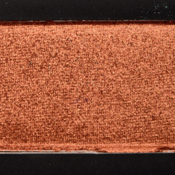


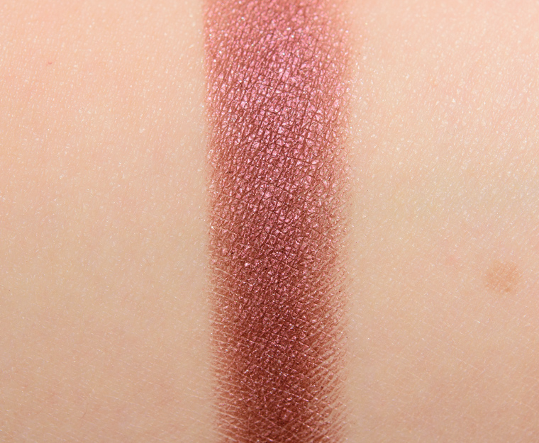
KVD Beauty Bloodmilk Eyeshadow
KVD Beauty Bloodmilk Eyeshadow

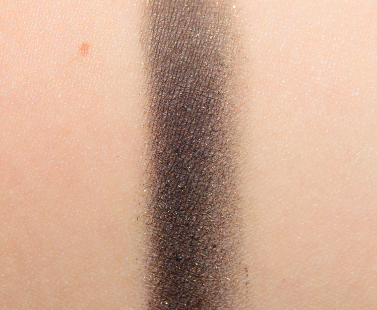
KVD Beauty Medusa Eyeshadow
KVD Beauty Medusa Eyeshadow

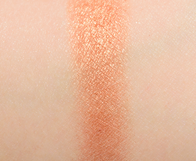
KVD Beauty Ankh Eyeshadow
KVD Beauty Ankh Eyeshadow

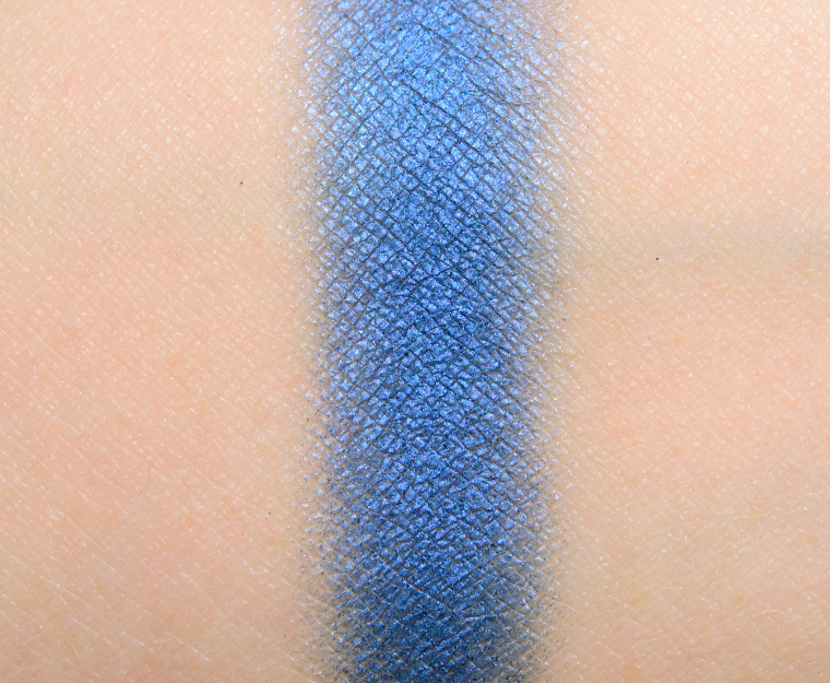
KVD Beauty Queen Eyeshadow
KVD Beauty Queen Eyeshadow

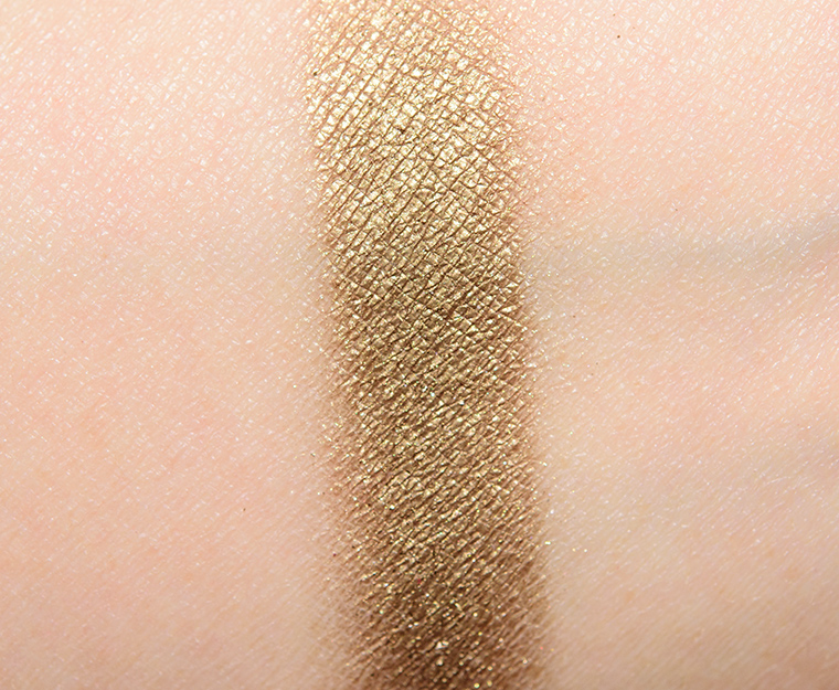
KVD Beauty Hieroglyph Eyeshadow
KVD Beauty Hieroglyph Eyeshadow

KVD Beauty Nile Eyeshadow
KVD Beauty Nile Eyeshadow

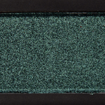
KVD Beauty Scarab Eyeshadow
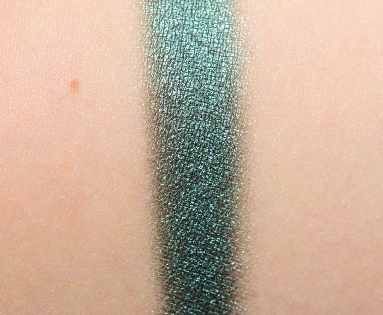
KVD Beauty Scarab Eyeshadow

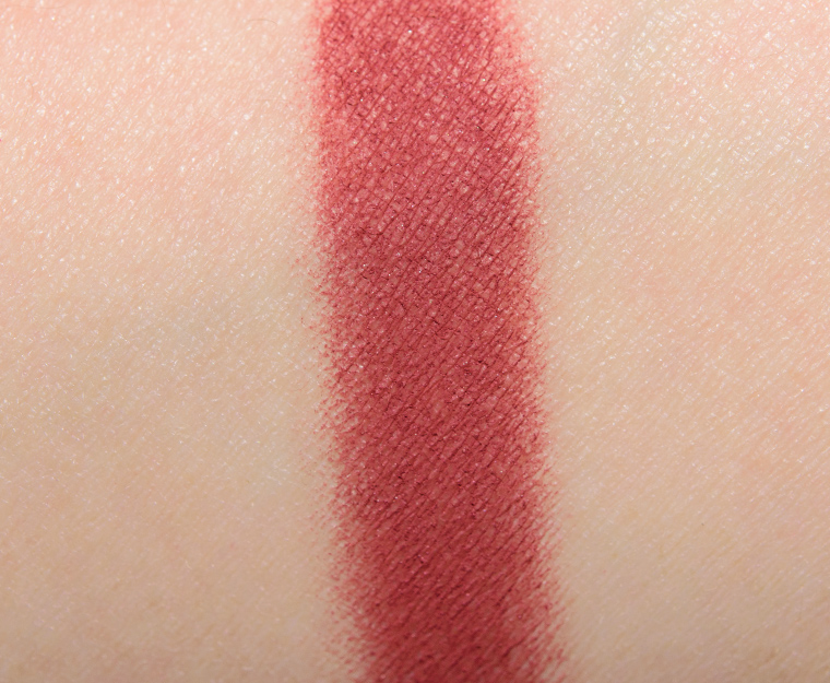
KVD Beauty Venom Eyeshadow
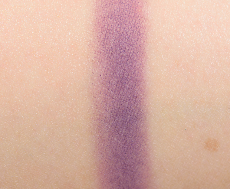
KVD Beauty Venom Eyeshadow

KVD Beauty Prophet Loose Pigment
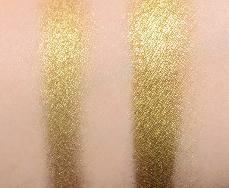
KVD Beauty Prophet Loose Pigment
Your Venom looks much worse than mine did! However your Bloodmilk looks much better than mine. I really am torn about how I feel… I mean, the colors are nice, but I found that only 3-4 were actually good while the rest were really crappy. Boo, KVD.
I was thinking that when I swatched and then saw your swatches! They applied better than I thought they would, though… Have you used them on the eye yet?
Colors! The matte shades look a bit less pigmented than the satiny but I’m OK with that. These bright shades I find are difficult to work with when they are super pigmented.
This looks so pretty but KvD brand seem to have issues with their matte base formula eyeshadows in Limited edition palettes.
An interesting combination of shades! The quality looks uneven in the swatches, though…
For all the hype, it actually looks pretty weak. At least 3 look subpar. Reds are decent, but most folks sprang for ABH mod ren. The blue and orange are only fair. Think this will give rise to a frenzy of blogger flogging and foaming. And it simply is not ALL THAT. And is there any reason for Ankh to be so separated and uneven, with un-bound glitter? I’m a kvd e/s fan, in general, but this does not do it for me at all. (Monarch was the first neutral to brown palette that I ever liked, thanks to C, bec. Never would have given it a second look w/o T review. And now, they 86d it……?…why….??..). We pretty much all want CAREFULLY CONCEIVED AND CONSTRUCTED. This is the former, but hardly the latter.
Some of these are swatching poorly. I will have to wait and see your review. I do like Scarab and I don’t think I have anything like it in my stash. I am not a feeling this so probably will pass. I can’t buy a palette for one or two colors. Thank you for posting the swatches.
I have a feeling, that this palette isn’t going to get an A. Those mattes look a little patchy. Queen doesn’t have that “pow” I was hoping for. Nonetheless, I’m excited for your thoughts. Also Christine, are you planning to review the Tarte x makeupbyshayla palette? It’s not everyday a contour palette designed for POC from a brand like Tarte comes out.
Yikes!!! WTH? What happened to the super-saturated bold swatches I saw online??? A couple of these look ok, but most of them look awful, especially Venom. So glad I held off, this kit is not worth $45 and all the crazy hype. There are so many better and cheaper dupes out there–UD Spectrum on sale and the City Color Shimmer Shadows are fabulous
Spectrum. Yeah, I need that like another, well, omit that body reference, but maybe just in case, bec the Kvd S does not quell color craves, at all. Given the top comment exchange, in which different bloggers have differing shitty shades, this is def not promising. Another case of sacrificing QC due to demand and release date.
I don’t know how often I’d wear this…but man, it’s beautiful to look at! Prophet is actually the most wearable shade for me.
I’m disappointed, probably passing.
It doesn’t seem to be available yet on the Canadian Sephora and i’m going crazy. The two disappointing colours are dupes for colours I already have and don’t like… I’m drying for the gold powder and bloodmilk colour.
I have a feeling this might be recalled like her blushes. There’s just too many dupes out there and the patchy delivery of the swatches. If this was limited edition, you’d think she’d put more quality in this palette but it seems rushed just to get it out there and compete with the recent releases of all the eyeshadow palettes.
Hmm, if you’re going to include a matte purple in a $45 palette that’s only 9 shades, it should be good… Maybe it performs better on the eye than it swatches, we’ll see.
Anyways, I’m not a fan of this current trend of red eyeshadows, they seem to be included in every new palette. Red-based shades really don’t work well on my complexion, they make me look sick/tired and bring out the redness on the rest of my face. Not for me!
Me too, I have cool undertones and green eyes, red eyeshadow is hard for me to pull off without looking like I have sore eyes!
Oh, dear, the matte red and purple dont’ look so hot. I’ve been told the Sleek i-Divine Sparkle Vol. 2 is very similar. I might go with that instead, depending on how this reviews.
Where can I find swatches of the sleek sparkle vol. 2 palette? Is it a new addition to the I divine palette collection?
My apologies, Jenny. It turns out it was Limited Edition. My sources didn’t mention that. Swatches can be found on-line if you google. Maybe it could be found on e-bay or something. 🙁
Does it bother anyone else that all the names are Egyptian-themed except Medusa? Just me? haha
Haha yes I noticed that there was one anomalous Greek reference! However it does refer to snakes so…
Yep. It’s been bothering me, too. Why not Isis, Bast, or Ma’at?
I’m excited to get mine in the mail today! I think these shades could really benefit from a primer or white base underneath.
I passed on this and now I am not regretting it.
It’s easy to see from the swatches that the purple, like so many purples, is a real let-down. I love 3 or 4 of the shadows in here SO MUCH but I honestly am running out of room for more makeup so I’ll check to see the dupes for the colours I like best and hope I’ve got them. Prophet, Scarab, Medusa and Ankh are the colours I love best so I’m hoping it’s a case of being attracted to colours I already have a-plenty!
Can someone explain why purple is so hard to make?? It seems like the only companies that consistently make good purples are Laura mercier, Urban Decay , MUG and stila actually
I wonder if there is some key ingredient that used to be approved for cosmetic use that explains why some purple shadows I have from long ago were great but perhaps this ingredient or dye or whatever is no longer approved for use or comes from an animal or plant that is now endangered….something like that.
I could buy a purple eyeshadow at the drugstore when I was fifteen that performed better than a lot of the more expensive shadows around today. Yet, some of these same brands create beautiful reds and blues. If you can create pigmented reds and blues, then why can’t you mix the two and make an amazing purple?
The only thing I can come up with is, perhaps the properties that exist in those two individual colors don’t mix well together. Now I want to know! LOL I guess I’ll be doing some research this evening. =)
Artistically-speaking, red+blue don’t necessarily make purple, at least, not a bright and saturated intense purple. The types of reds you tend to see for eyeshadows would make a muddy, subdued (greyed, or even brownish) plum color when mixed with a pure blue. What I don’t understand is why the bases or binding elements aren’t helping more. Granted, I really only understand paint, not eyeshadow, so I’m sure there are some good reasons why it’s a tough color to get right.
I completely agree with you regarding the types of reds you typically see and how they would look when mixed with blue. In the ABH World Traveler Palette, the Heirloom shade looks nothing like it does in the pan when blended out. Then she follows that up with Deep Purple in her Self-Made palette and totally nails it!
I pulled out almost every purple I own and most lean more plum, many of the others aren’t very appealing. However, KVD can absolutely create a beautiful purple as is evident in the Mi Vida Loca and Innerstellar palettes. The swatches of Venom aren’t so great but, then again, the way something swatches on the arm isn’t always indicative of how it will perform on the lid.
As far as the bases and binding agents, I’m clueless. Zinc stearate is supposed to be a very effective binding agent for pressed powders and Venom is the only shadow in the palette with zinc stearate listed first.
I probably have dupes for each color, but the color selection looks interesting .
I like looking at this palette; the colors are pretty but I will wait for your review to see if there are any wearable combinations you can pull off for work 🙂 Venom is looking like it needs some help!
I want this….now.
I hate to say this, but I’m not looking forward to getting this today. I haven’t read the comments yet, so I don’t know what you all have experienced but I’m sad. It’s not the quality I expect. I don’t even know why I bought it. I’m loving Scarab & like most palettes, I only like half of the colors. I definitely got wrapped up in some weird makeup binge buying fest in the past few days & I’m not proud to admit it. I’m ashamed & seeing these swatches makes me feel worse. Ugh.
Take that back, if it doesn’t suit you and feel no shame. They count on the hype, the name, and the pseudo-exclusivity/LEness to generate sales. It’s almost like makeup vapourware. You don’t need a reminder of temporary folly. We’ve all been there. Let them suck it up. Lesson learned.
Eeeesh. No bueno.
I just got this in the mail today. I was really back and forth on buying it, but I had store credit and I have four of her other palettes, which I love, and had the Pokémon Gotta Catch ‘Em All impulse to get this one, too. It’s beautiful. I’m all about autumn colors, which the first few shades immediately reminded me of, and I loved Egyptian stuff as a kid… I should be totally sold on it, but I dunno… It felt wrong buying something without reading reviews first. And the few I’ve seen so far have been very mixed. I’m not touching it until I read your review on it lol.
Smart.
I’m on the fence about this palette, I do love the shimmery colours but the matts look a bit sad. I don’t think I’ll get this, but it’ll be interesting to see the dupes for the shimmery shades.
Like so many others it’s a pass for me. I am so tired of these ” limited edition” palettes and it’s not even christmas for them! They also have so few palettes that they are gone within seconds! take not from ABH and just create some good palettes without all the dumb hype! I like the gold color though…
WOW….what on earth happened here? So many weak or uneven looking shades in these swatches compared to Kat’s swatches and Instgram. Venom and Ankh look the most different from what I’ve been seeing thus far. This palette just makes me sad as heck!
Hmm, this is weird, but after the blush fiasco it seems like kvd has some problems with manufacturing consistancy.
Unfortunately the colours Look better in the Palette than swatched. Will Save me some money I can use for the new anastasia palette.
Mine is arriving today, anxiously watching my UPS tracking! Knowing your love of green eyeshadows Christine, my guess is Scarab is the first one you went for! 😀
When I first saw this palette, I was in love! I decided that I didn’t really need it though, as I have dupes for most of these colors. I’m really glad I didn’t impulse buy it now that I have seen your swatches. I will be interested to read your review.
I was interested in this palette until I saw the shades. The chalkiness of the mattes (that there are even mattes in this!) and that orange shade are big turn offs for me.
Love the concept of an Egyptian-inspired palette though.
Oh my – those Medusa and Scarab colours look amazing, but some of the mattes look woeful…..
I had this release marked on my calendar for the past month, and bought it the second it was available on KVD’s website. Big mistake, as now I can’t even return it easily. I’m so so disappointed by these swatches. I had hoped and prayed that this palette would be a home run because I’m obsessed with all things Egyptian, I’ve even been to Egypt – best experience of my life!! (and also snakes – I have a ball python!) so this totally sucks. I don’t understand for the life of me, how eyeshadows that look this mediocre get past quality control. Doesn’t KVD even check her stuff out before releasing it?! Anyway I hope it performs at least decently in practice!
Oh, look at that, the purple is a disaster … how surprising. :-\
Hmm…I’m not usually one to complain palettes lack cohesiveness, but this one appears like it’d be hard to use on its own for looks. A couple of the shades look pretty sad and the gold eyeshadow is close enough to the pigment for my uses that it seems like the space for one might’ve been better used on another color.
These swatches are underwhelming. And here I was thinking this palette would be a must-have.
Love the Egyptian theme! I’m also glad that KVD is launching in the UK this autumn 🙂
The color combination in this palette is quite interesting. The quality of the satin and shimmers shades are beautiful while the 2 mattes are bad. Btw loved both of the eye looks you did with this palette. 🙂
I tried scarab and hieroglyph on the eye today and oh lawd… It was bad!! And that was over a primer. I ended up taking it off and going to the ABH Modern Renaissance palette. I’m so disappointed in this palette. It’s definitely going back!!
This is super disappointing. I was already not looking to get it because I have Mi Vida Loca, but the hoarder in me was tempted. Your swatches saved my bank account, Christine! 🙂
Bought this, swatched it over several different bases (UDPP og, UDPP Eden, Hard Candy Glamoflauge, NYX White cream base) and just could not get these to work. It’s rare when I am so disappointed in an item that I actually return it, but this one had to go back. The best part of the whole thing was the luxe packaging and the loose pigment. Sorry Kat, this was a fail.