Sneak Peek: Kat Von D Saint + Sinner Eyeshadow Palette Photos & Swatches

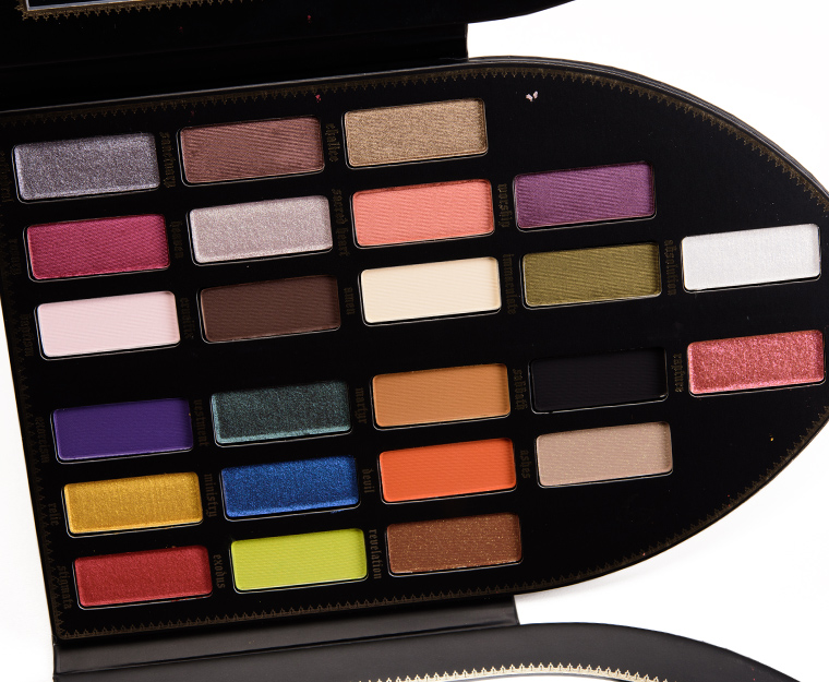
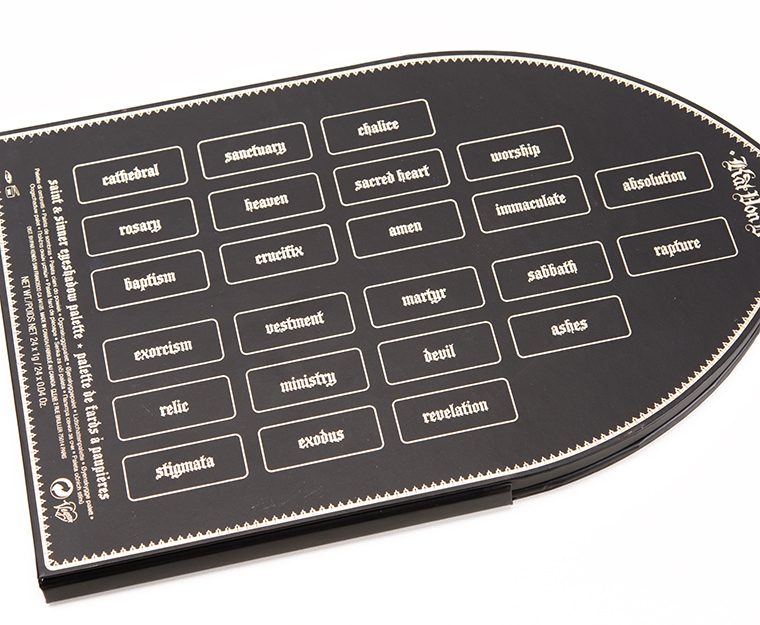
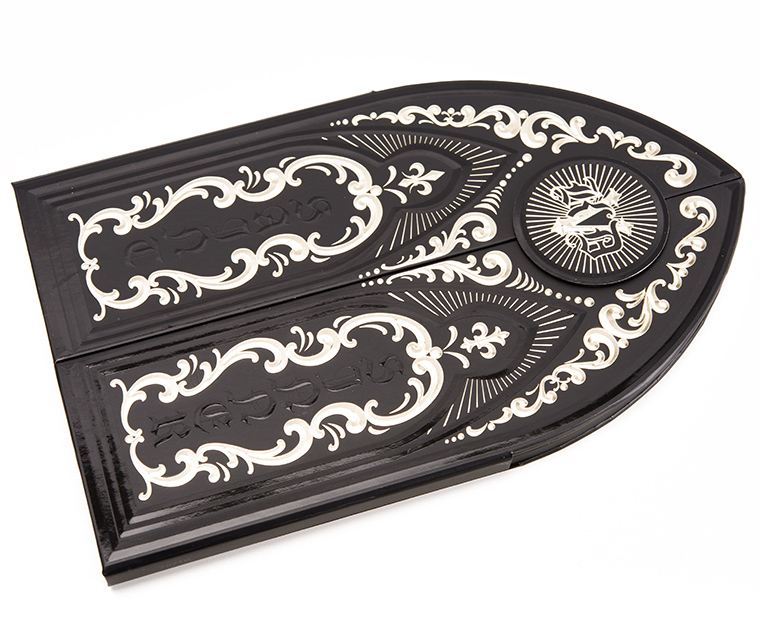
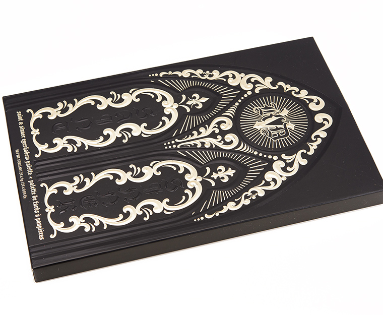
Kat Von D Saint + Sinner Eyeshadow Palette ($62.00 for 0.96 oz.) is a new, limited edition palette for the holidays that features 24 eyeshadows designed to mimic a stained glass window.
First Impressions
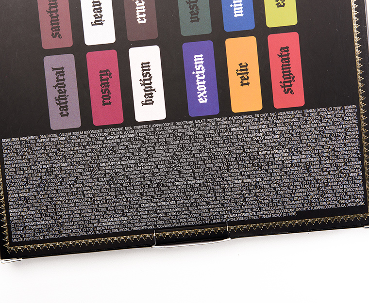
Overall, the palette seemed consistent with past Kat Von D eyeshadow palettes (but not the Metal Crush formula, generally) with the mattes having a soft, lightly powdery texture with medium to opaque coverage. There were some matte shades that seemed prone to sheering out (like Scared Heart and Exodus) but haven’t had a chance to apply the majority of the shades in the palette so hard to know for sure but swatching showed such things (my arm is drier than my lid). The shimmers were pigmented with soft to moderately dense textures with a couple being creamier but stiffer, like Vestment, and I felt like these often appeared less shimmery/metallic on (again, like Vestment).
Kat Von D Saint + Sinner Eyeshadow Palette


KVD Beauty Saint + Sinner Holiday 2017 Eyeshadow Palette

KVD Beauty Saint + Sinner Holiday 2017 Eyeshadow Palette

KVD Beauty Saint + Sinner Holiday 2017 Eyeshadow Palette

KVD Beauty Saint + Sinner Holiday 2017 Eyeshadow Palette
KVD Beauty Saint + Sinner Holiday 2017 Eyeshadow Palette
KVD Beauty Saint + Sinner Holiday 2017 Eyeshadow Palette
KVD Beauty Saint + Sinner Holiday 2017 Eyeshadow Palette
KVD Beauty Saint + Sinner Holiday 2017 Eyeshadow Palette
KVD Beauty Saint + Sinner Holiday 2017 Eyeshadow Palette

KVD Beauty Saint + Sinner Holiday 2017 Eyeshadow Palette
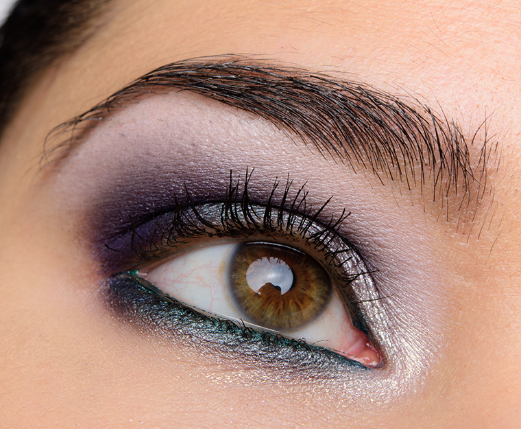
Kat Von D Saint + Sinner | Look Details
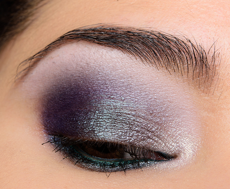
Kat Von D Saint + Sinner | Look Details
Mine arrived yesterday, and I played with it this morning to do a work friendly look using Chalice, Amen, Martyr, Revelation, Heaven, Crucifux, and Relic and it turned out really nicely. I do not know why this is my first KVD eyeshadow palette, but I’m really loving this palette so far. I do wish there were a few more crease color mattes in it, but I have so many palettes that it’s not a big deal at all.
I just got this in the mail yesterday. I really like it! I mainly bought it for the beautiful packaging, but the shadows performed well for me. The colors are great. 🙂
Little angel voice in my head:
“Seraphine, you don’t need this. Listen to me, you really don’t need this. You have more eyeshadows than you can possibly use already and you don’t have room for another palette. Just look away.”
Little devil voice in my head:
“Ooh, pretty!!!! You know you want this. Look at the cool packaging! Immaculate is so gorgeous! Do it…buy it…before they’re gone!”
Help!
So I’m an enabler when it comes to makeup, so I say get it. JUST DO IT! lol But in all seriousness, it really is a gorgeous palette. The shimmers that I used, were opaque upon first application. There was not a need of fix plus or anything to help them show up richly.
LOL Now you know why its called Sinner + Saint. 😉 (I went through the exact same thing. I ended up caving and getting it.)
Immaculate IS everything. Big time. Waffling about this, but it isn’t a wait and see pick. Doubt it will last till the sale. Rachel is so right about Saint/Sinner, lol. The color story is wow. But, idk. Some of the mattes need major help, and the glitter flecks don’t translate in no-glue, no primer swatches. Even some of the shimmers don’t look up to par. Overall, it looks uneven and not as solid as a Metal/Matte. And, providing C does a full review, I think it will be more dupable than expected. What draws me on this one is the unusual/atypical shades. I’d love to see Muse do sponge tip swatches…but they give an exaggerated depth and show shades to best advantage. But, Then I’d be on the button!
Thanks, kjh. This helps me to keep waffling on it. And the longer I waffle on it, the more there is a chance it will sell out and I will have saved the money that I really shouldn’t be spending on I. Lol
Kjh: Immaculate is amazing!! I also love Worship. Very good quality on those two. I’m a sucker for olives and for purples, so I would have bought it just for those two, LOL! I also think Cathedral is really gorgeous.
Ha! I’ll help….wait for Pat McGrath’s Mothership series…. 😉 Or maybe like me that doesn’t help, but just adds another one to the list.
Seraphine, I always get weak when a new Kat Von D palette comes out. For what it’s worth, I’ve never been disappointed when I cave!
OMG, squeeeee!!!! Mine is coming Monday, will be stalking the delivery truck. The packaging is so special, really does look like a stained glass window, so many unique colors, and your eye look, OMG, it’s The Look that will sell a thousand palettes! Not sure about Rapture, looks like fall out city, but the sparkling rose color is so stunning, I’m willing to work with it. But everything else looks great or fixable with primer. Have been waiting months for this one!
Agree about the looks she did:). I wasn’t too interested in these…but now…lol. I think the size just turns me off a bit so, probably won’t get it….but those colors though:). Looks like many fun combos can be done with this one.
I have mixed feelings on this one. I like some of them but not others. I think I’ll end up skipping it. The only current fall/holiday palette rocking me is the new ND one.
Your swatches have me super excited for my palette to arrive! Any idea why everyone seems to have a hard time with purples? Purple always seems to be one of the weakest shades in almost every palette (particularly so if that shade is also matte). Your purple swatch seems to follow this trend as well. It’s so disappointing as purple is a fav shade for me. Can’t wait for your full review.
I hear it has to do with the pigment itself. Something about molecule size I think? Its why certain colors tend to be so troublesome, like purple.
Michele, I’ve noticed that as well. I have collected quite a few matte purples (green eyes), but they’re all singles, and it took some time to find them. I wonder if they’re more expensive to make than other colors — at least to make right, anyway.
I know excellent red and purple glass are harder to make than other colors. So, I’m buying into that molecular composition theory. Any artists or scientists who read here?
If I remember correctly, when gold is heated to a certain temperature, it turns red. I don’t remember if this is before or after it’s added to glass. I used to collect antique Cranberry Glass and my parents would pick up any piece they found. At the time, it was rare and pricey. I do remember researching it for that reason. I don’t know how that affects eyeshadow, though.
Vestment and Cathedral are gorgeous! I probably have dupes for Vestment but I’m not so sure about Cathedral, I’ll have to check. Fantastic eye look by the way! 🙂
Same. I’d totally buy it if they were in a duo.
I see a few shades that I absolutely covet – Chalice, Sanctuary, Heaven, Immaculate and Vestments – but I really dislike the packaging. And the swatches show a few shades to be less than ideal – Rapture especially looks less than “heavenly”.
Just an FYI, the top two shades are supposed to be toppers, like the shades in the glimmer palette. I just got this and its performs really well and those shades look really nice over a darker shadow or a cream shadow.. even finger switched and built up over primer.
Christine, your eye look is breathtaking! Love it!
If it’s consistent in quality with her past palettes, I think I’m really going to like mine when it arrives.
Mine arrived yesterday. It’s exquisite, both in terms of packaging and shades. I’m going to play with it over the weekend.
Christine, I’m sorry if I missed this somewhere, but do you list the dimensions of palettes? I really, really, miss the pictures you used to do holding the palette in your hand. They were so helpful!
Sorry, I don’t measure the palettes! I had several complaints that my hand was misleading re: size comparisons, so I stopped doing that as that wasn’t my intention.
I almost made the same comment for the lastest Viseart palette, but I didn’t, thinking it was just making more work for you. But, it would be nice. I don’t get how your hand could be misleading. What did they want a ruler? Sheesh.
My hand is oversized and a poor representation of the average size.
At first I was really excited for this palette but now that I see it I’m just not drawn to it.
I’m with you! All of the shades seem just a hair off – so few would be flattering on my skin tone & eye color. It’s a pass for sure.
The good news is, I won’t be in line in front of anyone who really wants this.
Your eye looks are stunning Christine – particularly the cool toned blue one.
It’s a gorgeous palette, full of bright and varied colours and whilst there are some troublesome shades, a lot are pretty good.
I really don’t need this, but I WANT it! I dislike odd-shaped palettes but this one is gorgeous.
Christine, your purple eye look is a stunner. The teal liner – I wouldn’t have reached for that color – sets off the look perfectly.
all the colours are beautiful.. with the exception of “ashes”.. it looks hopeless…! eagerly awaiting your review!! .. great job christine as always! ..
I’m a tad creeped out with the color ashes, cause it looks just like ashes… like cremated remains. Maybe it’s just me?!? Hard pass for me, but then again it is nice to not want every new eyeshadow palette that comes out! Lol!
I thought the packaging on this was one of THE most beautiful ones I’d ever seen. But having seen the shadows inside, I don’t know, I was so disappointed. I guess I was expecting something as lovely as a stained glass window, and that is not what the shadows convey at all. I’m a huge KVD fan, and the sad thing is that the thing tempting me to buy this is the packaging and not the shadows! How freaking sad is that?
Well, some of the swatches look pretty pigmented, but o the eye it seems a tad muted. So that helps me say no to this one. Also, once I believe you had a question (or some other blog, can’t really now) about whether you boycott brands or not and why, and though I really like some of her products, she’s on my rare boycott list, so this won’t enter in to my already too long list pf palettes I’d like this fall. Truly thanks for your work Christine! I’m sure others have already said this, but you really have the most in-depth coverage and database I use to get up to date and even checkout old products. Are you raising a child or someone to take over once day when you retire??? 😉 ‘Cause this is data worth keeping!
I have dupes of a third of these, but I still want it.
Ashes is a really fascinating color — can’t quite figure out how to describe it.
I knew if I looked at Christine’s look for this palette, I would get weak! I love the Kat Von D palettes, and I especially love the looks Christine does with them!
I love the idea so much, but I’m sad they didn’t go all the way and arranged the pans in a tracery system. Trefoil pans in a vesica form? Is it too much to ask? j/k I doubt I’d get it, though. I’m waiting for the mini Everlasting set as it feels more Late Gothic for me personally. 🙂
The colors look nice but nothing is so amazing I need to try to get before sold out. Cardboard packaging in a Gothic design is still cardboard. Not impressed.
Love the looks you did, Christine! Especially the warm eye – super beautiful. And the purple-y one with Vestment on the lower lashline is divine. Thank you for helping me think of how to use this.
I’ve had mine for almost a week now and have had the chance to try quite a few of the shades. I wore Sacred Heart by itself, all over the lid and blended into the crease…it really brought out my brown eyes and I didn’t have any problems with it sheering out. I’m very happy with the quality so far, and glad I purchased this palette.