Archived Post
Sneak Peek: Clinique Lid Pops Photos & Swatches

Here’s a look at seven of the eight Clinique Lid Pops ($17.00 for 0.21 oz.). I have the eighth on its way to me, but I’m not sure when it’ll be here (was supposed to arrive yesterday) and didn’t want to push these off for too long! I will add the eighth if it comes today or tomorrow! Full reviews to come.
See more photos & swatches!

Clinique Lid Pops
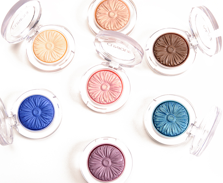
Clinique Lid Pops

Clinique Vanilla Pop Lid Pop
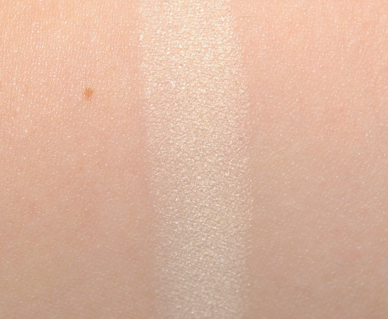
Clinique Vanilla Pop Lid Pop

Clinique Cocoa Pop Lid Pop
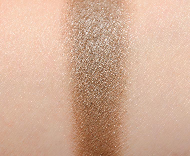
Clinique Cocoa Pop Lid Pop
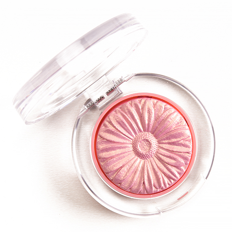
Clinique Petal Pop Lid Pop
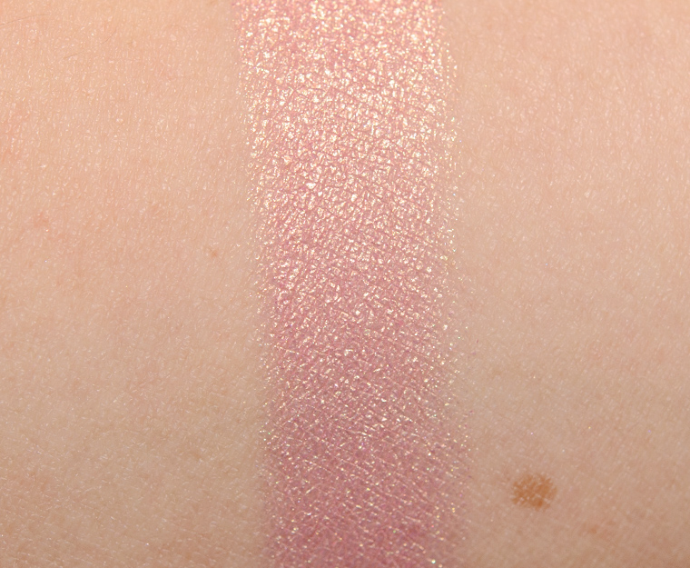
Clinique Petal Pop Lid Pop

Clinique Grape Pop Lid Pop
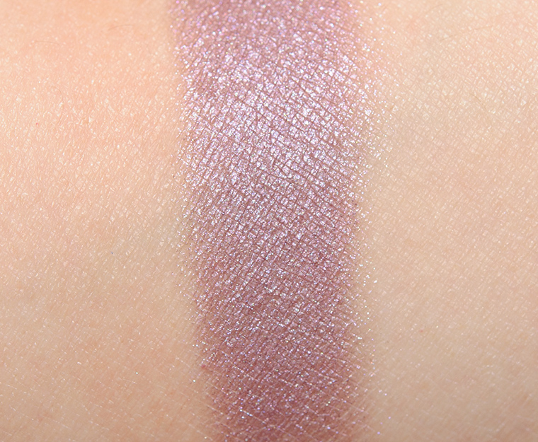
Clinique Grape Pop Lid Pop

Clinique Cream Pop Lid Pop

Clinique Cream Pop Lid Pop

Clinique Aqua Pop Lid Pop

Clinique Aqua Pop Lid Pop

Clinique Surf Pop Lid Pop

Clinique Surf Pop Lid Pop
You have 2 turned around. The last 2. These are unimpressive
Not sure what you mean? Aqua Pop is a teal, and Surf Pop is blue. They’re correctly labeled, and the last two products show the correct images (one product shot, one swatch).
I meant the pics were paired wrong. You have grape e/s with blue swatch underneath.
You have blue e/s with pink swatch underneath it.
Hey Traycie,
I’m still not seeing it 🙁 I’m looking at the Clinique Surf Pop photo of the compact and under it is a medium-blue swatch. The Grape Pop Lid Pop compact photo has a mauve-y purple swatch under it.
What device are you on?
When I look on my computer it is normal. If I see it on my iPhone 6 plus it is like how I explained. Weird
I will check on iPhone, but man, that is going to be a fun puzzle to solve if it is awry, lol! The only thing I can think of is it loaded funky and cache isn’t clearing it.
These are exactly groundbreaking colors, but Grape Pop and Surf Pop are catching my eye 🙂
Edit: aren’t**
Although the swatches are a little underwhelming and they’re probably more dupable than not, I’m trying to justify getting these in any way I can. LOL. They’re adorable and easy to stack… Maybe I’ll pick up Grape Pop and Surf Pop because my current collection is mostly earthy and nude tones. I could use a few good pops of color.
I love the look of Aqua Pop but I probably have 5 or 6 similar shades, and there really isn’t anything here to wow me….the only shade that really interested me was the brown one but it’s so like so many other browns I have (and, of course, these are all in individual containers and so a bit of a pain to use). It would be great if Clinique came out with a palette of 4 shades – once they expand the line and colour selection – small ones about the size of MAC shadows (can’t really tell the size of these from the photos).
Do these look de-pottable to you? They are very pretty.
Sorry, I haven’t depotted in years, so I’m not really sure.
If they are packaged exactly like the cheek pops (which is what it looks like), then no. I tried de-potting one of the cheek pops and the base on which the product sits is not a normal pan. I suppose you could pop out the product and mix it (as if you were fixing it because it was a broken powder product) and put it into an empty shadow pan…
Thanks for the info! Too bad your blush broke…
if they are anything like the cheek pops, they are not very easy to depot, i had to like burn the plastic on the bottom to pry them out and even then, they would sometimes break if you heated it TOO much since the bottom of the pigment is only held together with this flat grated plastic thing… and then it’s even harder to get them to stick to a magnet or metal, i had to superglue the metal to the bottom piece and then for the broken ones i had to superglue the blush onto the bottom piece to avoid more breakage. >_>
If these are anything like the blushes they are absolutely not able to be depotted. The blushes have a honeycomb design underneath where some product falls through to hold the useable part of it in place. If you try to depot it it’ll crumble up.
I dropped my cheek pop on a tile floor and it depotted itself PERFECTLY.
Hmm, I was curious about Grape Pop, but after seeing the swatch, I don’t think I need it. The color looks very similar to one of their Lid Smoothies (Currant… something) that I already have, it’s not particularly intense and more shimmery than I thought. I’ll wait for your review, in case they really have an out-of-this-world texture, but I think they’re a pass for me.
Grape and Aqua Pop look pretty good!
Wow, I really love some of these colors. Especially the grape. Can’t wait until you do the review.
Hmmm… in your description (and Sephora’s), the contents are listed for the Cheek Pops as 0.12oz, and for Lid Pops as 0.21oz. Are the eyeshadows really that much larger than the blushes?
I might not “need” it, but I am curious about these and I’ve been looking for a new pink…I might have to pick up Petal Pop.
Wow, these look gorgeous!! Petal Pop is making me weak in the knees, I’ve been eyeing Lancome Kitten Heels for longest time, and this looks like it could double as blush/highlight. Grape Pop looks pretty for softer wash of color, wonder if it can double as a luminous blush. Surf Pop looks problematic, but Aqua Pop looks like the real star –look at that pigment, wow ! You mentioned another color coming –is it a green/khaki? (please say yes)
Looks like Petal Pop could be a nice layering color over other, more pigmented corals/pinks. I like the multi-tonal effect on it.
I think I the flower pattern of these more than anything. I know I have all of these colours in other brands, but they certainly are fun to look at. My favorites so far are Aqua Pop and Petal Pop (maybe for the cheeks if it’s not too shimmery).
Some of these are pretty, but none are as good as I was hoping. I think I’ll be passing.
I was not anticipating the swatches looking as nice as they do! I certainly don’t want lid formulas to always perform like my blushes so I was apprehensive, but so far I am pretty impressed! The pigmentation looks really great. Although surf pop looks a bit “chunkier” glitter-wise than the others, there are a few I could definitely go for in here. And the packaging is so cute, who doesn’t love the ‘look’ of Clinique’s POP line. 🙂
Wow .21 oz is huge for an eye shadow. I hope they work as well as the blush.
Hmm, they look quite adorable in their little flower pressed shapes, but the actual shades appear to be incredibly dupe-able. Zzzzz?
I’m excited to see how these review. One of my good friends works high up for Clinique and not long aqo they almost cut a lot of jobs and hers was on the chop block. This was right before they added the extensions to the pop blushers. Since then, the company is doing better. I think at least a few of these look good esp. for the price. Clinique has a clientele that I hope these will will win over. My sister is a one of those people. She’ll be all over these. She loves Clinique stuff. I don’t know why,It;s her thing. 🙂
They are awfully cute. Do some highlighters with the flower pattern, Clinique 😉
I don’t know about these. The blushes in this formula are one of my least favorite in my collection. I have to work extremely hard to get enough product on my brush for my skin tone.
I expected a little more pigment but the blues look alright….
Oooh I really need Grape Pop. Mauve-y purple shadows are my jam. They look more neutral on me than brown, and they make my blue eyes pop.
I can’t wait to read your review on these. I love the cheek pops, hopefully these will rate well too. 🙂
I like the design, but am not too sure about the rest.
Oh, dear! Surf is the one I’m most interested in, and it looks like it might have texture issues! Aqua Pop looks so much richer!
Petal Pop is gorgeous. I love those pinky gold type eyeshadow shades. I probably don’t need another though, lol.
I had really high hopes for these, but they look pretty underwhelming once swatched. I was a huge fan of the Cheek Pops and there’s no denying that cute daisy design… Aqua Pop and Petal Pop it is!
Let’s just hope they continue the trend and come out with Highlight Pop next! 😀
Think I’ve commented once to you. Most of the comments on these aren’t very good for people who haven’t even tried them. To each his own I guess but I think all the colors are lovely! All the hype over the rest of “pop” items from Clinque, I’m surprised so many are having less than glowing things to say about these. I’m interested so can’t wait until I hear what you think of them. I told my daughter, who lives far away, about your blog. Told her if she wanted to know about ANY product this was where to go!
Thank you so much, April!! 🙂
I really like Grape and Petal pop! The Aqua looks amazing, but I have a lot of aqua blue shadows I never wear. Surf pop looks like the worst performer from the swatches. Can’t wait for reviews! 🙂
I’m a fan of Petal Pop but it looks like it’s highly dupable. I’d rather wait to see Colour Pop come out with something similar, if they haven’t done so already.
Most of the colors seem meh – plenty of options out there – but I do like the look of Grape and Petal pop, they look like very wearable, everyday-appropriate purple and pink (respectively). I’ll have to swatch them for myself before really deciding, but I have my eye on them!
I love my blush pop and I’m happy to see that those swatches look so smooth. Especially for colors I use often, I like a good size of it. I will look forward to your reviews and will probably try these!
They look pretty in the pan, but I think the colors are very dupable and the swatches are not so great… ?
I do like some of these, though I think they are probably very dupeable. It will be very interestin gto read the reviews.
What? No green?
(Otherwise – just lovely.)
the packaging is sooo cuteeeee, reasons why i bought peach pop from their blush collection (i love it)… the colors look very dupable and i expected a bit more pigment on the blue toned shades. i know clinique isn’t a ‘reckless’ brand in contrast with brands like urban decay and their crazy colored and pigmented shades but still, it looks very sheer… cream pop looks like a cute highlighter. i hope they release more shades bc the packaging is really pretty. hope these perform well!
I’m drawn to Grape Pop. The swatch looks similar to UD Bordello without the glitter. I like some of the others like Petal and Aqua, but I have dupes.
I ordered Cocoa and Petal yesterday. I can’t wait to try them 🙂
The turquoise blue is gorgeous – but the rest live in our palettes (especially if you own a Vice, a Book of Shadows etc.). Some of them look to be of very good quality, whilst others are patchy.
These are so pretty. I think Petal and Grape would make good “wash of color” shades.
Clinique and the Lauder companies in general are solid and safe. They depend on a stolid (not solid) customer base that is not adventurous, curious, or cutting edge. EL has DW foundation and a few other reliable workhorses, then they hit with the sculpting lipstick formula. Clinique has the hypoallergenic draw and some minor cult favorites like Black Honey. Then they hit with Blush Pops. These are WAY mature brands, and as such, somewhat set in their ways. With the Pops, they raised their bar substantially. People start to expect a Clinique product with the Pop name will.be innovative and high performance. I think that’s why many readers feel a sense of let down…kind of the Gwen palette effect. Does not meet projected expectations. It’s real tough to revive a mature brand. Lauder bought MAC, Bobbi, SmashBox, and produces TF. They innovate through acquisition and development, without much overhaul to their standbys. We can’t expect the new KVD formula type performance from a line at which the counter SAs still wear lab coats. See, the EL companies hold hard to their established brand identities, and it has worked very well for them. As to these shadows, reasonably meh, and I secretly wished they had been groundbreaking.
These are very pretty, perfect for spring. I thought Petal would be iridescent and it is ?. My favourite is Aqua.
I’ve seen micas on TKB Trading that look like every one of these for $1.50 for 6g. I’ll pass.
The cheek pops are gorgeous on the eyes as well.. I’ve used them as shadow just as much as blush.
I was so excited, now I’m not. I’ll still check these out in person, but I think I’d much rather get more of the blushes
Hmmm, I like Grape but I wonder how it stacks up to UD or MUFE or NARS!
Well… hmm. Petal Pop is really pretty. I was hoping Cocoa Pop would be a deeper, slightly warmer color.
Aqua Pop deeeeefinitely stands out 😀
Definitely a situation where I was more attracted to the packaging than the actual product. Seeing the swatches, I’m ambivalent. I was interested in Grape and Surf. Surf looks dicey.
Cream, grape and petal are too pretty!
Petal Petal Petal Petal Petal! Sooooo pretty. The gold shimmer isn’t that visible in the promo pics but the swatch is gorgeous! I like Grape and Aqua too, and Surf looks like it would be fab with primer. Cream would probably be a good “shimmer wash” type shade – the swipe and go kind for when you’re in a rush but need a little colour.
I actually love Clinique’s eye shadows in general; have for years. I think they’re really underrated. The brand tends to be seen as all about skincare but they do some lovely powder colour cosmetics.
Thank you for the swatches! I was interested in a few of these colors, they are very pretty (I especially like Grape, Petal and Aqua) but, I think I have many similar colors.
Goal for 2016 – try not to buy redundant products!