Pret-a-Papier Look: Coral Crepe as a Base

Pret-a-Papier Look: Coral Crepe as a Base
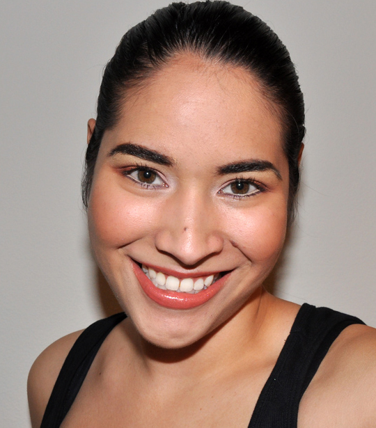
I wore this look to photograph lip swatches from Pret-a-Papier yesterday, but here it is in detail 🙂 By the by, I prefer the lighter Chromagraphic Pencil on my waterline — the darker one is a bit too subdued and runs a little yellowish on me.
You will need the following…
- Eyes: MAC Soft Ochre Paint Pot (neutral beige base), MAC Coral Crepe Paint Pot (coral), MAC Tissue Weight Eyeshadow (soft white-pink), MAC Bamboo Eyeshadow (matte soft brown), MAC Cut to Fit Eyeshadow (reddish copper), MAC Ricepaper Eyeshadow (neutral highlighter), MAC NC15/NW20 Chromagraphic Pencil (fleshy nude), MAC Almost Noir Pearlglide Eyeliner (black-burgundy), MAC Plushlash Mascara (black)
- Face: Make Up For Ever HD Foundation (140), Laura Mercier Loose Setting Powder (translucent)
- Cheeks: MAC Garb Blush (orange-peach)
- Lips: MAC Made to Order Lipstick (pinky coral), MAC Fold and Tuck Lipglass (pink-coral)
- Brushes: 226 (fluffy crease brush), 219 (pointed crease brush), 249 (flat, firm brush), 239 (fluffy shadow brush), 116 (dense blush brush)
- Substitutes: Tissue Weight = Phloof!/Gleam; Cut to Fit = Twinks; Almost Noir = Purple Dash; Garb = Coppertone/Peachtwist; Made to Order = Crosswires (not a great dupe!); Fold and Tuck = Lychee Luxe
For eyes, start by applying Coral Crepe paint pot as your eyeshadow base all over the lid area with the 249, then apply Soft Ochre paint pot as an eyeshadow base from the crease to the brow. Using the 239, apply Tissue Weight eyeshadow on the inner third of the eyelid. Next, apply Bamboo eyeshadow on the middle third of the eyelid and lightly blend with the inner corner. Darken the outer third of the lid with Cut to Fit eyeshadow with the 239, gently brushing it into the lower crease. Lightly blend Cut to Fit eyeshadow, with the 239, on the outer corner and lid. Lightly tap and brush Bamboo eyeshadow directly above the crease to soften. To finish the eyeshadow look, sweep Ricepaper eyeshadow as a highlighter on the brow bone. Bring everything together by applying Almost Noir eyeliner on the lower lash line and NC15/NW20 chromagraphic pencil on the lower waterline. Finish by sweeping lashes with Plushlash mascara.
For cheeks, apply Garb blush to the apples of the cheeks and sweep upwards towards the temple with the 116.
For lips, apply Made to Order lipstick first, and then layer Fold and Tuck lipglass for a complementing lip.
Check out more photos!


i like this look . you look beautiful 🙂
Thank ya, Dada!
So pretty and springy!
Thank you!
Woow, I love this look! You look great ^^
Thanks so much, Stephanie!
All those colors are gorgeous!!! Well,there goes all my money this week.
Thanks, Michelle 🙂
Hi Christine! I love how the chromagraphic pencil made your lower lashes look so much more vibrant! And could you recommend a close substitute for Instant Chic? Perhaps more to the coral side than the pinkish side? Thanks!
Maybe Style or Melba?
OOoooo I really love this look! I think I’m going to have to pick up Tissue Weight for my birthday (or before it, because I doubt I can wait a couple of weeks!). I’ve been looking for a colour like that forever to replace the top colour on a Revlon quad that they don’t sell separately!
And may I say that your skin looks absolutely radiant?
Thank you so much, Roxanne! 🙂
I like it all except the chromagraphic on the waterline. Makes it look like the person is low on iron lol
LOL! Interesting!
My favorite MA at MAC told me that the chromagraphic pencils are also good for lining the lips to crisp the outline (particularly for a bold lip) as an alternative to using concealer or whatnot. It could be another use for the darker pencil?
I think the darker pencil looks really yellow on me, which I guess is why it doesn’t work so well 🙁
wow this is fabulous on you! Seriously this is the BEST look you have ever done! I am going to do this as soon as I get my pret-a-papier stuff!
Wow!
Thanks, Ryan!
I love love love love love it ! Made me want to buy way too many things from this collection 😀
Yay! Thank you, Margot!
Christine – this foundation is AMAZING on you! Most flawless coverage ever!
Thanks, Pquanda!
In practise these colors looked much better than swatched.
I’m glad you think so!
sooooo pretty on you!
Thanks, Morgan!
I really like this look. Ricepaper is gorgeous, its one of those I’ve been delaying to buy since its permanent. Garb looks really pretty on you too 🙂
Thank you, Livia! Ricepaper is a fave 😉
This seems like a hard collection to pull of on its own. It’s too monochromatic, it needs a little punch from a complementary colour. I could see this worn with a teal liner on the top lid to balance things a bit.
I’d definitely agree that everything is sort of… the same.
This look is amazing on you Christine I said I wasn’t going to get anything from this collection but you’re making that hard now.
Aww!!
Thanks, Diana 🙂
This is lovely. Much more color on the eyes than I detected in your lip swatch photos. I like how Coral Crepe makes Bamboo eyeshadow look. The one thing is it’s funny to see you sporting such a matte cheek! I’m so used to you using a glowy blush or highlighter with your blush.
Bamboo is definitely pretty over the coral paint pot!
LOL, well, I feel like if you put anything on top, then it’s hard to see the color of the blush itself 😛 Normally I would have put a highlighter on!
Very nice!
So glad you liked it! Thanks, Brandy!
This is beautiful! I LOVE LOVE it! thumbs up!
Thanks a lot, Kathryn!
I love this look, so wearable!
Thank you, Claire 😀
This is really pretty, especially with Almost Noir on the bottom lash line! I actually wore Almost Noir today as well, but on my upper lash line with some neutrals. 🙂
Totally a last minute choice, but I liked it!
Looks great, Christine!
Thanks a lot, Rita!
look this look on you! beautiful.
oh and I also tried you advice you gave me on another page of yours. I heated up the soft ohcre paint pot in the microwave and it feels much better thanks!
Yay!! Glad it feels better now 🙂
This look is really gorgeous on you! I love the lips!
Thank you, Jen 🙂
loooooove this look! expecially for spring and summer time 🙂 i’ll do this as soon as i get my prêt-a-papier stuff!
Thanks a lot!
First thing: Hands down to you!! Great job on getting this collection out!! I really appreciate the fact that you go that extra mile for everyone. It’s nice to know that every skin type is being acknowledged.
This look is a great look for you. I really like the lips.
Aw, thank you Abbie! It’s my pleasure 🙂
I can certainly see why you love corals- the colours look beautiful on you!
Aww, thank you, KFM!
Beautiful Christine! You did a nice job with this look 🙂
Thanks a lot, Heather! 🙂
You look beautiful! The colour combination is great! eeeeeeeeeee!
Thank ya, Jane!
Ah that looks so pretty!! 🙂
Thanks so much, Andrea 😉
Christine – That is a really pretty look on you. I especially love the lip color!
Yay! Thank you, Katie!
Beautiful!
Thanks, Aisha!
Nice look, especially the lips, but to be honest I think that the Chromagraphic Pencil looks completely unnatural, really don’t like it. Also not sure about the coral eyeshadow base.
Really? I actually dig how the pencil looks, lol!
Maybe it’s better in real life, but to me it looks too pale and unnatural, like if you had put concealer on your waterline. Yuck. (Sorry.)
So pretty! Looks like a summer sunrise…
Thank you, Dini 🙂
That’s pretty – that coral crepe is really starting to grow on me.
Thanks, Alexis!
Nice look! Thanks for posting a look using coral crepe paintpot! I got that and the chromagraphic pencil today =)
Thank you, Natasha! 🙂
Your lip colour looks so lucious!
I’ve never done an eye combo like that before and if I try it I think I’ll pair it with a nude lip – Guerlinade perhaps, with a golden gloss over the top…?
Either way – fabulous!
Thanks, CeeBee! 🙂
I think it would be lovely with a nude lip!
I love those colors on you, pretty look Christine.
Thanks a lot, Leenie! 🙂
Love it. It’s subtle, but still pops in color.
Thank you, Ashley!
these colours seem made for you!
very ‘natural’ looking!
Thanks, Aradhana 🙂 Yeah, this collection is definitely more on the natural side!
Fold to Tuck is very pretty and so are all the other coral and peach lipsticks in this collection. I want to pick something up but I feel that MAC has been pushing out a lot of similar coral and peaches this spring/summer and they are starting to look the same to me. I know I would like to pick up Coral Crepe and I am on the fence with Fold to Tuck L/G. SIgh….
Oh my gosh, you look like a doll. Love love, your smile
thanks, this confirm my pick on made to order lipstick and lip-glass fold & tuck.
thanks, Christine your are such a helper
Thank you, Ilmy! 😀
Christine, I love that pencil in your waterline! It is really amazing. I must get that one. The whole look is wonderful!
Yay! So glad you liked it!
That’s a beautiful, fresh look on you, Christine!
Thanks a lot, Melissa!
Christine,
I went to my MAC today to check out this collection. The MA recommended Made to Oder l/s with Pinktreat lipliner and it looked great! Tones down the orange in it for me….you should try it!
Thanks for the suggestion, Mariana!
So Spring!
Thanks, Justin!
so pretty. this is a beautiful look!
Thank you, Summer!
christine! i love this look so much! just when i thought i was going to pass on this collection…
Aww, I’m sure you could dupe it with what you have 🙂
Thanks, Ashley!
omg awesome
Thank you, Michele!
eeek, to tell you the truth I wasn’t even that buzzed about this collection, after seeing this I must have that paint pot and that pencil!!
I cant wait for it to hit the stores here in NZ 🙂
Thanks Christine!
Aw 🙂 Thank you, Biddi!
This is off topic, but I just got an email from benefit cosmetics and it was talking about its award winning products and the last product was the winner of temptalias editors choice awards, the creaseless cream eyeshadow, haha, it excited me! =D
Oooh, yay! 🙂 They surprised me with it yesterday (asked for the go ahead on it), and it was such an honor!! 🙂
What a pretty look on you! Love the eyes! You look great in warm, and cool tones! Lucky you!
Thanks a lot, Carol 😀
This is such a lovely summer look and it looks very nice with your skintone, Christine. Do you think this look would suit a (very) fair skinned girl like myself?
Also, the qualitiy of your pictures are amazing!
I acually wrote my previous comment before I went to my MAC counter and I was planning on buying Dressmaker, Dressmaker and Fold and Tuck but I ended up getting only Fold and Tuck because Dressmaker, Dressmaker was too peach for my cool, fair skin. I also picked up Instant Chic blush, which shows up nicely on my fair skin. I was thinking about the Coral Crepe paint pot, but once I saw it, it seemed like something that I wouldn’t use often enough so I passed.
I find that this collection would work better for warmer skin tones, even fair skin with warm undertones, though there are a couple items that work well for both.
Hey Kathryn,
But yes, this whole collection leans a little warm — cooler undertones (usually pink/red) may have trouble wearing so much coral at once.
Yes, I think so!! 🙂
Thank you, Kathryn!
you look adorable. skin is flawless!
Thanks, Tiffany!
is coral crepe worth buying if you already have artifact? are they similar at all?
Nah, not similar IMO!
Okay… So when the gay guy in the room says you look hot… LOL 😉
I saw this today from my cell but wanted to check it out again from home. This is a REALLY pretty look on you – It compliments you well. I love all of your eye looks that are deeper and warm.
(And don’t you just love Almost Noir? I didn’t buy it at first, then I went back and did… I’m so glad I changed my mind!)
Haha! 😉
Thank you so much!!
I’m mad at myself for not having all the previous pearlglides 🙁
These were the first Pearlglides I’ve purchased. Honestly I think the colors are better than the previous ones… But I do kind of kick myself a little for not having bought the others (I like these SO much!)
I know, right? I was like, “Eh, Pearlglides, whatev. Pretty but not OMGAMAZING.” But these are. So now my inner-Pokemon-collector is like, “WTF where are the rest?”
Christine!!
OMG you look so pretty! I love those colours on you! Remember how i said i didn’t want a whole lot from this collection, well you are making me re-think what i said..LoL. Cut to fit looks so pretty on you but i already have twinks/glamour check/french cuff. So really i shouldn’t be spending my money on it. I just bought today the coral paint pot and the chromagraphic pencil in the lighter colour but i probably wont get it till monday. But now i might want to get tissue weight! and bamboo is on my list to get. Will tissue weight go with my NC30 Skin colour??
P.S. i love rice paper too!
Thanks so much, Nadia! 🙂
PASS on Cut to Fit, seriously!! You don’t need it with all of those dupes 😛
Tissue Weight I think would work — I am NC25 and it’s nice on me (IMO, of course…)!
Thanks Christine! 🙂 🙂 🙂
You’ve sold me on Coral Crepe. Your looks are always awesome. You look great!
Haha!
Thanks, Elle!
You look gorgeous! I love it! And now that I’ve seen the blush on you, I’ll need to check that out too!
Thank you so much, Connie!
Whoa, you look so pretty as usual! Do you think Coral Crepe made a huge difference to the brown shadow? You know what.. you should do a look with Coral Crepe and Crush Glow 🙂 That would be pretty!
Thanks, Natalie! Hmm, it was an interesting way to play with brown. I’m sure you could replicate the look using different eyeshadows over a regular base, though 😛
True. I have Perky, which I hardly use! I passed Coral Crepe and now I can’t help but feeling I am missing out something lol
LOL! It’s original, IMO. It’s different. You just don’t see that many coral eyeshadows or eye products in general!
i know I’m bias cause i love coral so much.. but this look is one of your most beautiful look ever!!
Thanks so much, Sasvia!
This is such a beautiful look!
Thanks a lot, Catherine!
Wow, this is really pretty! I love this look on you! But do you think Coral Crepe shows up as a base? Or do you think you could have achieved this look without?
Thank you, Sun! If you used eyeshadows that look like the shades over the base, definitely, but not with the same shadows.
You look gorgeous, corals are stunning on you. :]
Thank you, Nepenthe!
How was the lasting power of MAC NC15/NW20 Chromagraphic Pencil on your waterline? I ask `cause I have similar “concealer pencils” from Cargo which I bought for the waterline but the lasting power is 0. Let me know please!
I get about 5 to 6 hours of wear on my waterline, I’d say!
I wasn’t too impressed with the collection but you really made them work! You look wonderful.
Thanks, Michele!
wow!!! This look is so very pretty!!! Do you think made to order look similar to any permanent lipstick? I don’t want to loose sleep over something I might already have. lol
Thanks, Pia! 🙂 Not really — it’s kind of this glossy, pale coral that MAC doesn’t already have. Like Ravishing doesn’t have the glossiness and is all peach-orange. Crosswires is frosty and totally coral-pink/red. I couldn’t really think of a great dupe for it.
Love it! You look gorgeous!:)
Thanks, Vanessa 🙂
wowww christine it is uber duber great look dear
sooo tempting its hard to resist corals …
n the culprit is u my sweetie…
i had never thought m gonna fell in love with corals…
i love lychee luxe sooo much (which u only introduced me ) how would u suggest this lipstick n lipglass for me…
n how abt paint pot … i have rubensque, painterely n indianwood
so will it be good choice?
n yeah blush ??
pls tell me what all should i buy from this coll… as u know
i love corals ( pinks , golds , reds r also there)
will wait for ur reply before placing an order…
It’s a nice color, and I think since you like your pinks, you ay like it a lot 🙂
I would pass on both these blushes — I don’t think they’d show up very well on you! But I think you should get the Fold and Tuck Lipglass. The lipsticks are just okay, so I’d skip those!
Beautiful! I love coral eyes. The colours are perfect with your skintone too.
Thanks so much!
sexy look
Thanks, Jaspreet!
Hi Christine! I have a question.
I’m thinking about getting the darker chromagraphic pencil and I’m wondering if it’d look too yellow/dark on me. I’m an NC35 for reference. I want something very subtle for my waterline. I know you said the darker one looked too yellow on you, but do you think it’d work better for me since I have slightly darker skin tone? Or would I be better off with the lighter one? Thanks!
Hey Jenna,
So if you want something more subtle, probably the darker one. The lighter one is definitely starker. I wore the darker one in the swatch photos here – http://www.temptalia.com/mac-superglass-a-quick-review-lip-swatches
I LOVEE the coral crepe paintpot. it’s GORGEOUS. which reminds me that i need to rush to mac!
Thanks, Joanna!