NARS Self Portrait 1 Eyeshadow Palette Review, Photos, Swatches

NARS Self Portrait 1 Eyeshadow Palette
Best Left Untouched and Admired From Afar
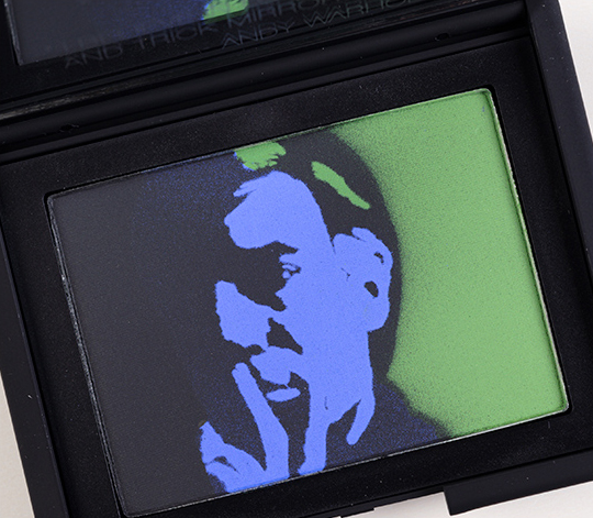
NARS Self Portrait 1 Eyeshadow Palette ($55.00 for 0.42 oz.) features a variation on Warhol’s Self Portrait (1967) painting. This palette is described as “black, bright periwinkle blue, and vibrant green.” It is the first of three palettes, and it will be available at department and specialty stores, NARS’ boutiques, and narscosmetics.com on November 1st (so you have some time to think about it, to the say least!).
Each of the Self Portrait palettes has a black overspray, which will disappear quickly. I recommend taking a large powder brush (I used MAC’s 134) to brush back and forth, up and down, to get the majority off. Now, I say that with the expectation that you’d actually like to use the colors in the palette. Assuming you only intended to keep it as a collectible, then I’d recommend not using it much and would say to avoid the blue to maintain the facial structure/details.
The first shade is a brown-based soft black that yields sheer, uneven color payoff and comes complete with a dry, stiff texture that doesn’t like to blend or move much. It was as fussy as MAC Carbon was in its most recent release. There are numerous matte black eyeshadows that are comparable; finding the intensity you’re looking for is very personal. Brands like Urban Decay, Inglot, Make Up For Ever, and Sugarpill all make excellent rich blacks.
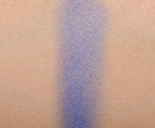
The second shade is a cornflower blue–blue with a hint of violet–that’s powdery, sheer, and prone to fading. The texture is soft to the touch, but it is hard to maintain any vibrancy. I’d say the only way to do so would be to layer over a cream base with similar coloring (which is a rather cheater-cheater kind of way to make a really inferior product work). It absolutely needed at least a primer (I used NARS) to show up, because on dry lids, it just wasn’t getting there. I had to pack it on, and after I moved from this color to the next, I had to go back to pat more on, because it does a disappearing act. Bare Escentuals On the Rocks is brighter, and it also has an iridescent sheen. MAC Dynamic Duo 2 is bluer and darker. NARS Rated R is bluer. MAC Cobalt is darker, slightly bluer.
The third shade is a medium grassy green with subtle yellow undertones and a satiny sheen. It had below average pigmentation, and the texture was on the drier side. It was less powdery than the blue shade, not nearly as dry as the black shade. By those standards, it was the best performing shade out of the three, but still rather disappointing. I had to do quite a bit of packing of the color on itself, and over a primer, to get decent color intensity. MAC Fresh Flare is darker, less yellow. MAC Wondergrass is similar but shimmery. Inglot #384 is darker, more intense. Make Up For Ever #91 is brighter.
It includes 0.42 oz. of product, which is plenty o’ eyeshadow, and it does make it cheaper by the ounce than buying the brand’s duos, trios, etc. However, you’re far better off going for a quality single, duo, or trio, because this palette is really lacking in quality. None of the three shades are redeeming; none of them are even as good as an average-rated eyeshadow. I have nothing positive to say about the performance of this palette; I had to use an eyeshadow base just to get the colors to show up, and even over a base, there was noticeable (and uneven) fading of all three shades. As soft as the blue shade is, it’s so powdery and disappears quickly. If you want to blend the colors together, do so with the most feather-light touch you can muster.
NARS Self Portrait 1 Eyeshadow Palette Review, Photos, Swatches
NARS Self Portrait 1 Eyeshadow Palette
NARS Self Portrait 1 Eyeshadow Palette

NARS Self Portrait 1 Eyeshadow Palette

NARS Self Portrait 1 Eyeshadow Palette

NARS Self Portrait 1 Eyeshadow Palette

NARS Self Portrait 1 Eyeshadow Palette

NARS Self Portrait 1 Eyeshadow Palette

NARS Self Portrait 1 Eyeshadow Palette

NARS Self Portrait 1 Eyeshadow Palette
NARS Self Portrait 1 Eyeshadow Palette

NARS Self Portrait 1 Eyeshadow Palette

NARS Self Portrait 1 Eyeshadow Palette (6 hours of wear, over a primer)
oh god. no.
At this point I’m tuning in for the incredibly clever titles as much as the reviews (which are awesome as always).
Outside of MAC, I can’t remember a brand launching a collection with this much fail in a long, long time. You just wonder what went so wrong!
NARS collections usually aren’t 100% winners for me, but I can’t remember a collection by them that left me feeling like this.
OMG, I’m a really big fan of NARS, but I’m really disappointed at Andy Warhol’s collection.
By the way, Does one swipe really take away the face? 🙁
Hi Jennifer!
If you use a little eye brush, you’re not going to remove the entire over spray in one go, but the layer of black dust is very, very thin – so if you took a small brush and used it on an area that had it, then yes, it would go away!
The brown-black looks pretty in theory, if only the execution would have been better.
Which is odd – they have some nice browns in the permanent range!
Aaaaagh!
Sigh, NARS. And the quotes aren’t making sense either.
Loltastic!
Also, LOL at that quote. From the sound of your review you’re going to need trick mirrors and low lights to hide this palette’s shameful quality.
LOL!
I love that green 🙁
It’s a pretty color in theory – not too bright, not too shimmery!
Have you checked out NARS Fiji? From what I can tell from swatches, it looks very similar, and the quality appears to be there, as well.
Ooops, I meant Fuji, which is darker, but still an apple green.
I just feel like they couldn’t have made these to actually be USED…and I don’t spend $50 on art for my makeup bag. Maybe this will be great for collectors, but it surely doesn’t appeal to me.
That’s the feeling I get, though I don’t necessarily agree with that. The best collaboration is when *everything* is great – packaging, concept, product.
These shades are pitiful! What a bummer.
the quality in this collection is a complete disappointment.
I feel like the bearer of bad news 🙁
I know readers were particularly excited about the launch, and I know it was a Big. Deal. launch to NARS, too.
Very disappointed in this collection (though I’m not a huge Nars fan to begin with), I definitely expect more from what I consider to be a fairly high end brand. The nail colors are nice, but that’s it.
I’m disappointed that the portrait itself disappeared. Although, they look like really nice colors… But I don’t think it’s worth so much money!
Last week, after seeing the photos of the full collection, I made my peace with just how disappointing I found it. As a die-hard NARS-ist, that’s pretty hard but it’s amazing what the right frame of mind will do because, now, I can just sit back and watch the show. I’m considering it as an out-of-body experience where my mind has just disassociated itself. *grin*
It definitely was my intention to get this as a collector’s item, but I still would have liked it if the quality of the palette was good, too 🙁
I can be a bit of an art snob (especially when it comes to music), so it’s been REALLY difficult to refrain from complaining about some of these product names (which actually have NOTHING to do with Warhol). I’ll begrudgingly give them “Walk on the Wild Side” since it’s ABOUT the Factory (even though it would be more well suited in a David Bowie collection than a Warhol one) but “Satellite of Love?!” Nope. No way. No how! Both are Lou Reed songs that were recorded – not only after he left the Velvet Underground but YEARS after Velvet Underground parted ways with Andy Warhol. BAHH!!!
Wow… I did a good job at not saying how I felt huh? LOL! What I was GOING to say was this:
Christine – The headlines that you’ve been using on the posts. LOVE THEM!!! Thumbs way up! 🙂
Well, hey, at least you were able to hold back for a few days 😉
The only things I see worthwhile to get is the nail polishes. What a shame! Green is my favorite color. I did want to get this palette, but not anymore!
This quality from NARS actually makes me angry. I hope their next collection is back to their usual standards
Dahell?
Even the swatches are terrible, and the wear photo…no, just no. If I’m going to shell out over $50 for something like this it better be worth it in quality, not just looks. NARS, what happened to your QA process?
They look fine.
Amazing how they could go so wrong with these…so disappointing.
That is just pathetic. What has been going on with Nars lately? I stopped buying their blushes after I realized that Francois Nars didn’t know the meaning of “restraint” and all the colors were too shimmery or glittery, but I still loved the eyeshadows. Now it seems like there is ALWAYS a bad apple in the collections–or in this case, the whole collection seems like it’s pretty much a fail. That’s a shame…kinda makes me not want to shop Nars anymore to be honest
Oh god, that’s freakin’ DISMAL. :/
Again, how does a cosmetics company come out with such an amazing concept(art eyeshadow) be so bad? They’re a cosmetic company, and last time I checked people only buy decent-amazing quality products. Step up your game NARS. Thanks for the review though, the concept is so cool I may have gotten suckered.
This just looks like a disaster waiting to happen.