A Shimmering, Spring Eye Look Featuring Tarte Unleashed
of 4

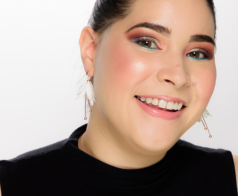


About this Look
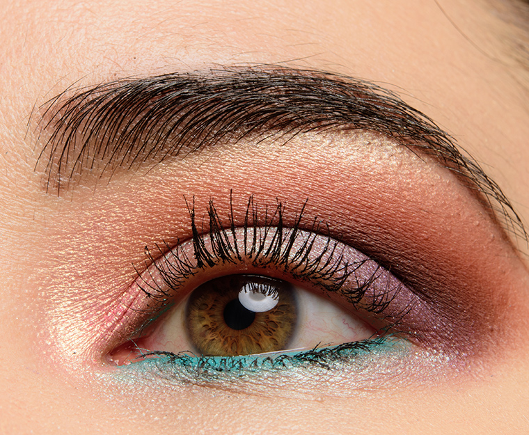
Using a mix of new Tarte Chrome Shadow Paints and the Unleashed palette, I created a metallic, almost pastel-hued eye look!
Step-by-Step Guide
- Inner tearduct: Frose
- Inner lid: Frose
- Middle of lid: Wild at Heart
- Outer lid: Unleashed
- Crease: Oh Deer
- Deep crease: Kolaified
- Above crease: You're Lion
- Browbone: Paradise Found
- Lower lash line: Whirlpool, Wild at Heart
- Cheeks: Cheeky Summer, Fair (1)
- Lips: Dancefloor Princess
Products Used
 Tarte Unleashed
 15-Pan Amazonian Clay Eyeshadow Palette
 Tarte Frose
 Chrome Paint Shadow Pot
 Tarte Wild at Heart
 Chrome Paint Shadow Pot
 Tarte Unleashed
 Chrome Paint Shadow Pot
 Tarte Oh Deer
 Amazonian Clay Eyeshadow
 Tarte Koalified
 Amazonian Clay Eyeshadow
 Tarte You're Lion
 Amazonian Clay Eyeshadow
 Tarte Paradise Found
 Chrome Paint Shadow Pot
 Marc Jacobs Beauty Whirl(pool)
 Highliner Matte Gel Eye Crayon
 Too Faced Ivory
 Born This Way
 Too Faced Almond
 Born This Way
 Laura Mercier Loose Setting Powder
 Jouer Cheeky Summer
 Blush Bouquet
 Natasha Denona Fair (01)
 Super Glow Highlighter
 Charlotte Tilbury Dancefloor Princess
 Kissing Lipstick
I love this look Christine! The Tarte Chrome pots are sooooo good! I think they are definitely a hidden gem. They deserve more hype imo.
Thank you, Bonnie!
I know (and LOVE) that you did an in-depth tutorial on how to apply eyeshadow. I mean, I printed it out and refer to it fairly frequently even though it was a while ago and I ought to have it memorized by now! But…
When you do a look that uses two distinct textures (e.g. pressed shadows and the new “topper”-type of shades, like Hourglass scattered, Tarte shadow pots, Touch in Sol’s, Tom Ford cream or glitter shadows), do you put down the shadow in any particular order. In this look, did you apply Frose, Wild at Heart, and Unleashed before–or AFTER (my guess) you worked with the pressed shadows? With all the blending involved, I seem to do better if I put the sparkling-finish shadows on last.
But the reason I ask is that you often (well, almost always) achieve a vibrancy and a color separation that I don’t. My shades sometimes get muddled together, and in any case I don’t see the distinct bands of color that you get when I try to copy a look from your page.
Thanks in advance! (I think by now just in answering my comments you might have given a full page of tips and techniques over the years… so thanks for that, too!)
In general, I apply mattes first, followed by shimmers, as mattes tend to be more powdery and thinner relative to shimmer shades (so they layer better under rather than over if you want the most impact from the matte). So, following that, I apply all of the crease colors – sometimes crease, above, and then deeper crease or above, crease, and deeper (working from light to dark) – and then work on lid colors. I will go back and diffuse/blend, if necessary, the deeper crease color, which may mean applying a bit more (if some of the shimmer was diffused too high) or just using a clean-ish brush to soften where the two meet.
In a halo eye, where the center lid shade is lighter than the ones flanking it, you might try going back over at the end with more product to help brighten/intensify the edge a bit, too.
That’s a big help!
Just wanted to share a couple of recent mental notes I’ve made to myself in working on improving my e/s game.. Know and choose the right size and shape of brush from your stash for depositing colour to an area for your eye size and shape and then pinpoint that area with great accuracy for the intended placement before you even think about blending. Use a different, meaning clean.. usually bigger lighter fluffier brush to blend so you are never completely disturbing your deposit to the point of making the deposit the same value of colour everywhere.. rather just lightly diffusing it from the placement outwards. You can always add more. It’s way easier to build than to subtract.