Lancome Pop 'n Green Eyeshadow Quad Review, Photos, Swatches

Lancome O My Rose! Collection: Pop ‘n Green Eyeshadow Quad
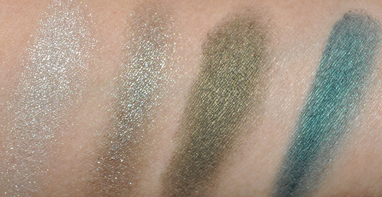
Lancome Pop ‘n Green Eyeshadow Quad![]() ($42.00) is a sultry blue and green palette for spring. It’s surprisingly un-spring-like and yet it’s not totally out-of-season either. It’s almost like the perfect accompamiment to a gloomy, rainy day–and I do mean that as a compliment!
($42.00) is a sultry blue and green palette for spring. It’s surprisingly un-spring-like and yet it’s not totally out-of-season either. It’s almost like the perfect accompamiment to a gloomy, rainy day–and I do mean that as a compliment!
Pop ‘n Green includes a bright silvery-white with shimmer; a greenish-gray with taupe with a more metallic finish; an olive-green with a subtle yellow-olive sheen/pearl (not really shimmery); and a blue-teal with soft silver shimmer over a pearly sheen finish. I don’t have colors quite like the olive green and teal in my collection–similar, but the pearly finish makes them distinctive against anything I might already own (all of which are either more matte or shimmery). I think it would have been cool for the entire palette to have the same pearled sheen finish, actually.
The green-gray-taupe shade is so-so; a little on the sheer side, even though it has a kind of “wet” look to it, I wish the pay off was more. The silver shade has decent pigmentation, but it’s not as color-rich as the olive green and teal are. I like the palette, though I can see this not being something for everyone. I like the way it fits a different side of spring; not the blossoming, pastel side, but the cooler, rainier weather. I think I’m really swooning for that green, though, and I must say, I’m a sucker for olive greens, so…
It’s like I’m in love with half the quad, but the other half is just so-so–the pigmentation is perfect and the texture isn’t as smooth as the good half. I do like that the other half makes sense, though–you can wear these four shades together or variations of three of the four.

If you want to know more about how products are evaluated, read out Rating System FAQ! 🙂
- Product: 26/30
- Value: 8/10
- Ease of Use: 4/5
- Packaging: 4/5

Recommendation: If you love cooler, non-traditional spring shades, you might find Pop ‘n Green to your liking!
Availability: Nordstrom

*sigh* that was my 2nd spring collection crush after “beige kaska” … I’ve restisted it for a few months, but I know I will buy it before March is over… It’s original and it had me at first sight!
Will you do a look with this quad? I can’t wait to see you trying some looks with it! (so I can shamelessly copy it! :p)
I will try 🙂
Gorgeours colors! Must check it.
that silvery colour looks like the famous Erika F!
The one on the bottom right corner looks very similar to Mac’s Birds & Berries.
I’ve checked out this palette, and although I liked it a lot, I thought that MAC’s sumptuous olive and shimmermoss are similar enough for me to skip this palette. I really like that greenish-gray shade though, despite the sheerness. I think it would be lovely as a wash during spring, very ethereal like.
yup ur right! and the 1st one (top left) is Electra. I guess if you dont have any of those then this is worth it. I like the way the Lancome shadows feel but they dont beat MAC’s pigmentation or wear on me….these sadly fade on me and I ALWAYS wear a base.
This looks fantastic and I’m in love with it. ♥ Definitely need to check this one out when I’m shopping next time.
Thanks for the swatches!
Hi Christine thanks for the review,
i just wondered if you were thinking
of doing a look with this palette? it
would be great to see it in action.
Thanks
I’m so behind on looks I need to do, so while I definitely will try, I don’t really know 🙁
They look cool! I would probably use them, maybe not for school but sometime
This quad is quite different to a similar name quad we have here. But I know that Lancome in the US has different kind of packaging and products(?) than in Europe and Asia.
A similar name quad we have over here is in square pans and the colors swatched not as bright as the ones you have. All the 4 colors you have in your quad are much brighter than those our quad here.
I really wish they didn’t do these separate things 🙁 Like some of the coolest products from O My Rose! were not released here in the U.S.! (But I am sure our non-U.S. readers are happy for a little perk!)
True, we did get those Khol Gloss Pencils, which look very pretty, shiny, but I’m not sure how well they would wear. They seem to move around, so I only dared to buy one. (And it seems high-end products cost so much more here, even MAC. 🙁 ) Actually I find it strange that they introduced it in European countries, because in many (not England or France though) I think people are a bit less daring with these types of colours and ‘tricky’ products. At least that’s what I notice.
Yeah, Chanel has their quad’s eyeshadows packaged in round ‘pots’in Europe (well, at least here), whereas in the US they are rectangles. No idea why. I’m sure there are differences in what packaging and product people prefer in countries, especially in U.S- Europe wise, but this type of dirrenetiation doesn’t seem to fit that.It just makes me feel like I’m buying a knock-off,sometimes. 🙂
I love love love (with a passion) smokey eyeshadow colors but for some weird reason I felt so depressed looking at these colors. I’m not even joking, when I saw the swatches I just felt really sad. It’s just so weird because I’ve never had that effect before, let alone from eyeshadow. ??!
That is weird, but at least it inspired a feeling from you? Even if it was a sad one 🙁
I really didn’t care about this until I saw those swatches! Now it’s a definite WANNNNT! 🙂
Are any of these colors a shade that can’t be duped by mac colors?
The teal is closest to Shimmermoss, the green to Sumptuous Olive!
STOP! I swear this blog is a total beauty enabler! My paycheck can’t handle anymore FAB products!
:skulkingawayfromBLOG:
LOL!
OMG have to get this now! I fell in love with this collection when it came out and got the 2 eyeliners,Pop n Cheeks blush and the l/g in Tangerina Sweetir, so now I’ll be getting this too. If only the gorgeous np in Pop Petrol was available here in the states!
This looks like a great quad, but I am over saturated with e/s and makeup in general. Could you make some suggestions on colors for dupes? MAC preferably. TIA 😀
Fineshine, Club, Sumptuous Olive, Shimmermoss. I’d say that Club isn’t a great dupe, but there’s nothing else similar in the permanent line!
The goldgreen looks wonderful 🙂
The green is a very pale version of Lancomes Erika F shade, which is a must have for any make up junkie.
I bought this palette a few weeks ago and I love it! I do agree that the lighter two are not as pigmented, but still somehow make a statement. They both would make a lovely wash. These shades paired up beautifully with the Lancome It Girl lipstick I bought. I’d really like to get Pop N’ Cheeks soon too!
It’s pretty but I don’t like the white. I always think sparkly whites look cheap and not really usable, even on the brow. Better off with a champagne.
Ah, the greens always get me…
This is such a pretty green and teal palette. I would be on the look out for this at the Lancome counters, hopefully there is a gift with purchase event too.
Hello: Due to illness and time my right hand and fingers are losing ther usefullness. So, how do I apply face and eye makeup with one(my left)good hand only?
Hi Josie,
Try stabilizing your left hand by setting your left arm (the elbow) on a tabletop/counter and get a magnifying mirror might also help!
Even though I love that teal colour, I can safely pass this one, since I already have Dior green designer quint. I think Dior one looks like it is a better quality, in terms of colour pay off and texture.
In Europe this palette is called Pop’n Petrol.
I’ve gone to see it but colours are not pigmented and I was very disappointed for that, so I hadn’t bought it. However, I’ve bought the nail enamel of the same serie in Petrol. Not so good as I hoped, sigh, I am sad for I absolutely love petrol colour!
Vale