Kat Von D Star Studded Eyeshadow Book Review, Photos, Swatches
Kat Von D Star Studded Eyeshadow Book
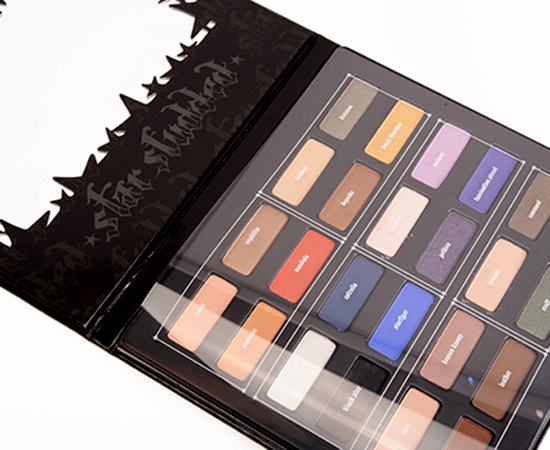
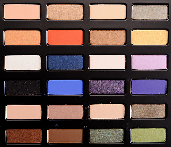
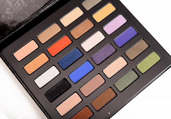
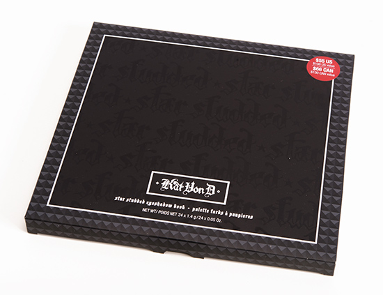
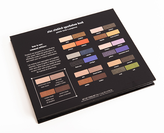
Kat Von D Star Studded Eyeshadow Book ($55.00 for 1.20 oz.) includes 24 eyeshadows from matte to frost. Perhaps the best way to start this review is to say that the formula used in the palette is inconsistent with previous palette releases from Kat Von D; they feel more powdery, softer, and in general, there’s a cheaper, chalkier quality across the board. Even shades that had better color payoff still had a dryness to them that feels like the eyeshadow has more filler in it than is ideal. These absolutely need a primer to even stand a chance; they just were miserable to use without primer, as they didn’t blend together well, while several shades went on much more muted. Then, of course, there is the issue of Gothica, which is a bit like a slap in the face (eye?), given that it is like loose micro-glitter without any base or binders. Brands should do better, and it’s such a shame when they put out inferior products that make customers question the brand’s reliability going forward. I’d recommend checking out her Chrysalis or Monarch palettes, if you’re determined to snag a Kat Von D palette this holiday season.
For reference, the majority of the eyeshadows wore between six and seven hours, with a few getting closer to eight, but in general, they seemed more prone to fading than other eyeshadows I’ve tried by the brand. Also, I would have probably given zero on quality for Gothica, but our system breaks when I use zero (on the to-fix list), hence the 0.5.
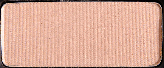
Solar is a light peach with warm undertones and a satin finish. It had good color payoff with a slightly powdery consistency. See comparison swatches / view dupes side-by-side.
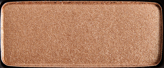
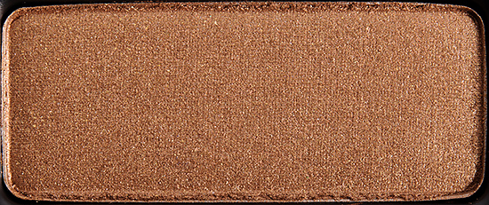
Nephilim is a warm, golden bronze with a frosted, metallic sheen. It had good pigmentation, though the texture had a dryness to it that made it prone to fading. See comparison swatches / view dupes side-by-side.
Damned is a yellowed beige with a matte finish. It was noticeably powdery with semi-opaque color payoff. See comparison swatches / view dupes side-by-side.
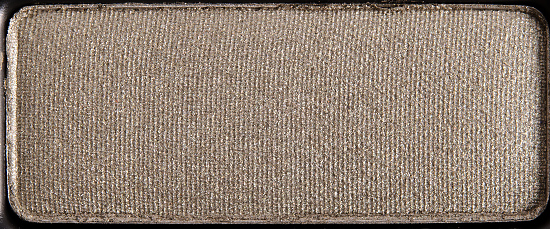
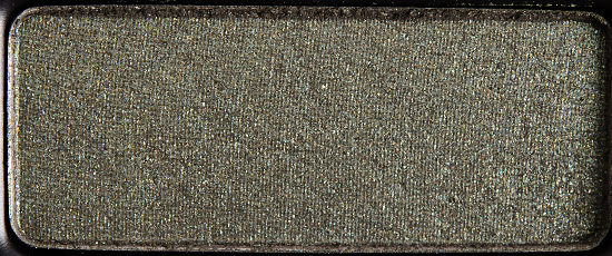
Division is a muted, medium green with a metallic sheen. It had good pigmentation with a slight dryness to its texture. See comparison swatches / view dupes side-by-side.
Platonic is a brightened tangerine with a golden shimmer and frosted finish. It had nice color payoff, though the texture was powdery, so it took a few layers to achieve the intensity as seen in the pan on the eye. See comparison swatches / view dupes side-by-side.
Mandala is a brightened, medium-dark orange with hints of red and a matte finish. It seemed pigmented, but it also quite powdery, which made it hard to apply with intensity. See comparison swatches / view dupes side-by-side.
Depeche is a warm bronze with a metallic sheen. It had good color payoff, but there was that dryness to it that made it prone to fading and harder to use on the skin. See comparison swatches / view dupes side-by-side.
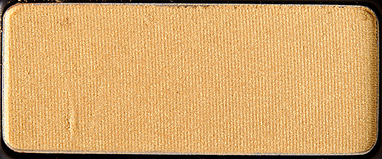
Brass Knuckles is a light-medium, yellow gold with a metallic sheen. The pigmentation was decent, while the texture was sofft and a little powdery. See comparison swatches / view dupes side-by-side.
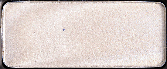
Anti-Star is a cool-toned, frosted white. It was noticeably powdery with semi-opaque color coverage. See comparison swatches / view dupes side-by-side.
Estrella is a cool-toned, navy blue with a pearly sheen. It had good pigmentation with a soft, smooth texture. See comparison swatches / view dupes side-by-side.
Banshee is a cool-toned white with a matte finish. It is powdery, dry, and chalky to work with, while the color payoff seemed to be semi-opaque. See comparison swatches / view dupes side-by-side.
Violator is a cool-toned, lavender with a hint of pink and a pearl finish. It had semi-opaque pigmentation with a lightly powdery texture. See comparison swatches / view dupes side-by-side.
Black Star is a matte black with silver sparkle. It had a dry, powdery consistency that was harder to blend on the lid. The pigmentation was decent, just messy and difficult to use. See comparison swatches / view dupes side-by-side.
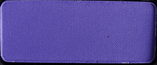
Starfllyer is a brightened, periwinkle blue with a matte finish. Though it had a lot of pigment, it was so powdery that it didn’t adhere well to the skin and faded faster than most eyeshadows. ) See comparison swatches / view dupes side-by-side.
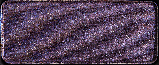
Gothica appears to be a muted, medium-dark purple with subtle, cool undertones and a frosted finish–except it’s more like muted purple sand due to an atrocious texture. See comparison swatches / view dupes side-by-side.
Fascination Street is a muted, bluish-purple with a matte finish. It was dry, stiff, and chalky, which made it difficult to blend, while it was semi-sheer for payoff. See comparison swatches / view dupes side-by-side.
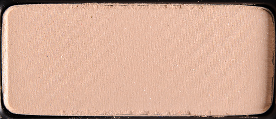
Moz is a neutral-to-cool-toned beige with a satin finish. It had good color payoff and was only a little powdery. See comparison swatches / view dupes side-by-side.
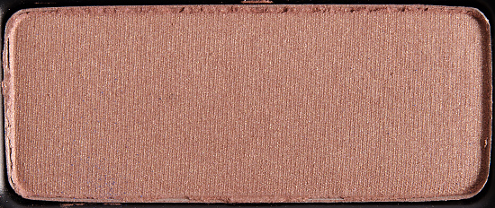
Heaven Knows is a rosy taupe with warm undertones and a satin finish. This shade was ridiculously powedery–touch your brush to the pan, and it’s like poof! See comparison swatches / view dupes side-by-side.
Crosses is a light, warm-toned beige with a matte finish. It was moderately powdery with good color payoff. See comparison swatches / view dupes side-by-side.
Covenant is a muted, medium-dark olive green with warm, khaki undertones and a pearly sheen. It had good color payoff, but it was powdery and dry. See comparison swatches / view dupes side-by-side.
Smiths is a copper bronze with warm undertones and a soft, frosted finish. It had nice color payoff with a smooth, buttery consistency–best shade in the palette. See comparison swatches / view dupes side-by-side.
Leather is a medium-dark, yellow-toned brown with a matte finish. It had mostly opaque color payoff, but it was fairly powdery and dry. See comparison swatches / view dupes side-by-side.
Craft is a medium-dark green with warm undertones and a sparkly, frosted finish. It was dry, powdery, and prone to fading, while it yielded semi-opaque at best. See comparison swatches / view dupes side-by-side.
Cult is a brightened, light-medium green with golden shimmer and warm undertones. It had decent pigmentation, but the texture was, again, powdery, which made it hard to apply. I had trouble getting this to blend as well. See comparison swatches / view dupes side-by-side.
Star Studded
LELimited Edition. $55.00.
Solar
LELimited Edition.
Estrella
LELimited Edition.
Banshee
LELimited Edition.
Violator
LELimited Edition.
Black Star
LELimited Edition.
Starflyer
LELimited Edition.
Gothica
LELimited Edition.
Fascination Street
LELimited Edition.
Moz
LELimited Edition.
Heaven Knows
LELimited Edition.
Crosses
LELimited Edition.
Nephilim
LELimited Edition.
Covenant
LELimited Edition.
Smiths
LELimited Edition.
Leather
LELimited Edition.
Craft
LELimited Edition.
Cult
LELimited Edition.
Damned
LELimited Edition.
Division
LELimited Edition.
Platonic
LELimited Edition.
Mandala
LELimited Edition.
Depeche
LELimited Edition.
Brass Knuckles
LELimited Edition.
Anti-Star
LELimited Edition.
Kat Von D Star Studded Eyeshadow Book
Kat Von D Star Studded Eyeshadow Book
Kat Von D Star Studded Eyeshadow Book
Kat Von D Star Studded Eyeshadow Book
Kat Von D Star Studded Eyeshadow Book
Kat Von D Star Studded Eyeshadow Book
Kat Von D Star Studded Eyeshadow Book
Kat Von D Star Studded Eyeshadow Book
Kat Von D Star Studded Eyeshadow Book
Kat Von D Star Studded Eyeshadow Book
Kat Von D Star Studded Eyeshadow Book
Kat Von D Star Studded Eyeshadow Book
Kat Von D Star Studded Eyeshadow Book
Kat Von D Star Studded Eyeshadow Book
Kat Von D Star Studded Eyeshadow Book
Kat Von D Star Studded Eyeshadow Book
Kat Von D Solar Eyeshadow
Kat Von D Solar Eyeshadow
Kat Von D Nephilim Eyeshadow
Kat Von D Nephilim Eyeshadow
Kat Von D Damned Eyeshadow
Kat Von D Damned Eyeshadow
Kat Von D Division Eyeshadow
Kat Von D Division Eyeshadow
Kat Von D Platonic Eyeshadow
Kat Von D Platonic Eyeshadow
Kat Von D Mandala Eyeshadow
Kat Von D Mandala Eyeshadow
Kat Von D Depeche Eyeshadow
Kat Von D Depeche Eyeshadow
Kat Von D Brass Knuckles Eyeshadow
Kat Von D Brass Knuckles Eyeshadow
Kat Von D Anti-Star Eyeshadow
Kat Von D Anti-Star Eyeshadow
Kat Von D Estrella Eyeshadow
Kat Von D Estrella Eyeshadow
Kat Von D Banshee Eyeshadow
Kat Von D Banshee Eyeshadow
Kat Von D Violator Eyeshadow
Kat Von D Violator Eyeshadow
Kat Von D Black Star Eyeshadow
Kat Von D Black Star Eyeshadow
Kat Von D Starflyer Eyeshadow
Kat Von D Starflyer Eyeshadow
Kat Von D Gothica Eyeshadow
Kat Von D Gothica Eyeshadow
Kat Von D Fascination Street Eyeshadow
Kat Von D Fascination Street Eyeshadow
Kat Von D Moz Eyeshadow
Kat Von D Moz Eyeshadow
Kat Von D Heaven Knows Eyeshadow
Kat Von D Heaven Knows Eyeshadow
Kat Von D Crosses Eyeshadow
Kat Von D Crosses Eyeshadow
Kat Von D Covenant Eyeshadow
Kat Von D Covenant Eyeshadow
Kat Von D Smiths Eyeshadow
Kat Von D Smiths Eyeshadow
Kat Von D Leather Eyeshadow
Kat Von D Leather Eyeshadow
Kat Von D Craft Eyeshadow
Kat Von D Craft Eyeshadow
Kat Von D Cult Eyeshadow
Kat Von D Cult Eyeshadow
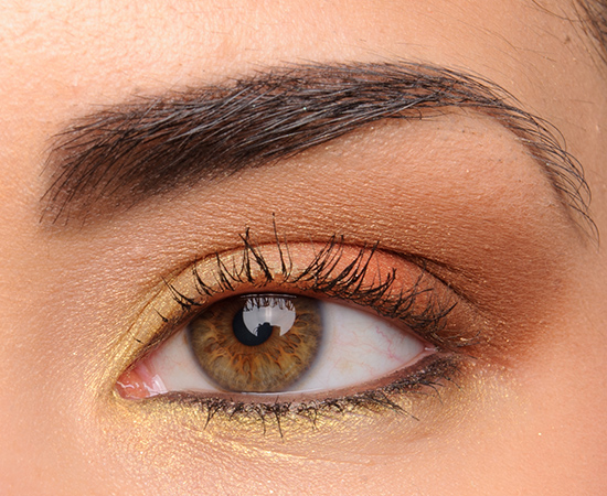
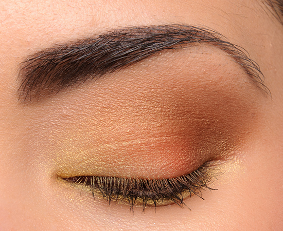
Kat Von D Eyeshadows: Brass Knuckles, Platonic, Mandala, Depeche, Smiths, Solar, Urban Decay Twice Baked Eyeliner
Kat Von D Eyeshadows: Brass Knuckles, Platonic, Mandala, Depeche, Smiths, Solar, Urban Decay Twice Baked Eyeliner
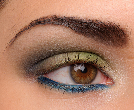
Kat Von D Eyeshadows: Anti-Star, Cult, Craft, Estrella, Crosses, Banshee, Gucci Iconic Ottanio Eyeliner
Kat Von D Eyeshadows: Anti-Star, Cult, Craft, Estrella, Crosses, Banshee, Gucci Iconic Ottanio Eyeliner
Kat Von D Eyeshadows: Damned, Nephilim, Division, Covenant, Sephora Welcome to My Loft Eyeliner
Kat Von D Eyeshadows: Damned, Nephilim, Division, Covenant, Sephora Welcome to My Loft Eyeliner
Kat Von D Eyeshadows: Moz, Heaven Knows, Leather, Sephora Welcome to My Loft Eyeliner
Kat Von D Eyeshadows: Moz, Heaven Knows, Leather, Sephora Welcome to My Loft Eyeliner



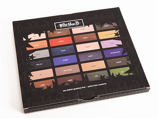



















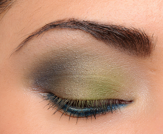
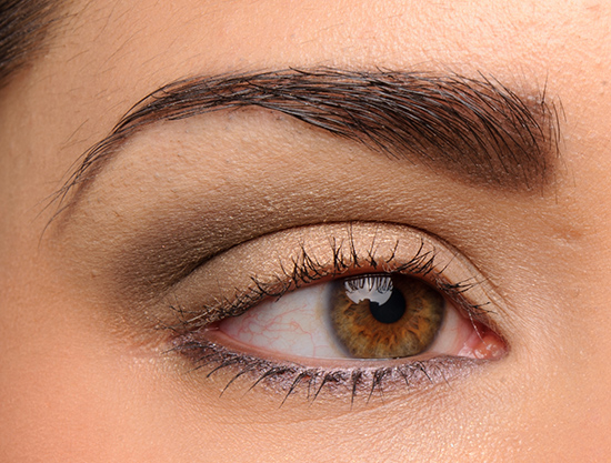
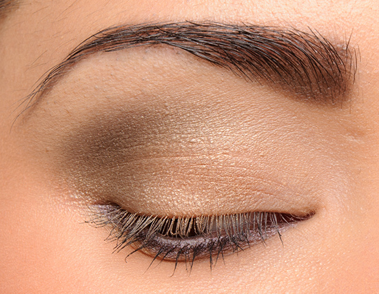
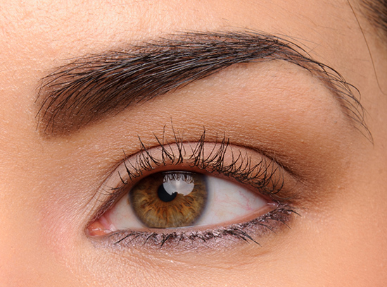


Gothica is like a trick shadow or something. But it’s not April 1st :-/ Obviously, you know me – I’m most annoyed by the fact that two of the worst (Gothica and Fascination Street) are both in the blue/purple line. Rrrrgh. That being said, at least Estrella is decent.
I hate it when this happens with shadows that look so pretty in the pan, too. It’s like KVD offers you a pretty chocolate, but when you take it you realise it was only the foil wrapper, because they ate the chocolate and replaced it with…sand, apparently…
LOL! That’s what they’ll do next year on April 1st. Gothica… IN FULL SIZE!
Gothica works well over a creamy base. I have a purple NYX Jumbo Eye Pencil, and the combo is beautiful. I have to use a base with *any* powder eyeshadow, so it’s not an “extra” step, but it is horrible on its own…
I haven’t played with Fascination Street yet, though…
What even is Gothica? I would say it’s a joke but this ain’t funny.
It is an odd one – never seen an eyeshadow like that… that was pressed.
I clicked and scrolled down just to see what Gothica looked like once swatched. Boy, I was not disappointed.
At least you were prepared 😉
Maybe this is a little melodramatic for an eyeshadow review, but my jaw literally dropped when I saw the swatches for Gothica and Fascination! They are so bad it makes me angry!
You & me both!!
Wow, Gothica. _WOW._
Indeed!
Hmmm too bad the palette doesn’t really live up to the expectations. The colors look nice though. Just a shame that quality isn’t as good as usual.
It had potential 🙁
This palette had so much potential (love the color families), but too many misses at this price point, and very disappointing for a Kat Von D. product. Division is gorgeous but Gothica and Fascination are embarrasingly bad, better to leave those shadows out completely.
There are so many shades to choose from, so why bother to include ones that you can’t do right?
totally agree!
What the F is actually going on with Gothica?? That’s something that should NEVER ever leave a lab. You know it’s bad when the dupes are of what the shadow is SUPPOSED to look like…
Makes you wonder how it made it through!
Some of these are so painful to look at! Yikes! Kat’s palettes used to be better quality!
They did!
How did Gothica even leave the testing stage…?
We’re all wondering that!
I love the look of several of these shadows and it’s a shame that they are lacking in quality. I especially love Division and while I have some of the listed dupes/possible dupes, even those do not look anything close to the swatch of the real deal – Division just is so lovely. I wish it were sold on its own (ditto Craft and Covenant).
I wish KVD had more permanent eyeshadows!
there really feels like a consistency problem between shades in basically all of kat von d’s products which is a shame because backstage bambi is my favorite pink lipstick
There seem to be more problems lately 🙁
Wouldn’t it be better to buy something from Coastal Scents then? It’s much cheaper and the quality sounds the same.
There are a bajillion things you could buy instead of this for sure.
Mine was so powdery, it was like a snowstorm whenever I tried to use it. It’s the only item I have ever returned to Sephora. I would have rated mine… is there a grade lower than F? G? G for “Get this piece of crap far away from me?”
I really liked the colors, and packaging, too. Such a shame. I hope KvD’s team gets it together.
You did a great job pulling off pretty eye looks with these. I’m impressed with your skills!
Snowstorm, hahaha! Yes, it is a very messy palette to use. Sometimes you have powdery where it just feels silky but powdery (which I’d say of LORAC) and then there’s more powdery and dry… and cheap, which is what these seem more like to me.
Yes. Some powder and fallout can be worked with, as long as the quality is there. For me though, every color I tried, no matter what brush I used, just kicked powder up and it got all over my face.
Gothica was actually the only one I got to work. How screwed up is that?
That is ironic! 😉
Christine, did you try applying Gothica to your eyelid?
Sure did, but nothing stayed on the skin. Even in the swatch, the merest breeze would have made it disappear.
Yikes, Gothica! My favorite thing about this palette is the eyeshadow names. Craft, Nephilim, Platonic!
They are some cool names in it!
Bummer that this palette didn’t perform as well as some of her others. I don’t like the packaging on this one either. :/
The packaging doesn’t seem as personalized as past ones.
I don’t like the color scheme, really. Out of all those neutrals (excluding the whites) there’s only one or two that are cool toned. I love the shade Covenant, though.
I don’t know that the colors are really cohesive or not – it’s so hard to tell, since even when they seem to go together, they don’t always blend well.
That’s my main issue with the palette… Individually, many of the shades are gorgeous, but I don’t like many of them *together*. It’s such a large palette that I have to store it separately from most of the others (I have a couple of others that are large, as well) so I don’t pull it out very often, since I have to use additional products.
Hi Christine, The eye looks you created are beautiful, especially the first two. Just gorgeous.
Thank you, Maria!
bullet dodged! I own several KVD palettes and love them, but I was so disappointed when swatching this one at Sephora recently. for a brand I really love that makes my favorite foundation, my favorite liquid lipsticks, and some of my favorite palettes, between this and the Studded Kiss letdown KVD’s been a super double-bummer this year. :<
I hope that 2015 is better for the brand!
I can count on one hand the number of times I returned a makeup product. THIS WENT BACK!
I tried the Esperanza palette earlier this year and enjoy using it. I completely agree that the Star Studded product is inferior. Powdery, no color payoff.
Took it back and exchanged for Vice 3.
So sad! Glad you were able to exchange for something better.
Let me start off by saying how impressed I am with the looks you’ve created with this palette Christine – they look lovely. I shall now finish off by saying ‘Come on guys, get your act together – all these different shades in one palette with no consistency; its better to have quality over quantity any day!’
Will definitely give this a miss.
(climbs off soap box and leaves the room!)
Thank you, Denise! 🙂
This palette doesn’t sound good at all. The swatches look nice but they don’t look so great in action. So disappointing
I wouldn’t recommend it 🙁
Wow. An eyeshadow so bad, it breaks your site.
Ha!
Wow – another disappointing palette from a brand that should know better! How often lately have we seen this? Some of the colour choices are interesting too – why for your Autumn you would have that seriously bright blue? I have read about this palette from other beauty bloggers and they have given it a miss as well. The only colours I really like are craft and covenant.
Your eye looks are fantastic Christine, but I think I love your teal eyeliner the most.
I have just consulted your swatch gallery and I am happy to announce that I have excellent dupes for craft and covenant – thank you so much for maintaining your swatch gallery Christine!
Yay!
There have been a lot of so-so palettes this season!
Im surprised Gothica was so horrible for you, when I went in store to swatch the palette it was actually really beautiful. Almost all the shadows were really good, maybe you got a bad batch? Same with some of the lipsticks. I guess however sephora is making them is really inconsistent throughout the past few months because products shouldn’t vary that extreme. 🙁
Glad it worked for you!
Whew, I am so glad I didn’t splurge on this!! Reading the intro I thought it would get an even lower grade…such a shame!
So glad you didn’t!
i do feel like in the last year her eyeshadow quality has gone down, however, i like this palette especially when i can find the right base to use.. so far i like using the continuous almond jordana pencil.
Thanks for the tip, Amara!
these are just so pretty colors – love the combo with anti-star and cult
There are some interesting shades in it!
Sorry Christine, I can really feel your frustration oozing through your description of Gothica, but the look of the swatch actually made me laugh out loud, it’s ridiculous quality! -still giggling hysterically-
Hey, as long as I can entertain, it was well worth it!
This was. I hardly know how to say it, but well, interesting. I have never, ever seen anything like Gothica. Ever. And I’ve used makeup for a long, long time.
The swatch looked like the worst sandy glitter. Even if your Gothica came from a bad batch, they must have some kind of quality control, and it should never have left the factory.
With such inconsitensies (sp?) in a palette or even within the brand they should take a long good look at what they are doing.
That said, you did a lot of very pretty looks using this palette.
Yes, it is much like very fine glitter… loose glitter.
some beautiful colours… and then some obviously huge misses. way too much inconsistency to spend $55 on, in my opinion. But Mandala really stood out for me! What a gorgeous mandarin colour.
They’re asking for a premium price for a sub-par palette, definitely not worth it! 🙁
Gothica… Oh boy… What were they thinking? I think it is so disrespectful with the people who buy that brand. I was waiting to see a look wearing Gothica, but I imagine that even that was imposible to do.
LOL! Pretty much impossible to use as-is.
I cannot believe it. Some of them looked like they swatched really nice too :/ good thing I seen this before buying! And my God, Gothica!? What….even….
I just bought the palette for $28 at Sephora and the colors work really well. Even the Gothica. Hardly any fallout. I think if quality goes back and forth, it’s not a good thing since we never know if we’re getting the good palette or the bad. Thank you!
Wow! Glad I read this. This has been on my to buy list, glad I saw this first. Kinda sad, because I love everything else they’ve done!!
WOW! So glad I didn’t purchase this palette! This is what I would call an authentic piece of poo…..so disappointing compared to her other palettes which I’ve bought & love.