Archived Post
Is there any color that is underrepresented in makeup?
I think cooler undertone products are missing from color cosmetics quite a bit – like cooler browns and taupes but also quality lavenders, grays, and purples. The most obvious gap is in base products with issues in shade/undertone diversity.
— Christine
Obviously many foundation lines cater only to the middle of the skin color spectrum and rarely venture away from very cool and very warm undertones. I have a super pale complexion and many lines don’t have pale enough shades, in particular concealers. My daughter is of mixed race and she struggles to find foundations that are dark enough and with neutral undertones. Many brands think darker complexions means red or orange undertones.
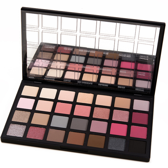
I agree that cooler toned e/s that are good quality are difficult to find and I also think that green shades are difficult to find. There is an entire spectrum of green that is missing in e/s.
I agree completel. Being very pale I share your challenges.
I’d second decent grays. Silver and grey are very unrepresented in my collection. Used to be a go to color in my teens.
I agree, shades and undertones in foundations. I never thought about shades like lavender though, maybe because I wouldn’t reach for them anyway.
I really think grey. Everything lately has been so warm-toned and even the cool-toned palettes don’t have good creamy matte or shimmer greys. Not silver. Grey.
I have to agree with you on both fronts, Christine. Cool tone products are definitely taking a back seat to warm tones at the moment. Lavenders, purples, blues, and greys are especially underrepresented in lip products (oh how I wish I could find a non liquid lipstick dupe for KVD Dagger, or even a dupe at all).
And like you said, the most noticeable gap in representation is with people of color (particularly deeper skin tones), who are super underrepresented in every step of the beauty industry, from product design, to marketing (v. few models of color in promotional materials), to shade availability, all of which is just unacceptable.
I agree with Christine’s answer 1000%. But, it’s even a worse under-representation after you factor in quality and diversity. For example, how many quality matte eyeshadows are in all these new palettes? How many warm oranges, peaches, rusts, bronzes, browns, yellows and teals do I have to buy in order to get that lonely berry or plum or violet-grey or mauve shade? How many cool bronze eyeshadow shades are there to choose from? Two maybe? if you beat the bushes? Believe it or not, there is such a thing as a cool gold shade (has some silver in it). Finding it is impossible. And, the lipstick collections: Nearly all of them carry the obligatory bright fuchsia and bubblegum pink, and the rest of the cool colors are pinky-nudes or deep blue-reds and berries. Count how many lines carry a bright deep pink or rose (no browns or plum-browns in them), or a hot pink (and I’m NOT talking about fuschia or magenta) or a cherry red in ANY of their products!!! Talk about gaps!!! And, don’t get me started on yellow-based foundations and concealers. They’re everywhere. The market is saturated with them. SMH (Those Asia-exclusive products need to be sent to the USA as well — I’m talking to you Chanel and Dior!)
The bright side of the problem: I’m not tempted to buy much of anything. I’m not going to buy something with the attitude: ‘I’ll make it work.’ Because it won’t work. It’s just a big fat waste of money. There’s only so much ‘playing around’ and mixing of products a person can do before it’s a hopeless, lost cause. End of rant.
Since you are clearly a major influencer, though it is not your mission, I certainly hope they are listening. Major agreement with you. The good flip side, ‘course, is that I buy less!
Agree with you about cooler shades overall, but that’s the fashion right now — warm reds, oranges, yellows. Things will turn eventually. Personally I think greens are way underrepresented. You used to be able to buy lots of green eye shadows in many different tones and tints but now it seems like green is completely missing from palettes/quads, or they may throw in one token sea green shimmer. I want to see cool hunter greens — true greens, not teal.
Second this. Even in palettes the green in the pan usually swatches teal. I thought this year’s Pantone color would prompt more greens from brands but it looks like Sephora isn’t doing it this year?
I completely agree!! I keep looking for a good cool tones eyeshadow palette and the best I’ve come up with is the Viseart Cool Mattes (which I do not own). I love warms tones, but I’m curious how long the trend will last.
In base products obviously, the shade and undertone diversity isn’t there for a lot of brands. Especially at the drugstore.
Cooler tones in eye products, I’d like to see more and in diverse colors.
I’m with you on this one, Christine. Strictly speaking to color cosmetics (eye shadow, blush, etc) cool tones and even more neutral options are often missing. There is a bizarre misconception I’ve noticed over the years that many people think all WoC are warm-toned. Which is of course absolutely not the case. I think especially in regards to shades of blue and purple we need more variety. It’s easy to find navy blues and pinkish purples, but difficult to find almost any other shade variation. Periwinkles, blue and red-toned lavenders, more violet cobalts, etc are all badly needed. And while I love that there are so many options for those who love warm tones, it’s to the point where basically every release is extremely warm-toned. It’s far too easy to wind up with a milion warm orange, red, brown, bronze, etc shades with little variation between them. It’s hard to find the exact right gray since many are super light or almost black with hardly any shade variation.
Basically, I’d like brands to consider the neutral and cool markets across the skin tone spectrum. More cool tones that can work on all. Every release has gotten so samey. A bunch of warm colors and maybe a pop of navy or purple or emerald is not good enough.
I agree, Christine. A go-to eye shadow color for me is a matte gray that isn’t silver, charcoal, or taupe.
Seems very hard to find.
Had the same issue… Eventually I made a quad of Inglot matte greys with different undertones. They have a very good selection if you have access to their singles/freedom system.
Thanks for the tip!
Where I see an issue is in foundation/face products lacking in deeper, paler or NEUTRAL olive hued. These 3 very distinct skin shade depths with their various undertones, as well as trying to find a good match if one has a noticeable olive undertone, but isn’t all that yellow. I would love to see more companies cover us in these 3 very overlooked depths and shades!
*I agree with everything you said.
*It’s still really hard to find much variety of shades — or good formulations of — greens, blues, and purples/violets in any product.
*Periwinkle in any products.
*Yellows in eye and lip colors.
*Opaque white lip color.
Definitely! In foundations the very, very pale with pink undertones and the deeper shades with all undertones are often not represented enough, except in the HE brands.
As for eye shadows, genuine cooler tones of taupes, greys and browns are often hard to find. Which is why I love my Sephora It Palette in neutrals – lots of cool toned greys and taupes.
Good green shades such as sage and forest green are hard to find too.
Christine, as soon as I read the question and before I saw your opinion, the first thing that came to mind were dood quality lavenders and grays. I also agree that cool undertone products are hard to find. So many of the lavender and gray eyeshadows I have tried a dusty and lacking in pigment. I find the same to be true with cool toned blushes whether powder or creme.
Neons, pigmented pastels, neutral grey colors they don’t lean too blue, and purple/blue family colors.
Also YELLOW undertones in foundation. Not the common “warm” which is peach or orange or a being. I had to make my own yellow mixer to get my foundation to match. I get the majority are not very yellow-toned but it stinks not being able to find literally any matched. Also, olive girls need love!
A few years ago it was impossible to find blue lipstick or matte red eyeshadow, and now these are allover the place! I think there are a lot of colors availble now than there used to be, but agree with the overall sentiment of lack of:
– Foundation shade ranges for POC
– Cool-toned eyeshadows, especially cooler neutrals, browns, green, purples, etc…
– Cool brown-pink blush/bronzer
– Red and pink eyeliner (so popular in Asian makeup brands!)
– Lipstick that is not red or pink
Outside of shades for WOC which is a whole nother problem, I think like a real red, a real orange and like quality greens arent out there that much
I find it puzzling that more brands don’t make each darkness of foundation in at least 3/4 different undertones (neutral, warm, and cool). So often the fair shades run cool/pink, and dark shades run red. As a neutral-toned pale girl I have such an easy time finding lip/cheek/eye colors, but I struggle with foundation and concealer undertones! Hourglass’s Vanish stick foundation should be a role model for all brands!
(my other biggest pet peeve is tinted spf’s and moisturizers that claim to be universal, when they’re clearly going to turn some skin ashy and turn my skin oompa loompa orange!
I agree 100%, more cool tones pls!
More representation for neutral skin undertones in foundations.
Thank you for pointing this out! I’m a pale af cool undertoned person, and a lot of “cool browns” or “neutrals” are straight up orange on me. Every time I see another palette full of “neutrals” that are actually warm browns, bronzes, coppers and oranges, I want to scream. Like really, how many effing brown palettes do people need?? If companies do release a “cool toned” palette, it will be black, blue-grey, silver, blue and white. That’s it. And then rarely companies will release palettes that have some cooler shades that actually work for me (yay!) but then half the palette is colors that will turn orange. The Bare Minerals Bare Sensuals palette comes to mind. I wish they had separated the top and bottom rows into different palettes. Grrrrrrr.