Givenchy Launches Prisme Quatuor for Spring 2015

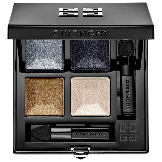
Givenchy #3 Prisme Quatuor
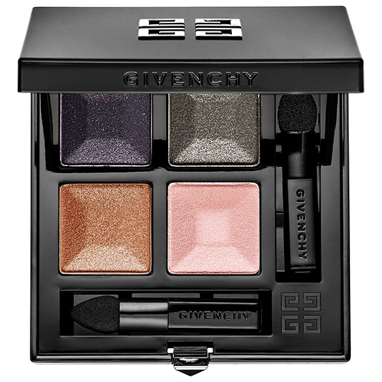
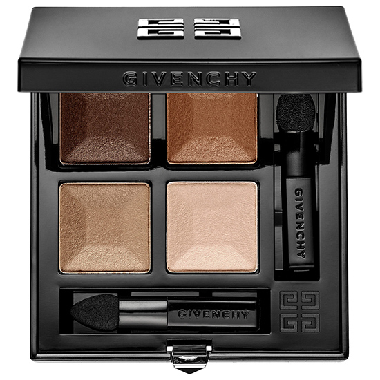
PRISME QUATUOR, rediscover Givenchy’s cult makeup product. Four domes, four colors, for beautiful eyes that can be infinitely reinvented. The keen color sense and expertise of Nicolas Degennes went into creating these unique palettes featuring bold, elegant and modern combinations where nudes mix with intense tones, where matte density plays off a sparkling veil. Each harmony is a unique composition, a world to explore. A brand new texture developed to provide even greater comfort and performance. Its intuitive application offers immediate and even coverage for pure, intense color payoff. Comfortable to wear and luminous, it stays true all day long. These 8 quarters come enhanced in a sophisticated new pack for a luxurious and creative experience.
Prisme Quatuor ($58.00) (New, Permanent)
- Caresse (1)
- Ecume (2)
- Inattendue (3)
- Impertinence (4)
- Frisson (5)
- Confidence (6)
- Tentation (7)
- Braise (8)
- Delicate (9)
Availability: Now at Sephora
See more photos!

Givenchy #1 Prisme Quatuor

Givenchy #2 Prisme Quatuor
Givenchy #3 Prisme Quatuor
Givenchy #4 Prisme Quatuor
Givenchy #5 Prisme Quatuor

Givenchy #6 Prisme Quatuor

Givenchy #7 Prisme Quatuor

Givenchy #8 Prisme Quatuor
Givenchy #9 Prisme Quatuor
Some of the combos look really interesting (#7, for example) while a few look quite odd and sort of a mish-mash. I’d be interested to see what these are like applied because some of the quads look really reflectively sparkly.
I agree – not quite sure why they put in a pink and purple with a lovely green eg number 7. I hope the quality is really good.
It’s actually a reddish burgundy merlot and an earthy rosewood taupey-like color, which pair well with earthy golden olive and a beige gold champagne! 🙂 Sometimes colors are not at all how they look in the pan. 🙂 I hope that helps you & I hope you enjoy them! <3
#9 Looks interesting.Neutral, shimmery; I hope the pigmentation of these will be decent.
Well this looks like it could be unfortunate for my wallet.
So beautiful! I love #7!
Curiously enough I like the number 7. Find it so pretty. Has to be the aubergine on it.
It’s so pretty, but I hate the little foam tip applicators they put in. If someone has this much money to blow on a quad, odds are they own and use brushes.
Oh my, #6 and #7 looks really beautiful.
Hi Christine,
are there any chances You will review Givenchy Colorecreation Collection?
Most of these look very shimmery, I wish they had put in a matte shade. Nice to see some color in these palettes, not all neutrals, and some interesting color combos. Hope they perform well
The “luxurious” description made me chuckle. I don’t think of the applicators as luxurious and I don’t have a personal makeup artist to apply them to my face so maybe they don’t quite give a luxurious experience. 🙂
Inattendue looks so pretty!! Love those jewel tones…
I’ve been really digging Givenchy’s approach since its darker take on some its more recent Holiday collections. Judging by the comments and my own feelings, #7 seems to be the front runner. That burgundy with the green is just magnificent!
I like the packaging!
Both #3 and #7 look interesting except that I think each should have had at least one matte shade too. I can’t handle all shimmer/glitter shades.
Are these replacing the Le Prisme Quartet? I only see one color on Sephora now & it’s not even in stock.
I like #2!
Ahh!!! So pretty!!! Can’t wait to see how these perform!! 🙂
I love number 7, I can imagine that looking very pretty on the eyes!
These look beautiful in the pan, but so many high end brands are getting bad grades. I hope these translate onto the eyes. I like #3 and #7 the best.
I’m loving #3. Very jewel toned
#3 and #7!
Hopefully they are good
I am pretty interested in #1 and #7. Though my wallet is not! I agree with the previous comment that some seem sort of mish mashed and others are well though out in the color combos.
Some of these look really intriguing – especially numbers 2, 4, 5 and 7. I would be very interested in seeing how Givenchy does the blues and greens.
These look better than their other quad lineup. Don’t love the aesthetic of givenchy but these colour combos are quite nice, particularly 7 and 3
Some of these look *very* pretty indeed! I’d love to see how 2, 3, 4, 5, and 7 swatch up…
this actually catches my interest and i’m team inglot free palette for years. but the shadows are gonna expire soon so might as well minimize and try something new
So pretty! Can’t wait to see some swatches!
These are very dramatic but theres not one quad thats practical
These seriously remind me of an 80-pan no-name palette I found at Ross for $3. I think it’s the chalky, sparkly texture.
#7 I love purple and khaki – green for eye combo and also for outfits and #9 look interesting! But first Christine’s review!
Ooo, no. 3 is calling my name. I like the look of 2, 7, and 8 too. But would love to see swatches of allllllll of them, lol!
Wonder how these compare to the Holiday 2014 eye palette? Those are all heavy duty shimmer and glitter, but gorgeous. And I don’t mind sponge applicators so much for that sort of glittery shadow as they work okay for patting it on.
These make for fun and exciting reviews to view from you, Christine! Especially since some look similar in color to a few Tom Ford quads, is it sunstone or something like that and then cocoa miragey-ish.. Trends that palettes from many companies are trying to reproduce color-wise yet I doubt will reach the formulation.. So it will be interesting to see these swatched and in action! <3 Thanks for the preview! 🙂
They are also a bit Chanel dupe-y.. But that’s just by looking at the four colors creating the quad.. Interesting!
Please perform well, Givenchy! Not did I mean that they hadn’t performed well in the past. The brand has been quiet and very low-profiled for too long, compared with Dior, Chanel and those old-school haute couture fashion house names. I love them head to toe, of course the packaging! And their now-discontinued pressed powder back in 2008. Their current foundation powder, the one with a stripe of pink highlighter, is still one of my favorites!
I’m so looking forward to trying these! I’ve never really tried Givenchy’s eyeshadows before. I hope that they perform well. Some of the colour combinations are beautiful. 🙂
I’d love to see swatches of #3 now that this is on sephora.com
Hi!
I stumbled across this site quite by accident and have really enjoyed reading trough the archives in my meanderings in to improving my beauty routine.
I wanted to ask for advice about these Givenchy quads, I picked up the les mini prisms over the holidays and while I wasn’t vowed by the blush or powder colors I fell hard for the eyeshadow, its the N 71 in the regular les quatours thats in the mini prismes.
I’m not very skilled in the matters of makeup, never have I been able to apply makeup in the sharp and defined way if the SA’s at sephora nor is blending something I master,
I’m a basic kinda gal, for years I had one eye pen, it was the Clinique Sable and mostly when I use shadow its one single color, dark brown or a deep purple swept over the whole lid.
I have large dark green eyes and a fair amount of lashes, if I apply too much makeup I easily begin to look clownish and heavy makeup does not suit my lifestyle anyways.
My skin color leans towards yellow warm and I seldom wear bb creams or tinted moisturizers, I blend some concealer and light swipe of blush to seal it off with the Guerlain meteroites.
Even if I were to wear more make up it would probably just involve eye pen and lipstick.
I have dry skin and abhor facial powders , the only reason the meterorites work is because it goes on as such a slight powder and it never goes over my whole face.
Can anyone advice on how to pick a second color selection?
I want it to work for everyday use but also be able to spiff it up for more occasional wear, purples and peach really complements my eyes, I just can’t imagine how these will look like on, in fact I wouldn’t know which shade goes were.
N9 & N5 looks really dull to me and the N1 I worry is too peachy for my skintone and I simply have no idea which of the other combos goes best with my colors.
I can say I’m very drawn to the 3, 4, 5 but then again, yellow is one of my all time fave colors, when it comes to interior decorating. Navy has similar effect on my eyecolor as a rich purple would but if I go in a certain rose color direction it plays up the red in blemishes and loodvessels.
Peach with the slightest shimmer and navy refreshens me and olive green is a personal favorite but might be too close to my eyecolor?
How do I do green on green the right way?
My eyes are a solid green and pretty dark green..
I should mention I’m 42 and these quads are the first I found that don’t either crease my lids, too sparkly or too matte.
I really enjoy the translucency in the N71, how buildable it is and the depth of the darker plum shades, the light pink and the light peach in the quad barely shows on my lids, they essentially even out my natural tone with the slightest flush of colors and shimmer, the pink being the lightest bubblegum pink and the peach a dry but warm orangey yellow they both open up my eyes and gives me a refreshed look.
I’d like to have a second quad that does the same, but different colors. : )
Any advice and suggestions deeply appreciated, I always get overwhelmed trying to figure it out in the store and this could be tremendously useful helping pick the right one.
Thank you!