Givenchy Island Lagoon Le Prisme Mono Review, Photos, Swatches

Givenchy Will Take You to the Tropics & Back
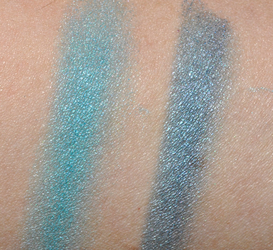
Givenchy’s Summer Collection is an island themed number featuring quite the variety in products, but in this post, I’m going to concentrate on Island Lagoon (No. 17) Le Prisme Mono ($29). It’s a multi-colored “quad” that features lighter aqua-blue, medium sky blue, grayish-black, and deep purple-blue. The powder portion is small enough where using the individual colors is near impossible, but the top two squares are primarily aqua-blue with sky blue, while the bottom two squares are primarily aqua-blue and deep purple-blue, so I kind of looked at it as two shades of eyeshadow in total.
The compact has a pretty blue coloring on the outside, and the compact itself is much slimmer and thinner than previous limited-edition eyeshadow quartets released by Givenchy in the past. It comes with a tiny sponge-tipped applicator that I wouldn’t bother using myself.
The eyeshadow looks incredibly pretty and artsy in the palette, but I’m not in love with the product itself. It’s just not as bright and vibrant as it could be. The first two squares yielded a frosted aqua-blue that’s semi-opaque–it’s noticeably on the sheerer side. The bottom two squares worked together to create a semi-sheer, muted navy blue with silver sheen. Over an eyeshadow base, they’ll be less visibly sheer, but the colors won’t pop. If you want to get them to really pop, try them over a more metallic base–go for a champagne shimmer shade to keep them the same, slightly muted shade or use a colored base (like gold or blue), you can brighten them up a bit. The eyeshadow itself is incredibly silky and buttery smooth–easy to apply and blend.

If you want to know more about how products are evaluated, read out Rating System FAQ! 🙂
- Product: 25/30
- Value: 8/10
- Ease of Use: 4/5
- Packaging: 4/5

Recommendation: I like it, but it’s not love–for me, it looks prettier than it actually is. I think if they made it as vibrant as it looks, I’d like it more! The eyeshadow has an excellent texture and feel but could use a little more pigmentation.
Availability: May 2010


Givenchy Island Lagoon Eyeshadow

Givenchy Island Lagoon Eyeshadow
I actually really like this. While I will totally rock a bright, electric lipstick, I haven’t quite gotten there with eyeshadow yet. Sheer brights are good for me- sort of like bright-eyeshadow training wheels, lol!
LOL!
I can totally get that 🙂 It’s not terribly sheer, which is good, but it’s not quite as vibrant as one would expect!
I squealed inside when I saw this, but the swatches were just okay. But the packaging and look of the eyeshadows are brilliant!!
Not exactly my favorite color. I dunno but I still can’t accept makeup eyeshadows.
But the packaging is so pretty! haha
That’s a shame, because the packaging is so, so droolworthy.
They look like pretty, soft blues. I like blues that pop, and blues that don’t. Nice review.
So do you think this would be better as just a single eyeshadow? Do you think I could run my brush over the entire thing and still get consistant color? Thank you for the reveiw! (=
You could, but I’d probably still use it as two or three 🙂 I think it’s really just two, but you could mix more of the dark into the blue to get shades in-between the two I showed here.
I would still swatch this in person and then make a decision. I would think that I could build the color to the intensity I want if it goes on somewhat sheer. I always appreciate your honesty!
I was wondering if these are supposed to be sheer? I know with some collections, a sheer wash of colour is the intended look.
I think sometimes we forget that eyeshadow comes in different degrees of opacity, just like lipstick and that is the intended look for the product. A shadow being very bright always throws us off b/c we expect it to be opaque. I love sheer bright shadows, when you can see the skin glowing underneath. That with a bright lip is gorgeous!
I looked around, but I couldn’t find any information on whether they’re supposed to be sheer or not! I tried to see if they were supposed to be sheer or not, but I couldn’t find anything either way.
I’m going to get this, the powder and the mascara. Will you be reviewing them too? 😉
I’ll be reviewing Island Tan soon, and hopefully the mascara to follow!
It’s a shame, I love the packaging but the product itself seems lackluster.
I don’t think the color would work for me but I have to say I love the design of the packaging and the eyeshadow. Absolutely gorgeous!
this looks gorgeous!!! i cant wait to check out the other things in this collection 🙂
I’ll never understand this more-than-one-color in a single place.. I think it’s too messy and not very practical for consistency purposes
I seriously would have preferred four colors. Its like the urban decay packaging this time was UGLY but at least the products are good (generally). This one is all pretty and stuff but its not what I would want, I would want four colors or at least a better product.
not gonna lie, I would totally buy it just for the cute packaging. Not really a fan of blue though.
Hi! And what is the shade of the lip gloss on the last photo? Looks very nice 🙂
Sun Cocoa!