Giorgio Armani Fatal (12) #4 Eyes to Kill Palette Review, Photos, Swatches

Giorgio Armani Fatal (12) Eyes to Kill Palette
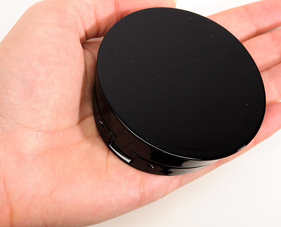
Giorgio Armani Fatal (12) Eyes to Kill Palette ($59.00 for 0.0.21 oz.) consists of four shades is part of the Shimmer palette series. The quad is supposed to contain “iridescent, eye-catching colors with electric shine and shimmer.” Something I’ve noticed with Giorgio Armani palette is that they always come together better on the lid and applied than they initially seem just swatched. The texture has something to do with that, I imagine, as they’re very soft and velvety–easy to blend and work well together. When I wore the palette together, the shades lasted well for eight hours but had slight fading that was noticeable after nine hours.
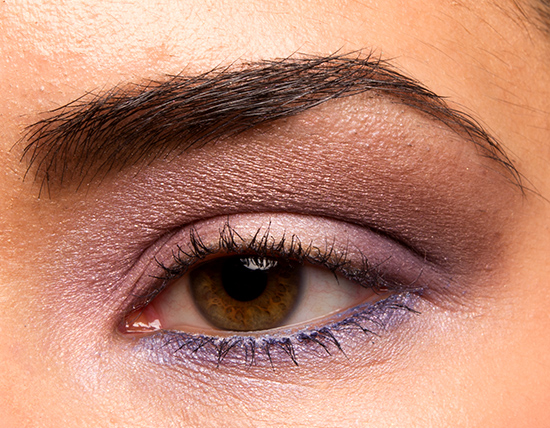
Fatal #1 is a cool-toned, plummy brown with a pearly finish. It had good color payoff, but it could have been a bit more pigmented for really true-to-pan intensity. theBalm Just This Once Jamie is a little lighter. Urban Decay Stray Dog is browner. MAC Universal Appeal is more plum. MAC Daylight is lighter. Chanel Raffinement #1 is darker, browner. See comparison swatches.
Fatal #2 is a pale, cool-toned pink-tinted white with a pearled finish. It was semi-sheer and slightly powdery. There is no shortage of similar shades to this. Shades like Tom Ford Enchanted #1, MAC Fresh & Mint #2, MAC Fresh Ice, Dior Garden Pastels #3 are all slightly cooler-toned, more lavender than pink. Then shades like NARS Douce France #1 (matte), MAC Stratus (darker), MAC Let’s Skate (cream), MAC Seedy Pearl, MAC Radial Pink (lighter), MAC Maribu (more frosted), and Dior Aurora #3 are all close. See comparison swatches.
Fatal #3 is a soft, medium-dark lavender purple with gold shimmer. It had good color payoff and applied smoothly to the lid. This almost appears warm-toned, which isn’t common to see in a lavender. Urban Decay Tainted is pinker. Urban Decay Grifter is more frosted. Giorgio Armani #1 Spring 2013 #1 is lighter, cooler-toned. Benefit Fancy Pansy is cooler-toned. See comparison swatches.
Fatal #4 is a dark, cool-toned purple with a nearly matte finish. It had good pigmentation but was a bit powdery. The shade blended out easily, though, as a result. theBalm Lavish Latoya is more frosted, less purple. Urban Decay Gravity is more shimmery. NARS High Society #3 isn’t as cool-toned. MAC Dynamic Duo #4 #12 is darker, less purple. MAC Drawn to Drama is cooler-toned. MAC Ron Ron Run is slightly darker. L’Oreal Perpetual Purple is more shimmery. Giorgio Armani Green Jacquard #4 isn’t as cool-toned. See comparison swatches here.
Fatal (12)
PPermanent. $59.00.
Fatal #1
PiPPermanent in Palette.
Fatal #2
PiPPermanent in Palette.
Fatal #3
PiPPermanent in Palette.
Fatal #4
PiPPermanent in Palette.
Giorgio Armani Fatal (12) Eyes to Kill Palette

Giorgio Armani Fatal (12) Eyes to Kill Palette

Giorgio Armani Fatal (12) Eyes to Kill Palette

Giorgio Armani Fatal (12) Eyes to Kill Palette
Giorgio Armani Fatal (12) Eyes to Kill Palette

Giorgio Armani Fatal (12) Eyes to Kill Palette

Giorgio Armani Fatal (12) #1 Eyes to Kill Palette

Giorgio Armani Fatal (12) #1 Eyes to Kill Palette

Giorgio Armani Fatal (12) #2 Eyes to Kill Palette

Giorgio Armani Fatal (12) #2 Eyes to Kill Palette

Giorgio Armani Fatal (12) #3 Eyes to Kill Palette

Giorgio Armani Fatal (12) #3 Eyes to Kill Palette

Giorgio Armani Fatal (12) #4 Eyes to Kill Palette

Giorgio Armani Fatal (12) #4 Eyes to Kill Palette
Giorgio Armani Fatal (12) Eyes to Kill Palette


Ooh this is pretty! I thought Armani only made summer eye palettes but I guess I was wrong! Do you think these colors would look good with the Armani dark velvet lip maestro or would that be too much?
I don’t think I have that shade!
Can I just say, I love the separate glossover for each shade in a palette. It makes the reviews even better!
Yay!
Shade 3 to me looks very much like Laura mercier African violet, would you agree?
I don’t think I have that shade!
My biggest problem with the Armani ETK palettes.. I can never seem to decide which one I want the most and they are expensive and the neutral palettes which I love best are quite similar. I’ve got a couple of additional palettes on my wishlist and they have been siting there for some time. Boudoir,, Terra Sienna, Medusa, Mystery..I want them all.
I do agree and find the texture to the shadows to be quite unique. They do not feel like any other shadow in my collection. What seems to be a bit of flour like feel when pulling the colour up from the compact, does not translate to that feel during application. It’s like the shadow melts on. .. emulsifies.. tough to describe, but different and maybe some will not like that softness. I wasn’t sure I did until actually wearing and seeing the quality for myself.
I love these shades! Always such a gorgeous look you create and I live the visual dupes. 🙂
Love the quality of these palettes.I own the Mediterranean -aqua, green and teals. And a purple trio #7 ETK palette. Both are great and I need to wear them more. Not feeling these colors though to cool toned for me. But pretty on you Christine.
Ugh my gosh this is SO gorgeous. I need it! I have been eyeing this one and Mystery since they came out. Mirage too but I ended up getting the Summer 2013 palette and decided they were similar enough that I didn’t need both. I love a good purple palette though and this one is just beautiful! Love the look you created too! 😀
I’m not that interested in the quad. However, I wanted to say I love the look you created.
Hey Christine, how would you compare this palette with the Lancome Color Design 5 Shadow & Liner Palette in Orchid Splendor? They look very similar, but I don’t know which one I would buy.
I don’t think I have that, sorry!
Oh my gosh. Oh wow this is a beautiful quad. I need to resist the urge to buy it, however, since I think it’s double the price here.