ColourPop Metamorphosis Super Shock Shadow Quad Review, Photos, Swatches
ColourPop Metamorphosis Super Shock Shadow Set
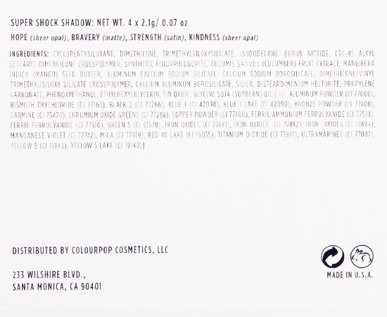
ColourPop Metamorphosis Super Shock Shadow Set ($20.00 for 0.28 oz.) includes four new, limited edition shades of cream eyeshadow. Two of the shades are supposed to be sheer for layering over other products, though I found they were rather semi-opaque, so I found that they tended to consume whatever they were layered over with only slight undertone or brightening/softening of the base coming through. The other two shades are very pigmented, long-wearing, and felt like they had more slip than other satin/matte finishes in the ColourPop range. The shades worked well together, and they wear fairly easy to apply and blend together.
Also worth noting that despite it being incredibly hot during the entire time my order was in transit, everything arrived in tip-top shape (I was afraid there might be melting!).
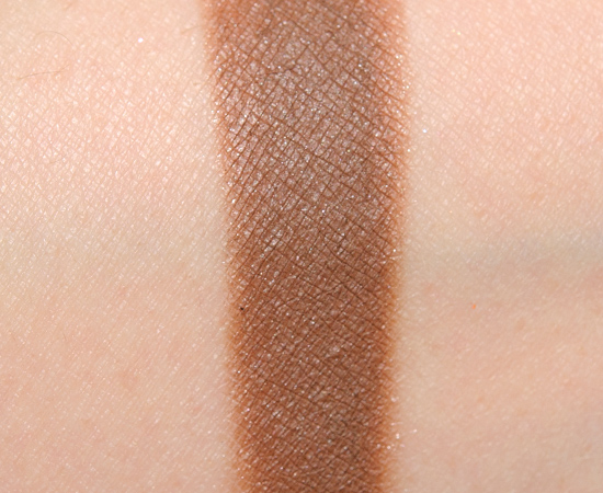
Bravery is described as a “true medium brown in a matte finish.” It’s a medium-dark brown with warm, reddish undertones and a satin finish. I saw very faint shimmer in this one, even though it is listed as a matte. The texture was lightly creamy and easily blended to the skin, while it had good pigmentation and lasted for ten hours without fading or creasing. Sephora + Pantone Universe Russet (LE, ) is less pigmented, warmer. Viseart Taupe (P, ) is lighter. Too Faced Truffled (P, $16.00) is warmer. ColourPop Farah (P, $5.00) is cooler. ColourPop Bandit (P, $5.00) is lighter, brighter, warmer. Make Up For Ever S632 Hazelnut (P, $21.00) is lighter. Urban Decay Twice Baked (P, $18.00) is more shimmery. MAC Texture (P, $16.00) is warmer. NARS Galapagos (P, $24.00) is darker. See comparison swatches / compare dupes side-by-side.
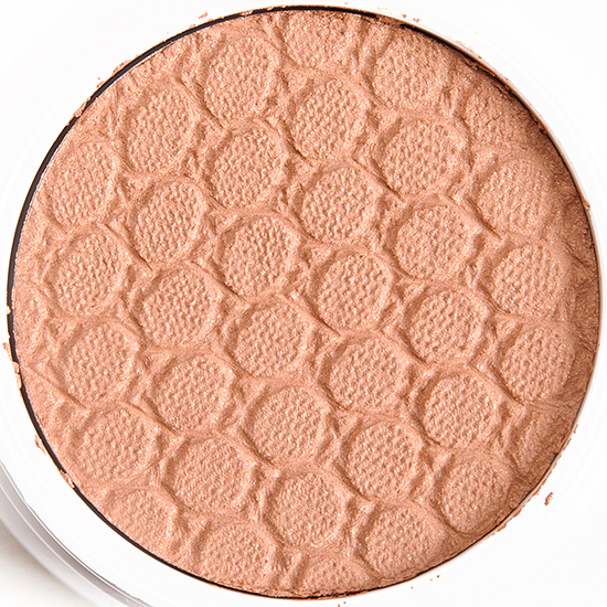
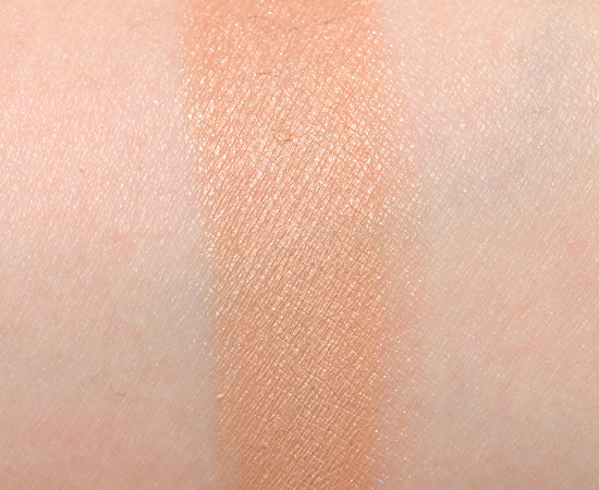
Strength is described as a “soft peachy caramel in a satin finish.” It’s a muted, light-medium peachy brown with warm undertones and a very fine, gold shimmer-sheen finish. It had good pigmentation with a lightly creamy consistency that adhered well to the skin and blended out easily. On me, it lasted a full ten hours without creasing or fading. Make Up For Ever S642 Sahara (P, $21.00) is darker, cooler. Makeup Geek Purely Naked (P, $5.99) is darker. Chanel Tisse Vendome #1 (P, ) is more shimmery, darker. Milani Bella Cappuccino (03) (P, $4.49) is darker. ColourPop Desert (P, $5.00) is darker. ColourPop Smash (P, $5.00) is darker, cooler. ColourPop Truth (P, $5.00) is more shimmery, lighter. See comparison swatches / compare dupes side-by-side.
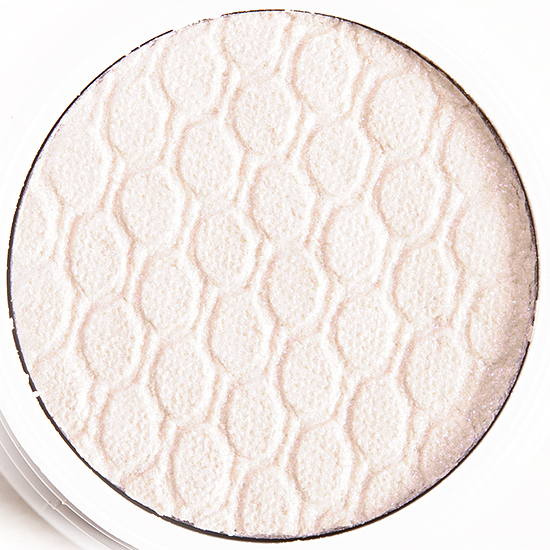
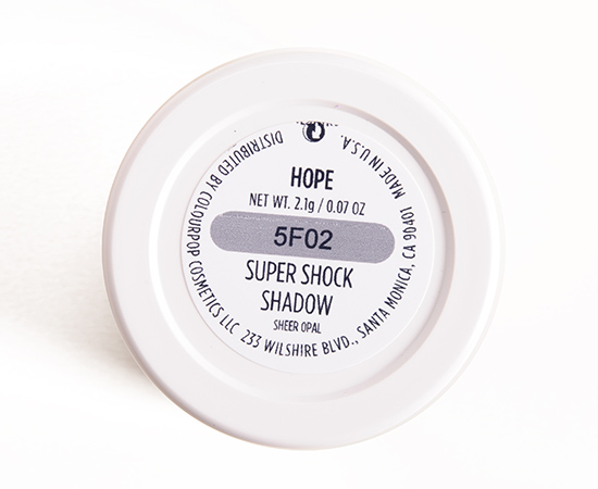
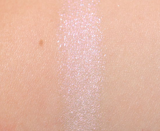
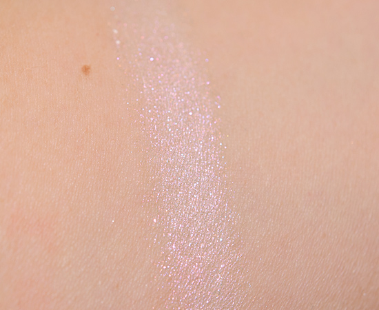
Hope is described as a “radiant opal with pink, violet, blue and silver duochrome in a sheer opal finish.” It’s a pinky-white with lighter white and iridescent pink sparkle. It had a very subtle duochrome to it, and it really only becomes stronger over a very dark base color (like black) and appears more iridescent than duochrome on its own. The more sparkly texture can emphasize the lid’s natural texture. It had semi-opaque coverage (it wasn’t sheer at all!) and lasted for ten hours without fading, but there was minor fall out over time. It is similar to Monster Super Shock Cheek, just sparkly and made for the eyes. Too Faced Strawberry Ice (LE, $16.00) is darker. Tom Ford Beauty Crushed Indigo (Left) (LE, ) is lighter, brighter. Milani Bella Rose (29) (P, $4.49) is darker. Makeup Geek Whimsical (P, $9.99) is more shimmery, lighter. Maybelline Petunia Punk (120) (LE, $6.99) is less shimmery. Urban Decay Roadstripe (LE, $18.00) is lighter, brighter, cooler. Make Up For Ever I872 Pearly Pink (P, $21.00) is less shimmery. MAC Ready to Party (P, $20.00) is more shimmery. L’Oreal Strawberry Blonde (LE, $7.99) is less shimmery. Make Up For Ever D868 Crystalline Pink (P, $21.00) is more shimmery. See comparison swatches / compare dupes side-by-side.
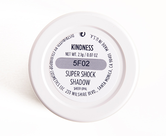
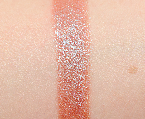
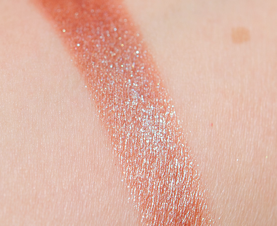
Kindness is described as a “warm red brown undertone with a gold, green, and blue duochrome in a sheer opal finish.” It’s a medium-dark, reddish brown with warm undertones and a blue-to-green duochrome finish with a strong, metallic sheen. It had semi-opaque pigmentation (again, not really sheer) that went on evenly and played well on its own or patted over others. I didn’t have any fading or creasing over a ten-hour period.Sephora + Pantone Universe Castor Gray (LE, ) is darker, cooler. Urban Decay Solstice (P, $20.00) is more shimmery, darker. MAC Boom Boom Room (LE, $21.00) is more shimmery, darker. Urban Decay Lounge (P, $18.00) is darker, cooler. Makeup Geek Insomnia (P, $6.99) is more shimmery, darker, cooler. MAC Fireside (LE, $21.00) is darker. MAC I’ve Got a Crush on You (LE, $32.50) is darker, cooler. See comparison swatches / compare dupes side-by-side.
Metamorphosis
LELimited Edition. $18.00.
Bravery
LELimited Edition. $6.00.
Strength
LELimited Edition. $6.00.
Hope
LELimited Edition. $6.00.
Kindness
LELimited Edition. $6.00.
ColourPop Metamorphosis Super Shock Shadow Set
ColourPop Metamorphosis Super Shock Shadow Set
ColourPop Metamorphosis Super Shock Shadow Set
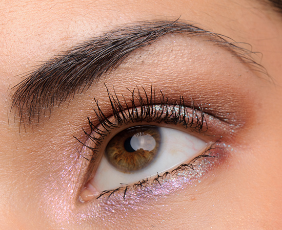
Hope (inner tear duct), Strength (inner lid), Kindness (middle of lid),
Bravery (outer lid and crease), Truth (brow bone)
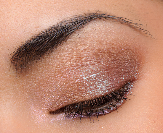
Hope (inner tear duct), Strength (inner lid), Kindness (middle of lid),
Bravery (outer lid and crease), Truth (brow bone)
ColourPop Bravery Super Shock Shadow
ColourPop Bravery Super Shock Shadow
ColourPop Bravery Super Shock Shadow
ColourPop Bravery Super Shock Shadow
ColourPop Strength Super Shock Shadow
ColourPop Strength Super Shock Shadow
ColourPop Strength Super Shock Shadow
ColourPop Strength Super Shock Shadow
ColourPop Hope Super Shock Shadow
ColourPop Hope Super Shock Shadow
ColourPop Hope Super Shock Shadow
ColourPop Hope Super Shock Shadow
ColourPop Hope Super Shock Shadow
ColourPop Kindness Super Shock Shadow
ColourPop Kindness Super Shock Shadow
ColourPop Kindness Super Shock Shadow
ColourPop Kindness Super Shock Shadow
ColourPop Kindness Super Shock Shadow










I love the names they picked for these 🙂 I think I could do with a little Kindness 😉
We all could!
I might have to pick this up before it sells out! I have had my eye on UD Solstice but wasn’t too keen on the fallout – looks like Kindness may be a decent dupe for it!
It is very similar, just a less intense option – and definitely won’t have the fall out of Solstice!
Very nice. Dani did a good job with this quad.
It is a nice set of shades!
Hi again! I was really impressed as well! After seeing everything Dani had put into it and watching others she linked, I was sold! What a good message, too! The only rant I could make is that the sales aren’t going to actually proceed any women needing it… Which would have made this even better, but I still caved! 🙂
Hello there Miss Lady 😉 I agree. The message is nice, but a donation would have been awesome too. Either way, it’s a must have. We have to remember that Colour Pop is still a baby and I think that these items are just a tip of the iceberg of what is on the way!
Hello, MissJae! 😉 Great point! The massive hype kept me away initially for a long time.. All good reviews? Seriously? But then I started watching as Christine here kept posting more and, being I try to avoid YouTube & have never had an Instagram to be involved in as little social media as possible.. Christine’s posts & those who commented when I gained interest & had so many questions. It was really soothing and became real. So what really made me first respect them was when I saw the blushes & highlights.. I was happy because this hyped up company had something for everyone, every shade of the rainbow! Being a WoC, I’m sure you relate to feeling like not enough companies do that! I’m without color, lol, but this is something so important to me! We aren’t all shades of bisque with one undertone. The darkest skin is not tan or deep. There are nuances to every skin tone! And ColourPop has something to bring that out! I applaude that fervently. I hope their impact will be positively affecting the entire industry and change is around the corner! May they stay true to who they are and remain fabulous in the process! Btw- the quad is LOVELY! 🙂 XOXO & AMEN!
Agreed, Lotus!!!
I wish Strength had been something different, because they have enough light brown/caramel crease shades in the line and almost every quad seems to have one. It could have been a black or charcoal or navy or eggplant or purpley-gray. But I’m definitely getting it for those duochromes, and I won’t *mind* having the two browns.
That’s true! They have a lot of browns – these are nice, but I initially worried they would be very similar to existing ones.
Dani and ColourPop worked quite a while to make these different… I had my qualms too.. But they are different! Multi tonal and the mid tone is more peachy so that’s fab as a satin on pale girls, Ginny! 🙂
I’ll be passing on this. The colours don’t excite me at all.
Bummer!
Yay! You reviewed it and it went well! Mine should be coming in today! I’m so excited! 😀
Awesome! I didn’t think you liked their eyeshadows, so I’m surprised to see you ordered this! 🙂
Well so was I! I researched it in depth when I found out.. Realized Kindness isn’t the same MAC club everyone does, but has a sweeter base and will adhere as a perfect illusion to alter anything or add a smudge of my eye cool to the pinnacle, which I enjoy greatly! He names alone are empowering, I have no neutrals from ColourPop and the peachy satin one is a color I love, so I was jazzed, and then a deep chocolate? And a mini mobster with shimmer like Fluorescent from UD? I think I bought it the day it became available! Now seeing your reviews, I’m stoked! I was in a bad way when I decided to up my mood and play with the other colors I received and I was dismally depressed by the warmth in the purples.. But they can be made cool.. And Beauty Call was still amazing.. I like touching them. Heheh.. 😉 And then I saw this.. Perfect for green/blue eyes! Encouraging, and hey, I guess I’ll add Jet, Feather, and Swan to give me options as well as free shipping! Butterflies and opalescent ethereal anything gets me & the cool colors of UD smoked got me, so I decided YAY for ColourPop! Luckily, right about then, MAC LE disko made me happier that I did! So what some colors are wrong? These things feel like nothing else and I’m like a child, entranced by texture and color.. I want to play more! 😀
Here’s hoping you like these a lot! 🙂
I do, thank you! Fantastic! 😀
Kindness is gorgeous. Not sure if I like Hope
Hope is great for brightening, but it is a little sparkly so it could apply a little better. Not bad, but there’s some room for improvement!
Oh! In the descriptions way above, I think you may have intended to put “it’s like Monster super shock cheek but with shimmers,” for Hope, not Kindness, where it is.. Just an FYI as you do so much! I thought that too! But what’s a little monster with some shimmer? Bonus. Haha! 😀
Fixed, thank you! 🙂
Aww, you’re welcome, Christine! 🙂
Christine, you have such beautiful eyes!
kindness is my fav so far! it’s such an exciting shade. It looks way better when in the light 🙂
Thanks, Lea!
I love bravery and kindness both in these shadows, and as qualities I see in good peeps 😀
😀
The only color that looks interesting to me is Hope, and I already have Monster highlighter, which is so much more opalescent and duo chrome. I’m just going to dab Monster on as a brow highlighter or pop it on top of shadows and try to stay away from the immediate eye area
There ya go! 😀
So happy this did good!I just ordered it last night with Sour and some other stuff. I just had a feeling. Im addicted to ColourPop. I saw some other stuff that caught my eye and when I get back to the house to check that I don’t own them,I may order sgain!lol!i really find it on par with mufe in all honesty. I requested a collab with you again Christine,lol!:)
LOL! They are really lovely to work with. There are only a few duds, but by and large, they are nice!
I said No, NO MORE and then placed an order for this one!!!! I have no control!!
LOL!
Wish I could just get Kindness. The others are nice but I already have a bunch of shades similar to Strength and Bravery.. and while I like the idea of Hope.. it’s a nice idea but I think I’d like it better if it really was as sheer as if said it would be
Yeah — I think these layer, but they would be even better for layering if they were genuinely sheer.
Now I’m even more excited. Mine arrive by mail tomorrow .
Yay!
Darnit Colourpop, stop! I’ve already got enough of your eyeshadows. j/k I’ll be getting these as well.
Haha!
Georgeous! I think Hope would be beautiful layered over other shades.
It is!
Love the quality of the Colour Pop shadows even though these are not my colours. Another great eye look Christine.
Thank you as always, Genevieve!
I didn’t realize these were cream shadows. I thought they were embossed powders. Hmmm
Yep! All of ColourPop’s eyeshadows and blushes are cream.
Thanks, Christine. I didn’t realize that at all. No one other than you has mentioned that they were creams in their reviews, and I’ve never seen an embossed cream before. Now I must get some! tyvvm
What are you wearing on the lower lash line? Is that more Hope just showing the duochrome?
Just Hope and Kindness, though I had a slight mascara smudge that I had to clean up, so that might be why in the middle it looks a little darker.
I might make my first colourpop order to get these duochromes.
Nice 😀
Colourpop is just taking all my money
Christine, Your swatches of hope seem more opaque than I expected … How many passes did it take to build up the color? ☺️
Just one.
Whoa. That’s impressive!
OMG. I am so in love with THIS quad! It has such a soft and somewhat ethereal look for summertime, or anytime really, because it has versatility. Yep, I’m getting this in July. And yet another great eye look that you put together, Christine. I’ll be borrowing this look and tailoring it to my lid and eye shape. Gotta tell you, I get a ton of inspiration from the looks you put together with eyeshadow eyeshadows and liners! As well as the motivation to step outside of mundane and go for fun looks instead.
You’re so sweet, Nancy! Thank you <3
I really love the names of these shadows. Strength looks like the most awesome blending shade.
They are very positive names!
OMG Christine they’re all soooo gorgeous. Thanks for the swatches and look!!
No prob, Dee!
I just purchased my first color pop order. I bought this, the Kathleen lights combo, and 2 lippies. I have heard the shadows have an almost “wet” texture. What’s the best way to apply the shadows?
I like using a flat synthetic brush like MAC’s 242!
I now have almost 30 of their eyeshadows plus a dozen of their other items and I seriously need to stop but they keep putting out such gorgeous products and you make them look so good I just can’t!
Nice! 😀
After swearing I wasn’t going to buy this quad because of the brown and tan shadows being so redundant, I finally caved and placed the order last night. So now I’m super excited to have the two “transformer” shades on their way to me (I may gift the other two to my sister or a girlfriend). But honestly, this is probably the last combo set I’ll be buying from Colourpop for quite awhile, precisely because of how they’re putting so many shades in them that are almost dupes for each other. Having said that, though…. between this quad, Jet, and a few of the super-bright pressed pigments, it may have been the oddest mix in a shopping cart ever LOL! But what can I say? I’ve had a seriously rotten week, and looking at all the pretty colors on my screen instantly cheered me up! At least it’s relatively inexpensive makeup/retail therapy… that’s something, right?
LOL! Here’s hoping you love the set 🙂