Natasha Denona Metropolis - Reorganized!


About this Story
An attempt to rearrange the Metropolis palette to make it make more sense to my eyes!
Products Used
 Natasha Denona Troop (250CP)
 Cream-Powder Eye Shadow
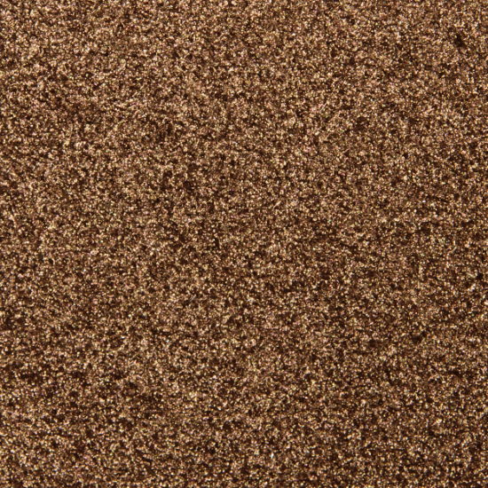
 Natasha Denona Noble (264M)
 Metallic Eye Shadow
 Natasha Denona Orium (251DC)
 Duo-Chrome Eyeshadow
 Natasha Denona Shield (252M)
 Metallic Eye Shadow
 Natasha Denona Lethal (258CP)
 Cream-Powder Eye Shadow
 Natasha Denona Imperia (265M)
 Metallic Eye Shadow
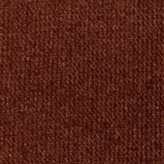
 Natasha Denona Rhizome (273CM)
 Creamy Matte Eye Shadow
 Natasha Denona Rope (256CM)
 Creamy Matte Eye Shadow
 Natasha Denona Fuse (257M)
 Metallic Eye Shadow
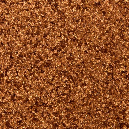
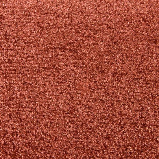
 Natasha Denona Rust (249M)
 Metallic Eye Shadow
 Natasha Denona Blaze (263K)
 Crystal Eye Shadow
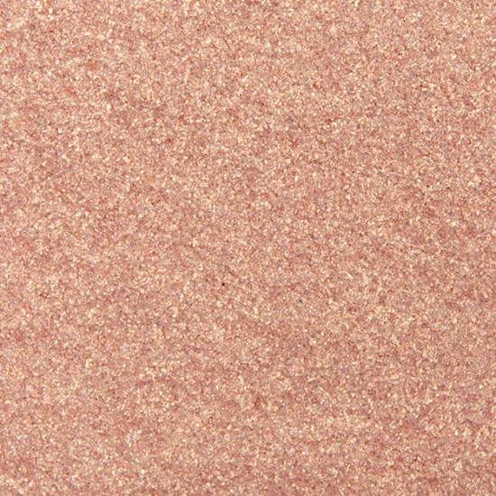
 Natasha Denona Penny (259M)
 Metallic Eye Shadow
 Natasha Denona Queen (262M)
 Metallic Eye Shadow
 Natasha Denona Mace (255M)
 Metallic Eye Shadow
 Natasha Denona Pure (269CP)
 Cream-Powder Eye Shadow
 Natasha Denona Azoic (270CP)
 Cream-Powder Eye Shadow
 Natasha Denona Helena (275K)
 Crystal Eye Shadow
 Natasha Denona Chrism (260CP)
 Cream-Powder Eye Shadow
 Natasha Denona Stain (254CP)
 Cream-Powder Eye Shadow
 Natasha Denona Ripe (253CM)
 Creamy Matte Eye Shadow
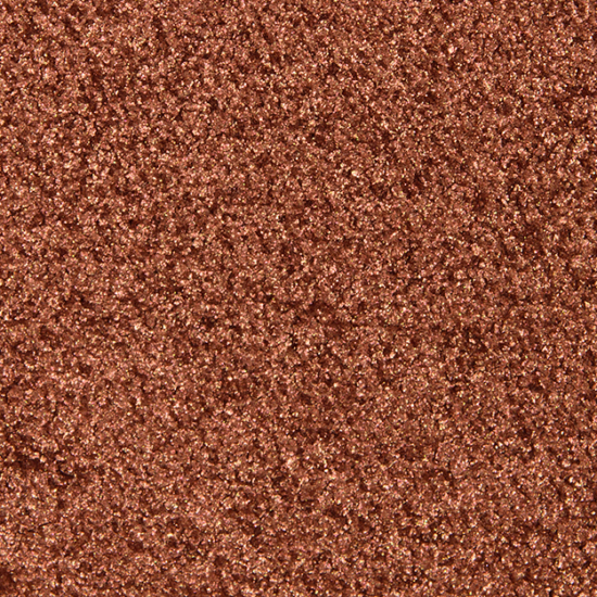
 Natasha Denona Crest (267M)
 Metallic Eye Shadow
 Natasha Denona Claret (274M)
 Metallic Eye Shadow
 Natasha Denona Antique (276CP)
 Cream-Powder Eye Shadow
 Natasha Denona Jubilee (271M)
 Metallic Eye Shadow
 Natasha Denona Royal (266CP)
 Cream-Powder Eye Shadow
 Natasha Denona Aqueous (261M)
 Metallic Eye Shadow
 Natasha Denona Enigma (268CP)
 Cream-Powder Eye Shadow
 Natasha Denona Symbol (272CP)
 Cream-Powder Eye Shadow
This is an incredibly helpful innovation Christine!
So useful to see the the similar shades side by side – it answers a
big question I have for any big palette, how much overlap is there?
Thanks so much for coming up with this idea, and sharing it with us. Hope to see it in future big palette reviews :).
Please take a look at the Dupe List for shades you’re interested in, read the review, or compare this palette alongside any palette you’re curious about!
You weren’t kidding about the repeats in the palette! So much gold!! However, I am particularly interested in those cream-matte shades, and hopes she puts out smaller, more curated options featuring shadows with that type of formula in the future.
This is so incredibly useful!! I absolutely HATE palettes that are arranged in a disorganized fashion in what I feel is a deliberate attempt to conceal near-duplicate shades and a limited color story! I actually can get a good sense of what shades are in the palette when they’re rearranged like this.
This is awesome! I’ve been thinking about how to reorganize this palette—it’s great that she makes them reorganize-able. I was also pondering including my favorite shades from the Sunrise to make the ultimate Natasha Midi. For me, that would be more plums/peaches less oranges/reds. 🙂