10 Natasha Denona Mini Eyeshadow Palettes I'd Like to See
As I was testing the newest Natasha Denona Mini Eyeshadow Palette (in Nude) this week, I was struck by how much I would love to see the mini format in a slew of other color combinations. Those of us who tend to like variety or flit between palettes likely don’t need full-sized pans of eyeshadow, so the minis are a great way to enjoy a variety of color, finish, and so on at a much lower cost (compared to high-end brands single or palette price points, like ND’s $129 larger palettes!). I particularly liked the mix of finishes in the Nude palette with two mattes and three shimmers, as I felt like it gave me a lot of room to play. Hope you enjoy and find some inspiration (you can always recreate the color combo with existing shades you own!) from my 10 concept palettes below…
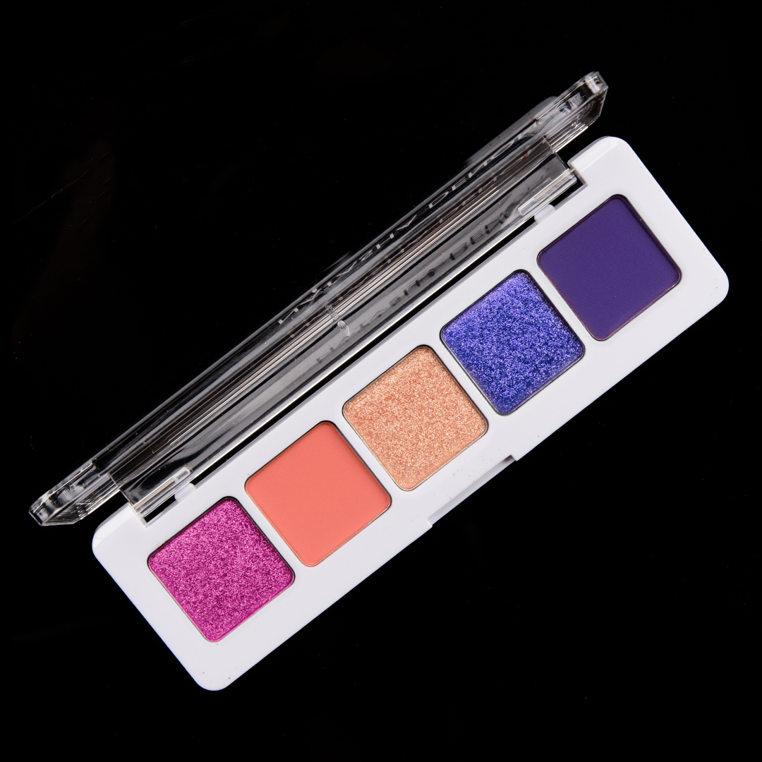
Galaxy Eyeshadow Palette
Galaxy
Deliberately designed to be less cohesive than several of the others you’ll find described below, this is all about the kind colors and depths seen if you, quite literally, googled “galaxy” — pops of fuchsia and deep orange, violet, and more purple-leaning blue. I think the five shades work together but could see this complemented easily by shades likely already in one’s stash.
Colors I’d include: mid-tone, shimmery raspberry with subtle, cool undertones and a bright, metallic sheen; vivid, mid-tone orange tempered by slightly redder undertones and a matte finish; medium, golden peach with stronger, orange undertones and a metallic sheen; deep violet with flecks of blue, lavender, and pink paired with an intense, metallic finish; deeper, slightly subdued, cool purple with a matte finish.
For those who might own several past releases from the brand, I’ve also pulled the closest shades released (some of which can be purchased individually, many of which are exclusive to a palette) that might “dupe the vibe” if any existed (so not all shades are “duped”), which you can view here.
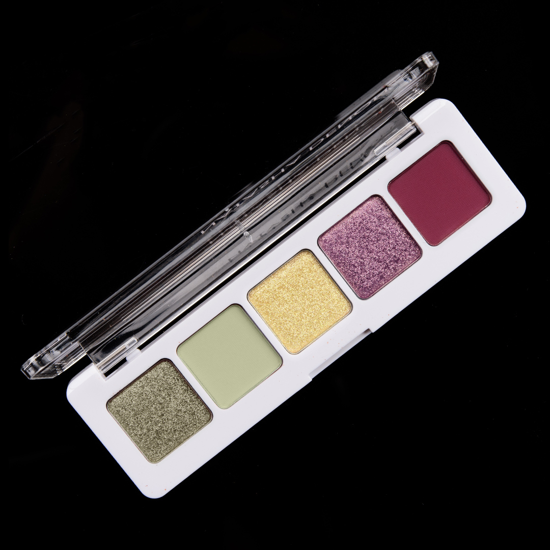
Signs of Spring Eyeshadow Palette
Signs of Spring
I like pastels in spring but often find they’re lacking in quality, and it seems like, in general, that they’re harder to produce in ways that translate well across a lot of skin tones. As a result, when I think about spring, I think about slightly richer but still more dulled down shades.
Colors I’d include: light-medium, golden green with a sparkling, metallic finish and subtle gold-to-green shift; pale, muted light green with muted yellow undertones and a matte finish; pale yellow with balanced undertones and a pearl sheen (not enough to be orange and yellow enough that it isn’t gold); medium-dark mauve with gold-to-pink shift and a shiny, metallic finish; and deep reddened plum with a matte finish that leans slightly warm.
For those who might own several past releases from the brand, I’ve also pulled the closest shades released (some of which can be purchased individually, many of which are exclusive to a palette) that might “dupe the vibe” if any existed (so not all shades are “duped”), which you can view here.
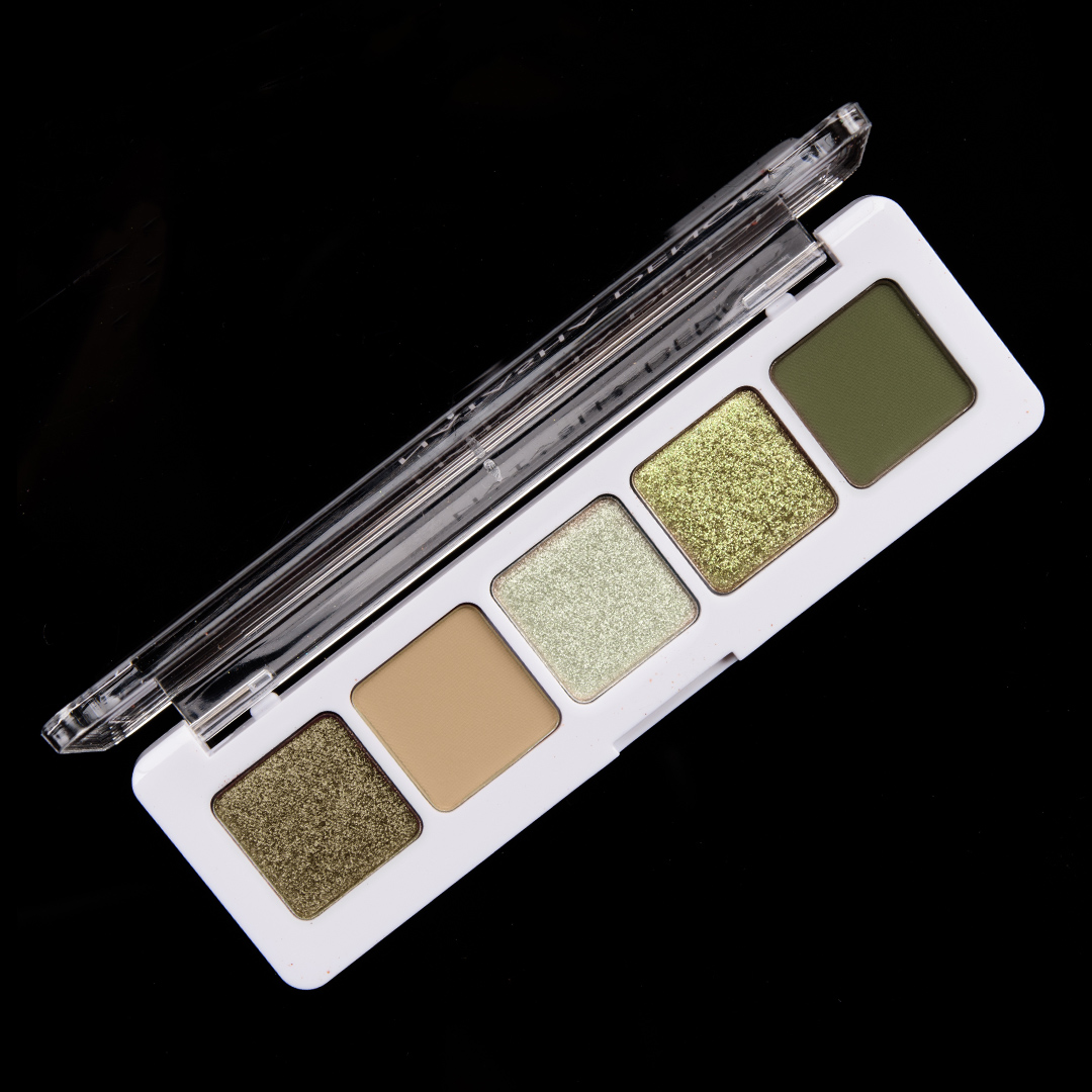
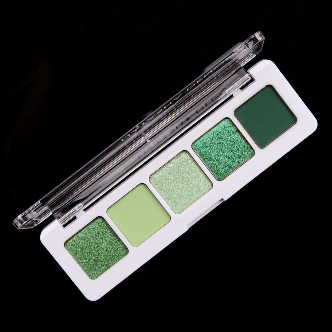
Camo Eyeshadow Palette
Camo
Who would I be if I didn’t put together some murky greens? What I like about the five-pan format that Natasha Denona has going is that you can start to play with undertones a bit while still making it more cohesive, so the two shades on the left are slightly warmer, whereas the three shades on the right run slightly cooler.
Colors I’d include: smoky, medium-dark olive green with a soft metallic finish; light-medium dirty beige with a matte finish; pale, tarnished pewter that leans ever-so-slightly yellow with a bright, metallic finish; mid-tone, sparkling yellow-green with slightly olive undertones; and a deep, army green with neutral-to-warm undertones and a matte finish.
For those who might own several past releases from the brand, I’ve also pulled the closest shades released (some of which can be purchased individually, many of which are exclusive to a palette) that might “dupe the vibe” if any existed (so not all shades are “duped”), which you can view here.
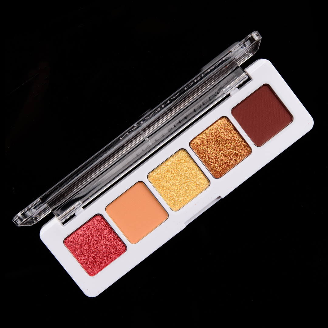
Scorched Eyeshadow Palette
Scorched
My vision for this palette is all those warm-toned shades we see over and over but on steroids–they’re amped up, they’re vivid and vibrant and so rich that they appear almost dense (in my mind). More Natasha Denona Sunset on Fire than just a sunset.
Colors I’d include: rich, molten red with warmer, more orange undertones and a soft, metallic sheen; pop of tangerine orange with strong, yellow undertones and a matte finish; intense yellow gold with true yellow undertones and a bright, shiny metallic finish; deep, orange-copper with a sparkling, metallic finish; rich, red-brown with a matte finish.
For those who might own several past releases from the brand, I’ve also pulled the closest shades released (some of which can be purchased individually, many of which are exclusive to a palette) that might “dupe the vibe” if any existed (so not all shades are “duped”), which you can view here.
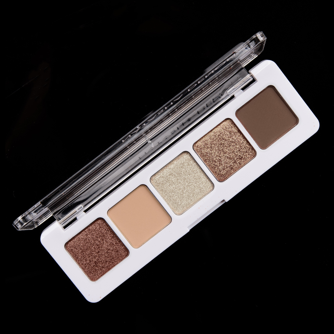
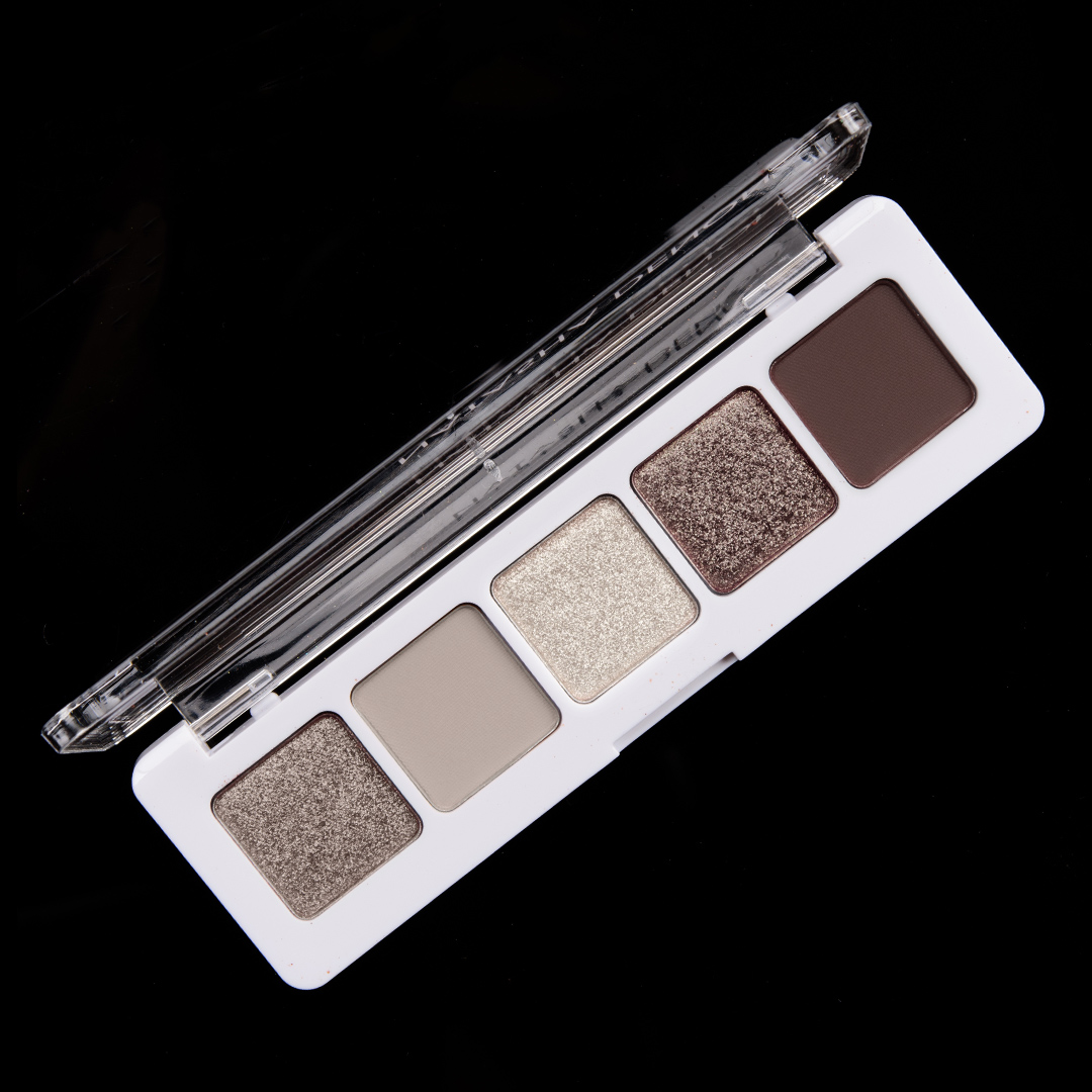
Warm Smoke Eyeshadow Palette
Warm Smoke
Hey, I know that not everyone can or wants to wear color 24/7, and I can enjoy some sumptuous neutrals as much as the next person! I even think there’s still room for warm neutral releases… just ones that aren’t as red/orange based. (And of course, we so need a few dozen cool-toned neutral launches but anyway…) This is my take on slightly warmer neutrals that are on the more muted side, which you might also interpret as “dirty.”
Colors I’d include: deep, plummy-taupe with subtle, warmer undertones and a satin sheen; medium, almost grayish beige with neutral-to-warm undertones and a matte finish (I envision it looking slightly darker when applied); light, dirty beige with a bright, sparkling finish; medium-dark taupe-brown with subtle, warm undertones and a metallic sheen; darker (but muted that there’s a softness to it when diffused), taupe-brown with neutral-to-cool undertones and a matte finish.
For those who might own several past releases from the brand, I’ve also pulled the closest shades released (some of which can be purchased individually, many of which are exclusive to a palette) that might “dupe the vibe” if any existed (so not all shades are “duped”), which you can view here.
Emerald Eyeshadow Palette
Emerald
Emerald green is really underrated. We often see chartreuse, more lemon-lime greens, or really green-teal kind of shades, but it’s harder to find more balanced green-hues, especially from major brands. It’s one of my favorite colors because it can lean warmer or cooler depending on what it is paired with.
Colors I’d include: rich, medium green with slight, warmer undertones with a soft, metallic sheen; light-medium green with very subtle yellow undertones and a matte finish (think deeper than pastel green but not mid-tone); light mint green with slightly warm-leaning undertones and a pearl finish; rich emerald green with a sparkling, metallic finish; deep, slightly muted forest green with cool undertones and a matte finish.
For those who might own several past releases from the brand, I’ve also pulled the closest shades released (some of which can be purchased individually, many of which are exclusive to a palette) that might “dupe the vibe” if any existed (so not all shades are “duped”), which you can view here.
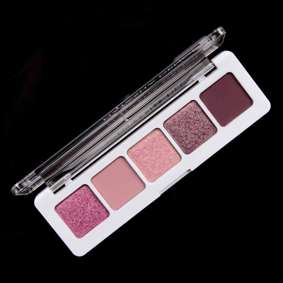
Sugar Sugar Eyeshadow Palette
Sugar Sugar
For the most part, I start playing with the colors and tones first, and then a name might come to me (though sometimes a theme, like Galaxy, inspires the colors); this was one of those where I wanted romantic pinks and plums that weren’t too pale but weren’t too red/plum either. It is kind of funny but when I “design” these mockups, I tend to think about what’s actually doable in the industry so I’ll find ways around more troublesome types of colors if I can!
Colors I’d include: deeper pink with subtle, warm undertones (the type that could almost look cool-toned based on someone’s undertones and what it was next to) and a pearly sheen; mid-tone, dusty pink (much more pink than mauve) with a matte finish; light-medium pink with warmer, rosier undertones–more warm brown than gold/orange–and peach and gold shimmer with a metallic sheen; smoky, plummy mauve with flecks of gold and violet sparkle; and deepened plum with subtle, warm undertones and a matte finish.
For those who might own several past releases from the brand, I’ve also pulled the closest shades released (some of which can be purchased individually, many of which are exclusive to a palette) that might “dupe the vibe” if any existed (so not all shades are “duped”), which you can view here.
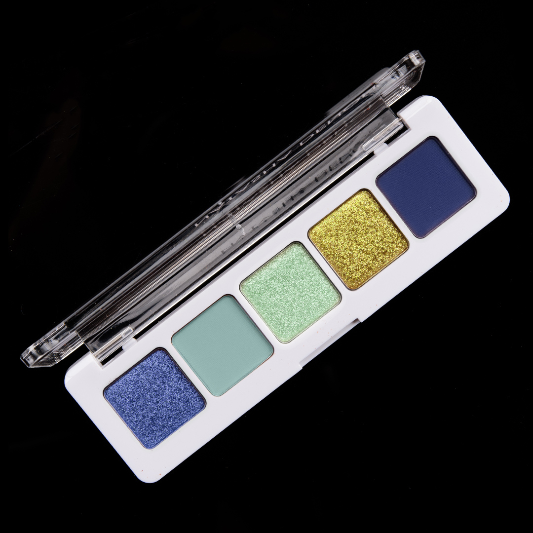
Starry Night Eyeshadow Palette
Starry Night
One of the color combos I’ve come to love is a mix of gold and blue, which I think doesn’t always sound like it’ll work, but it can end up quite beautiful. A lot of the ones I’ve played with have included copper as well, but I thought I’d try playing with mint green as companions with the cooler, greenish-gold shade as the “pop” of color.
Colors I’d include: smoky, cornflower blue that leans almost violet with a peary sheen; mid-tone aqua with subtle, cool undertones and a matte finish; light-medium, springy green with subtle, warm undertones and a brighter, metallic sheen; rich, greenish-gold with a sparkling, metallic finish; deep, vivid blue (I don’t want it to be a blackened blue!) with strong, cool (almost purple) undertones and a matte finish.
For those who might own several past releases from the brand, I’ve also pulled the closest shades released (some of which can be purchased individually, many of which are exclusive to a palette) that might “dupe the vibe” if any existed (so not all shades are “duped”), which you can view here.
Taupe Enough Eyeshadow Palette
Taupe Enough
Taupe, how I adore thee, and yet there aren’t nearly enough of them out there, especially grayer, cooler, more neutral ones. We tend to see plummy-taupes (almost like a mix of mauve and brown) or golden taupes (not quite brown, not quite true taupe).
Colors I’d include: medium-dark platinum with a bright, shiny finish; light-medium grayish-taupe with neutral undertones (expect it to go on a bit deeper than it appears in the pan); light-medium, cool beige with flecks of fine silver and gold micro-shimmer; deep, smoldering taupe with subtle, cooler undertones and flecks of subtle sparkle over a metallic finish; deep-dark taupe with subtle, cool undertones and a matte finish.
For those who might own several past releases from the brand, I’ve also pulled the closest shades released (some of which can be purchased individually, many of which are exclusive to a palette) that might “dupe the vibe” if any existed (so not all shades are “duped”), which you can view here.

Violet Lullaby Eyeshadow Palette
Violet Lullaby
I suspect this is the least realistic as these types of purples are difficult to achieve, presently, without getting marked as “pigment” (as the ingredients that give the richness in purple aren’t allowed for use on the immediate area, at least in the US), but I can dream, right? Purple, purple, purple in delicious, monochromatic dreams.
Colors I’d include: vivid, medium-dark violet with subtle, cool undertones and a pearly sheen; mid-tone lavender with subtle, cool undertones and a matte finish; pale, silvery lilac with flecks of gold and periwinkle sparkle; intense, smoldering pink-purple base with flecks of pink-to-gold shifting sparkle; and a deep, slightly subdued, violet purple with cool undertones and a matte finish.
For those who might own several past releases from the brand, I’ve also pulled the closest shades released (some of which can be purchased individually, many of which are exclusive to a palette) that might “dupe the vibe” if any existed (so not all shades are “duped”), which you can view here.
Thankfully there are not (yet) real…cause my bank account would cry. These are all insanely gorgeous! You have a real talent (among many others) for these color combinations!
I was a little bummed that a few didn’t exist in the end, LOL!
These would be fire if they were real! I want them all!
I totally agree!! I would love these color combos!!
This is my new favorite post of yours. Thank you! What fun!
I’m amazed (again!) by the e/s palettes you put together. You have such an eye for selecting the appropriate shades and names. On the other hand, if ND released these palettes for real, it would be a disaster for my wallet as I want them all 🙂
I would snap up every single one of these! Oh how I wish you were creative director of ND lol
I guess it’s a good thing you’re not in product development (though you should be!) because I’d be in debt up to my eyeballs. I’m actually sad that I can’t order the majority of these at Sephora right this minute. It would be really awesome if you released your own makeup line. Ok, I’m done fangirling now.
Well, if only money grew on trees!
OMG. You came up with wonderful color cobmonations. I hope ND sees these. I would purchase camo, sugar sugar and the taupe one for sure.
These are stunning palettes!!! The taupe one is to die for…I hope ND is paying attention!
I’ll take a decent (see, I’ve even lowered my bar) taupe palette from just about anyone…
The Zoeva taupe palette is not nearly as useful to me as your mini would be. I live for gray taupes. To me, Bobbi Brown comes closest with many of her Ltd edition taupe/cool brown/gray/silver palettes. But they tend to be fairly expensive.
These are fantastic, Christine! If they were actually on the market, I’d buy them. Emerald, Starry Night, Galaxy, Camo, Signs of Spring, and Violet Lullaby would all be must-haves.
These are stunning! I would buy at least 5 if not all of them! My only issue is the formula of Natasha Denona mini palettes is pretty bad. I have two of the minis and they’re not worth the money. I hope another brand sees your combinations and jumps on this color story instead.
When ND gets it right, they’re superb, but for sure, ND has some misses – and I think that’s true of larger palettes as well as smaller ones! (All the minis rated a B+ to date for me, though.)
Hello makeup world, if you want examples of palettes done thoughtfully and done right PLEASE ASK CHRISTINE!
Oh my gosh, these are amazing. I’m even drooling over the warmer palettes and I’m your resident crybaby. You have such a knack for color!
Of course I’m drawn to the taupes and even Warm Smoke looks wearable for me. But I find I’m really drawn to Signs of Spring and Camo which really surprises me. They’re all gorgeous and I’d be in trouble if these were real! I like how you arranged the colors in the pan, too. The placement of a dark matte in the far right with a lighter matte on the lefthand side helps someone who gets overwhelmed with choices (like me) see the potential because there’s a pattern to it… does that make sense?
Yeah, I really dug how the Nude palette was setup – even the depths of the actual Nude palette work particularly well to create “cohesive” look between depths and finishes, IMO! I tended to go a wee bit darker over lighter for the first matte, just to make them more likely to work on more people. I also felt like you can look at the left and right side as trios, so the middle shade could work with either side… or all five could work together. So, I tried to emulate that throughout!
The taupe was my favorite and I’d buy it in a flash. I need no more eyeshadow but this could easily be my daily go-to. Well done!
This is AMAZING! I really wish these palettes could come to life. I’m not even sure I can pick a favorite. Violet Lullaby, Taupe Enough, Signs of Spring, and Emerald are all tied for that spot. I love the names you picked, too! 🙂
I would LOVE any of your palettes!!! What a dream to have cosmetic companies create such lovely things! Though, honestly, I have no idea why they don’t because can you imagine how hard it would be to keep the green or purple palettes in stock?!? People would line up at the door to get those!
I really feel companies are not appreciating green for the hot seller it could be!
Yes! I 100% agree with this. I would buy the Camo and the Emerald without hesitation!
First of all – HOW DID YOU DO THAT???? Second of all, YOU should be producing these mini-palettes and, third of all, if you ever do, PLEASE, PLEASE ask me to be part of the test group for Taupe Enough and Warm Smoke. Or at least make them easy to get hold of in Canada!
I feel like since I play with the colors in Photoshop, it’s actually wayyy easier to put together a color combo than if you asked me for one right outta my head!
That camo design is A+ Christine! I loved the idea of the Safari palette and I think it would be something that would fit in well with what I already have.
Yeah! I was definitely thinking you could pull a couple of shades from Safari for a camo theme and then a few new shades (it seems lie that’s sort of the spirit of the Minis – often playing with existing palettes but usually complemented by a couple of new shades, too).
I vote yes, yes and yes on these. Hope if ND smartly does them, you are properly compensated Christine!
Galaxy, Camo, Scorched, Starry Night and Emerald are DIVINE looking! Okay, sooo, how can we make these be a “thing”? Because, I’m literally dying to see this sort of very well curated mini version of fabulous larger palettes that I can bring with me. Especially handy for anyone who has to do their shadow on the fly or perhaps, like me, has problems with teary allergy eyes that might need some touch-ups throughout the day. You certainly did put together some excellent, very unique shade combinations. Hey, I’d wear ’em!
Umm I feel like you have such a talent of color combos, I remember when you did one of these for Colourpop. I don’t even like Taupe, it’s my least favorite eyeshadow color, and that Taupe Enough palette is something i’d wear.
I thought I heard the sound of a heart breaking! Taupe! Least favorite eyeshadow color! ???
Thank you!
OOOOOOOhhhhhh! I hope Natasha Denona sees these!!! I’d break my no-buy for a few of them (say in a month or so) for the spring. Galaxy (definitely), Starry Night (so, so pretty) and Violet Lullaby (yeah, Easter!). Beautiful! As for the others, though Emerald and Scorched would also be strong considerations, the others I could live without, even though they’re unique, like Taupe Enough and Camo (the latter I already purchased something similar, so I couldn’t justify getting a similar scheme).
Signs of Spring was the one I was most bummed about not existing in true palette form, LOL.
It’s pretty too, but since you worked that out by combining shadows, that’ll work for me ;). As Nancy said, I’d like to see these happen, but didn’t know how you’d feel if I wrote them and sent the link to this article. I ALWAYS write ND with ideas (at least four times now in the past two years). LOL! Still waiting for some to turn up, but I KNOW she’d do at least a few of these. As others have mentioned, she should do some type of color style artist collaboration with you.
You should collaborate with ND . . Mimi palette combinations were AWESOME!!!!
I love every time you make these! You really know what we want from ND, Colourpop, etc. I would seriously buy most of those palettes today if I could. Maybe someday you’ll have your own makeup line and I’ll buy every single product ? You really have a gift
It’s very fun to play around with ideas! Thank you, Lauren! 🙂
Camo and taupe enough are everything I want. These are beautiful
Christine I would buy every single one of these! All are gorgeous and well thought out. I’m excited for your review of her mini nude. Right now it’s on my list to pick up during the next sale.
All are stunning. I’d buy them! Signs of Spring is my favorite; so incredibly creative.
That was the one that came together, and then I was kind of mad that it didn’t exist!
I’d purchase a number of these, especially Violet Lullaby! That is gorgeous!
Still don’t understand why no brand has hired you on yet! Especially when so many brands pump out collabs all the time, but with the same 3 people, haha. I think Starry Night and Emerald are to die for, but all of these mock-ups are great!!
I love the shade combinations – especially the taupe and olive green ones. I agree with you Christine – there aren’t enough cool toned taupes around these days.
I would buy so many of these, and I am very picky. Please start your own makeup company, and take my money.
I love it when you do these!! So inspiring.
I just loved this post. I would buy up every single one of these and I already have almost every one of her big palettes! Love the nod to Van Gogh. That could be a thing – using the palette of a work of art as inspiration for a… palette. Genius. You really need to create your own m/u brand. Go for it, Christine!
Camo and Taupe Enough would be mine in a hot second if these existed. You really are gifted. I can’t think why companies haven’t worn a path to your door for colabs!
Those two would get the most use, for sure. But I’d have to have them all – they’re even more beautiful and cohesive than almost anything else in the 5-pans availble right now. I’d love nothing more than to see a ND x Temptalia series. But you just know it’s one of those collabs that would sell out immediately and then we’d spend months waiting for a restock!
I love these posts. You definitely have a gift for color theory.
I’d stand in line for Taupe Enough, Camo, Sugar Sugar, Emerald, Warm Smoke, and Signs of Spring. My favorites are Taupe Enough, Camo, and Signs of Spring.
If these companies ever start listening to you I’ll be in financial trouble, lol.
Christine have you considered creating your own makeup brand/line???
It’s very expensive to do so, and it takes a lot of time + expertise to make sure that the investment actually has a chance to be successful!
You DEFINITELY have the expertise, but I understand not the time right now. I know you’d have a very loyal and immediate customer base though!! I’d buy all these palettes – your eye for color combos is unparalleled and I know you’d had the highest quality standards.
I don’t have expertise in terms of manufacturing, distribution, running an ecommerce site, etc. – those are all way outside of my experience/knowledge – that’s what I meant 🙂
She needs to collaborate with Pat. No one better for talent with talent. The ones I personally wouldn’t use I would buy to gift. I thought it was real until I read the review then disappointed set in.
Who would like to see a ND/Temptalia collab? I would buy them all! These are beautiful and I just hope ND sees this and takes action to make it happen! Dreams do come true.
Where do I sign up to order these, LOL!! These are absolutely stunning combinations and I love each of them. Of course, I would have to say Camo Emerald are my favorites but there isn’t a one of these that I wouldn’t buy. Really great post, Christine. Also, how did you do that? They look so real!!
I want them all! Natasha better pay you for this!
Loving this post. I’d buy the taupe palette right off the bat, and then seriously deliberate on the Camo, Starry Night, and Spring palettes.
If you did this as a collaboration, I would have wanted to buy everything! This is just so… Perfect. All the colors I love, none the colors I dislike and those names… Oh. Why can’t Natasha Denona have you as her creative director or something 🙂
YESSSS I am ALL about the taupes!!! Love the emerald, purple, and starry night ones too!
These are all gorgeous. My faves are Emerald, Camo, and Taupe Enough. Can I order them now please? You are so right that with all the so-called neutral palettes, cool taupes are hard to come by. The matte shade in Taupe Enough is so fabulous. Where did that come from?
Christine, why you’re not heading up a product development team for a major cosmetics company, I do not know 😉 Truly!
Well, probably because I already have a full-time job, lol! 😉
Well, yes, there is that 😉 Plus, we NEED you here! XO
I love all of these and wish they were real. I’d get the taupe, green and purple one immediately.
These posts are so much fun, and give me a lot of inspiration.
Someone should be paying you to do this.
Wouldn’t that be a dream? “Hey, we saw your post and we want to use those color schemes, here’s some money…”
Wow your color schemes are really impressive!
The Taupe Enough and the Warm Smoke palettes ???
I have never commented here before but I had to now. These palettes you designed are amazing. The biggest problem would be which one to buy. I love them all. They should hire you as a consultant.
Happy first comment!
Thank you!
HOW can we make Taupe Enough a reality?! I absolutely love what you said about taupes often being on the mauvey or golden side – is it so hard to create that grey/brown/neutral/cool taupe of our dreams?
I came on to say a couple of things, but it seems like everyone has already said most of it. First I thought they were real–how can they look completely real but not be? They’re so gorgeous! Such a disappointment! Way to go, you’re very talented with colour mixing (among other things).
Also, like others, I get overwhelmed with too many shadows, so these five pan shadows would be much easier to figure out, rather than buying a huge pallet, not knowing what to do with it, and then also having more shadows than I need or will use. Easier to store, as well, I bet.
One last thing–too bad you have no like button! Or emoticons, lol.
I don’t say much, but thank you for all your hard work Christine. I don’t buy much makeup, but what I do buy, I check with you first, lol.
They probably look real because I started with a photo I took of the Nude mini palette! 🙂
it makes me literally sad to see these and know they don’t exist. they are such creative and sophisticated take on color as well as neutrals, and this type of mini format for them would be absolutely PERFECT. I would buy them in this order:
camo
taupe enough
emerald
starry night
galaxy
first spring
violet lullaby
that’s 7 out of 10, coming from someone who hasn’t bought an eyeshadow palette for two years now.
not bad christine 🙂
I wish companies were not so tone deaf and actually listened to what seems most of the makeup community has been asking for a while now. yes, warm neutrals appeal to a wider audience but so would something like taupe enough, neutral but far more sophisticated and polished looking.
meh, complaining to the ether…
well at least it’s money saved (says she hoping someone will take inspiration from christine’s creations)
There are definitely still more “wearable” type of combos that haven’t been done over and over yet we don’t see ’em! I swear we’ll buy!
I need all of them. Christine why would you do this to me?! I literally gasped when I saw Galaxy and I got really excited b/c I thought ND was releasing a new and interesting mini-palette. These color combos are so amazing. I do really like the mini Lila palette, I reached for it today to supplement my Aeris palette b/c I didn’t want my eye look to be orange. It’s perfect size. There’s more than enough product there to get me through at least a year of use. I find the more makeup I own, the more I’m drawn to 5-6-pan palettes and mini 5-6 pan palettes only make things better. I wish all of these existed. But maybe it’s good that they don’t.
I’d love to see a shrinking in size (and price tag!) in some categories like eyeshadow for sure – hard to use up full-sized eyeshadows in a palette (especially since we’ll tend to get through some shades faster than others…).
I’d buy at least two if not three of those palettes if they were real. Taupe Enough, Violet Lullaby and probably Galaxy. Nice job!!!
Christine,
All the suggested palettes are such stunners!! I guess, my faves are the Purple Lullaby (especially that shade with golden flexes next to the last deep matte purple- so gorgeous!!!), Scorched and Galaxy. But actually I’d like to have them all. I did say a few months ago to you on Instagram that brands should seriously consider hiring you as a creative consultant, at least on the project-based terms. You give all these terrific ideas, and since lots of brands (big and small alike) follow your blog/social media, they probably do rip off your ideas without any compensation to you. It only makes sense that they should hire you. I mean, looking at all those repetitive releases time and time again (look at the last 2 years), it feels as though their creative team has completely run out of the ideas. They could use your expertise and eye for colour!