Natasha Denona Safari Eyeshadow Palette Release Date + Brand Swatches
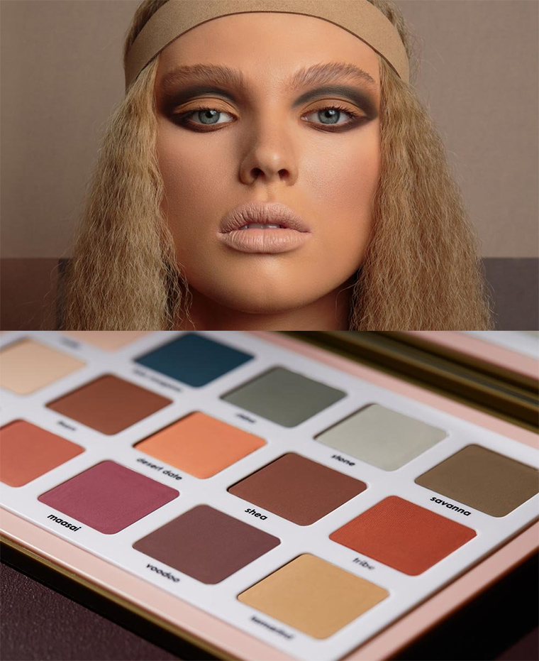
Natasha Denona Safari Eyeshadow Palette
Release Date + Collection Info
Products Available
Safari Eyeshadow Palette, $129.00 (Limited Edition)
Editor’s Note: There is concern with respect to some of the names used in this palette, such as Amhara, which is an ethnic group (and region) found in the Amhara region of Ethiopia (Wikipedia) and Maasai, which is “a Nilotic ethnic group” found in parts of Kenya and Tanania (Wikipedia) in particular.
- Malia Powder pink (Matte)
- Fata Morgana Deep sea blue (Matte)
- Rhino Green-toned grey (Matte)
- Stone Pale cool grey (Matte)
- Savanna Olive khaki
- Aya Pale apricot (Matte)
- Thorn Deep rust (Matte)
- Desert Date Pastel peach (Matte)
- Shea Cinnamon brown (Matte)
- Tribe Bright tangerine (Matte)
- Lotus Muted pink (Matte)
- Amhara Terracotta coral (Matte)
- Maasai Muted berry (Matte)
- Voodoo Deep merlot (Matte)
- Tamarind Creamy beige (Matte)
Natasha Denona Safari Eyeshadow Palette
Cool concept, but why does no brand seem to put green in their palettes? Some olive green like shades would go great with this, and separate it more from the thousand MR clones.
I agree. It’s surprising that there isn’t an olive green in this palette!
Isn’t savanna an olive green? From the above pix seems to lean Brown.
Concur with you both! I would have preferred two greens than the red or brown, since she already have palettes with matte browns.
I want a green (esp warm/olive green) palette SO BAD and cannot find one! Everyone is doing red/pink/purple it seems like. I’m even having trouble finding singles that are a nice pigmented olive ?
I’m trying to think what palettes I have that have a matte olive green in them. The Jeffree Star Androgyny palette does. I have a Sleek palette that’s mostly greens. If I think of more I will post them.
The shade Savannah is a beautiful olive green shade! Unfortunately, ND’ s own promo pic makes it look more grayish. ND needs a better art department!
Lauren, I really love olive greens as well. Here are some of my favourites:
bareMinerals Soft and Smokey has two different greens, one of them being the beautiful olive shade Eureka.
bareMinerals The Scenic Route – a duo, with the best olive shade Spectacular
Dior Tisse D’Automne – a gorgeous quad of olive greens
Dior Jardin – a mix of olive and teal green – an excellent palette.
I hope this helps a fellow olive green lover.
Tisse d’automne is Chanel (if we’re talking about the same quad) – I LOVE it and the Dior one that was LE that year. I don’t have Jardin but when Dior gets it right, they really do it well. BM’s Eureka is a stunner. It’s been released a few times previously, I think, and it’s a winner which I guess is why it’s been brought back.
Hi try Melt they have a Gemini palette you might like.
I agree. A khaki green seems like an obvious choice for something called Safari.
That is an exceptionally terrible promo picture.
I’m glad I’m not the only one who thought so. That is a really bad looking makeup job. It’s hard to think someone would look at that poor model and think “yes, I must have this!!”.
That’s what I thought too…. it’s the nude lips that does it for me.
…and me too (whenever I’m asked what trends I’d like to see “die”, the nude lip is pretty near the top of my list)
The matte lip is on my “please die” list. I don’t get wanting one’s lips to purposely look dry and wrinkled. This photo turns me off of the collection.
…and put “nude” and “matte” together – could it look worse? Also, does it look to anyone else like they’ve given the model 2 sets of eyebrows?
I dunno, I know when I hear the word “safari” I always think of a white model with too much bronzer dressed to go to Coachella. (That was sarcasm. Also that lipstick is terrible on her.)
?
Agreed. Very disappointed by this.
I thought so too.
Seriously Right?? Almost scary!!
…and here I thought it was just me. Glad to know I’m not alone (and my objection is actually on several fronts – I didn’t even want to touch on the cultural/political objections I have as I got told off once before about an objection I had).
I love that this is all mattes, but the price takes it out of my consideration.
I agree. I love all matte palettes — when I find them. But this one is bound to be $150+ Canadian. Waaay too rich for my blood.
Me too….and I’m not a big fan of all matte palettes. Too many of these shades also just don’t look all that flattering to me.
Agree with other comments. Why so many palettes with all the red-orange-pink? I love grey green, but no really good olive matte out there. Safari to me implies olives, sands, grey-brown shades, with a cream & black. For the price of this, there’s not enough difference in everything that’s come out over the past year at least for me.
I’m really torn by this release. I like it but I don’t like it. There’s something refreshing about it but I also feel like it’s missing something. I can’t make up my mind at all.
Since I’m all stocked up on mattes, plus I have ABH Subculture, I do believe I’m covered in this area very well as is. I fail to grasp the concept of a $129 palette full of mostly basic matte shades.
If you really do go on a safari, you come across lots of shades of green – the grasses, leaves, trees etc. So no greens in this safari adventure.
And to be honest, the model isn’t selling me the product either. With her very nude lipstick and the way the eyshadows have been applied in bands and not blended….I don’t think it showcases the palette at all.
However I am looking forward to the review….
I really love the concept of the palette! Also, the color scheme seems actually well-related to the concept, AND not just one-sided or uni-toned. I won’t be buying because I find the price point on Denona ridiculous and don’t like really big palettes. But this looks like winner to me.
I have real concerns about cultural appropriation here, particularly with the shade names. These are stereotypes/Western fetishes with no understanding of the cultures from which they are borrowing, or an acknowledgement that cultures are living and breathing and not stuck in a particular (misunderstood) moment in time. The picture seals the deal. I am not the only one to notice, either.
I was hoping I wasn’t the only one reacting to this with a lot of discomfort. A blue-eyed model with kinked up hair advertising a palette called “safari” (a name itself evoking a brief trip, by outsiders, for enjoyment!) that has shade names like voodoo, tribe, and maasai?? It feels very disrespectful and I want to be really surprised that no one involved in its production realized that either but maybe I should know better by now which is sad.
I couldn’t agree with you more! It was utterly unnecessary to use culturally significant names, and the way the model is done up is just plain wrong. I’m not touching this.
That promo pic is hands down the worst I’ve seen in recent history. The eyeshadow and lipstick look awful and of course it’s a blonde haired, blue eyed, pale skinned model for a palette name synonymous with the African continent.
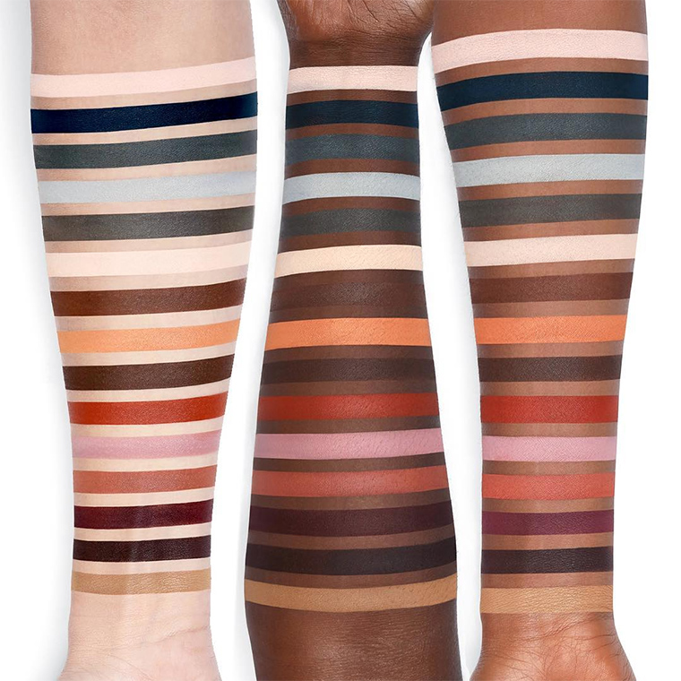
And those swatches make it look like there are multiple dupes (or near enough) within the same palette, 2 “blacks”, 2 cream shades, 2 – 3 medium browns, 2 charcoal greys – and no greens, tans, caramel or sandy beiges. I don’t understand the inclusion of the pastel blue and pink either.
I’m a bit eye-rolly over the whole thing.
Oh my, I think this will be my holiday palette (since I have plenty of metallic, shimmers, and the like already. I’ve been wanting a great matte palette with colors that are not muted or faded. Will be waiting as patiently as possible for your review Christine.
Maybe it’s just me, but I don’t think it’s too expensive @ 129$ for 15 shades. How is it different from Viseart’s (all mattes)? Which I know everyone likes, but I have found there formula that great (maybe it’s because I have newer palettes from them). That said, whether I purchase this one depends on performance. So far, I’ve had great results, truly, from all of my ND’s.
It’s just so disrespectful to have those names in a platte named the safari palette….what was she thinking
I was so curious to see what the colours of this palette actually look like! I thought it would be the last palette I would ever need… But it’s not. Although I like there’s teal blues in here, I was expecting the bigger sister of the Camel palette, with indeed, as the others stated above, some greens in it too. I am happy because it’s way too expensive anyway.
I never really thought of green, but now that I’m reading about it it might be an interesting color to wear. I used to wear blue eye shadow a lot, but feel it’s outdated now what do you think about wearing blue eye shadow?
I’m not sure there’s such a thing as an outdated eye shadow color for companies like MAC — non-trend, yes. Not what Chanel would do, sure. But outdated? I would argue that neither green nor blue has ever gone away, they’ve just shifted in their undertone and intensity, with different versions being more-or-less-acceptable at different times. I would also argue that green has been off the radar long enough that it’s almost guaranteed to make a comeback in a big way at some point.
I believe we’ve reached (or are nearly reaching) a point in makeup history where people “want what they want” and aren’t so concerned about someone telling them that when it’s appropriate to like certain colors. There’s been a general hue and cry for greens for at least a year, so market-wise, we’re due.
In answer to your question, blue eyeshadow is fine. There are as many different kinds of blues as there are browns — writing off an entire chunk of the spectrum because we’re all still uneasy about the bad makeup of the 70’s and 80’s is like throwing the baby out with the bathwater.
The colors that look green in the pan, look blue on the arms; green would have made more sense for a safari — maybe one “big sky” blue, but the other blue-appearing ones should have been green. Another palette with unnecessarily close colors … they should have dropped stripes #1 and 9, made Savanna much more recognizably olive, and made stripe #3 more of a rich, foliage green. Unless the pan shot really is more true-to-life? No idea what we’re getting here.
In addition to the tribe names, I feel like the inclusion of “Voodoo” is pretty problematic since, at least by my understanding, “Voodoo” is not a practice one would encounter on a safari, as it is a diasporic religion combining aspects of several African and Western traditions. In Africa one would encounter the original religions and traditions that form the basis of Vodou and Vodoun, correct?
I’m also with the people who think this palette should have more green, and that the model photo does not look great. It’s a hard pass all around for me.
omg i want this palette, this is the first Natasha Denona Palette taht’s really intrigued me. i love the earth tones and options to get a warm or cool toned look. how much is is?
This may not be a popular comment but the photo of the model has all things that really don’t appeal to me – “dead” nude lips, dreadful hair (how mine looks if I do nothing to style it and don’t take care of it) and generally just a not very nice take on the 60’s hippie chick look. A lot of the shadows look downright ugly to me and for the price (probably closer to $150 or 170 here), well – just no! Bear in mind though that I am much older than many here and remember the headbands and “Woodstock look” from the first time around!
Well yes, let’s do an eyeshadow palette called SAFARI, call a white model to do the promo and just frizz the shit out of her hair! *yawns*