Illamasqua Burst Eyeshadow Review, Photos, Swatches

Illamasqua Burst Eyeshadow
Illamasqua Burst Eyeshadow
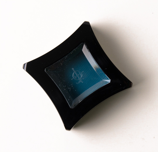
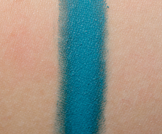
Illamasqua Burst Eyeshadow ($20.00 for 0.07 oz.) is described as a “blue-green.” It’s a medium-dark that’s just barely been kissed by tones of teal. It’s more blue than it is teal or green, but it’s not just blue. Tarina Tarantino Ozma is a bit similar in color, but it has a frosted finish, so it ends up looking different. MAC Cool Heat is a little more teal and has a subtle sparkle. Urban Decay Haight is bluer. Inglot #338 is a bit darker.
Another newly released shade, Burst has insane, intense color payoff! I’m loving how top-notch these new shades from Illamasqua have been. Not a dud yet! The texture is soft and smooth, but it never becomes powdery against the skin or during application. It adhered well to the naked lid; it wore about eight hours without fading or creasing. What I liked about it was that it was easily blendable over bare lids or over an eyeshadow primer. I think this is an interesting shade of blue/teal, because it’s not really either of those, but it’s not quite a mix either! It’s more muted than full-on blue eyeshadow, but there’s not enough green in it to constitute a true teal either.
Burst
PPermanent.
Ingredients
Talc, Dimethylimidazolidinone Rice Starch, Mica, Aqua (Water), Propylene Glycol, Magnesium Myristate, Octyldodecanol, Isopropyl Myristate, Glyceryl Stearate, Peg-150, Phenoxyethanol, Ricinus Communis Oil (Ricinus Communis (Castor) Seed Oil), Cetearyl Alcohol, Quaternium-26, Silica, Methylparaben, Glyceryl Ricinoleate, Cera Carnauba (Copernicia Cerifera (Carnauba) Wax), Candelilla Cera (Euphorbia Cerifera (Candelilla) Wax), Ethylparaben, Sodium Cetearyl Sulfate, Stearic Acid, Cera Microcristallina (Microcrystalline Wax), Propylparaben, Tetrahydroxypropyl Ethylenediamine, Paraffinum Liquidum (Mineral Oil), Cetyl Alcohol, Cera Alba (Beeswax), Parfum (Fragrance) And May Contain: [+/- Titanium Dioxide Ci 77891, Iron Oxides Ci 77491, Ci 77492, Ci 77499, Carmine Ci 75470, Ultramarines Ci 77007, Yellow 5 Lake Ci 19140, Blue 1 Lake Ci 42090, Bismuth Oxychloride Ci 77163, Manganese Violet Ci 77742, Ferric Ferrocyanide Ci 77510, Red 40 Lake Ci 16035, Chromium Oxide Greens Ci 77288, Chromium Hydroxide Green Ci 77289] (Eu Exclusive Shades May Contain: Ci 12085, Ci 15850, Ci 45380, Ci 15985, Ci 73015, Ci 45410, Ci 77266). May contain Carmine as a colour additive.
Illamasqua Burst Eyeshadow

Illamasqua Burst Eyeshadow

Illamasqua Burst Eyeshadow

Illamasqua Burst Eyeshadow
Illamasqua Burst Eyeshadow
Illamasqua Burst Eyeshadow

Wow, that looks really pigmented!
Beautiful shade. Just wondering- why do you do so many pictures? Some of them are very unhelpful… to me at least. Is there a reason why we need so many?
Wouldn’t you rather have too many as opposed to not enough? I find it strange that that’s even an issue.
That’s what the scroll key is for 🙂 . I like all the pictures. The close-up often shows texture. It’s great to see the packaging looks like as sometimes cheap packaging can be a turn-off. Conversely, great compacts can sometimes be works of art on their own. I also enjoy that Christine takes enough picture so you get a sense of what a colour looks like in different lighting and at differing distances. Based on the on-line swatches of this colour, I assumed it was a teal and it turns out it isn’t exactly what I thought it would be although I still love the colour.
@wwendalynne Yes, but do we really need three pictures of a basic packaging like this? I could understand more pictures of swatches but she only included one in this post.
Packaging of cosmetics is important to quite a lot of people. And considering the price of Illamasqua products, it’s way better to let more people get all of the information they need in her review before they decide to sink their hard earned cash into it. If it’s really an issue for you just go ahead and scroll down.
In what way are they unhelpful?
Because some people want them. One picture shows packaging, another overall look and texture of the product, and then there is the swatch.
That’s the whole point this blog is so popular: great picture quality and quantity and a thorough review (not just “The color is pretty, I l love it.”) It’s the second best thing to actually being able to try something before you decide to buy.
6 pictures is too much for you? oh no..
First, I’m not trying to treat you like you’re unintelligent, so I’m sorry if it comes off that way. 🙂 This is a runthrough of what purpose each picture shows, mostly: The top picture is of the overall packaging from above. Next, is a shot of the texture of the shadow in the packaging. Then there’s a close up of the texture of the shadow. Fourth is a shot of the back, showing the ingredients. Then there’s a shot of the packaging with the lid down and last is the swatch of the shadow itself. The reason there are so many shots of the packaging is because some people buy things based on what type of packaging it’s in (some shapes fit better in storage, others just look better to some, etc.). Also, some people like to take a look at the ingredients before purchasing, this allows them to do that without having to Google it. I understand where you’re coming from though, as packaging doesn’t really influence whether or not I make a purchase for the most part.
*Fifth, not fourth. I’m glad my friends proofread what I don’t, haha.
What a wonderful color! Want!
I’m loving these new Illamasqya eyeshadow reviews! I bought Fame and a few others when Illamasqua just came out and it was easily the worst shadow formula I’d ever come across. Just horrible! I’m going to give them another shot now that you seem so impressed by their new range. And this colour is just sublime!
I love this color and I have never met an Illamasqua product I didn’t like!
Illamasqua truly has some gorgeous colors. I do want this. <3
I’m so excited you reviewed this colour, Christine as it is on my Illamasqua wishlist. I was looking for a teal eyeshadow and this looks more like a dirty/dulled down peacock blue. These matte shadows rock my world. The great thing about matte shadows..more versatility in my opinion..you can always add shimmer! Thanks so much!!
Beautiful color, but I swear I never saw it being in stock on Sephora.com.
@Lett As far as I’ve seen, Sephora.com hasn’t actually added any of the new Human Fundamentalism eyeshadows to stock yet, but you can get them on the Illamasqua website.
Not sure about the other products, but for the eyeshadows, they already have Hype, Fledgling, and Inception in stock. Burst and Pivot are the only ones that are still not available. My local Sephora actually have both Burst and Pivot in stock haha.
I would say that the pictures are totally misleading about the true colour of this eyeshadow. I have it, and it looks nothing like the pictures, which just looks like a blue eyeshadow, rather than what Burst actually looks like. It’s an amazing eyeshadow and really needs to be seen in the flesh.
@madamepanic Hmm, on my computer, it definitely looks like Christine’s description of “it’s more blue than it is teal or green, but it’s not just blue.”
I love it! I love blue/teal mattes.
Waiting for this to come back in stock on Sephora.com…I gotta have this one. Lovely color.
Ooooh gorgeous!
love it !!!!!!!!!!