16 x ColourPop Fame Pressed Powder Shadow Palette Look Ideas


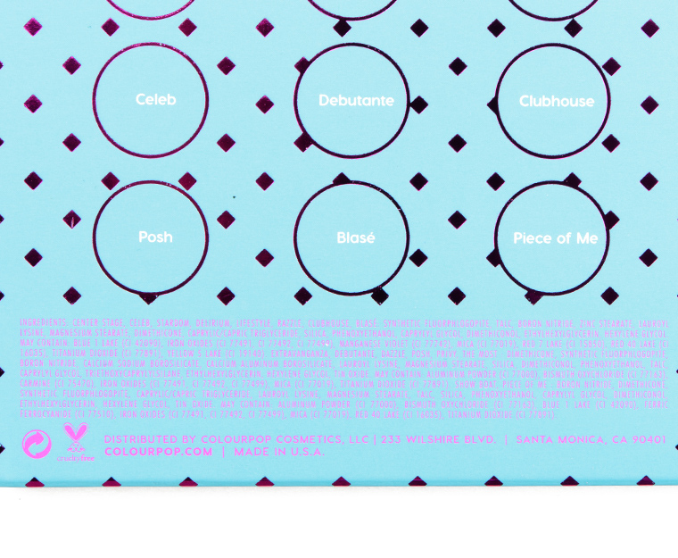


ColourPop Fame Pressed Powder Shadow Palette ($22.00 for 0.56 oz.) is a 16-pan palette that features an assortment of neutrals that lean slightly more neutral and cooler in undertone (particularly in comparison to the typical neutral palette). I did not find that it was truly cool-toned across the board but rather they leaned rose, plum, or gray rather than peach, yellow, or orange. The shimmers work best when applied over primer or used with a dampened brush, and there were a few shades in the palette that felt a little redundant–I definitely felt a want when putting together potential color combinations for a few deeper, more contrasting crease shades (Lifestyle is almost so dark that it is out of place!) as well as one or two more mid-tone/deep shimmery shades (rather than four light shimmery shades). The overall light and mid-tone depth of the palette I felt made it a little more limited and seemed like it would fit someone with a lighter complexion (generally) and who had preferred their neutrals to be subtle and softer. The overlapping nature of some shades would ensure easier blending, though.
About This Series
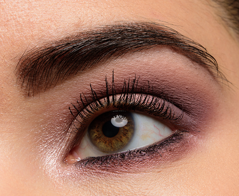
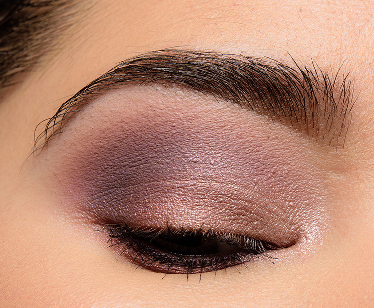
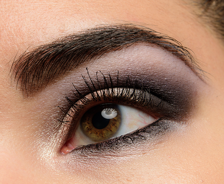
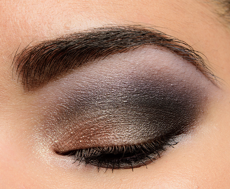
Each look idea is centered around a “quad” of four shades with the expectation that one might bring in the appropriate brow bone or additional transitional shade based on skin tone. I know that I tend to use more like five or six shades in a typical look, but I think that four is a happy medium to give a good idea of the “core” color scheme of a look while giving you the ability to lighten/darken as desired. I have listed the colors in this order: inner lid, middle of lid, outer lid/crease, and crease/above crease.
You might see combinations that seem slightly repeated but placement will vary (e.g. a halo placement where the lightest and more shimmery shade is placed on the center) as placement can also create a different effect/look! You might also want to consider incorporating your favorite matte/shimmer shades (as applicable) to increase the versatility of certain palettes. Consider these ideas a jumping off point!


ColourPop Shadow Palette
Fame 1.0


ColourPop Shadow Palette
Fame 2.0


ColourPop Shadow Palette
Fame 3.0


ColourPop Shadow Palette
Fame 4.0


ColourPop Shadow Palette
Fame 5.0


ColourPop Shadow Palette
Fame 6.0


ColourPop Shadow Palette
Fame 7.0


ColourPop Shadow Palette
Fame 8.0
ColourPop Shadow Palette
Fame 9.0
ColourPop Shadow Palette
Fame 10.0
ColourPop Shadow Palette
Fame 11.0
ColourPop Shadow Palette
Fame 12.0
ColourPop Shadow Palette
Fame 13.0
ColourPop Shadow Palette
Fame 14.0
ColourPop Shadow Palette
Fame 15.0
ColourPop Shadow Palette
Fame 16.0
This is especially awesome because I ordered this palette a couple days ago! 😀
Yep, this just convinced me to get the palette. I checked it against my vanity earlier today and discovered I only had dupes for 4 of the colors! This palette appeals to my wardrobe of rose pinks, black lace, and floral. Thank you for the inspiration, I’m really excited to do a couple of these looks when I get my hands on the palette.
Timely, since I got this yesterday! Thanks. Looked at it at night, but frankly it does not improve in cool factor by day. Pales in comparison (bad pun Friday) to the color singles, which are fab. I know this will prob become a workhorse, but it’s even more one note than expected. I see 3-4 coolish neutrals, with the rest on the warm side, but not as warm as most current offerings. Only a few with overt yellow, copper, or orange leanings. Your swatches come off cooler than mine. Oh, well, that’s undertones for you! Despite just getting this, used V today, and that’s telling.
That “Temptalia Asks” from the other day concerning what one would wear to a job interview? THIS. I see several looks up above that you put together that would be perfectly professional and appropriate for that occasion. This palette does have that business/professional vibe to it.
Thanks for this! I’ve already had this palette for a week and this is some great inspo for some new looks! Also did you see that Colourpop JUST released a sister palette to this and it’s ANOTHER sunset/warm toned palette? I guess a zebra really can’t change its stripes in this case. I’m going to have to be REALLY impressed with the swatches to consider purchasing.
I didn’t really want this palette until I saw your always awesome color combos.
Just received mine yesterday but haven’t played with it yet, so this is super timely, thanks!
At first glance, there are a LOT of similar shades and I was a bit disappointed that there wasn’t more depth and variation but we shall see how it works on the eye. Definitely useable though – as much as I love the variety in the All I See is Magic and Yes, Please palettes, I do find myself reaching for Double Entendre and Give It To Me Straight more often because the tonal colour palettes are super easy to use (and I’m lazy)!
You’ve done a great job with these combinations Christine, especially as there are so many pale shades.
This has me rethinking this palette. Thanks!!
I just absolutely love this series you’ve been doing! You think of combinations that aren’t immediately evident – to me – and it’s a great way to make the most out of all of the pallettes that are out there. Thank you for doing this!
Glad I could help! xoxo