Archived Post
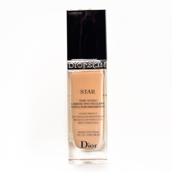
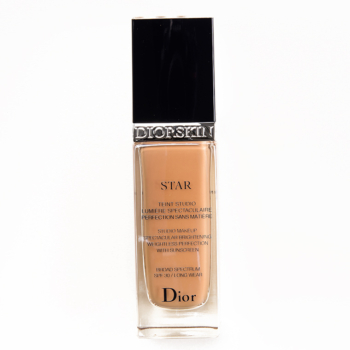
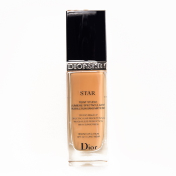
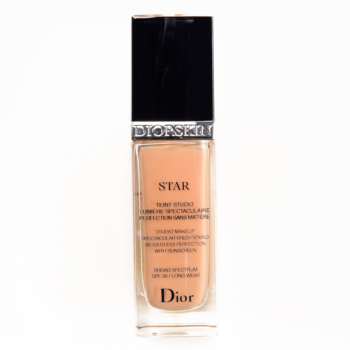
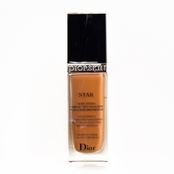
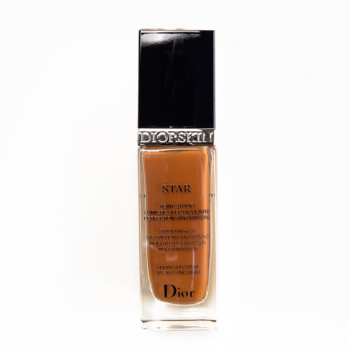
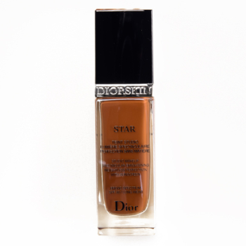
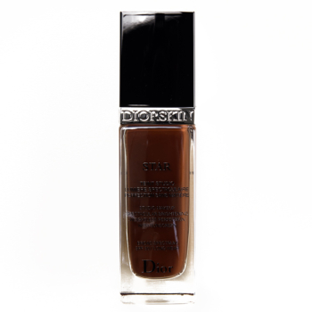
Swatches: Diorskin Star Fluid SPF 30 Foundation

Dior Diorskin Airflash Spray Foundation
Dior’s been a long-time supporter of the Foundation Matrix, being one of the first brands who sent us full ranges of foundations to swatch when we did a major revamp a few years ago. We now have swatches of a foundation I’ve heard a lot of raves for by readers (you may have also seen me wearing it several recent photos, as I’ve been giving a try myself!) — Diorskin Star Fluid SPF 30 Foundation ($50.00 for 1.0 fl. oz.) — which features one of the larger shade ranges for the brand. It’s a liquid foundation that’s supposed to have lightweight feel, long-wear, and a luminous finish. Have you tried it before?


My absolute favorite! It’s great that the range includes some deep shades, but I still feel there’s room to expand on both ends of the spectrum.
Almost always room to expand! 🙂
I have a love/hate affair with Dior foundations. Air flash is one of my favorite formulas, and I really like this one as well. Their shades are so weird though. They oxidize poorly and have either way to much orange or pink. They do nothing for fair girls or girls with neutral/yellow tones in any shade.
Yeah, I was surprised at the jump between 010 and 020/021! Right now I’m mixing 020 and 021 but find that a little more 021 makes sense than a 50/50 mix.
I added my comment about the same problem without reading here first. I thought the shades were too neutral for pink undertones — at least the 10 and 20. I guess we can all agree that their shade range should be expanded! Lol.
And like so many other brands, their shade range for darker skin tones is cringe-worthy. Red-based deep browns are pretty much it. So too bad, so sad for most Latin/African skin tones.
010/021 has always been my range, with a 30/70% ratio. Which sucks, because I’m not down with spending $120+ on a foundation when MAC Face and Body nails the color range for 3/4 price.
ETA 3/4 $$ less
I hear you Sarah. Dior has this great “Healthy Glow Foundation Second Skin Effect” (from Terracotta Skin line), in the shade “Blondes”; it has the consistency of a mousse (it’s very light) and you could use just a dab of it and combine it with any foundation or BB cream in order to get the right shade.
I have fair skin with neutral to cool undertones and I had the same problem with founding the right foundation shade. I’m currently using the Koh Gen Do Aqua Foundation in PK-0, which is a little too light for me; however, the next shade, PK-1, is too dark. Instead of buying two foundations to combine them, I mix the Blondes from Dior with my foundation and I get the perfect shade. You can apply Blondes with a beauty blender as a bronzer; it gives a very natural sun-kissed look.
You said it all! And their fairest shade is dark! Pitty…
The difference in color of most (all?) Dior foundation formulas between the 10 and 20 shades is ridiculous. A lot of fair skin ladies will fall somewhere in between and have to buy both shades and mix, or add a color shade corrector. Also, they’re both very neutral, which is not the best match for ladies with pink undertones. I gave up on Dior foundations for those reasons.
It’s been awhile since I’ve seen 010 swatched, so I did a double take initially!
Or yellow undertones either. I’m also surprised how deep their fairest shade is as well with 35 to choose from.
I had to buy 10 and 21 to get a match. I’m NC 20 in MAC. I’ll never buy this foundation again after I finish what I have. For me it’s $100 at once to get the right shade. Not something I want to pay.
They look way orange!
Funny to hear everyone saying it because it was my first reaction upon seeing both these swatches and the air flash – not much for pale girls like me! Oh well. Maybe they’ll expand someday.
No real ingredients list on big S. No big surprise. Thought I had better check them, before whining about the colors. These look warmer than the other you reviewed today, and as everyone pointed out, there are major leaps between shades. Think I’ll do a KGD aqua and maybe a Jouer. I hear chem sunscreens, Benzyl salicylate, and aloe murmuring in the background. Believe I prefer the overall look of the air flash. But both formulas look decent.
Not yet, but call me now interested! Sand appears to be a great match for me, or possibly Med. Beige. Hard to tell, really. I’ve only heard great things about Dior foundations!
Wow! What a jump from 010 to 020! I wish they would fill in the lighter end of the spectrum more like that have with the 020s and 030s. I’m sure the other end of the spectrum would appreciate that as well for the 40s-80s.
Aaaand the lightest shade is still too dark =’/
I truly wish Dior (and a few others) would consider removing or at least changing the fragrance component of their foundations. I’ve never fully understood why foundation (or any cosmetic for that matter) needs to have a heavy scent. Today, so many people have become sensitive/allergic to the fragrance ingredients that it just narrows your market!
I’ve tried a few Dior foundations in the past — and even found good shade matches and formulas that I really enjoyed — but every single one has resulted in breakouts and rashes. It’s just not for sensitive skin it seems.
They’re certainly not alone in this, especially among the French companies. Although I will say that Guerlain seems to have found in Lingerie de Peau a formula that is lightly scented yet doesn’t bother me. Don’t know if that was by accident or by science!
None of these look like they would work on my skintone/undertones. Maybe 21. But it would probably be a hair too dark?
I will say I like the darker shades. Tho i wish for even more darker shades. Because while it may look “dark” on Christine’s arm, it would look a lot lighter on an actual dark skinned person. You know? (Not blaming Christine actual ALL I’m very appreciative of Christine posting swatches of all shades not just hers!!)
I love how Dior is catering for the pale to the deeper shades. Ivory would be the one for me. I still think there could be some more very pale shades.
The foundation looks beautiful.
I agree with others that have noted the strange orange tinge to a lot of these shades- it’s a bit odd. I have not tried this foundation myself, but I am wary of how a luminous finish would work with my oil-prone face.
The big jump from ivory to light beige is weird! I haven’t tried any Dior foundations.
Ivory looks too dark and too pink. I guess it’s great for my wallet.
im not sure any of these would work for me, Maybe ivory
These are even darker than the spray versions (which is better for the dark end of the shade range), but leaves light girls out completely (unless you happen to have pink-toned skin). Dior seems to think that if you’re yellow or neutral, you can’t have light skin. We keep giving companies flack for their shade ranges, but I can’t imagine what a nightmare it would be to try to accomodate every possible skin value and undertone on the planet; even so, this is surprisingly spare in choices.
Forgive the errant opening parenthesis. Imagine it’s a comma instead.
I wear 012 in this and in the Forever. It doesn’t seem to be sold everywhere though, it was quite hard to find. But it does exist!
Awww thanks for the dark skin swatches! Now can you send me Dior 050 Dark Beige Star Fluid Foundation SPF 30, I’d love to rock that in a Youtube video demo!
I’m usually one to go for the lightest shades in foundations but it makes me really happy to see that brands are expanding their deeper range. Ebony looks amazing!
I bought this foundation during Sephora’s $20 off $50 promo last year after doing tons of research. It’s the first high end foundation I’ve ever owned and….. I was pretty disappointed. I have very dry skin and it looked awful on me and seemed to disappear after like 5 hours.
Dior’s shades need some help. It looks like all the shades between the lightest and darkest are all peach/apricot undertoned and the lightest and darkest are more cool/leaning neutral. I’m never the lightest shade in any brand but I have to use 010 in nearly all their foundations. It’s a beautiful foundation too–looks great on people with older skin–but the color matching is atrocious.