Archived Post
5 Muted Shades of Spring
I’ve always loved the idea of more darker, slightly muted versions of your typical spring colors! While Laura Mercier’s take was disappointing, it inspired me to take a look through shades that exist that might satisfy that craving for subdued pastels and shades of spring. I narrowed down my list to a mere five, but if you wanted to see how many I started with, check out the many I considered here.
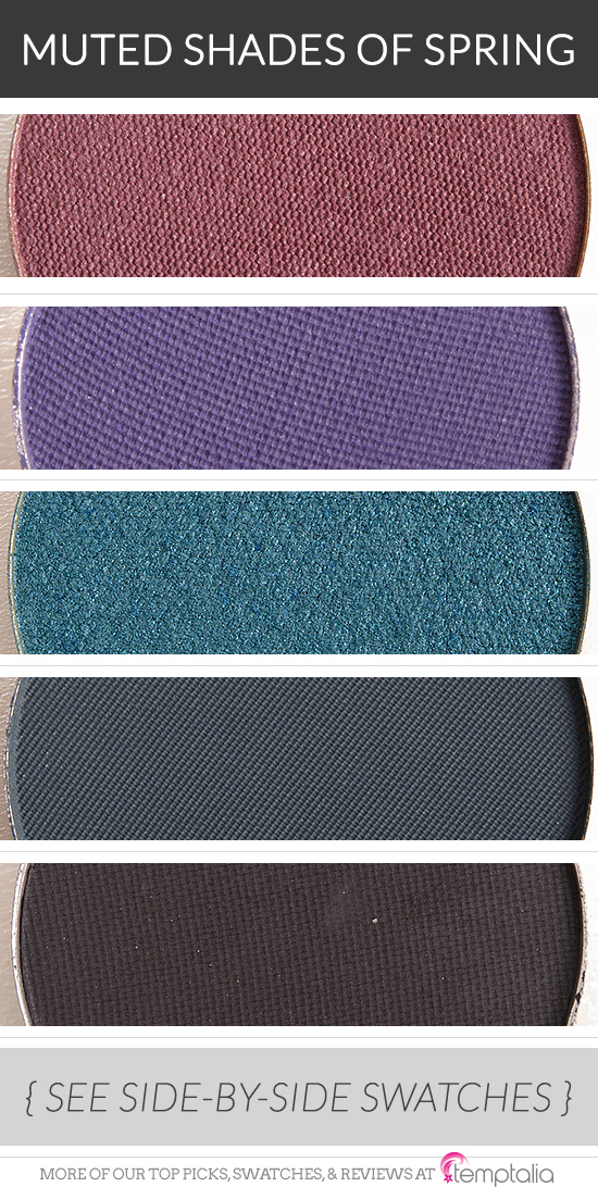
- Make Up For Ever S836 Pink Ash — a muted, pink-purple with a satin finish
- Makeup Geek Duchess — a muted, cool-toned purple
- Make Up For Ever I238 Blue Cedar — a lightly brightened blue-teal
- Make Up For Ever M240 Prussian Blue — a dusty, navy blue
- MAC Typographic — a sooty gray
Yes!! I generally don’t buy anything from anyone’s spring and summer collections because I generally don’t like pastels and many of the delicate brights that companies put out for their collections. My personal take on spring definitely reflects the colors above! I know I’m in the minority, but I would love it some day if one of the big companies did a darker, muted spring collection like this. In the meantime though, I’m happy to hoard during the fall and winter months 🙂
Ah, well, we all need a break from buying, right?? More money for fall/winter 😉
I just love the idea of pastels… but darker and a little richer – not totally washed out, but not the brightness you’d see in more summery collections!
These are all so darn pretty…. the Make Up For Ever and Makeup Geek lists continue to grow….
I was like, “OH, I whittled it down to five… three are MUFE? Hmmm…” I try to vary what’s listed, but the MUFE ones were just too good.
I always love your reviews like this. I cannot for the life of me determine if something is cool toned, warm toned, or muted. It has to say right on the product what it is. It doesn’t help that I’m partially color blind, ha. Well, anyway- thank you! I really like muted shadows and it is always difficult for me to find some.
Thanks, Jenny! 🙂 It can be tough to figure out! Some colors are very nuanced or are closer to neutral so they can lean cooler/warmer just depending on what else is near it!
Blue Cedar <3
Such an amazing shade!
I love this idea. Spring collections tend to look a bit bridal for me (not that this is a bad thing, but it gets boring after a while) so this is a nice change.
To me, spring collections are often the one season where there is an above-average amount of sameness across brands. I think you get more variety throughout the other seasons, because you can be bolder then – but you’ll have brands provide softer options when it makes more sense for their brand (e.g. Bobbi Brown).
Do you ever sell the makeup that you don’t use?
Nope.
These are lovely! I recall you mentioning “April Showers bring May Flowers” as a Spring trend before. These could definitely be some storm clouds.
YAY! 🙂
I like Prussian Blue, it’s a moody-looking navy with gray and teal undertones. It’s like spring trying to shake off the winter blues
Great pick, Katherine! 😀
All great choices, I have yet to try a marsala color near my eye!
You should!
I do love typographic it is one of my essential eyeshadows, it just applies and blends so well and there is really no shadow like it.
xx
Typographic has such a great finish!
Nice to see your process as far as the list you started with.
I always trying to find perfect greys. I have MAC Print and Scene but have not used them enough to judge them. I have wanted a MUFE grey since the old formula was around but never got around to it.
How do you feel about MUFE M106 Slate compared to Typographic? I intend to get Typographic but I don’t want to double up they seem similar.
I prefer Typographic’s formula (MAC’s Matte2 is one of the best), but it is a much deeper, darker shade compared to Slate. http://www.temptalia.com/submit-dupe?sbs=1&pid=171137&dupe=105918
Great! I have Print and the color looks similar to Typographic but I love Matte2 formula so I will get Typographic then go for MUFE Slate or Cement if I am still not satisfied with my greys. I remember liking Anthracite in color before they changes formulas.
Thanks Christine!
My pleasure, Markie!
I really want Blue Cedar and Duchess. Those are very pretty crease colors
Agreed!
Love those sooty, muted shades – very flattering with transition shades I would say. My favourite? The Blue Cedar and Prussian blue.
Blue Cedar is SO lovely!
Thank you, Christine! These are what the Laura Mercier Watercolor palette should have been more like.
🙂
*flail* W00t! I love this so much, Christine! This is the reason I still have a part of me that wants to get that Laura Mercier watercolour palette – the muted, misty spring colours as opposed to the more pastel/leaf colours. <3 Prussian Blue… <3
Prussian Blue is a pretty shade!
Blue Cedar and Pink ash are such gorgeous shades… I have these MUFE shades in my wishlist! 🙂
Both are fab!!
Thanks for a brilliant counteraction to that dreadful LM palette. The IDEA has such promise. Lots of us ‘mature’ women look as if we’re trying to look young with pastels + brights. The muting is perfect for those of us ‘of a certain age.’ Why does the big S MUFE shadow display look so dreadful + boring (at least at my local,) when there are superb shades like these three that never hit the store? @my local, it’s a sea of brown mixed with a few other neutrals. None of the wonderful unique shades get any shelf display + the website pix hardly do the shadows justice, plus, no swatches. I never would have given these a second glance, were it not for your extensive review + coverage. These three + the MUG are all delightful. Your thoughtfulness is only matched by your insight.
I wonder how they decided which colors to put in each store – my guess is some stores may sell neutrals better vs. brights – but it’s a shame that it’s lacking so many great shades!