Neon2 Pigment Experimentation x4
Last night, I experimented with four of the Neon2 pigments–please keep that in mind, I experimented! I emphasize that, because none of these looks are 100% finished/polished. You’ll also have to note that I only changed the eye makeup, so the foundation/blush/eyebrows may get wonkier as you progress (LOL). I don’t purport these to be my best work (or even decent work, ha!), but I think you’ll get an idea of what you can do with the Neon2 pigments (and see that they’re more wearable than you think).
So here are my conclusions based on playing with four of the Neon2 pigments:
- I don’t really like them! I’ve never been a huge fan of matte pigments, though True Chartreuse is my exception to that rule (goes on like a buttery dream!). These pigments go on more like the typical matte pigment, which is a bit chunky, loose, and there is fall out. Some of the colors go on better than others, but when used with mixing medium, none of them go on as you see them in the jar. They all go on darker, which may be a good thing, since it does make them more wearable.
- They will stain. Some of the colors have dyes that are potent enough to leave some staining behind. Keep in mind that I only wore each look for maybe 10 minutes tops–I applied the look, took photos, and immediately took it off.
- Magenta Madness did irritate my eyelids. I did notice a bit of a mild burning sensation on my lids immediately after I applied Magenta Madness. It wasn’t extreme nor particularly painful, but I felt something, and it’s probably not a good thing.
- These pigments may be better over a regular base, like a paint pot or UDPP rather than used with mixing medium as a base, especially since the color changes so drastically.
- Blending really, really, REALLY sucks with these. It isn’t hard to blend so much when colors are deeper, or you’re applying them on the lid–it’s when you’re attempting to blend from wherever you finished laying the pigment down to your regular skin. I only applied the Neon2 pigment base just above my crease, and you’ll notice in most of the looks, that there appears to be a harsh line of color–that’s the blendability issue I was talking about. Yes, I think if I was intending these looks for more than experimentation, with more work and elbow grease, I probably could have gotten it blended right. The good news, however, is that in full-face shots, most of the harsh lines aren’t noticeable.

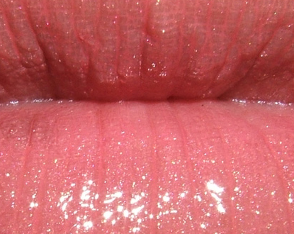
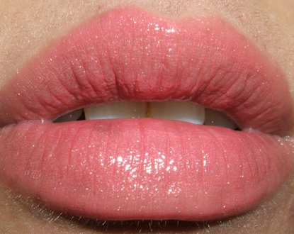
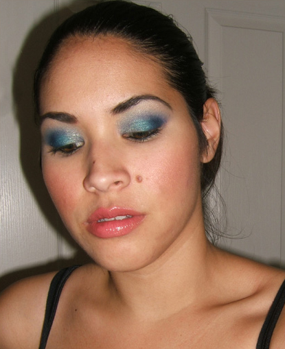
I used Full Force Violet pigment (with mixing medium) on lid, Warm Chill eyeshadow (LE) on inner lid, Gulf Stream eyeshadow (LE) on middle of lid, Climate Blue eyeshadow on outer lid and crease, Shroom eyeshadow on brow, Graphblack technakohl on lower lash line, and Plushlash mascara on lashes. I wore Margin blush on cheeks. I had Strawberry Blonde lipstick (LE) with Backlit 3D glass (LE) on my lips.
** These are recommendations for dupes based on permanent colors available — may not necessarily be identical; they are the closest I can think of!
Warming Chill = Juxt; Gulf Stream = Teal; Climate Blue = Electric Eel + Parfait Amour; Strawberry Blonde = Sweetie; Backlit = Instant Gold
See the rest of this look AND three others…


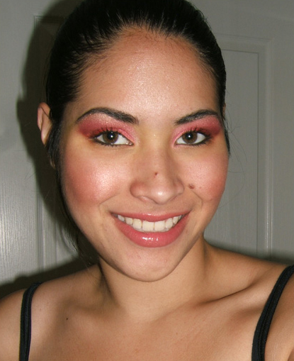
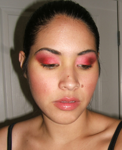
I used Magenta Madness pigment on lid (with mixing medium), Sushi Flower eyeshadow on inner lid and above crease, Passionate eyeshadow on middle of lid, Antiqued eyeshadow on outer lid and crease, Graphblack technakohl on lower lash line, and Plushlash mascara on lashes. I wore Margin blush on cheeks. I had Strawberry Blonde lipstick (LE) with Backlit 3D glass (LE) on my lips.
** These are recommendations for dupes based on permanent colors available — may not necessarily be identical; they are the closest I can think of!
Strawberry Blonde = Sweetie; Backlit = Instant Gold


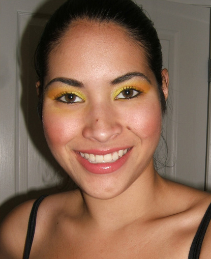
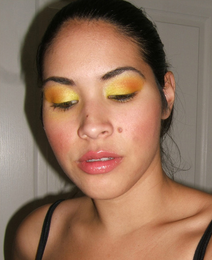
I used Rock-It Yellow pigment (with mixing medium) on lid, Goin’ Bananas eyeshadow (LE) on inner lid, Juiced eyeshadow on middle of lid, Orange eyeshadow on outer lid and crease, Goin’ Bananas eyeshadow (LE) above crease, Shroom eyeshadow on brow, Graphblack technakohl on lower lash line, and Plushlash mascara on lashes. I wore Margin blush on cheeks. I had Strawberry Blonde lipstick (LE) with Backlit 3D glass (LE) on my lips.
** These are recommendations for dupes based on permanent colors available — may not necessarily be identical; they are the closest I can think of!
Goin’ Bananas = Sour Lemon; Strawberry Blonde = Sweetie; Backlit = Instant Gold


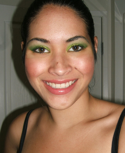
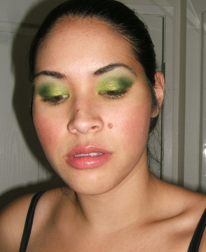
I used Green Space pigment on lid (with mixing medium), Overgrown eyeshadow (LE) on inner lid and above crease, Juxt eyeshadow on middle of lid, Humid eyeshadow on outer lid, Femme Noir eyeshadow above crease, Shroom eyeshadow on brow, Graphblack technakohl on lower lash line, and Plushlash mascara on lashes. I wore Margin blush on cheeks. I had Strawberry Blonde lipstick (LE) with Backlit 3D glass (LE) on my lips.
** These are recommendations for dupes based on permanent colors available — may not necessarily be identical; they are the closest I can think of!
Overgrown = Bitter; Strawberry Blonde = Sweetie; Backlit = Instant Gold


Despite all the not so good things about these pigments, you still look great. You are a master of makeup Christine:)
Thank you, Jennifer! They are tough to work with, but if you have the patience… lol!
It is unbelievable how you can pull of that much color without looking garish in the least! I love it! You are very, very good, thanks for letting us share your “experiments”.
Thanks, Nell! It helps that the mixing medium toned down these pigments a lot!
These are great, independent of what is said about them.
You look gorgeous is these vibrant colours.
Thanks, Márcia 😀
The blue look is so pretty on you! I bought all of the Cool Heat shadows yesterday! Thanks for letting us know how the pigments are hard to work with. Saves me some $!
BTW when you use mixing medium with the pigments how much do you use? I bought some and used it with a solar bit and it creased on me so I think I did something wrong.
Thanks!
Thank you, Donna! Let me know what you think of your new shadows from Cool Heat!
I use just a very, very tiny bit. I’ll put a drop or two on my brush, then pick up pigment.
Ups, I mean ‘with’…
Wow, I love those green colors!
Thanks, Carrie! Overgrown is definitely gorgeous over Green Space.
You did a great review of these.. although I can’t help but be so in love with them! I think what I would do is use MAC’s paint as a base, and put the neon pigs (HAHA) on dry. They’d probably be best to work with in small concentrated areas, like lining, etc. Even though you were experimenting, you look fabuloussss! The magenta look is so different and so amazing, I love it on you. I love ALL of them. Thanks for letting us see!
Hey Kella! They can definitely be worth it for someone who wants these colors, but since they’re much harder to work with AND not actually eye-safe, makes me pretty boo on them.
Thank you!
I know neon is the big fashion trend.. but watch out. When it’s Halloween, we’ll all be working magic with these pigments
That’s very true 😉
Oh and I forgot to say, you are soo getting the lips and cheeks right lately. Not that you didn’t before bc I love all your looks! But these colours are YOURS. 😀
Thanks for sharing these info about these pigments!..
Sure thing, Mandi!
The pink is my favorite. It blew me away!
Oh, wow! Thanks, Jessica!
wow they all look very wearable! the green look is awesome!
Definitely, Lily! The mixing medium takes out some of that POW! factor (which may be a good thing for a lot of people!).
they all look amazing! wonderful job! 🙂
Thanks, Zoila! Glad you liked them!
I’ve been reading your blog for a year now,but just can’t help commenting this time.
Christine,you’ve got one of the most amazing talents to combine colors and create SOMETHING out of the most simple stuff.
Did you ever create a make up for someone from your friends?
If yes,please show us.
P.S. I’m stuck with one looks,maybe you could help me thinking of something,please.
If you were to create a real babydoll look,with babypink brigtht lips,blue mascara and pink eyeshadows,how would you do this?
What is your notion of a babydoll looks so far?
Please help!
Hey Whirl! Thanks so much for commenting 🙂 I rarely do makeup on my friends, actually. Most of mine aren’t into makeup, and I have a lot of guy friends, too, lol!
Hmm, when I think of baby doll, I think of more like pink lips and cheeks, maybe heavy mascara.
Thanks so much!
Finding the time to answer everyone is quite an issue.
If you ever go for a baby doll make up please show us!
Thanks.
No problem 🙂 I’m happy to help out if I can! I sure will if I do!
The second look is gorgeous! Too bad the Magenta pigment irritated (or sort of) your lids 🙁
Thank you, Terry! I was surprised, to be honest, because in terms of pigments, never had that reaction before!
Yep, totally awesome. All of those looks are great. I especially like the pink and yellow.
Thanks, Trisha 🙂 The yellow one as my favorite, I think.
That blue look is the best I’ve ever seen you look!
Really?! I’m very surprised you think so, but thank you, lol!
I loved the red look!
Thanks, Sadie! Think you’d ever wear it?
I actually thought these were a bit funky in their finish when I checked them out at the Pro store too. I think that matte finished pigments are better left alone for nudes only. So sad that MAC would strip these colors from their vibrant potential. Great job however.
I wish they could formulate it like True Chartreuse. It’s matte, colored, and goes on like a dream.
WTF? These are all flippin’ GORGEOUS!!!
Thank you, Kensie 😀
omg!!!!!!!!! so beautiful my fav. is the blue and red!!!! <333333333
Thanks a lot, Lala!
i really like the blue look, and the green look 🙂
Thanks so much, Brittany!
Wow these are much more wearable [at least on someone as pretty as you] than I expected them to be! The blue one is my favorite!
They’re more wearable than I thought they would be, too! The mixing medium just takes some of the punch out of them, which helps to tone them down.
Wow, impressively wearable looks! Thanks for the low-down on the neons! I loooooooove the first peacock-blue look!
Thank you! If you LOVE these kind of colors, they may be worth it, but they’re not as easy as the typical pigment!
wowwww i didnt think these pigments were going to look like this! they look FABULOUS on you!!!! esp the green piggie!!!
Thanks, Tanya! I loved how pretty Green Space turned out.
oooooh! I LOVE colorful looks- they’re my fave! These all look absolutely gorgeous- esp. the magenta one!!
Thank you so much, Gina!
Girl you are too hard on yourself! The harsh lines that you are talking about are BARELY visible. And to a non trained eye, no one would even know! I started reading how you said you didn’t really like them, and I was like, oh no! since I just bought all 6 but then I saw your looks and they look amazing! Keep up the awesome experiments!
Aw, Cassie, thank you! It is definitely easier to see things about yourself, though, lol!
Let me know how you fare with the new pigments!
Hmm, I guess I won’t be buying these pigments after all. I think I’ll stick to my Kryolan eyeshadows, I don’t want to risk irritating my eyelids!
They might be worth getting samples of, but Kryolan is better, especially since they’re safe for eyes!
Oh Magenta Madness looks terrific on you!! And that yellow/orange combo! Really nice!
Thank you!! I think the yellow one was my favorite!
Hi Christine! Wow, these are all very amazing looks! I especially loved the blue and green. You look great! I can definitely see the “blendability” issue you talked about, though. However, I think these pigments could be gorgeous liners! Thanks for your review!
Thank you so much! I agree that these could work well as liners!
Ok when do these launch?!?!?
They are out in a lot of PRO stores already!
They look gorgeous! They are more wearable than I expected them to be. Thanks for ther review.
Thanks so much, Gio! Happy to do it!
u know, i really like these looks! too bad the pigments suck 😛 However, I do have some suggestions. These two sites: http://www.medusasmakeup.com and http://www.aromaleigh.com both offer brightly colored pigment eyeshadows ( in TONS of colors) for about $6- $7 each, you should really check ’em out!!!!
Thanks for the recs, Tatti!
They’re all beautiful on you, especially the blue and the green.
Thanks a bunch, Dee!
You are right. These colors look much more wearable in these looks than I expected them to be. I do see what you are saying about the semi-harsh line where the pigment ends though. I’m sure with some practice, that could be fixed. I personally love the 1st & 2nd looks. The pink look is more red & I love that. Great job!
I think it might take a little more patience, and perhaps quicker application, lol. Not sure yet, but we’ll see how it goes.
Thanks!
Hey Cristine,
I lovvvvvvvvvvvvvvvved it sooooooo much,They r looking so Gorgeous,I really luved them.Im falling in love.I have to have to buy them.I adore red (FIERY) and yellow one (WARMTH OF SUN).But ill go for all of ’em.
”’WE HAVE THE BIGGEEEEEEEEEST TREAT SEEING U IN SO MANY LOOKS IN ONE GOOOOOO”!!!!!
Zzzzzainy….
Thank you so much, Zainy!! 🙂 I think the yellow one was my favorite, too!
I really love the blue one! Do you think you will try them again using something different for a base? 🙂
Thank you so much, Stacey! I will probably try another look using a paint pot as a base. I just prefer the mixing medium because I feel it keeps the pigment on SO much better.
Eeh! The green and blue are GORGEOUS. Not sure if I’d wear the pink/red out but it’s still quite pretty. The yellow is definitely also wearable 🙂 although somewhat outrageous too!!
But seriously. The green and blue, omg. Haha. I wish these were shadows :[ I love the colors but I don’t know if it’d be worth getting a full jar!
Thank you, Rosa 🙂 The yellow was my favorite, lol! I’d say get samples if you could!
too bad bout all the downsides but you make the colors look GREAT!!!
Thanks, Mae! I had high hopes for these :/