5 Eyeshadow Palettes I'd Love to See ColourPop to Release

ColourPop Treasures & Trinkets Eyeshadow Palette
Last week, I posted swatches of ColourPop’s newest eyeshadow palette, Give It to Me Straight, and the comments were pretty telling: give us something that isn’t warm neutrals. It got me thinking about what kind of palettes ColourPop (or any other brand!) could put out, and I was inspired to try my hand at making a few 12-pan color combinations as well. I’ll say that it’s a lot harder to visualize a palette in my mind and put it to “paper” in a cohesive, organized way. I think I would be better able to put something together if I had say, 100 eyeshadows on a table, and then I could choose, arrange, and keep re-arranging until satisfied. When I thought about possibilities, I tried to go for a mix of cooler, more muted, and more colorful shades that we haven’t seen as much of.
I’d love to hear from you — breakdown a 12-pan palette you’d like to see; describe the colors and textures as you see them or mockup your own image!
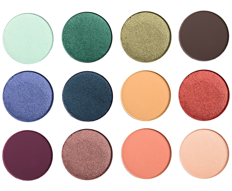
ColourPop Treasures & Trinkets Eyeshadow Palette
Treasures & Trinkets
This concept was inspired by jewel-tones and the shades that might play well with them–like emerald, sapphire, jade, amethyst, and so on. I wanted it to be usable on its own, but I see it paired with someone’s go-to transition and brow bone shades.

ColourPop The Woodlands Eyeshadow Palette
The Woodlands
If you know me, you’ll know that I love green… and in all forms–bright, chartreuse greens to deep olives to green-golds and everything in-between. I wanted something a little monochromatic but with a play between cool and warm undertones with a variety in depth and finish.

ColourPop Amaranthine Eyeshadow Palette
Amaranthine
I love mauves, plums, and tuapes, and this palette is about mixing the two for something sultry, smoky, and muted but still with dimension with an assortment of pearl to metallic shimmer and mattes.

ColourPop No Less than Dazzling Eyeshadow Palette
No Less than Dazzling
This was a variation on jewel-tones with more brilliance and luster–the metallics would be really shiny and smooth on the lid with a few of the shimmery shades having a satin-to-pearl, lit-from-within quality.
ColourPop On a Summer Breeze Eyeshadow Palette
On a Summer Breeze
I wanted something with a little pop and warmth but still more focused on color without being neon with really intense, rich metallic and shiny finishes.
I would buy the shit out of that palette
……All the palettes!!
Yes I agree!!
I so agree!!!
I agree!!!! Beautiful combinations ^.^
OMG YAS!
I haven’t bought any Colourpop palettes in quite some time. I’d buy all of those. I especially love the green palette, The Woodlands. Great job! Are you listening, Colourpop? We need more color.
Crazy that we feel the need to tell COLOURpop that we need more color! Maybe they’ll answer our prayers soon since they just released those more colorful super shock shadows.
A girl can dream…
Seriously? How did you make these so perfect?!? Love love love them all!! You should totally do a collaboration (or several) with Colourpop asap. I’ve been saying that they need more cool-toned neutrals as well as jewel tones & these are exactly what I was hoping for. I really hope they take your advice and create more cool-toned palettes. I have a cool undertone so I can’t always wear bright orange/red/yellow without it looking strange, too bold and even make me look a little sickly. Cool tones all the way!!
You’re too kind, haha! I agonized and still didn’t come away from any but maybe the green one really satisfied!
I love them all, but I agree with you on the green one ? The green and the mauve palettes are really exceptional ??????
I do not typically wear green well, personally, but yes,. I gravitate to the green and mauve palettes here too.
Great job, Christine! ????
The green/Woodlands one is FANTASTIC. I don’t even buy palettes as a general rule, but I would 100% buy that. I’m waiting and waaaaaiiiting for them to release more cool-toned pressed powder shadows! (Honestly, how many shades of peach/rust/maroon/pink/orange/burgundy does anybody need?!)
Totally this. I am a cool-tones girl, but I’m fine with having some warmer tones. I just want *greens and purples.* I like pinks, but they’re mostly for transitioning for me; I don’t want to look like I have pink-eye.
I would buy the HELL out of ALL of these! The Woodlands, Treasures and Trinkets, Amaranthine (I love that name, hello Bioware)… PERFECT. The final two are also stunning, and I’d buy them, especially if there was no duplication of colors in the palettes. I don’t want to spend my life buying singles and then trying to remember what undertones they go with.
I’d even like that row of creams or some browns to go with the greens, or maybe some shades of green that approach blue, like peacocks or a robin’s egg color. SOMETHING that’s not muddy.
I’ve been searching for greens and they’re so hard to find! I would buy each and every one of these and I will personally endorse a Colourpop collab! Love!
Christine, i love green also especially olive green. The tropical palms, of ferns, the beautiful clear ocean water in an island, green, hazel eyes and it looks really great on a tall tanned sexy man! That’s what I say to my friends. Lol! ?My favorite color!
Am I the only one who wants to spam Colourpop until they see this and notice those BRILLIANT suggestions? I dearly wish these concept palettes were available, honestly. Can’t stand brands releasing the same colour schemes over and over again! Shout out to Pat McGrath, Anastasia and Marc Jacobs for the bolder choices and colorful (yet cohesive) palettes.
I get why each brand does their take on a trend, but it can definitely be wearing on the customer after awhile! With ColourPop, since they have released several warm-toned palettes, I can definitely see why the last one drew more ire than desire!
Why don’t you list all The names of the shade that you picked because every one of those pallets is awesome I would definitely buy all those singles and make my own palette like you did please please do !!
Hi Gigi,
They aren’t real shades – there’s nothing to list because I made them up!
Tell me how to send this to ColourPop, and I’ll do it 5x/day.
YES! Id stand in line for the woodland palette and the summer breeze for sure!! Even treasure and trinkets is nice but I dont want to see anymore golds. I probably have a gold in every freaking palette. I want some cool neutrals and mild but good colors that are non-metallic, no more high glitter for us older ladies.
Go to their website…bottom of the page has a “contact us” button which opens up an email to Colourpop….
Done 😀
Temptalia x Colourpop please happen!
DONE!
So much done.
Also, I guess we can cobble them together from singles ourselves. GlamourTech on etsy make awesome empty palettes.
GIRL, Imma help you do that too.
I agree!! Marcela ,
Oh, my goodness- I love Amaranthine. I would buy that in a heartbeat. Love!
I need the woodlands one like yesterday. These are such well thought out and designed color schemes! I wish half the industry took note tbh
girl a company needs to hire you as an advisor or concept director or even just a collab. the whole internet looks to your reviews and expertise! these are dope!
NEED A LIKE BUTTON ON THESE COMMENTS (:
Yes! Exactly! We could email Colourpop to hire Christine to add spice to their collections. 🙂
They’re all gorgeous, but I would buy the No Less than Dazzling palette in an instant, followed by On a Summer Breeze palette!
I love this so much. I’d grab pretty much all of these but Amarantine (and only because I have so much purple already). I’d love for CP to stop releasing the same palette over and over again. I don’t want them to become the new TooFaced!
I love these! I’d probably buy them all tbh… but the greens always call out to me and I can’t figure out why no brand (to my knowledge) has released a green monochrome palette. So beautiful!
I KNOW! Greens are everything!
It’s so weird, I was just thinking (hoping) that Natasha Denona would release a green monochrome palette. A girl can dream, right?
Yeah that would be awesome! Something like the Sunset or Lila you mean? She does have two 5-pan palettes that are green-themed: #9 & #11 both of which I own because we have to take what we can get amirite? Her formula for the greens in those palettes is pretty nice so I’d be all over a 15 pan green palette with a nice mix of mattes and shimmers… drool.
Yes, exactly, like Sunset or Lila. I have the No. 9 5-pan palette and I love it. That Indian Gold and the green are a couple of my favorite shades of all time.
Swoooooonnnn. I would buy every single one of them. I would. I would. These are surreal.
I would buy The Woodlands in 0.5 seconds. You’re brilliant
that first palette idea is beautiful.. especially with that mint and golden bronze looking like they have slight shifts to them 😀
These are amazing! Two guesses says you’ll be their next collaborator.
I think what I would like to see from Colour Pop and everyone are palettes that TRULY emphasize someone’s natural eye color, incorporating both neutral and vivid colors into 12 pan palettes that also satisfy the entire spectrum of skin tones. I know we’ve seen palettes like this before in smaller selection, but I’m sick of the “violet for brown, brown and blue for blue, and neutrals for green and hazel”. And every brand literally had the same selection of shades with the same undertones and pretty mediocre formula. Eyes have so many different combinations of undertones, little flecks and freckles, outer iris colors, etc, just like no two skin tones are exactly alike.
I understand this has been done for decades and with single shadows people have a multitude of options for making their own perfect palettes, I just think it would be neat to revisit this concept with more depth since color possibilities truly are endless.
You can definitely build your own with endless possibilities, but I think it’s hard, and it’s never cheap – even if you’re paying $6 an eyeshadow, that’s still $72! More than most pre-made palettes. I think you can even see it in how popular pre-made palettes are these days that there’s definitely a convenience to them that trumps singles for a lot of people!
I do buy most of ColourPop palettes because they’re awesome quality but I do think it’s time for something new. I LOOOOOOVEEE your creations. I hope they get inspired because I want to buy those palettes!
The quality is usually pretty good, and then the price on their pre-made palettes is icing ont he cake!
Swoon! Loving the Woodlands and Summer Breeze creations.
Now THAT’S what we’d like to see! These would be in my cart instantaneously, if I could stop myself from jumping up and down, and clapping like a tot at Christmas. They must read you, and sure hope to H they listen and reach out. I wouldn’t even care if I had their dupes already. These are gorgeous, refined, and everything you represent. If you did a color for MAC, you can certainly (with maybe wee reservations) work with CP to bring your vision to reality. Idk how you’d have the time, but these combos are prexisting shades, so it’d be all business work. These are so terrific that I’m going to leave this page up as a bookmark, so I can moon/swoon over them daily! One really ought to be Mellan Love, am I right?
I almost did a Mellan-inspired something rather, but it would end up more warm-toned than I think suited the motivation of the post itself!
Mellan Love does not have to be based on Mellan’s own coloring! Think of all he looks good in! He is an inspiration as well as a source of weekly joy. Your Woodland selections could be named for him. That, like the mountain sunset palette, makes me think of labs, malamutes, and other outdoor oriented dogs. LL Bean. Labs of all colors. Our beautiful natural heritage, the canine companions that venture with us. He could even inspire a natty menswear inspired 12. No matter the colors, if you put it together, and it was named for him, i’d have it, if it meant a criminal act!
Oh, yeah, definitely not solely his coloring, but I’d have to have a nice yellow-gold and reddish-yellow in there. A pool blue. Baby blonde for his lil’ lashes. Sooty black-brown for his nose maybe some sort off deep brown or black with a peach-pink shift or shimmer to reflect the nose going from pitch black to pinky-brown over time. Probably some multi-chrome, lightly glittery shade that screams “joy” for his optimism. Some sort of green for hope…
See, lots of associations! Don’t tell hubby, but Mellan is the MAN! Yes, Nancy, they can even use Paper Tiger, which fits for those rare occasions that he has to pretend to be overly protective! Mustard, a dark cranberry red, a forest green, a ‘regular’ red, like some of those Mayan inspired collars from tailwags, that are soooo incredibly beautiful. We want Mellan Love, even all warm, and we want it NOW.
Now that’s a warm-toned palette I’d be all over, Christine! I imagine butterscotch, mustard, French vanilla, deep rich taupe, etc.! Let’s hit ColourPop up!
*Referring to KJH’s suggestion of a Mellan Love Palette!
Every one of these is way better than the palettes Colourpop comes out with! I especially love the last layout.
I think you should reach out to them for a collab project. I’d totally buy it.
I think if you’d be able to sit in their offices with a table full of products, you’d be able to come out with a full line.
Yes yes yes! Temptalia x Colourpop! I would buy the whole collection!
They should reach out to Christine, esp after that homage (thought it had 2ms, but it was spell corrected.) with brilliant, groundbreaking combos.
Me too! I would buy all of these! Especially the woodlands and the no less than dazzling palettes.
I would definitively be all over The Woodlands palette!
I guess I’d do a palette of dark mattes (6, 3 cool and 3 warm, red green and blue), with a jewel tones (3 neutral shimmery red, green and blue) and 3 transition colors or “base colors” (gray/taupe mattes), everything needed for a colorful smoky eye. I’d name it “The Vapours” XD or something like that. No black because I’m sure pretty much every makeup fan has a matte black eyeshadow.
Also, a palette that mixed duochromes (Glass Bull, for example) and “dirty” grayed colors (steel blue, mustard, etc). I’d call it “Urban Unicorn”.
Ooh, I like, Urban Unicorn. A gritty take on the whole unicorn thing sorta? I dig.
I love your “Urban Unicorn” idea!
+++ On both of your ideas, as well. My glass bull sucked, but think it’s a one off. Urban Unicorn sounds like an indie/CP crossbreed…(i’m still on Mellan.). And both of you think complete, no pull outs needed. Actually, this is making me cross, bec it is vaporware/imagination and i’d so like to see this spark a revolution.
Love your gritty unicorn idea! Id definitely buy that, duochromes and deeper colors are my jam!
I love all of these! I hope you don’t mind but I sent a link to this post directly to ColourPop for inspiration. I hope they take note and follow through!
From your lips to their ears 😉
What a creative and great project! (I’m all about warm neutrals so I’m set, but just have to applaud your efforts here!)
Ahh, lucky for you! Actually, the funny thing about is I really like the colors in the Give It to Me Straight palette (and I’m of the mind that affordable, high-quality eyeshadow? I’ll take it in all forms), so I wasn’t personally like, “NOOO, more warm neutrals,” but I get the reaction from the community in general.
It is true that Give It to Me Straight does not really interest me, but I think it is because it is too neutral that not red enough for my weekend looks, yet too dark for my weekday daily looks. But blue, green, purple, jewelry color are even not for me (I will never ever wear them in any accession). So I have to say, sorry temptalia, I if have to choose, I still would choose Give It to Me Straight rather then these five paletted you designed. (example palette I would buy such as new Wet n Wild palettes, Revolution Newtrals 2)
I really hope some people from colourpop (or ABH even more because colourpop is not available here) sees this! I especially love the last 2 palettes, pretty pops of color but still very usable for everyday. And so different than everything we have seen lately.
I would by most of these to be honest 😀
Amazing ideas! What colors did you use for the amaranthine palette?
These were all Photoshopped, so I didn’t take any specific shades! I started with random pans (different intensities/finishes) and then changed the colors digitally.
Ooh, I thought they were all real….so much for any quick do on any of these. Still say go for it….all of them.
Couldn’t agree more! I LOVE Colourpop palettes but I’m waiting on a unique one. I’d buy all of these! Especially the green one and jewel toned one!
Wow, Christine! I would totally buy all of these palettes–even the green one, which I hardly wear! I love the first palette the most! Great job!
You should definitely collaborate with colourpop!iwould looove to see a Temptalia X Colourpop palette !!!
COOLER TONED NEUTRALS! I’m begging you! Browns, beiges, golds, olives, pretty much anything – just not *orange* or copper or red for crying out loud! I’m super fair and need a nice every day palette for work appropriate looks that isn’t crazy warm.
I feel like I’ve asked for this for five years now, lol!
Me too, Christine, me too! D:
Also – longtime fan of this site. You do an exceptional job.
Christine, they need to hire you!!! I would be all over these palettes like there’s no tomorrow! My bank account would be severely depleted, but I would be one super happy makeup junkie. Great color combos and mix of finishes! I swear so many brands are getting lazy, and either dumping the same old warm neutrals into a palette, or coming up with another ABH MR knockoff. Please send these ideas to CP ASAP –CP are you there???
Wow people need to be doing colab’s with you. I would buy all of these. The purple one is a NEED
I would buy Woodland and Amaranthine tomorrow if they were available. I need a green palette in the worst possible way and have yet to find one. 🙁
The only thing I would add/change on the Amaranthine palette would be adding the purple middle, right column from Dazzling palette.
Colourpop please make this happen!!
Could totally see that! I think that seeing them swatched / trying them on one might make substitutions – one thing I’ve noted in my own tendencies is that they can get a little too muted/dark and I need more brightening shades!
I would buy any or all of these! I LOVE the idea of a true jewel toned palette! Not just two colors in a palette of neutrals. I’m fair/cool toned myself so I don’t buy or wear any of the popular warm toned palettes. I want a sapphire, emerald, amethyst, peridot, ruby, gold, silver, copper, and a peacock blue/green, all in one palette! With maybe one matte blending shade and maybe one pearl highlight shade. They should all be metallic and not “blackened” or smoky. I want brilliant cool jewel tones of amazing pigmented quality! That is my dream palette; I would buy the heck out of that! I also want a matte version of jewel-toned staple shades: teal, pine green, magenta, royal blue, a true purple!!!, aqua, again maybe one or two cool blending shades. Make it happen, please someone!??????
Might not be exactly to a T, but check out the Sleek Arabian Nights palette. Jewel tones and very affordable.
Love that green palette! It’s uncommon yet many people want something like that hard. Not a green fan but I would definitely buy that palette and play with some green looks!
I am here for Treasures & Trinkets and The Woodlands! Get on their payroll! I’d buy both of those! I tried my hand at making my own custom colourpop palette, but I feel like there weren’t enough available shades at the time. I still liked what I ended up with but these are much better. Mine was supposed to be a mix of greens and purples, which I also imagined some sort of majestic feature about.
Oh, yeah, I felt that if I limited myself to solely what they have in single format, I’d be hosed! So, I said, pfft, and Photoshopped what I wanted, LOL! (There may be shades that already exist in CP’s line that could work for some!)
Are any based on existing individual eyeshadows? If so, I’d love to know which ones so I can buy them! The Woodlands is the best imo for sure.
Awesome job.
I did start with photos of random ColourPop singles, but I only did it for the texture (matte vs. pearl vs. metallic) with the actual color completely changed!
I mean ColourPop should just put these all out for spring. A Temptalia collaboration would be a blockbuster and you’ve already done all the work for them! These are gorgeous and creative!
I would settle for fall and a year from spring. As fast as they churn ‘em out, even CP needs some lead time.
Ha ha true ? I got overly excited.
Christine, these are gorgeous, and you echo everything wrong with CP right now. They haven’t even put out a basic cool neutral palette yet – literally every palette is warm. Even the MAUVE one is warm. How you guys gonna screw up mauve? I don’t get it, and it’s why I won’t buy what they keep pumping out. If they put out Amaranthine, it would already be in my cart.
Do more posts like this one. I LOVE the creativity and moxie.
Sales must tell companies that cool-toned palettes won’t sell but man, I don’t know they know since I feel like there are just so few to even track sales of anyway!
That’s what I was thinking. Just gauging what *has* been released over the last few years, they’ve all either ended up on “clearance”, in “bundles”, or stuck around for ages. NARS L’Amour, Toujours, L’Amour palette is still around, UD Naked Smoky was finally clearances/DCd, Kat von D Innerstellar was bundled, and while Monarch went through a couple of production rounds, Chrysalis stuck around, and was finally clearanced; even when the Metal/Matte mini was released, it was the more popular warm shades that “influencers” used when the original released.
Part of the reason, I think, is that “influencers” tend to go for warmer, more “universal” shades, and cool tones can end up looking quite ashy on deeper/tan/faux-tanned complexions. Also, warmer shades just look more “exciting” in the pan, which is why nearly every “cool toned” palette has that obligatory gold tossed in.
All. Of. These. Please. ColourPop!
Amaranthine, Woodlands, and No Less Than Dazzling speak to my personal tastes the loudest. Thing is; the BRANDS that keep spitting out ultra warm palettes really NEED to read this! They need to SEE what we the consumers would love to buy from them. KVD and UD have been heeding the call to create and sell unique, fun color combinations even while also issuing out warmer offerings. So; when a brand names itself “ColourPop”, it would be indictive of them being colorful, right? I mean, one would assume so!
My lust is for a palette that has various finishes and tones of purple, violet, deep smokey plum, mauve, iridescent pale lilac w/ a silvery pink flash, smokey iridescent lilac, metallic lavender, a light matte purplish pink for a transition, a pale satin warmer pink-ivory as a browbone option.
Help!!! I want this. Yes. Exactly!!
I am wearing TF Enchanted today and it’s not quite as cool as could be.
Have you seen kvd’s Divine palette, about to launch? Omg, loooove John Waters, so will have to nail it, even if I AM a tad (maybe 40 years?) too old for drag queen inspired… it will be funnnnn.
I would buy any of these in a heartbeat! Woodlands and On A Summer Breeze are exactly what I’ve been looking for. If I see another warm-toned palette I might actually cry!
I suspect the problem is that a lot of warm-toned pigments make better quality shadows. The number of times I get excited by a cool-toned palette only to see it get far worse reviews due to poor quality makes me think that it’s just fundamentally trickier to make good cool-toned shadows without significant R&D investment.
Okay, can you just find a way to make these palettes under the Temptalia name? I’d buy all of them.
I would love to see you do another collab effort. I would buy every single one of these palettes. I haven’t worn it for a long time but still love Jealousy Wakes 🙂
Wow, I think I’d buy all of these! Treasures and Trinkets, Amaranthine, and No Less Than Dazzling especially. Gorgeous!!!
Christine, I love these!!
wow these are gorgeous! I want treasures and trinkets, the woodlands and amaranthine
I luff these, the green one especially would fill a gaping hole in the market right now.
Personally, I’d take the whole mythical creature trend away from mermaids and unicorns and do something dragon-inspired. Super metallic, rich jewel tones, but not the sort of magenta/purply ones that Urban Decay always shoves out. More like deep ruby red, velvety emerald green, and a gold that makes your eyelids look embossed. Also, as long as we’re fantasizing, the best rich royal purple to ever purple.
Also I’d make a banshee palette: Matte and shimmery greys, ghostly pale silver, shimmery white, luminescent pale blue, mossy green.
Dragon-inspired would be VERY cool! 🙂
Yes. Yours and all the other’s ideas are so much better than Kylie, the sea of warm neutrals, etc. makeup has become like our nation of strip malls. Same big box stores and fast food franchises everywhere. No different in Nogales than Peoria, Bar Harbor, or Tacoma. Same endless stream of MR or Naked 1 derivatives. BTT. Bored to tears. Everything is unique. NOT!! Everything is a rehash. No wonder i’ve only bought 4 products this year. Saaaaated.
You’re a genius. I love all of these! I especially love greens and never feel that there’s enough diversity in the green world, I would love to see companies take notice of your talent!
Fingers crossed we’ll see more greens 🙂
These are all lovely!
I would buy any and all of these.
Wow!! I would buy “On a Summer Breeze” and “No Less than Dazzling” in a heartbeat!!!!
I would knock you all down in order to be first in line to buy most of these. I’m posting it on CP’s FB page for sure!
Love the idea of the more vibrant ones! And I’d surely love a colab with you on the lid!
OMG! I need all of it!! The pallets is amazing!! I’d buy at least 3 because I’m sure I’d hit pan FAST!!
THIS IS AMAZING!!! I don’t usually write in caps and w/ multiple exclamation marks but this is some serious stuff Christine!
I would buy three out of the four ES Palettes right now (exception: No Less than Dazzling). They are just perfect and I wouldn’t need anything else in terms of ES. This is what I’ve been waiting for!
Honestly, can ColourPop do something about it, aside from the fact that they should hire you as their Creative Director?
I feel like ColourPop has color up their sleeves — or at least, here’s hoping 🙂
Your Amarinthine palette is absolutely amazing. If I could, in mattes and satins only, and using yours as a jumping off point, I’d like 20 shades:
Top row and bottom row of Amarinthine
Right column and bottom row of No Less than Dazzling plus the purple in the middle row, left column, of Summer Breeze
A row of light to mid-tone grays (no silver)
A row of taupe/greige shades from light to mid-tone
I would *never* buy or need another palette if I could buy this.
The world needs more satins!
Ugh! Thank you! Still hoping for a cool tone brown, oyster and multi tones of gold! (I would call it: Makin’ It Reign!)
I absolutely love all of these, and would totally buy them! The Woodlands is hands-down my dream palette, as I am medium+ skintone with olive undertones (swoon) and love rich browns and greens. I am one to do wash-of-color looks almost every day, with two similar shades all over the eyelid and up into the crease. I can see any of these palettes producing dozens of variations on a wash-of-color approach.
Ooh, then a monochromatic green-ish palettes would definitely be perfect!
I would buy the Woodlands and the Amaranthine palette in a heartbeat. I love warm neutrals but my collection has them in abundance. I have been hoping that someone would release a green focused palette for so long now!
I love the Woodlands and Amaranthine! I would add a little more taupe to each. I haven’t seen a lot of good greens lately. The purple in Amaranthine seems a good mix of cool and the warm that’s trending. I like Treasures and Trinkets too. But mostly Woodland and Amaranthine. Earth to Colourpop, I think there are buyers here!
Taupes would work well with both of those color schemes, I think!
ColourPop needs to hire you, STAT. I would buy all of these. Fantastic job, Christine!
They need to, is right, Rachel! Christine’s palettes that she created in her minds eye are GENIUS!
I’d LOVE to see them make up your Amaranthine palette! I’m tired of companies sneaking blues into purple-based palettes. I have bright blue eyes and cool-toned skin, so blue eyeshadow makes me look like a corpse, so it’s automatically a waste of pans in a palette for me.
Colourpop collab NOW! I’d buy all of these and I’ve never shopped with them.
O.M.Gee! ? Woodlands and Amaranthine are definites, T &T and Summer Breeze are nice, id need to see swatches of Dazzling. Love the choices you made!
They should do a Colourpop X Temptalia collab or a Temptalia curated collection…I’d buy them all, these are gorgeous palettes!!
These are all wonderful, but that Amaranthine palette is particularly stunning. You have a fantastic eye for color combinations!
ummmm i would buy every single one of these
i would buy every single one of these
Dear Cosmetic Companies,
I have been waiting and waiting for a green palette! It seems long overdue – and green looks good on everyone.
Signed,
Bored of Orange
Christine – the Woodlands that you have here is just about exactly what I’m imagining. The only thing I’d add is maybe a chartreuse metallic pop.
Christine, you’re a genius. Design concepts, color stories, even the names are so great! And this is clearly a universally-held opinion. If Colourpop doesn’t take these ideas and run with them, they’re nuts.
I’d buy the first 3 palettes in a HEARTBEAT. The only reason I’d sit out the others is that I already own 2 Juvia’s Place palettes that satisfy my bright-colour needs. I’m dying for those green and purple palettes! But for the green one, I’d replace one of the white-cream colours for a more MAC Soft Brown-ish shade (as a neutral colour for us brown girls, or a crease shade for paler girls). Having 3 pale white-grey colours is pretty intimidating when you’re not fair skinned!
And another thing – why AREN’T cosmetic companies lining up to do collabs with Christine/Temptalia?! Christine, I don’t presume to know if you even *want* to do collabs, but your name recognition in the beauty community, the trust the community has in your opinions and knowledge, and your sense of trends, design, and color – it seems like it would be a match made in heaven (along with an instant, loyal customer base) for a company to collaborate with you.
Probably because I wouldn’t tell everyone that they needed to buy it or else, lol!
Christine, you wouldn’t need to. People would buy because your name is on the product. Your name is trusted. We all recognize your integrity.
I will be heartbroken if these are never released! I want to buy each and every one of them. Christine, this is perfection! ? ? ?
I love all of these! But On a Summer Breeze, No Less than Dazzling and The Woodlands really speak to me the most. I feel they are most unique in an over-saturated palette market, and I would more than happily get these sent to Melbourne, Australia 🙂
I with everyone else. These are the palettes I would buy, esp. the Woodlands one. I love good green shadows.
All these combinations are gorgeous – I love how original The Woodlands and Treasures and Trinkets are especially! Don’t get me wrong, I love a warm palette like the next person…but I think the beauty industry has enough of them for the time being, unless they come out with warm duochrome shades (which I haven’t seen much of–yet).
I hear ya! I enjoy the warm-toned palettes, too, but variety is nice!
Ugh I love your Woodlands and Amaranthine mockups…purple and green are my favorite colors and I like more neutral/cool eye looks than the warm ones that are more popular right now, so definitely eagerly waiting for palettes like these!
Anyhow, the recent Colour Pop release actually inspired me to make a mock up of a palette as well! Don’t think there’s a way to upload images here, but basically I started with green & purple and decided to make a Mardi Gras themed palette (my New-Orleans-native dad is always telling me to add gold when I decorate something with purple & green ?). So three sets of purple, green, and gold – a bright, matte set of those colors (gold would be yellow here); a deeper colored, mettallic trio; and then a lighter, satin trio. To make it into a 16-pan palette, maybe a matte teal to make using purple & green together easier, a matte or satin magenta for more purple variety as well, and finally a metallic silver for another shiny option haha. Definitely not an everyday palette, but I have plenty of solid options for those already!
One good way to share images is imgur.com where you can just upload and copy and paste a link to it 🙂
But your palette sounds so fun!
Haha, didn’t think of linking from another site. Derp. Anyway, made my original ‘mock-up’ with just a random drawing app on my phone, but decided to photoshop together actual eyeshadow pans (fun way to procrastinate, haha). Edited the colors to get closer to what I was thinking of, and while not quite perfect this gets the general idea across! https://i.imgur.com/pmNR2w1.png
Ooh, the reminds me of Mardi Gras!
Definitely unique, too, and you know me – I love those greens!! Thank you for sharing 🙂
I’ve got a Mardi Gras outfit and was just looking for local king cakes today. Apparently, many states don’t allow the baby inside, and it is sold on the side. I have to pull out about five palettes to get Mardi Gras right, and your palette would work with my Neville Brothers staff shirt, too! Too bad most cos cos (short o, long o, cosmetics companies) pander to what are the strongest sellers. Warm Neutrals. Red family. Matte Lips. Highlighter. Contour. Makes me want to Rip van Winkle.
I’ve actually made a king cake for my office the last three years! Managed to find plastic babies in the baby shower section of Michaels to add into the cake, haha. Should figure out where I put them, since Fat Tuesday is coming up quickly.
Hopefully there can one day be a Mardi-Gras-colors palette for both of us! Or even just a solid, true cool neutrals palette…I’d be happy if they start with that…
Oh wow Amaranthine is amazing. Did you build these from existing shadows? Do you by chance have a list of the colors in that one?
I just used photos of real shades as a basis, but I completely altered the color/saturation/depth via Photoshop!
Christine, if you haven’t already, you should post these to your IG account. Maybe it would catch the eye of Colourpop or another company that would be interested in doing a collaboration.
Thank you for the suggestion, Shari! 🙂
Well, I love them all. Woodlands especially — and I feel greens are overdue for a big comeback. The only problem I am having is that I want all the shades of green you’ve identified– like the minty green and the goldy green in the top row of on a Summer Breeze in the Woodlands, replacing its bottom row, along with the green in the top row of Treasures and Trinkets. I gasped when I saw it because I have been craving that exact shade. I know I am being a little greedy about getting all the greens together. The Amaranthine Palette is also gorgeous. And I totally wouldn’t mind including somehow the two pale lilacs in the lower right of No Less Than Dazzling. Stop me now from messing with your choices. Can’t help it. I’m an editor! LOL.
Omg, I need CP to come out with these so bad! Ignore the fact it would be like $80 for all of them. Give me every single one!!
I love these. Especially the last two. Are they actual colorpop colors ? If so can you share? Agreed you definitely need to do a collaboration with colorpop.
They aren’t actual colors, unfortunately!
I would buy them all but especially Treasures & Trinkets because I do not have those types of colors and they are so beautiful! Colourpop collab with Temptalia??? 🙂
Wow… I honestly would buy quite a few of these! This is so refreshing from the typical neutrals-with-pop-of-color schemes we’ve been seeing for quite awhile! I literally think I have every shade of bronze and brown imaginable at this point.
Seriously… I want all of these.
This was such a great idea! I think greens & purples are the hardest to come by in palettes and they tend to be the most patchiest shades I find (maybe it has something to do with the pigments used). But I’m glad you incorporated these shades in most of the palettes you made and included different undertones, finishes and depth of shades. I think a Colourpop & Temptalia collab would be quite successful.
It is true! I think that shimmery purples are a little more consistent, so I wonder if maybe you could work with some of the troublesome shades and make them semi-matte or satin without making them true shimmers (but better in quality).
I want to buy all of these right now.
These are great ideas Christine! Hopefully Colourpop, in particular, is paying attention. I’ve liked their palettes but I haven’t bought anything because I could dupe most of the colors lol
I also love your Woodland palette. As others have said I, too, am surprised that more green/olive palettes don’t exist. Lots of people love greens and they’re pretty easy to wear. We’ve been going on two (or three? more?) years that have insisted that reds and oranges are easy to wear (or at least should be embraced as the IT color). I’d love to see greens become the new trend. School of thought is probably that there aren’t as many shades of green as there are of brown, but that’s not true! There’s forest, hunter, peacock, teal, turquoise, aqua, emerald, kelly, olive, bronze, tarnished gold, lime, chartreuse, khaki, ochre, so many!!
I would like to see more Color Stories happening in palettes. I think the Pop Effect is true…… a company can put out a 12 pan palette with 10 of the same ol’ browns and then 1 bright teal and 1 bright yellow, and suddenly everyone is thinking about what they can do with the teal and the yellow. And they think “Oh, well, all the browns will be useful I guess” and they buy the palette.
I also think too much emphasis is put on blending and “transitioning.” So every palette goes on the same journey from light cream to dark brown. And every palette becomes the same. I know that transition shades are So Must Have right now, but really, why? It’s become like paint by numbers. When I watch Lisa Eldridge or Mary Greenwell they don’t blend out looks with “transition” colors. They just use the colors they want to use. I don’t even believe that “beginners” or casual makeup wearers need that many crease/transition colors. Just one matte trio or quad. And Colourpop is certainly marketing toward makeup junkies, who already have all those colors ten-fold!
So I would like to see more color inspiration in palettes. Complementary colors that aren’t bogged down in needing a neutral for every bright. So like, all greens! Blues and oranges! Pink, gray, teal and yellow! Just palettes that are more exciting to look at. Give me the pretty colors and let me figure it out.
A recent palette like this that comes to mind is the Jouer Skinny Dip. You get 6 gorgeous metallics and it is not particularly concerned with how the user will pull them together. Obviously they are all neutral colors but there are no matte “transition” shades. There’s no obligation to pair them a certain way. I still want to buy this palette and it’s been almost a year.
The most recent example I can think of is the KVD Saint and Sinner palette (Pastel Goth also comes to mind). For me, personally, it’s too much of a jumble. BUT, it clearly is a Choose Your Own Adventure palette. I’d like to see more of those.
Also looking back, your Summer Breeze palette is bae! I love that one side is jewelly and the other side is sherberty. Perfect for summer nights and days, respectively.
It would be cool for a brand like ColourPop, which seems to be able to launch quite a few products in one go to maybe put together a transition palette (maybe a light/med/dark variation?) and then palettes that coordinate from there.
I know that the idea of a brow bone shade as a must-have in a palette is true for a lot of folks, but it isn’t actually practical since it’s still flesh-toned and we come in many skin tones!
That’s another great set of palette ideas that you could post inspo pics for Christine!!
I would buy the green or purple palette in a heartbeat. Maybe you should start your own makeup line. Who knows more?
Okay… where can I buy them?
On a summer breeze is sooooo perfect?
Amarinthine actually reminds me of one of my custom MAC palettes!
Love this idea! You’re so creative, Christine! I’d love to see more of this 🙂
I have been dying for a good, all-green palette for quite some time. I’m THIS close starting my own makeup company to just have options that don’t look like a pink-eye/warm toned infection! I’m over it. Been over it. Was never into it.
Honestly, most makeup collectors/users that want to use bold colors already have a gazillion brown, bone and taupe shades. I’m not interested in paying for palettes that have neutrals in them anymore: I have two palettes with base shades and that’s already more than I’ll finish up in a long time. Spending money on a palette with only a few colors and mainly transitional shades seems like a big waste and a repetitive buy. These already exist in droves should someone want one for travel.
My ideal palette would be probably an ALL green 9 pan: 1. a dark, matte hunter green; 2. a shimmery emerald, 3. an honest-to-God matte grass green (super vibrant); 4. a light matte lime; 5. a beautiful kelly green; 6. a really pretty cooler toned shimmery juniper shade; 7. a smokey emerald; 8. a smoked out dried sage color; 9. a super dark, almost burnt cash dollar green. Basically any greens that are more emerald and plant-y and not too yellow or light.
I’m waiting for a makeup company to do a set ROGBIV palettes. One palette per color, with NO transition shades or neutrals. Said company could release a separate neutral palette to coordinate and mix in, if they chose – but the market for simple, blend-able, affordable, single color themed palettes exists, and I think it’s pretty big.
All of these I need in my life! I would stay up all night to get these on release date! Especially that woodlands one the greens are thing and I love cool tones
I would buy every single one of these, maybe 2 of the woodlands lol I am weak for greens as well <3
I would buy the Woodlands and On a Summer Breeze in a heartbeat!
Not only are the color palettes gorgeous but your placement of the shadows is amazing. I feel like brands randomly scatter the shadows throughout their palettes out of laziness. I am sure that is not the case but either way, a weird color placement can block people’s inspiration. I think a classic example of this is the last Kat Von D holiday palette. (the cathedral looking one) I had no interest in that one until I saw someone depot the shadows and lay them out in a comprehensive pattern. I still did not purchase that palette because that is way too much work but I did not even see the potential.
These no doubt would sell out in a flash. I hope the right people see your post and contact you. If not, you should be a brand consultant!
That is very nice of you to say, Emily! I actually struggled a lot of with how best to organize them. My brain kept thinking in “six-pans” – so I could get six to look good but found arranging them altogether was a real challenge.
Wow – I love all of those! My favorites are Amaranthine and On a Summer Breeze, with No Less than Dazzling a close third. ??
I don’t know if you ever did any collabs, Christine, but you should definitely do it or maybe something like that. All the palettes you’ve created are beautiful, but the one with mauves is my fav. I feel like the last few (well, 2-3 at least) years it’s been all about the warm colors, which is nice, because they are beautiful as all the colors are, but it felt like they are the only or the main colors in the spectrum, which they are not. I think Youtube played a part in it, too. It’d be nice to see more cool(er) palettes. Also, I don’t mind a transition color, but nowadays it feels like you just can’t do a look without a transition color. I am sorry, but it’s a nonsense. I mostly see this tendency with Youtubers. I do watch some of them, but I wonder where they got this “must-have a transition color” madness? I do not mean to offend anyone, it’s just it has become a little bit too crazy.
I did an eyeshadow with MAC many, many, many moons ago 🙂
I posted two videos like this on YouTube! One for Urban Decay and one for ABH, with my mockups. It was a lot of fun. Your dream palettes look amazing!
I think for 2017 I don’t want to bother with high end warm toned palettes. Something like No Less Dazzling or the Woodlands palette ideas would be nice. I’m hoping Colourpop releases a 2nd Semi-Precious palette with some of those jewel tones you listed.
Palettes right now are so dead to me?
I’d love to see a Semi-Precious 2! The formula of that one was fab.
I would buy Amaranthine tomorrow if I could! That is such a flattering palette. Colourpop should do a collab with you because you understand color so well.
Fantastic Christine – you have hit the nail on the head. It would be such a commercial success. I hope Colour Pop is reading this blog.
Your feel for color is awe inspiring. I must have On A Summer Breeze NOW. Thank you.
Would love a cool neutral palette. Not a fan of much color — really only purple/taupes and pinks — but all of their current neutral palettes are too warm. Just about every one has a brassy gold or bronze that makes me not want to buy.
Wow! Great job! I love the Woodlands & Amaranthine palettes! So many companies toss us a bone or two with a green shade tossed in. One company recently did a great looking green —Smashbox? but it was a duo tone. We don’t need greens mixed with black. I would love the green palette. Sometimes the brown mattes need some green as a nice coordination. The Amaranthine is beautiful! Lots of purple & plum shades but with pale pinks for the below brow area. Enough with the warm colors, we need cooler colors or the jewel tones you posted.
Yeah, I think browns and taupes can pair nicely with green without making a palette too heavy on greens nor make it so light on greens that it ends up just another warm-toned palette.
Amaranthine… I’d be ALLL over that ! Great job picking colors. I’d also like to see something in the warm gray family like gray leaning taupes with pops of color.
Love Summer Breeze and AMARANTHINE!!!!! Would buy them today if they were available. AMARANTHINE Would be my HG!
I would buy every palette you just put together there ! Christine you should do a collab with them ! ?????
I would totally buy the palettes you just created ????, so let’s get you to do a collab with Colorpop ????!
Omg yes!! I love them and would buy one of each!!!
Yes! Yes! & a thousand more Yeses! That mauve row is very close to $aucey I have it and am in love! These would all be lovely! ?
oh my god, I would buy all of those in a heartbeat! especially love the first three!
Amaranthine took my breath away. I would love that. All are so cohesive and cool, current and different. Love them. Bravo!
completely loving the “on a summer breeze”, this one is a beautiful mix of pretty much everything non-neutral but wearable shades. I also love the woodlands but I would love to see a warm brown thrown in the mix for those days that when I’m feeling less cool and just a teensy bit warm-olivey/green. 🙂
Wow I mean can any other brand come out with these palettes too? Not just colourpop because these are absolutely stunning and NOT at all unreasonable for a normal person.
I would buy most of these palettes, especially the first one. I looked forward to Colourpop’s palettes so much, but now it’s just the same thing, rehashed. I don’t know why they keep going in this direction. I love your more outside the box posts you’ve been doing lately.
Well, if this is a water test, bec they have already reached out to you, which I certainly hope, you will also have to create the 36 hour day. Because you cannot quit your day job to devote to these. Too many of us would have withdrawal issues! How else can I wear out my iPad? These have been such fun, and held my interest far longer than, let’s say the 24 volumes of Morphe warm neutrals with pots of red/orange, that took over Ulta’s new arrivals. Oy! Now THESE are eye candy.
Your support is always so motivating 🙂
TAKE MY MONEY! I’m in love with these palettes- especially The Woodlands one. I’d love to see :
*Smaller palettes that can you can do a complete look with. I find that the bigger ones can be a hassle to travel with and I’m only using a couple of colors anyway.
*Multiple versions of a palette, i.e. the theme is the same, but the colors offered would vary by skintone.
I’ve always loved the idea of releasing at least two palettes with skin tone or undertone in mind!
OK, now that we’ve — very deservedly! — slobbered over these palettes and thought that ColourPop is BSC if they don’t do a collab with Christine, does anyone know of actual similar palettes?
There’s Cargo’s “Emerald City” one. It doesn’t mean Emerald City like The Wizard of Oz, but is referring to Seattle, which has the nickname of “The Emerald City.” The colors are browns, golds, and greens, and I got it for my DIL for Christmas and am tempted to get one for myself, except it’s mostly shimmers. It’s also on sale right now online at Ulta.
Know of any real palettes with lots of green? Anyone tried the new one called “Water” from Makeup Revolution?
Pat McGrath’s recent palette reminded me a bit of some of the themes I played with, but it’s obviously significant more expensive that one might be able to buy a variety of MAC, Makeup Geek, ColourPop, and Inglot eyeshadows instead, lol.
Viseart Bijoux Royal has some similarities to the first one, I think: https://www.temptalia.com/viseart-bijoux-royal-09-eyeshadow-palette-review-photos-swatches/
I agree! You should collaborate with ColourPop! Great ideas! Or start your own line ?
You need to do a collaboration Christine. I would bet that it would be a sellout. I know I’d buy at least four of these. Would you consider listing the actual shades…maybe one palette a week….please ?
I second that! I’d love to know what shade your chose for these.
My ideal would be something like:
Matt black, matte white, matte light/medium gray, matte warm deep brown, matte cool medium brown, deep dirty metallic gold, pale shimmery gold, deep blackened teal, deep royal shimmery blue, violet/blue duochrome, a shimmery whitish color with a strong blue sheen, same in green, matte RED, deep vampy shimmery red, sparkly peach/pink duo chrome, and maybe a deep shimmery cold purple
…is that everything? Is that all the things? I’m less in to palette color themes and more about having every color I could see myself wearing (or wanting to have the option of wearing) every single day in one place and one magical formula, AND not take up too much space. So magic. I want magic. :p
This would be a gorgeous palette, Z! 🙂
I am obsessed!!!! These are all stunning and different, yet the combinations you made are all actually wearable. When I see colorful bright palettes from brands I get disappointed because I can’t think of how I’d wear them daily. These are genius!
I’d be on Amarinthe like white on rice!!! They’re all beautiful. Hope somebody at Colourpop sees this!
Christine these are gorgeous and I would buy the lot. Hopefully Colourpop is listening.
That green set! I’d love something like that from ColourPop. Also would really love a green mix in similar tones for a Viseart Theory palette.
I love these! I wish you had your own brand! Amaranthine and Treasures and Trinckets are especially nice to me. I wouldn’t want this as a twelve pan necessarily, perhaps an eight. I’ve been looking for and failing to find a Smokey eye palate that goes from white to black with plenty of grays in between. No browns. No blues. Just a white to black gradient various finishes.
What a fun post! I agree, I’d love to see some non-warm neutral palettes from Colourpop. All of these mock-ups you made look amazing, I would buy them in a heartbeat!
ColourPop should hire you, Christine! I loved all of your palette ideas!
Idk how much effort you put in these but I absolutely love love loveeee each of them. I’d buy all of them!
About an hour to come up with the five combos in general, though these are all the types of palettes I’ve wanted in some manner! I wasn’t really happy with how they looked and tabled them (I got busy with some other stuff), came back to them this morning and re-arranged and altered a shade or two within each set, so maybe two hours 🙂
Girl, I would not eat for a month, but buy every single one of these beauties, especially amaranthe, summer breeze and treasures. I would buy them all asap!?
Such a fun post. I’ve had my own palette theme idea for a while. As background, I really get excited for collabs where the personality designs a tightly edited palette perfect for their own coloring and use, instead of a palette aimed at broad appeal that is perfect for no one. But in order to have broad appeal, what if the brand took a page from L’Oreal with their Pure Reds collection? L’Oreal’s campaign features 10 women with their individual perfect red lipstick. What about releasing a collection of palettes for several personalities of different coloring? I don’t think there need to be as many palettes as foundation shades, because my low melanin hasn’t stopped me from being happy with color products by and for WOC.
MAC sort of did that with their last lipstick collaboration where almost all the influencers ended up with sort of a “my lips but better” or “my nude” kind of shade, but they weren’t all available (just by country). I wonder if their recent set of influencers will be offered more globally!
OMG Christine I would buy the Summer Breeze and The Woodlands palette you put together in a heartbeart. Did you put your palette together utilizing existing Colourpop shades? Would you possibly be able to list the names of the shadows you used from Colourpop to put together your palette ideas? Even though it would be costlier I would be willing to buy singles and put them together for real! It’s so hard to find flattering palettes with a focus on color variety while still flattering my NC20-25 olive color and I think the palettes you put together would be perfect for me!
Hey Aeryn,
Unfortunately, the shades don’t exist! There may be some that are similar by look but weren’t taken. I just started with photos I’ve taken of random ColourPop eyeshadows, but I totally altered colors via Photoshop to get what I wanted for each palette / finish!
I think the reason is colourful eyeshadows are harder to perform than neutrals. I shop both Super Shock and Pressed eyeshadows and for what I see the colourful range of their Super Shock performs better. Maybe they’re trying to find a good formula for their pressed ones, as they did for the super shock ones.
Stunning! I love them all
Treasures and Trinkets & On a Summer Breeze are too beautiful! This actually would have been a convincing April Fool’s joke if you would have went that route.
Christine,
I love the variations of color and varied finishes you have placed in the palette configurations. I really wish the cosmetic companies would realize that the same ole palette revamped is not enough for everyone any more.
I am truly tired of the same recycled browns, oranges, berries, and the like, and I am someone who owns the Peachy Mattes and Tarte Toasted.
I was really yearning for some greens, blues and purples in varying finishes this holiday season and decided to purchase singles during the after holiday sales and put them in a palette to use with my mattes and other palettes.
Here’s hoping we’ll see a new trend at least this year in palettes so maybe it’ll feel inspired again 🙂
I’M ALL ABOUT CUSTOM PALETTES… and for that I use MAC, Makeup Geek, Make Up For Ever and Inglot. Nobody talks about Inglot any more at all, which is SAD, cause their shadows are good and inexpensive.
Personally I dislike all of the amber, orange and red shadows that are so popular right now, and don’t need any more neutrals AT ALL! I’d love to see more blue and green shades, even if just in quads.
You are so creative!! Got sick of all those warm tones palette already and now i’m leaning towards cooler tones eyeshadow. Love the greens, mauve & the summer breeze one, hope they make these palette and i would totally buy them all!
These are all from existing CP singles, right?
I used photos I’ve taken of ColourPop singles so I could retain some realism for texture, but the colors were changed in Photoshop!
Damn. I need to hide my money. I would purchase all 5 palettes in a heartbeat! Currently, I only have two palettes from Colourpop – You had me at hello and All I See is Magic. Their newest palette is on its way to me!
I literally googled the first pallete to buy it.. you got me so hyped.
I’d buy those palettes! Especially the green and purple themed ones!
I would buy all 5 in a heartbeat!!! ??
These are all beautiful but I’m begging for more earthy tones. Give me woodlands!
Yes to all of these!!!! I WANT THEM ASAP. ColourPop take note!
I love all of them!
Looove this post Christine!! Such a good sense for color and what people want. All of these combos are beautiful. Far more appealing to me than any of the palettes Colour pop has put out. I feel like you picked colors I love so much that I may have dupes for all of these ?. I feel like the last one is maybe my favorite and the most of the moment, with the ’70s/’80s and tropical styles and patterns and earthy color trends for spring.
Can you imagine if a brand (and I just think in ColourPop now, since I feel like they could react + release quickly and in greater quantity) did palettes by decade?
Oh that would be really interesting!! I’m flipping out that the ’90s are now so far away and could now even be a “theme” palette haha.
CHRISTINE THIS IS FLAMAZING.
Colourpop — pls make this happen.
I love the woodlands, summer breeze, and treasures and trinkets! These are all so perfect! Colorpop needs to see this and bring something new to the table!
Time to start your own makeup company!!!! I would buy all of these in a heartbeat!
OMG please tell me you emailed this post to them!!!
Are these actual ColorPop eyeshadows? If so, could you give us the color names? I’d love to put together the Amaranthine pallette. Thanks!
They are Photoshopped colors, not real ones! I definitely would have included names if they were real 🙂
Christine, please send copies of these potential palettes to Colourpop. We would all love to purchase these if they would make them.
I’ll try to let them know 🙂
I like the treasure and trickets eyeshadow palettes
Picking my jaw off the floor to echo what others have said… these are inspired! Please, Colourpop (or MAC or UD or whomever is reading!), make it happen! Whichever brand brings your gorgeous ideas to life will get my $, that’s for sure.
The Woodlands and Amaranthine are just perfect to me. Greens and purples are what have attracted me to Natasha Denona palettes, though I’ve not purchased them (yet). Colourpop is more my price range (though I realize they are not less expensive really per gram!) Between the new warm neutral palette (again) and Lux lipsticks I’m scratching me head a bit at where Colourpop is going with their product line up. They would do well to read this post and thread I think.
The ND palettes are all nice and everything, but it’s a ton of eyeshadow and unlikely that one person will get through it in a lifetime, so sometimes spending less is way better! Here’s hoping we’ll see some more interesting combos from ColourPop soon 🙂
I would buy Treasures and Trinkets and Amaranthine on a whim ! And also The Woodlands…
Plus we all know that Colour Pop is able to do very good quality palettes without breaking the bank. I think these more colorful palettes are something people would buy more easily from Colour Pop than from a more high-end brand
Oh, definitely! They are a great brand to do color, since they release a lot of on-trend, one-and-done products, and they manufacture in-house, so they could really work with demand as it came.
I especially love the green and mauve palettes . But I’d buy any of these! They need you on their creative team!
Oh wow I love all of these palettes, you did an amazing job! I would buy all of these palettes & I actually agree with you on all of these palettes because I love playing with colorful eyeshadows! I love the purple palette and it would maybe be cool if you even added some shades of purple that are more on the pink or wine side like mauve, magenta, mulberry, & a pretty iridescent white that kind of has hints of pink & purple in it! Ooh it would also be cool if you added more of a purple/blue color like periwinkle, There are just so many fun options! Wouldn’t it be amazing if all you did for a living is put together all different kinds of eyeshadow palettes? I love all of the palettes that you created but especially No Less Than Dazzling & On A Summer Breeze! I’m so glad that I’m not the only one that is burnt out on neutrals, I mean I like neutrals but I love color even more! I remember writing on Colourpop’s Facebook page about 6 or 7 months ago and I asked them why didn’t they have as many colorful eyeshadows as they used to have, I didn’t get a reply but I was so happy when I saw several new colorful eyeshadows being released last month! May I please ask how you created these palettes online? I would like to try but I’m not too great with computers, never have been! LOL! Well thanks so very much for sharing with us hun, I really appreciate it! I absolutely love your website, I use it all of the time when I want to see makeup swatches or when I want to compare products or find a good dupe! Well thanks again love, have a good night! ???
Hey Jana,
I took photos of ColourPop eyeshadows that I’d taken from past reviews, and then I removed the white background so it was just the pans. I played around with the color controls via Photoshop (hue, saturation, light/dark) to get the color I was after.
Thank you so much! xo
Thanks again Christine, I really appreciate it hun! Have a blessed day! ??❤️✌???
The woodlands and Treasures and Trinkets are my favourite!!! Love!!
I’d love to have them all !!! Thank you Christine for this great article 😉
STUNNING!! I can only hope Colourpop go with your suggestions….we need more colour!!
I would buy all of the palettes you put together there, such lovely colour schemes!! Especially the Woodland palette and the Amaranthine palettes would be palettes I have been searching for for a while now! Absolutely stunning choices.
I am now going to look at the individual shadows and look whether I have some of them and maybe order some of them! Thank you so much for the inspiration!
I do think it is a shame that these are not actual palettes by colourpop (you can make them yourself, but I would like to buy them at a lower pricepoint, preferably in cute packaging…). I think it is such a waste that they make so many warm-toned palettes that differ only ever so slightly form each other. Especially since they obviously do know how to make nice cool-toned and colourful shadows.
I hope you can find some similar shades in your stash to recreate the effect of one of the palettes!
They aren’t real shades, actually 🙁
As a cool toned eyeshadows gal, I’d buy all of them, with additional backups of “Woodlands” and “On A Summer Breeze”. They are GORGEOUS! <3
If you’re into similar color schemes, I recommend Sleek On the Horizon” and “Enchanted Forest” I-Divine palettes. Love them both.
Sleek has our back when it comes to cool toned palettes 🙂
Stunning, all of them! Great job Christine, now im going to have to buy them all!
Beautiful! That first one caught my eye! I’d buy a colourpop x tenptalia palette any day!
Since you said you love olive greens, have you tried La Douce from Stila’s shimmer line yet?
I did! 🙂 https://www.temptalia.com/product/stila-shimmer-glow-liquid-eye-shadow/la-douce/
This comment is just as lauding as the others, but these are FABULOUS, Christine! I was scrolling through everything and praying that there were shade names so I could just step up and put it together myself, but I’m even more blown away that you did these shades yourself! Incredible work.
If ColourPop did a collaboration with you in order to make even just one of these palettes, I’d be alllll over it. ColourPop should have more color — it’s in the name, for crying out loud! 🙂
It would definitely be cool to collab with a brand again!
Wow, would really like to see them make amaranthine and woodlands!
I actually did this a couple months ago! Mocked up an inspiration board in Polyvore, chose some shadows (mostly cool toned shades, duochromes, and shades I didn’t own in my collection) and bought an empty palette and the singles when they were on sale. Mostly very happy with the purchase, but wish I had maybe bought a bigger palette to eventually expand my collection of singles. (Also the shade Silver Linings isn’t that great, might eventually replace that one with a stronger purple.) Here’s my image if anyone is interested: https://i.imgur.com/Lk0iabl.jpg
Oooh!! I like that! That’s very pretty and spring appropriate!
Which shades did you use for this one?
This full album has all the shades listed and finger swatches (not that you need swatches lol): https://imgur.com/a/udMc1
It was a bit of a hassle to compare all the shades and narrow down which singles I wanted…it would be nice if they had a “palette builder” that let you visualize what it would look like. I ended up using Polyvore.
I love it! It’s a beautiful set of shades. It’s pastel-ish without looking really chalky to me. Great job, Adriana!!
Thanks ?
Maybe they should make that palette builder and let people easily create palettes…they could even be posted publicly and “quick ordered” by other people who like the combo, or voted on in a contest and the most popular one gets made into one of their 12-pan palettes. They wouldn’t even have to create new shades!
i tweeted at them to try their hand at a Subcullture type palette. Something bold, artsy, unexpected. I would like an emerald green, dark teal and mustard but then anything goes for the rest. Just stop with the mid tone browns and reddish browns. we are tired.
I’m surprised they haven’t done a twist on Subculture! Maybe for fall?
I would SERIOUSLY buy those palettes!
I’ve literally been waiting for a “Woodlands” palette for half of my life. So often, I see people comment on greens, wanting green palettes, green shadows, green looks. Hopefully its day will come. Loved all of these, really! But that one was immediate “would buy” on sight. Hopefully they’ll listen. 😉
I love this so much that I am commenting for the first time. I am a total cheapskate when it comes to makeup (which is why I love your reviews so much, Christine!), but I would shell out for these palettes. All of them. I have been waiting forever for greens and purples, especially so thoughtfully edited here. Everyone says to just get singles, but I love the artistry and usability of palettes (plus they are so much more affordable). I would be more than willing to pay something like $20/palette for each of these or buy them as a set. Hear that, Colourpop?
Singles get to be expensive, which is why I think that pre-made palettes have increased in popularity – and there can be a certain cohesiveness to a palette that a brand has done vs. when you do it yourself (sometimes it turns out better/worse!).
I would buy all of these. They are everything a makeup enthusiast wants.. I hope colourpop brings them out.
And pls pls do more of these. Ur fab at what you do.
I would love each and every one of these, but I did let out an audible “ooooh” in the office when I saw Amaranthine. I’ve been all about mauves and taupes these past few months—to me they are a lovely twist on neutrals that works every time. ColourPop, GET ON IT!
I would buy all of those! Do I feel a collab coming?……
I wish! 😉
ATTENTION C OLOURPOP! We want ColourPop X Temptalia palettes ASAP! Seriously Christine you nailed these. I would buy all, but especially The Woodlands and Amaranthine! Stunning!
Like lots of others have said, I would definitely buy the Woodlands and Amaranthine! I have hazel/gold eyes… Plus, I just love greens and purples! I wish they’d put out a completely duo-chrome palette as well. I think that would be fun and I LOVE duochrome shadows! I’m kind of wondering when CP will try their hand at loose pigments, since that seems to be the last shadow category they haven’t tackled yet…
Colourpop needs to make these palettes and give you credit – great job Christine!!
Hi,
I think you put these ‘Colourpop” palettes very professionally!! If they existed I would buy them all! I love them all. I always enjoy your blog and look forward to it everyday.
Thank you, Tulin!!
These are jaw-droppingly amazing. I don’t know how you are so talented at literally everything you do (or how you have TIME to do everything you do). I’m in awe. Would buy the first three the second they were released. The 4th and 5th are also gorgeous, they’re just not shades I currently wear often… but tbh I’d seriously consider getting them too. Mannnnnn I hope these come to fruition! C’mon CP!!!
I will be the 290th to say, not kidding I would buy these so fast! Especially The Woodlands. In all seriousness, is there a way to make sure Colourpop sees this? They really need to sit up and notice where the interest is. If the industry has been cranking out warm toned orangey sunset pallets for the past 12 months, then surely we’ve all bought what we need and want. The first line that notices the desire for a new trend will be very happy they did. And thanks, Christine, for the beautiful eye candy while we wait!
Have you played with ittse’s palette builder that lets you arrange and rearrange colors in different palette formations? It’s pretty fun, almost like a game.
Christine, these are mindblowingly beautiful (and very insightful) color combinations! I love Colourpop and I would want to buy them all! You have such a gifted and skilled eye for creating palettes!!
Sold.
I love every one, so they are stunning, but I’d buy the first three palettes without any doubt.
I need that Woodlands palette to be real, it looks like you made it for me!
I would buy every single one of those palettes without hesitation!
I’d love to see you do this with other brands. Too Faced, Kat von D, NARS, Tarte–they keep putting out “new” palettes that are only slightly different from the one just released. ColourPop is not the only offender in this practice.
None of these colors are real, so the brand doesn’t really matter since they’re not actually ColourPop shades they could easily be inspiration for any brand! 🙂
Isn’t got a few of this!!! Súper cute ideas and I’m sick of everyone releasing only warm browns with ONE pop of color!!!! Looking forward for the “Temptalia x CP” collection xD (would be a dream!)
Amaranthine is exactly what I’ve been telling them to make for the past year! The Woodlands and Treasures & Trinkets are also gorgeous. Thank you for doing this <3
I love the green one (Woodlands) in particular, I feel there aren’t enough green palettes out there. I would add a one mid tone matte brown to that palette and maybe a gold shade because green and gold are just gorgeous together ?
these are gorgeous!!! why is it so hard for companies to come out with something like this? why!!??? :(((((
I would buy woodlands, treasures and trinkets, amaranthine and no less than dazzling. In an instant.
I really, really hope colourpop, or any other brand for that matter, takes note of this :(((
I would buy every single one of these on their release day without hesitation!!!! Christine you’re a creative genius! I love your ideas. Bravo. I hope Colourpop hires you for a collaboration!!!
I love them all. Christine, you should definitely create a palette with Makeup Geek1
These are all amazing and I’d want them all!
I would buy them all! Very nice job!
ALL OF THESE LOOK ABSOLUTELY AMAZING!!! You should seriously collab with them. I’d buy all of them in a heart beat. So tired of all the same looking Colourpop palettes 🙁 What a waste of what they’re know for: COLOUR!!!!
Woodlands and Amaranthine had me instinctively reaching for my wallet! I have been looking for something exactly like Woodlands for ages – plays on different types of greens that aren’t too over-the-top, and clearly laid out in a logical order to make a complete eye look instinctive. And I love every single shade of purple, but it can be hard to match them unless they’re already paired together. Right now, I have no green palettes despite looking high and low for the right one for quite some time now, and I get my purple fix from one of the old Guerlain quads and the purples in the Laura Mercier artist palette with African Violet in it.
We (I?) buy palettes because putting colours together harmoniously isn’t the easiest task in the world. Sure, I could make my own palette, but part of the reason why I buy pre-made ones is because I’m paying for someone else’s expertise in putting together colours and textures that go well together. I know what I like, I know what I don’t like, but I have trouble putting it together from scratch.
Green is my FAVORITE color and I would buy 10x of those Woodlands palettes. Listen up CP!
Are these all real colourpop shadows? Could you include the names of all of them? I’d love to make these palettes myself 🙂
These were made in Photoshop!
I would buy all of your palettes, especially the On a Summer Breeze one! Such an interesting concept. I’ve been wanting to place an order forever (like, probably years, now), but they have so much that it’s overwhelming to think about. Maybe I’ll do something like this to figure out what to get!
I have palette fatigue but I’d totally buy this!!! You need to collaborate with someone ??!
As a huge fan of CP eyeshadows (got all but the newest palette and a ton of the singles) I say a huge YAS! to this idea because honestly, I have already got so many nude shades to use till I die!
I need plums, blues, greens, duochromes etc. But mostly plums and mauves!
Colourpop PLEASE!
Honestly! I would get all five ASAP!
Omg..How am I just seeing this. .Yes..Greens are EVERYTHING. I literally have not seen a palette even remotely similar to this. I’m literally like dying right now. I’ve been waiting and waiting for a palette with Olives, earthy greens, taupes, old golds. This palette is spectacular. .Absolutely stunning and I’d buy this even with my last $20! These are my colors and so under appreciated. You might really be on to something here!
Colourpop should colab with you, this five palettes concept are way more tempted than what they released. If this comes true, I will definitely get them all. No doubt.
I am completely in love & would but every single palette!!
ENTIRELY LOVE EVERY SINGLE ONE! As if I made it myself! I would buy every palette on this line up. But especially the colorful ones! Were these made with real colourpop shadows?
No, they are edited in Photoshop.
Missed this, and definitely I’d like Treasures & Trinkets!
Christine, could you suggest an eyeshadow that is similar to the deep green on the top left corner of the woodlands palette?
//www.temptalia.com/swatches/?compare=267405,322372,188875,258145,322397,103638,342915,267396,322373
I’m loving “the woodlands” because I have a thing for muted colors. I wouldn’t buy any of the others though. When I buy a palette I expect to be able to pick it up and put it on, to be “functional”.. otherwise I’d just buy singles. I give a pass for a matte highlight but other than that I need enough workhorse colors to make the “jewels” work. So a minimum of three graduated mattes in a palette this size, more if there are multiple tones included. The more vibrant the “pops” the more neutral the blenders for balance. Additionally I’d want as many light and medium shimmers as darks, as I expect a palette to get me through a week or more of various looks for real life wear.
The very first one is perfection! I wish they could make a palette that just had standout shades, marketed to those who want popping colors but already have all the neutrals in their collection. The closest I have seen Colourpop accomplish this is through All I See is Magic, Colourpop X Shayla, and the Sol Y Mar palettes. The latter being the closest to date. But I would love jewel tones. And I would definitely spring for the first palette you created! <3
I can’t believe that brands can’t find a balance between bright palettes (all neons) and boring neutrals! I wish brands could come out with full color palettes like in purple or green or blue without them being neon. This is especially true for colorpop because I would totally buy these palettes at an affordable price.