Wet 'n' Wild Maldives Sky Photo Op Eyeshadow Palette Review, Photos, Swatches

Wet ‘n’ Wild Maldives Sky Photo Op Eyeshadow Palette
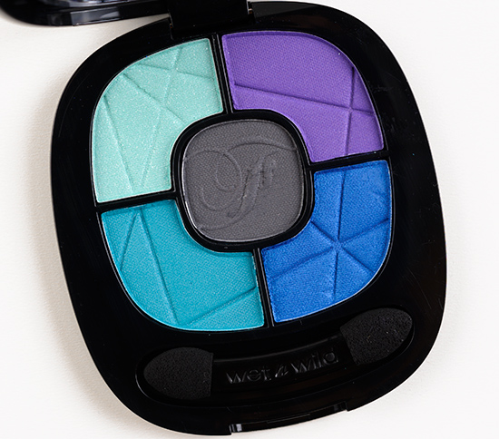
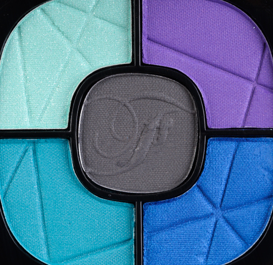
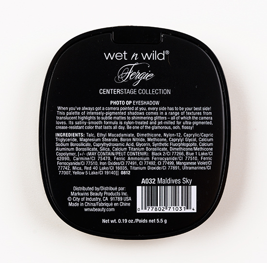
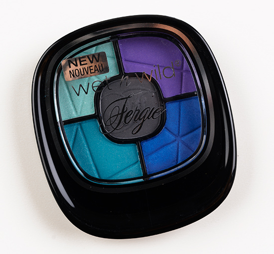
Wet ‘n’ Wild Maldives Sky Photo Op Eyeshadow Palette ($4.99 for 0.19 oz.) consists of five shades: aqua, purple, dark gray, bluish-teal, and blue. The formula is supposed to be “ultra-pigmented,” “crease-resistant,” and “last all day.”
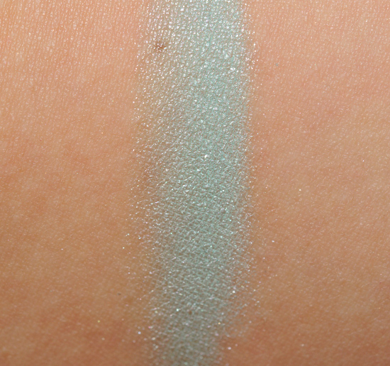
Maldives Sky #1 is a light-medium aqua with a soft, frosted finish. It had good color payoff, but it was slightly powdery and almost looked chalky when applied to the lid. Inglot #345 is greener. Jasmine Blue Oasis is matte but close in color (slightly bluer). NARS Debbie Harry #4 is darker. Sugarpill Mochi is darker. MAC Aqua is slightly greener and matte. This particular hue is not well-known for being nicely pigmented, regardless of brand, which is not a justification but worth noting that it’s hard to get it right.
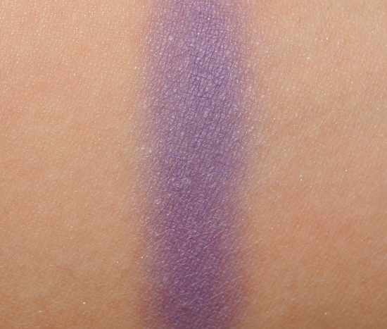
Maldives Sky #2 is a dark purple with subtle cool undertones and a mostly matte finish. It had sheer color payoff, but the worst part was how dry and stiff the texture was. Wet ‘n’ Wild Drinking a Glass of Shine #4 is very similar but more pigmented. Wet ‘n’ Wild Shimmer the Night Away is shimmery. Inglot #379 is brighter, bolder.
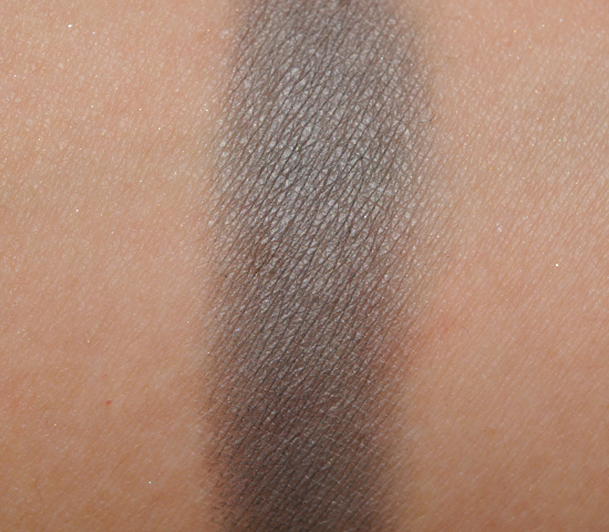
Maldives Sky #3 is a dark gray with a matte finish and neutral undertones. You may notice a pattern developing here: sheerer color payoff, dry, stiff texture. Urban Decay Desperation is cooler-toned. MAC Scene is similar but satiny. Chanel Gris Exquis is darker. Inglot #339 is similar.
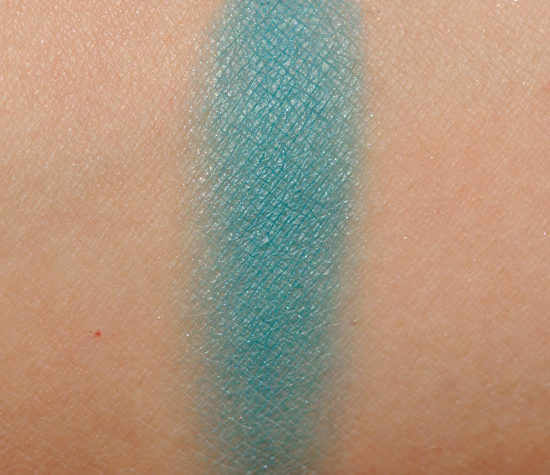
Maldives Sky #4 is a medium-dark teal with blue undertones and a slight dusting of silver pearl. It is dry, chalky, and sheer. Wet ‘n’ Wild Sparkle ‘Til Morning is less blue, frosted. Sugarpill Mochi is lighter. Sephora Curacao Punch is more glittery, brighter. MAC Robin’s Egg is more teal-hued.
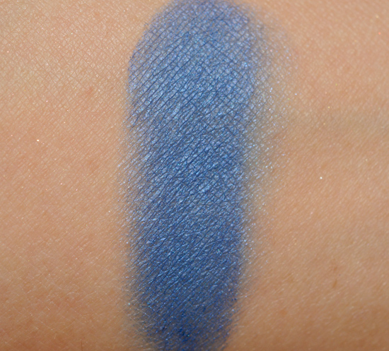
Maldives Sky #5 is a medium-dark blue with a satin-like finish. It had decent to good color payoff, but it still had a drier, stiffer texture that made it hard to apply and harder to blend out. It is fairly comparable to Wet ‘n’ Wild Shimmer the Night Away #8. MAC Switch to Blue is similar but a cream product.
I had a lot of trouble working with this palette; so much so, that I really just gave up after awhile, because the colors weren’t applying with much intensity, consistently disappearing, and had no desire to blend with each other. It was an exhausting exercise in frustration. Wet ‘n’ Wild’s Color Icon formula is so much better than this one, and that formula is such a winner and well-reviewed that I’m truly mind-boggled why they’d use something else (and one that was inferior). When I wore what I did manage to apply, it wore well for about six hours before starting to fade. It’s such a shame, because the colors they chose would be beautiful together, if only they were pigmented, soft, and smooth. You’re better off taking your $4.99 and buying one of the existing Color Icon palettes.
Wet 'n' Wild Maldives Sky Photo Op Eyeshadow Palette Review, Photos, Swatches
Wet ‘n’ Wild Maldives Sky Photo Op Eyeshadow Palette
Wet ‘n’ Wild Maldives Sky Photo Op Eyeshadow Palette
Wet ‘n’ Wild Maldives Sky Photo Op Eyeshadow Palette
Wet ‘n’ Wild Maldives Sky Photo Op Eyeshadow Palette
Wet ‘n’ Wild Maldives Sky Photo Op Eyeshadow Palette
Wet ‘n’ Wild Maldives Sky #1 Photo Op Eyeshadow
Wet ‘n’ Wild Maldives Sky #2 Photo Op Eyeshadow
Wet ‘n’ Wild Maldives Sky #3 Photo Op Eyeshadow
Wet ‘n’ Wild Maldives Sky #4 Photo Op Eyeshadow
Wet ‘n’ Wild Maldives Sky #5 Photo Op Eyeshadow
Get it together Wet ‘n’ Wild!
I’m sort of glad you’re giving the WnW Photo Op palettes bad reviews; I reviewed two of them and had very similar experiences; poor pigmentation and just not worth it at all.
But, I’ve seen some other more positive reviews, and was sort of wondering if I was being too picky or what was going on – so it’s reassuring to know that you had similar problems.
Yeah, I actually find that Christine’s comments match my thoughts about a product about 90% of the time. This means same likes and complaints. You have the best pictures too – the pictures you take are often more true to colour than the ones on the product’s website (*cough* naked palette *cough*).
Keep it up!!!
🙂
I loved this at first glance, but then seen the grade “F” 🙁
Gorgeous shades! I would love to see a look with these 🙂
It looked so bad, I decided not to post it.
Really? I know you can make almost anything look great, and you have done looks with some very poor-quality eyeshadow, so I guess that says it all… 🙂 What a shame.
Hmm, the swatches look good, except for the first one…
that on it’s own speaks volumes!
The colors looked so pretty…..oh well
It’s a shame that these are just horrible pigmentation. I have always loved Wet N Wild trio’s and palettes because they are usually really pigmented. But these Fergie ones have just been such a miss.
ew they even look dry!! i am really loving wet n wild lately.. i hope they get their act back together
I bought this a while back and had the same experience. I tried and tried to get these to play nice and my husband even said the look was ‘scary’! I ended up putting it in my reject pile!
oh no! 🙁 At least we aren’t alone!
Those look pretty fancy and pigmented for WetnWild! I’d give them a try for that price!
how sad. the pan looks so vibrant. thanks for the review. i will be passing on these.
Too bad! The colors really do look lovely in the pan. On the bright side, this means I don’t have to worry about hunting this palette down.
I’m just glad I don’t find any of the palettes appealing; so far, WnW is 0 for 2 with these…
i have this & i love that mint shade, but i have to wear it with their primer & NYX’s jumbo eye pencil in milk & really pack it on with a sponge-tip applicator, or else it won’t show up in the least. they’re gorgeous colors, but the pigmentation & texture is so disappointing..
I bought this a while ago because I am a huge fan of WnW and their current eyeshadow permanent range but this was so bad that I ended up throwing it in the garbage. Beautiful colors but such poor quality that I could not do anything with them, even with the use of primers and other cream bases in an attempt to bring the colors to life.
I’m sad to hear you had a similar experience (because it is frustrating) but so happy you shared so I know I wasn’t alone!
Both compacts you have reviewed so far photograph very well..in their pans 😀
I jumped on these when they first came out. (We all know how hard it can be to find the WnW exclusives) Now they’re just sitting in my vanity unloved. Poor guys, they’re so pretty in person!!
It’s sad that WnW, which surprised everyone a few years ago with its amazing quality (the Colour Icon trios, 6 and 8 pan palettes) seems to be going the way of the “big companies” by putting out substandard products, one after the other! Having said that, although these colours aren’t my “go to” types of shades (I love neutrals), this palette looks so stunning. It’s a shame it doesn’t measure up to how it looks in the pan or to their former quality.
Ha Ha. What do you say? Yes, there are high end brands that end up with a “F” grade, but I would not promote this brand…when I can buy other U.S. made brands for similar pricing.
I was so excited for these, and I only brought this one color palette. SO BAD. I’m surprised you even got the shadows to show up as much as you did. I couldn’t get barely ANY color.
Are the rest of the palettes as bad?
I haven’t liked any of the ones I’ve tried!
I too, loved these colors. In the pan. But once I got them home, I wanted to cry. There is no payoff whatsoever if you are an NC45 like myself. Chalky, stiff, non-existent. I always try to make things work, and I did find that when you use the primer in this line (which is actually quite good) you get a little more payoff, but not much. I rarely throw away makeup, but this is in the trash.
Has WnW actually had good products? I mean it’s $5! What can you expect? I as a makeup junkie just learned to avoid drugstore stuff all together. I that wrong? It’s just too disappointing.
uh yes… lol their lipsticks and their permanent palettes and trios had great reviews from many many blogs.
Aside from the middle shade the swatches don’t look bad. I’ve noticed though that almost always warm tones get scored well above what I would give them and cooler shades are reviewed much lower (and less often). If only there was a blonde Temptalia!