Wait, Something's Different!

Welcome our New Layout for 2010!
(This was posted last week, prior to Thanksgiving, but we’ve bumped it up for regular readers returning from the holidays.)
Long-time readers will know that we change-up our layout on a yearly basis, and this year is no different! (Well, a little different–we’re a smidgen early!) We took a lot of your feedback into consideration and tried to implement certain design elements and features that would best answer your needs!
We do have some additional tweaking of certain features and areas of the site, but it should be functioning fairly normally — so if you encounter any bugs (like, “OMG, where’d the page go? The sidebar is missing!”), please, please let us know! There’s one major feature that we’re still working on that’s not quite ready for launch and that’s an advanced search function. Bear with us 🙂
Definitely let us know what you think of the new site, but let me walk you through some of the major changes…

The NAVIGATION got a major revamp with an entirely different look and feel, plus the placement is different. You’ll find the navigation at the very top of every page, and when you roll your cursor over one of the menus (e.g. Looks), it will drop down a menu with all of the sub-categories within that menu. No more “view more”!
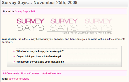
The POST is very similar to the way it was structured before, but it just was styled to fit the new layout. You’ll find the list of categories the post is in just under the title (e.g. Posted in: Survey Says). You’ll see the actual content and whatnot from there on. At the bottom of every post is a wide pink box that lists the number of comments the post has, a link for you to add your own comment, and another to add it to your favorites (aka bookmark it). Beneath this pink box is a list of tags for the post.

The SOCIAL NETWORKS can now all be found at the right-hand side of the top of the page. You can access our Twitter, YouTube, RSS, or Facebook right next to the navigation.
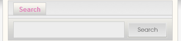
The SEARCH BAR can be found at the top of the right-hand sidebar. Eventually, you’ll be able to choose from Search and Advanced Search.
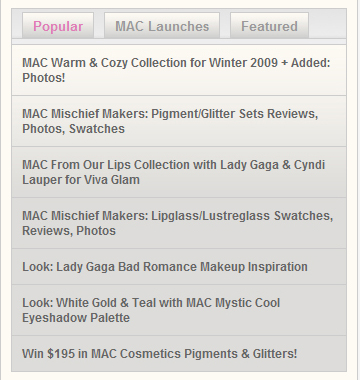
The POPULAR/MAC LAUNCHES/FEATURED POSTS can now all be found in a tabbed box in the sidebar (on the right). We used to have this beneath the logo, towards the top of the page, but now we’ve moved it to the side. Popular posts are based on all sorts of criteria like how many views, comments, etc. for the month. MAC Launches showcase all the latest information we have on upcoming MAC collections. Featured posts are must-read posts hand-picked by us!
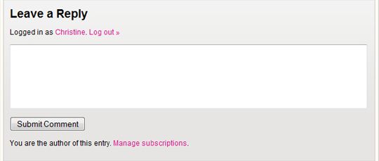
COMMENT easier with the comment form found below the post’s content and no longer at the bottom of the page.
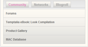
EXTRAS can all be found in a smaller tabbed box in the sidebar (on the right). It contains links to our projects, like the Product Gallery and MAC Database. It also lists what networks we belong to and a list of our favorite sites and affiliates.
It’s beautiful and so feels a lot cleaner too. Love it lots!
I’m excited for this layout. I’m really digging the drop down menu on the navigation. I can’t wait for the advanced search option! Since I started reading your blog a few months ago there’s so much to explore :).
Love it! Cleaner and more polished.
Love the new look….its so professional and the navigation is much easier!
I LIKE THE NEW LAYOUT ITS NICE
for the most part, i love the new layout. i was trying it out now and it is definitely easier to navigate and find things especially when looking for a post on a specific brand. i also like how the drop down boxes pop up when you scroll over the top. it makes navigating much easier.
one small thing that bugs me is the bar that separates the title from the articles/posts. for some reason it makes it look very disconnected and not cohesive. i don’t know why that is though…
overall i love the site even more than before. keep up the good work!
I agree with you about the ‘bar’ that separates the header from the posts. At first it reminded me of when you search google images and load a website & it comes up with that separation… i’m getting used to it now tho 😉
Love it! 🙂
I LOVE IT!! It is a great improvement Christine. I never hated the other layout, but it wasn’t the most functional all the time. Great work you guys. I am a long time reader, so I can say that I will be cruising away faster than normal on here.
I LOVE the new look, Christine! It looks really ‘clean’ and simple, and looks really professional too. Great work! 😀
Also, Happy Thanksgiving! 🙂
xx Renee
Great! I love everything about it! I was a little anxious because sometimes sites change their layout and it turns out worse than before you know? But not at Temptalia! It’s very fresh and light 🙂
The dropdown menu is much handier than before although it sometimes seems to “freeze” sometimes e.g. the dropdown box ‘Looks’ will just stay unfolded for a while. (Could be my computer though, just thought I would let you know!).
There’s one thing I would like to suggest (if that’s alright with you): it would be fantastic if you could have the forums, gallery, database, lookbook open in a new window! Just an idea 🙂
Anyway, congratulations on the new layout! Make sure to give the bf lots of hugs and kisses because he’s doing a great job (and so do you of course)!
Just changed the links to new windows!
Thank you! 🙂
Great! Thanks!! 🙂
Just wanted to let you know they still open in the same window (don’t want to whine about it or anything)!
Could you refresh? They should work!
They do now 🙂 Thank you!
I like it. It’s a little cleaner, a little easier to use, and I swear it loaded faster. Good job! ^_^. Will keep you posted if I find any bugs.
Faster?! PFFT, I wish, LOL! I mean, if it did, I jump for joy. I only know of one solution to make the site *any* faster, but it’ll double our monthly costs, so I’m still hesitant to do so! I want a slightly less costly solution, haha.
Thank you!
It actually is faster on Safari, quite a bit faster.
Absolutly love this!! It looks really clean.
I really like the new layout! But as always, I think it takes some getting used to. 🙂
i love the new layout. it’s most excellent.
Good graphic revamp! Looks cleaner and more ordered while still being the same in essence. Easier to navigate too. 🙂
The new site looks great! Good job! :]
Love the new layout, chic, pretty, clean and amazing!!
wowee exciting! what software do u use to create ur site? dreamweaver? flash? i have been studying web design at university! love your site christine!
I think my boyfriend uses mostly Dreamweaver!
LOVE IT!!!
Happy Thanksgiving Christine!!
I like the old one more!
agreed.
The navigation is superb! I do miss the date on the top right corner though; It makes it easier to tell what sales and collections are still relevent.
Wow awesome job! Everything seems so fresh, love it!
I like it!
Good changes 🙂 I like the navigation bar at the top and the comment form following the post. Both make for easier navigation.
love the new layout! it looks so much cleaner and not cluttered.
:] the first thing I notice is the comment box at the top which I remember mentioning so I feel important LOL. but i love the rest of it too, it looks so polished! I love the sidebar addition too :]
Hi Christine!
I really like it. I used not to be too keen on having to scroll down a page every time to see the newest post, but now it’s right on the top. Very cool! 🙂
I like it. The layout is much cleaner and not as cluttered. I thought the right side and the top of the page was too cluttered before with ads and other widgets. Kudos for putting the comment box at the top of the comments section instead of the bottom.
I like it, well done!
I love the look and feel of your updated website! It is so much easier to navigate and to find things. I use a MAC (Safari as my browser) rather than a PC and I always had problems with the layout and being able to easily access the different “buckets” of good information. Thank you for taking the time to revamp!
I’m really liking the new layout! Not so different to the point of being lost, but different enough that it will take a few visits to get used to it.
The only (minor) issue I’m having is with the drop down menus. They seem to lag a tiny bit, so when I hover on one of the links, the box shows up without a background and after a second or two it comes through. Although I think that the issue comes and goes.. I just scrolled back up and once I hovered over the links numerous times, it seemed to no longer lag.
Am I the only one seeing that?
Oh and, I adore how these comments look, especially the reply button, it’s so pretty!
Hey Ashley,
Thanks so much! We’re going to tweak some of the loading of the site so hopefully those navigation images will preload so you won’t have the lagging issue! Appreciate you letting us know about it 😀
The issue is fixed now! No lagging, even on the really large drop downs 😀
I like the new layout! It’s cleaner and easier to navigate.
I love it! And it loads a little bit faster!
I don’t like it. 🙁
I really like the new layout, Christine! Noticed it last night, but I knew you’d have a post up once all the changes were done so I kept my mouth shut until the comment would be relevant to the post 😛
It looks really clean — plus, I love that the “leave a reply” box is above the other responses! I think it’ll prove to be really handy.
Its neat….and easy!!
I love the new layout! It looks great. I like how the comment box is at the top of the comments so it saves time from scrolling all the waaaaayyyy down. haha. 🙂
I really like the new Navigation bar!
I’m Loving the navagation idea!