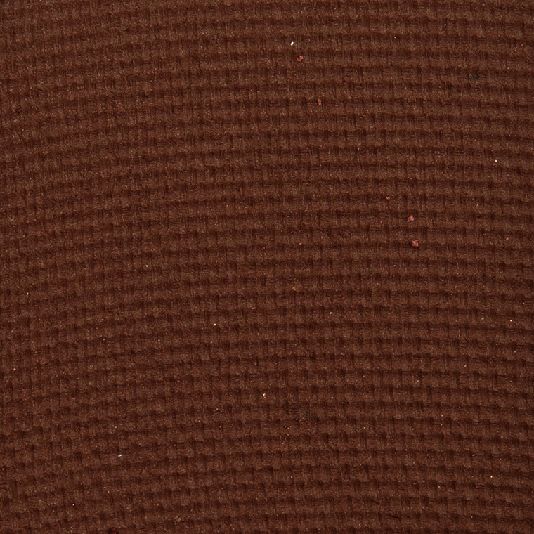
Viseart Midsommer + Solstice Palettes | Swatches


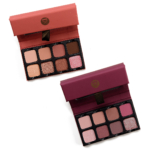
Last week, two new Viseart Petit Pro Palettess ($30.00 each) released. There’s a slightly cooler-toned, rosier palette called Midsommer, and then a warmer-toned palette called Solstice, which are both swatched for your viewing pleasure in this post.
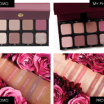
The initial announcement of the two new palettes resulted in quite a bit of concern and discussion over color accuracy — there is a big wide discrepancy between the photos of the palette as well as between swatches, particularly with Midsommer (which looks like a pink/mauve palette on deeper skin and… coral and brown on lighter skin per the brand’s photos).
I’m lighter (my arm is lighter than my face by a smidgen normally, though I think they’re close at the moment), but the Midsommer palette definitely appeared more in line with the swatches on deeper skin; in the pans, they align more with a rosy/mauve theme than coral/brown.
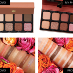
With respect to the Solstice palette, the promotional swatches are more similar, though they do not match up so well with the promotional photo of the palette (which reads less orange and desaturated in comparison). The reality ended up being a slightly deeper version, but still more on the desaturated side, of the promotional image–I didn’t get brighter orange tones on me (again, a lighter skin tone) with shades like Crescendo, Ferver (that’s how it’s spelled on the label on my actual palette, though the swatch photo says Fervor, as it is actually spelled…), and Litha.
Right now, the palette is only available online, and obviously, swatching in-person has come to a grinding halt anyway, so it’s more important than ever before to provide more accurate imagery, but it’s definitely important that things line-up visually. It’d also be a good idea to have video filmed, too, to show the palette in motion in case images do not align. It’s ideal for the customer to have a good grasp of what they’re purchasing because when expectations are missed, that’s when people return products or stop trusting brand imagery/swatches–and with people moving shopping online, keeping that trust is imperative!
I think in this instance the original promo images made both palettes look extremely light-leaning, and based on the comments I saw from readers and others in the community, it felt exclusionary to medium and deeper skin tones, which caught me by surprise as I recall Viseart mentioned before that they test on deeper skin tone first to ensure colors work there and then move to lighter skin tones. Then, the brand released swatches and people were very confused seeing the difference in Midsommer swatches between skin tones and the richness in colors for Solstice!
After seeing them in person and swatching both palettes, they are lighter color stories. I would have loved to have seen one more neutral palette and one more colorful one, since they released two together, as Viseart has so much artistry behind them yet so many neutral-heavy releases (like Paris Edit came out earlier and is similar in story to Midsommer). Solstice feels like a lighter Apricotine (and the Spritz Edit). They really do feel like more muted, edited versions from the Paris Edit/Spritz Edit launches, which was just in February and April, respectively, of this year!
Neutrals obviously sell well, otherwise brands wouldn’t keep putting them out, but Viseart’s starting to feel like they’re reinventing the same wheel rather than expanding on it. Where are the earthy neutrals — plums, taupes, olives? Even more golden-leaning browns rather than peach/orange. I’m definitely looking forward to hearing how those with medium and deeper skin tones find these new palettes! Or make these complementary, almost fall-winter takes on Paris Edit/Spritz Edit, so they’d run a bit darker/richer (and maybe Spritz Edit for fall would get redder, rustier, or more olive).
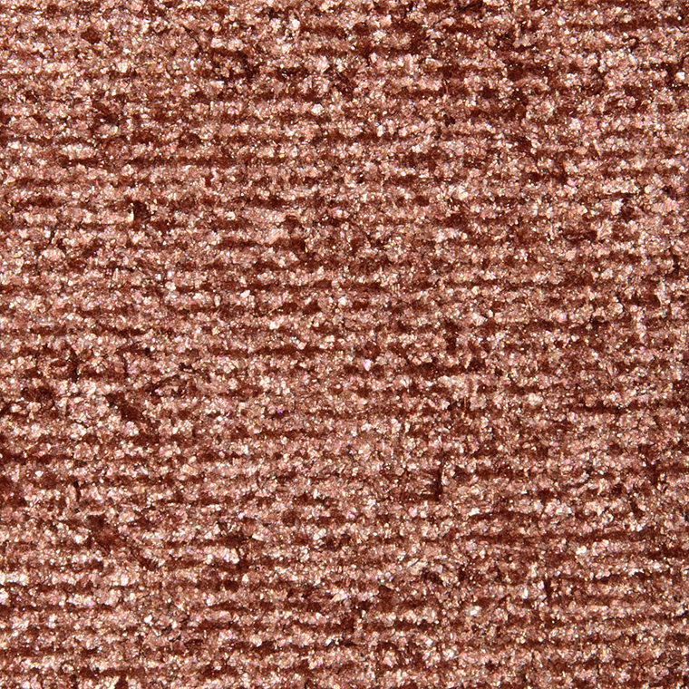
Midsommer + Solstice


Viseart Midsommer Petit Pro Palette

Viseart Eglantine Eyeshadow
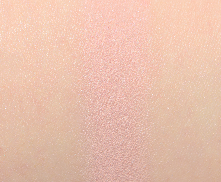
Viseart Eglantine Eyeshadow

Viseart Cupidon Eyeshadow
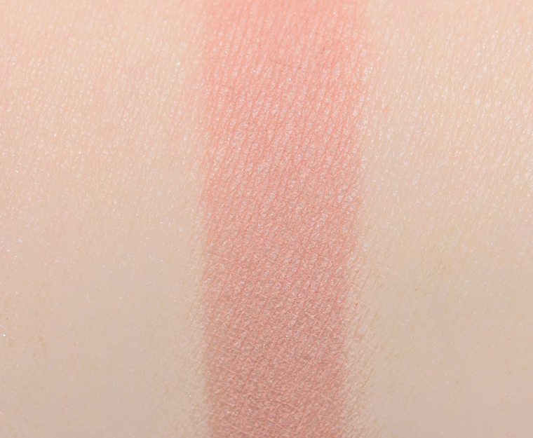
Viseart Cupidon Eyeshadow

Viseart Puck Eyeshadow
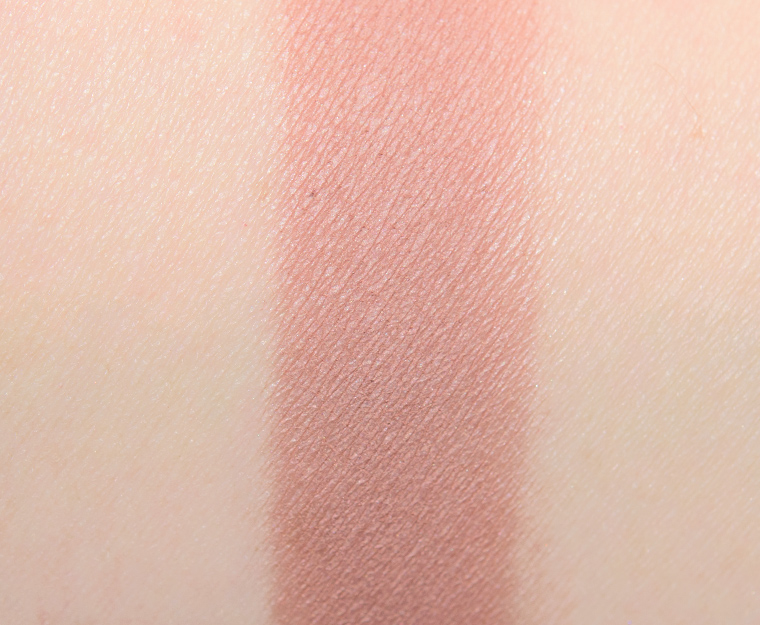
Viseart Puck Eyeshadow

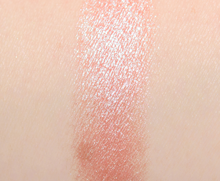
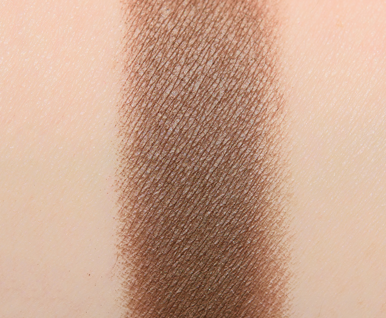
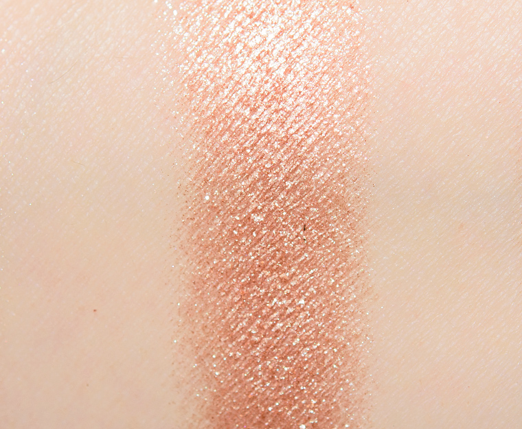
Viseart Midsommer Eyeshadow
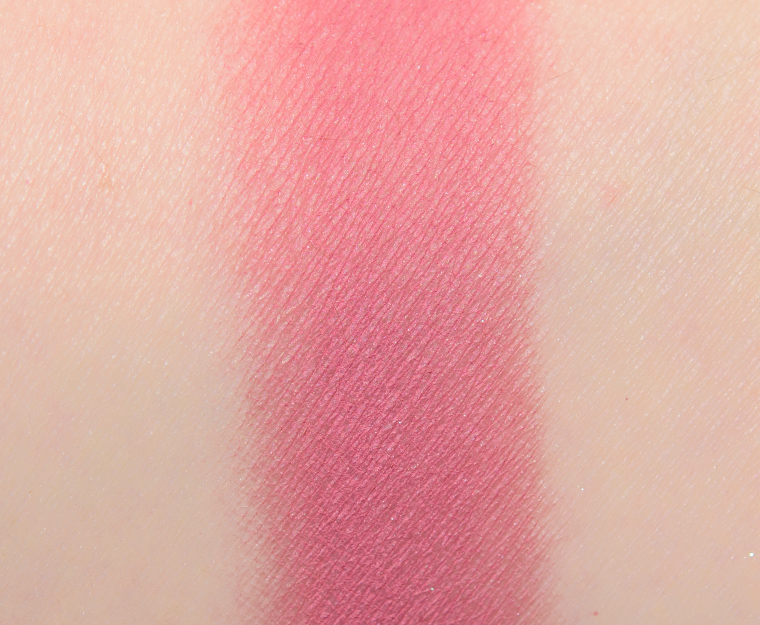
Viseart Midsommer Eyeshadow

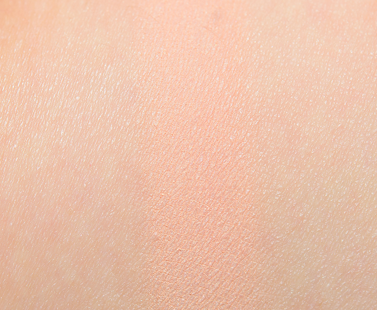
Viseart Faerie Eyeshadow
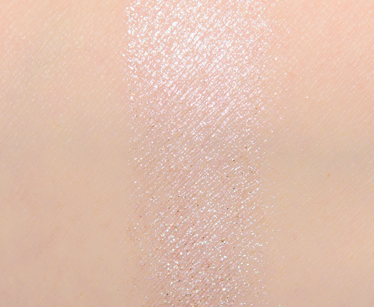
Viseart Faerie Eyeshadow

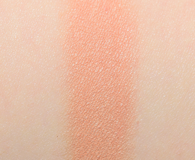
Viseart Potion Eyeshadow
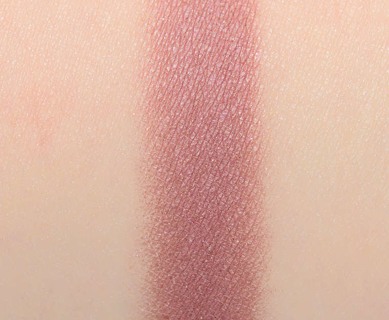
Viseart Potion Eyeshadow

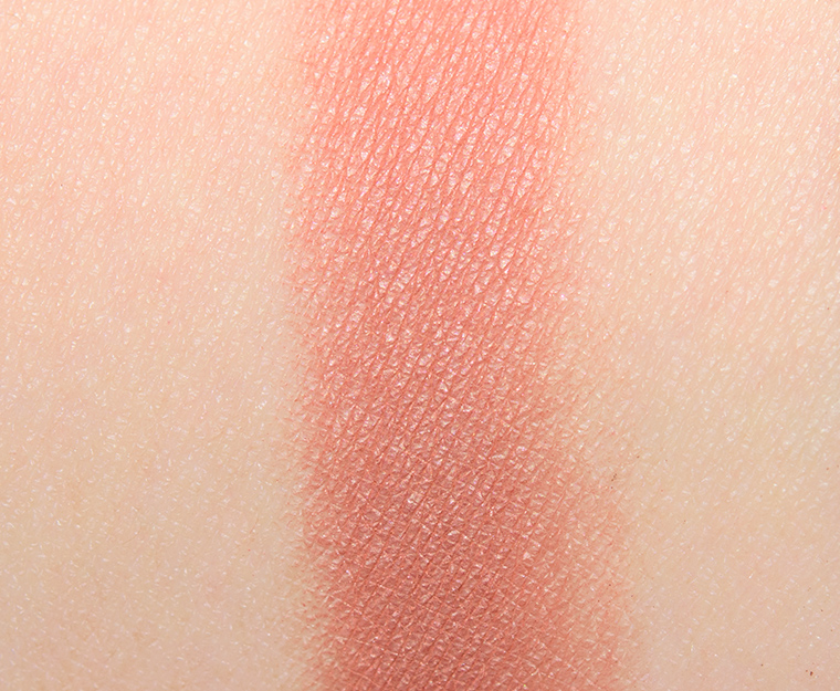
Viseart Titania Eyeshadow
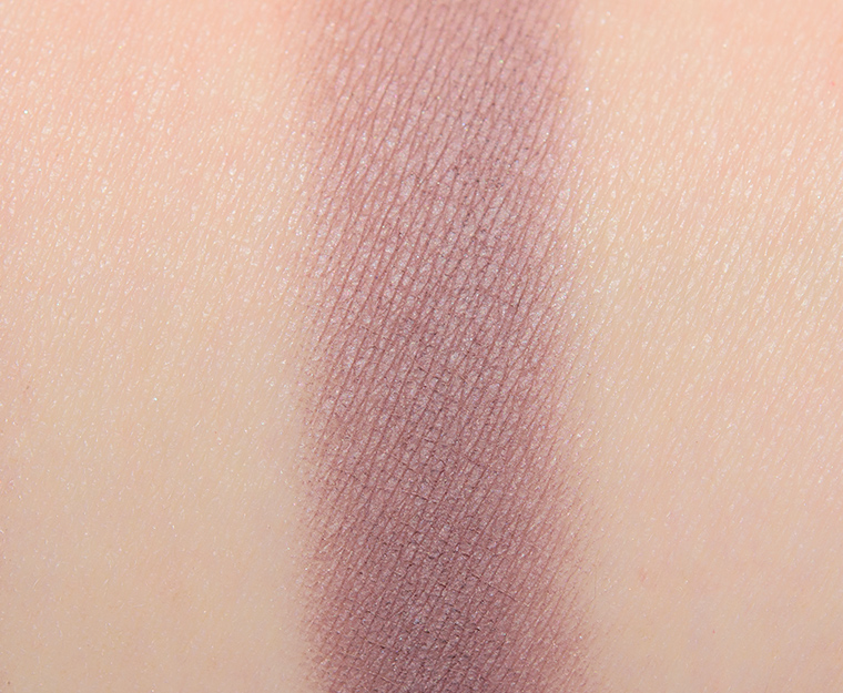
Viseart Titania Eyeshadow

Viseart Changeling Eyeshadow
Viseart Changeling Eyeshadow

Viseart Solstice Petit Pro Palette

Viseart Languor Eyeshadow
Viseart Languor Eyeshadow

Viseart Crescendo Eyeshadow
Viseart Crescendo Eyeshadow

Viseart Summertide Eyeshadow
Viseart Summertide Eyeshadow
Viseart Duir Eyeshadow
Viseart Duir Eyeshadow

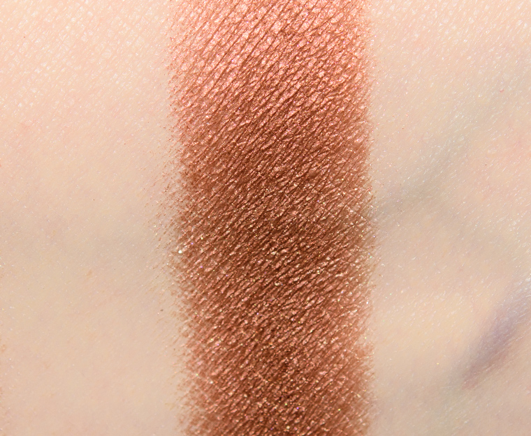
Viseart Ferver Eyeshadow
Viseart Ferver Eyeshadow
Viseart Litha Eyeshadow
Viseart Litha Eyeshadow

Viseart Splendor (Solstice) Eyeshadow
Viseart Splendor (Solstice) Eyeshadow
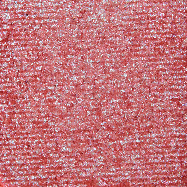
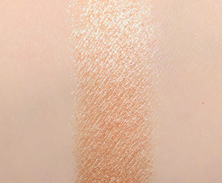
Viseart Solstice Eyeshadow
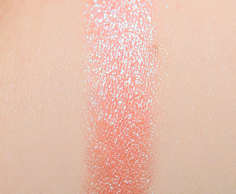
Viseart Solstice Eyeshadow
I never rely on the brand’s or merchant’s photos for accuracy, but one hopes they are at least a reliable point of reference. But Viseart is one of the few brands that I purchase without hesitation so I had no qualms about getting these as soon as they became available.
I definitely don’t expect 100% accuracy (and it would be impossible since color varies from screen to screen!), but these seemed so off! I do think product photos tend to be more accurate, whereas swatches can start deviating.
Am I the only one that finds these…. lackluster? Colourpop came out with similar color stories a few months ago at a lot more affordable price.
Right? All Things Equinox (C) and She’s Got Solstice (W). These are among my least favourite CP palettes too. I can totally do warm and cool muteds, but generally want greater variety in terms of value within the palette so neither of these do it for me. I’m passing. No doubt can dupe them out in any event.
Same here, the Midsommer one looks like Making Mauves and the Solstice looks like any of Colourpop’s coral/Sweet Talk/peachy palettes.
I was thinking this is V’s CP turn. Getting self repetitive and looking very CP. I can wait; it’s not like Viseart usually sells out to Over! very often. The minis are very appealing.
Yes! I saw it and thought ZZZZZZZZZZZZZZZZZ. ?
I adore Viseart, so I was excited to order both of these. I also signed up for the pro discount recently when they offered it to everyone for a short time, so I got 20% off both, which puts them at $24 each, which is just a little more than 1 UD eyeshadow. Both palettes look very usable, so I’m excited to receive them!
I like that Midsommer is actually a cooler toned palette, but there is no depth to the palette. I wish Puck and Tatania were a few shades deeper and richer colors. Puck looks quite similar to Cupidon and like they are going to look the same on the eye.
You make some very good points about promo photos and swatches. I don’t buy brand new releases without seeing any reviews or swatch posts online. I’ll miss out if it is LE and a quick seller, that’s fine. I’d rather miss out than end up with a palette of colors that look nothing like they were advertised as and potentially unusable (for my wants/needs). There are very few brands I trust based on promo photos alone, and that list continues to shrink as I feel duped by swatch photos. I think the video idea is great and would also love to see photos of palettes and swatches in natural light as well. Studio light vs natural light can make a big difference!
I love visart but I’m disappointed with this new release. Two palettes, both very light. I have a deep tan skin-tone, there are probably three colors that would show up on me.
Speaking as someone who falls solidly in the “Medium” category for most of the year, and “Medium-Tan” currently, I could probably use these…for a VERY soft, almost watercolor eye? There is a painfully obvious lack of contrast in either palette, but especially lacking in the Midsommer version. And that was the one I was most interested in!
The duochromes in both palettes were the main reason why I would even consider getting these palettes. I am definitely going to wait for dupes to get posted as I do not see a reason to buy two whole palettes full of colors I already have if I can get similar colors in single form.
Even though the duochromes seem to have a different base, I honestly couldn’t tell the difference applied (wearing both right now). The Solstice duochrome is more shimmery/vibrant.
I suspect there is a Sydney Grace or Colourpop shade that looks similar to the Solstice Duochrome. I just feel like I have so many neutral eyeshadows that the rest of the palette does not do it for me.
Not something I would buy. Too light for my tan deep complexion.
I’m glad to see Midsommer is actually mauve-toned. I’m going to pass on these.
The promotional swatches were quite misleading and Christine is right: in a world where things are only available online and where swatching before purchasing is no longer a possibility, accurate swatches are super important!
As for the palettes depicted, I love the idea that Solstice is basically a muted and lighter version of Apricotine and Spritz Edit (I found the latter two palettes too dark and vibrant). I’m going to wait for the review and if there are no major issues, I’m placing an order. Does anyone know if this will be available at Sephora?
You are quite right in your comments about Viseart exploring different neutral shades — earthy neutrals and gold leaning browns…these two, whilst looking OK from the swatches, are just reiterations of not just this brand, but others over the past year or so.
Accuracy of images and swatches is absolutely vital these days and for the beauty industry to survive, it has to make its swatches as clear as possible.
Both of these palettes look more attractive to me in your photos than the promo photos. I do feel like Viseart is repeating color stories quite a bit though with Warm Edit, Spritz and Apricotine. Those are all lovely palettes but how many warm neutral palettes does one need? That being said if I can pick the up during a Sephora sale I will, but Viseart needs to mix it up more!
Yeah, I get neutrals being popular, but it just seems a lot for back-to-back releases! A lot of folks definitely only purchase one or two palettes a year, so if they grabbed Spritz Edit, are they going for another one like it released in the same year?
So interesting how all the different swatches and photos look! Bless your consistent lighting!
I really thought I wanted Midsommer, but now, after seeing your swatches, Christine I don’t think I want it anymore. I will decide after the reviews. I need the dupe list, but am quite certain I have loads of dupes for most of the included colours.
I agree with all who pointed out the lack of depth. and the similarities between some of the shades.
Thank you so much for swatching, it is so helpful.