Sugarpill x Edward Scissorhands Collection for September 2015

Sugarpill x Edward Scissorhands Collection
Twenty five years after the world fell in love with Edward Scissorhands, Sugarpill presents a limited edition, vegan and cruelty-free eyeshadow palette and nail lacquer collection that combines dark romantic shades with sweet suburban pastels inspired by the modern fairytale.
Six cutting-edge new eyeshadows allow you to create countless inventive looks ranging from metallic smoky eyes to retro housewife chic. Enhance the look with two corresponding nail shades designed to wear beautifully on their own or layered on top of each other!
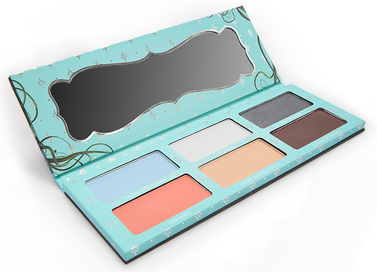
Eyeshadow Palette ($36.00) (Limited Edition)
- Home Sweet Home Mtte powder blue
- Ice Angel Silvery white with iridescent blue sheen
- The Inventor Creamy metallic gunmetal
- Suburbia Flirty matte coral, doubles as a blush shade!
- Heart-Shaped Cookie Soft matte beige – the perfect blending shade
- Castle on the Hill Deep stone brown – the color of a castle’s deteriorating exterior.
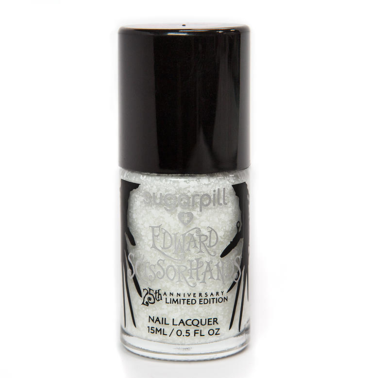
Ice Angel Nail Lacquer ($10.00) (Limited Edition)
Enchanting blend of snow white flecks in varying sizes. Wear it alone for a sweetly subtle look, or layered over different colored bases to create a never-ending assortment of your own custom looks!
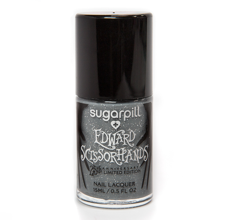
The Inventor Nail Lacquer ($10.00) (Limited Edition)
A pinch of silver glitter mixed in a dark steel gray base. Wear it alone, or dress it up with a coat of Ice Angel on top!
AVAILABILITY | Midnight EST, September 28th, 2015 at sugarpill.net
See more photos!
Sugarpill x Edward Scissorhands Collection
Sugarpill x Edward Scissorhands Collection
Sugarpill x Edward Scissorhands Collection
Sugarpill x Edward Scissorhands Collection
I was excited until I read “twenty-five years,” and now I’m just sad and feeling old.
Lol! I’m with you, sharing the same feelings.
I totally agree and hate it when someone interrupts my delusion of youthfulness.
I love the concept, but the colors in the palette look super random to me. Four neutrals and two pastels? Well, to be fair, it makes sense if you’re supposed to create a cool toned look with the first horizontal row, and a warm toned one with the second. But it’s not something I’d buy, even as a huge fan of Sugarpill. Maybe I’m just baffled at the thought of them coming up with a brown shade. Wow, just wow.
I didn’t understand the deep brown either! Not for this movie! He trims elaborate topiary, there ought to have been a brilliant forest green!
Agreed. There was so much green in that movie. I love Sugarpill and Edward Scissorhands. But this isn’t even mildly tempting for me on first look.
I think the pastels are a reflection of the 60s housewife motif, the white is the snow, and then the darker shades the darkness of the movie.
But I agree with others, a green would have been nice instead somewhere.
As someone who truly understands and gets this movie completely, and loves it dearly, of course I’m over the moon happy for this collection! Not crazy about that pale blue at all, though. Love the white flakey polish overcoat!
I get the pale blue, but it’s the coral that seems out of place to me… I do agree there should have been a green in here! Also, even if it meant charging more and/or doing smaller pans, sooo much more could have been done…
Between this one and the Lorac Mega Pro Palette, it certainly seems as if creativity got flushed down the toilet!
I think the coral is a reflection of the time-period the movie is spoofing. The 60s were rife with it.
I feel a little disappointed, but I don’t feel so bad either because I’m broke right now. LOL
I love the movie and was super excited about the eyeshadow palette until I saw the colors…can’t say I would really wear any of the colors, except the brown and white, but I probably own similar shades.
I was almost screaming over this collection till I saw the colors in the palette. The pastels mixed with grey mixed with warm brown? I get that the movie has moments of pastels and moments with a lot of black, white, and grey but I think they should have just picked one of those aesthetics rather than this confusing mixture. I just don’t know what kinds of looks I’d make with this.
Me either. Smdh. ?
I think I get it now, kinda. You can mix both of the vertical rows on the sides with the one in the middle, so you get a middle ground between both aesthetics. It’s a metaphor for Edward and Kim’s romance! Hahaha.
My issue is that the pastels are so “powdery” in tome, as oppsed to more “saturated” like in the film. A bright green and/or rich sky blue would have been a better choice than the poeder blue. As for the coral, I get that it can double as a blush, but they would have been better off making it a separate product.
I loved that creepy, sad and romantic movie! I like the color choices in the palette, you could do a lot of looks. Especially if the light blue is well pigmented.
The cover of the eyeshadow palette is awesome; too bad the colours inside aren’t 🙁
Wow, the 1990s are back! I definitely feel old, but lots of fond memories too. I’m so excited you’re reviewing Sugarpill as I keep hearing readers rave about them, but not feeling the colors in this palette. And I agree, there should be a green shade.
OH MY GOD.
I am not even that excited for the products themselves, but I am SO obsessed with this movie, it is my favorite hands down, and I just want it ALL!! 😀
I like the concept, each shade reflecting the different pastel hued houses in the subdivision the the final two being the dark shades of Edwards world! But regardless I ain’t got time for all these pastels.
Love all the packaging!
I didn’t really like the film and I think it’s a bit dated to link an eye shadow palette with it. I also think the shadows are a real mixture: cool tones on the top and dupable warm tones on the bottom. Not too sure about this one.