How useful are brands' promotional swatches to you?
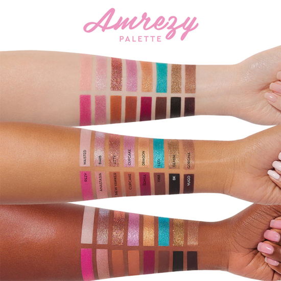
A lot of them are heavily edited that they’ve lost meaning; when they look nearly digitally stamped on or exactly the same across three skin tones, they aren’t very useful. I like when they are well-done but still have a foot, or at least a toe, in reality.
— Christine
Exactly what you said, Christine. I depend on the Temptalia swatches, not brand swatches. I’ve been with this website long enough to be able to judge how a color might look on me when I see it on Christine.
Ditto Seraphine
Same!
Me too!
Yes, I don’t purchase until I see the swatches here or in store.
Yes, of course!
I lived under a rock makeup-wise from roughly the mid 90s until a few years ago, I had what worked for me so unless it was nailpolish I really didn’t pay much attention to beauty marketing. When I decided it was time for me to make some changes with my professional image I admit I believed marketing swatches at first.
I don’t trust them much for the same reasons you mentioned, Christine. That and I know how easily I can forget my monitor display is in “amber night mode,” one time I ordered yarn for a colorwork sweater. I opened the box and wondered if I had gotten someone else’s order because the colors were nothing like what they were supposed to be and then it dawned on me that I selected them at night during night mode. /facepalm So I especially don’t trust what I see on a monitor!
If they were done more realistically they would be more helpful. They are basically nothing more than paint chips in my opinion. Pretty, but not too useful.
The way a product can really play well against depth of skin is a selling point; otherwise, just post the swatches on a white background.
I love seeing the swatches but I don’t trust them when they are exactly the same image with only (say) the lip colour changed. I don’t know how to use photoshop or any other image-altering software so I just jump to the conclusion that those types of images are manufactured. I definitely trust your and other beauty writers’ swatches far more!
They usually give me a general idea of how the color story would work with my skintone. But 90% of the time, these swatches are not very helpful, as they look like they are photoshopped in the photos. I rely a lot more on swatches like you do here, or watching YouTube swatch videos.
Maybe useful in that it tells me a certain color story. Tells me nothing in terms of pigmentation or performance. Hate how artificial they are!
I’d much rather see the product in person. I’ve learned the hard way that things aren’t always what they seem like online. I’ve seen many shadows described one way but look completely different in “real life”
USELESS. I don’t care for photoshopped swatches. Stencil swatches are equally useless, since they’re not different from a picture of the pans.
Stencil swatches are the worst in some cases. Yes, there are colors you pack on the lid… but for things you actually blend, it’s useless to see those stencil swatches.
Not nearly as much as it used to! I’ll admit, when I first started more actively getting into makeup (roughly past 1 1/2 years) I really did love looking at the promo swatches as a way to judge the quality of a palette. Somewhat unsurprisingly, it was after I found this site and looked for Beauty YTubers who talked more about formulas and performance such as Kinkysweat that I had a better appreciation of whether promo swatches were as helpful as I hoped they would be.
They’re rarely approximate to what the actual palette would look like in real life, and for some companies (let’s say Pat McGrath for example), the filters that they put over the products make for stunning IG photos, but don’t really show how the swatches look on different skin tones, and I’m not completely convinced that swatches are the end all to be all for performance and judging eyeshadow quality. I tend to look for reviews from people who are passionate about makeup and use that as a barometer as I think it’s more helpful.
That’s why we need you! I always check colors on Temptalia.com!
Most of the time, they’re not accurate enough for me to form an educated opinion on them. I wait until I see swatches here and on my favorite YT’ers channels, ie; Mel Thompson, Alicia@kinkysweat, etc.
Yeah, those digital “swatches” are awful! As are those taped off and stenciled ones, too.
I love how Mel Thompson and Jen from jenlubsreview swatch against similar colors, especially (for example) old palettes some might already have. It gives a better idea of the color, even if the colors don’t translate to screen as in reality.
They aren’t. I can’t remember the last time a brand swatch was actually trustworthy. They’re good to get a sense of color story only.
Heavily edited swatches are absolutely useless to me. I appreciate a finger swatch even if the product itself does not swatch well(I know that swatches don’t tell us the true story of whether an eyeshadow works well on the eyes) I can at least get a better idea of how the shadow will look on a range of skintones. tbh most brands so heavily edit all of their ads that other than telling me they have a new product I think they are a waste of all the time and money the brands put into them. We’re at the point where so many products brands show us end up looking entirely different in person.
They’re okay, I guess, though they give me more of a general idea of the collection’s vibe than how any particular color might look on me. The ones that really annoy me are the ones where the brand decided to do something ‘artistic’ in their presentation and end up making the swatches too small or otherwise hard to see. Like, a bullet tip, or worse a pencil tip, and a squiggle doesn’t tell me anything useful at all. I actually discovered this website because I was on the hunt for better quality swatches. Now it’s my go to resource.
Not at all, for the reasons you give. They’re usually photoshopped into another product entirely, if not outright faked. I wait for reviewers swatches.
I pretty much agree with everything posted here. I would add that since my computer monitor is not particularly accurate, I rely on Christine’s description more than the actual swatch photo, even here on the blog. If something is described as a warm peach, I have a general idea of whether it would work for me. Also, since Christine looks good in everything, I have to take photos with a grain of salt.
All swatches (including on this blog) are somewhat irrelevant for me; it’s not necessarily the fault of the person taking the photos, but colors differ from screen to screen, even the environmental light can change the way my eyes perceive colors.
That being said, most times I just don’t care about brand promoted swatches look. They are highly photoshopped and manipulated, and sometime they simply put a layout of color on artificial images of skin tones (they don’t even use real models).
Usually I get interested in specific colors from swatches on Temptalia, then go to see them actually in store and how they look against my own skin tone.
Barely. They have the basic idea of what color to expect, but I’ve yet to see a brand’s image come anywhere near reality when it comes to swatches – even accounting for computer/phone differences.
Couldnt agree w u more!
They help me get a general idea, but I normally search out a beauty vlogger on YouTube or instagram whose skin tone is close to mine – one where they show the swatch in natural light versus indoor/beauty lights.
I don’t really believe them at all because I think, as you have said Christine, they are edited/photoshoped etc to look far more pigmented than what they are. I really only trust your reviews.
I don’t believe the swatches but get stuck wondering how they get perfect rectangles with powder shadow. I do like looking at the colors just like I like looking at paint swatches and fabric samples. I simply love seeing colors.
Another issue is the impossibly small text of color names often not ever close enough to my complexion sample!
Honestly, usually only preliminarily. Is a pan matte? Does the champagne swatch as a topper? Sometimes even those most basic questions are not answered but it is better than nothing.
Swatches are super useful. Brand swatches? Not so much. They photoshop the thing so much that in some cases (foundations and concealers) it is impossible to guess.
I’d rather have true skin swatches.
I just like it to see the colors away from the distracting background of the packaging. I don’t need to see across 3+ skin tones…I realize these swatches are not really accurate representations.
You know which company has the absolute worst swatches for lip products? NYX. They clearly edit it onto these very oddly photoshopped faces, and they look nothing like when swatched in real life. And shades always look the worst on the women of colour – super ashy, kind of gross looking, which is no use to me. I honestly don’t know why they even bother.