ColourPop So Jaded Shadow Palette Swatches


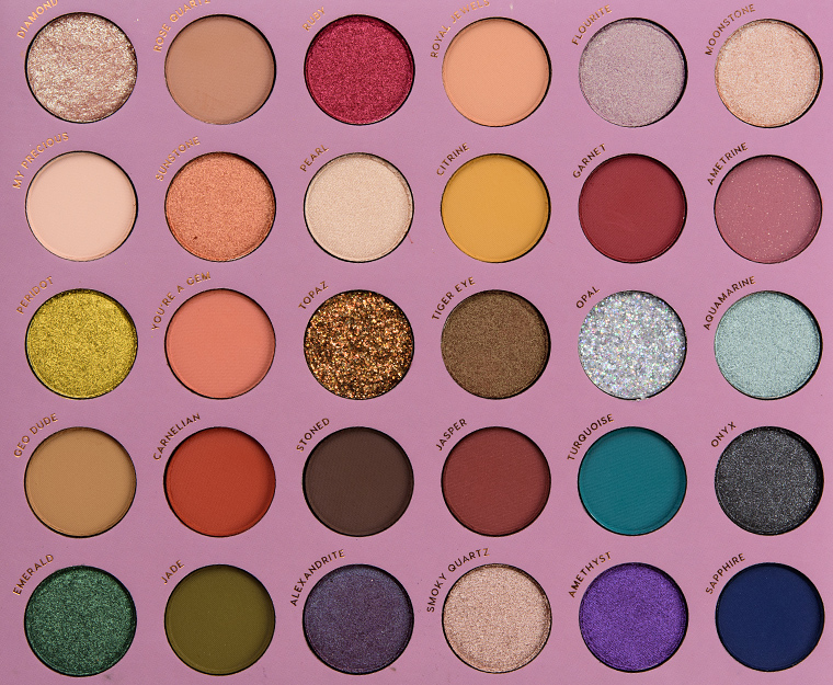
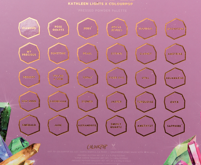
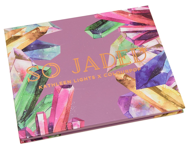
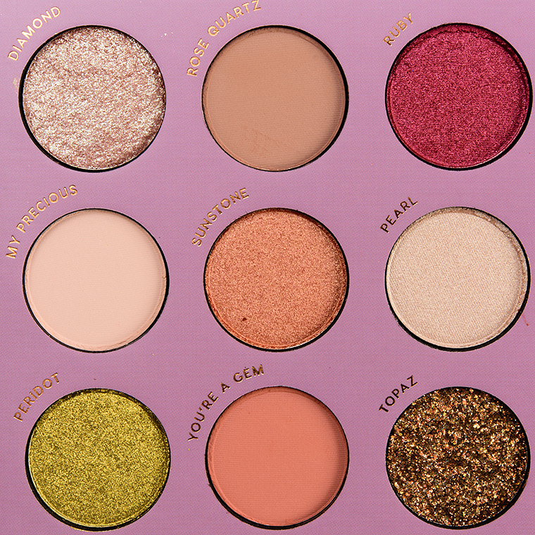
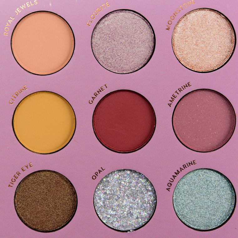

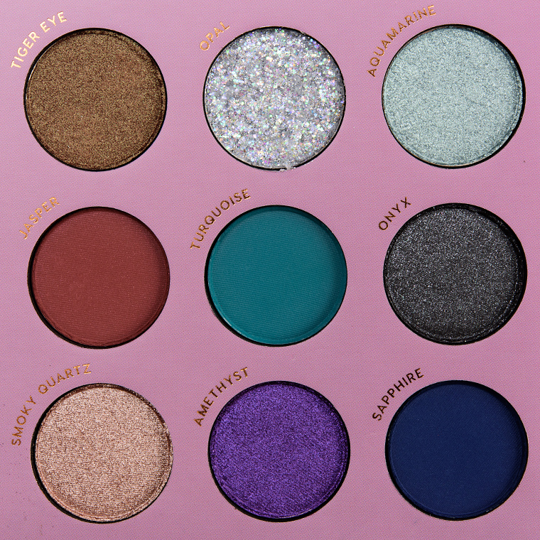


ColourPop So Jaded Shadow Palette ($39.00 for 0.92 oz.) is the newest palette collaboration with influencer Kathleen Lights, and it is the brand’s first mega palette, which features 30 shades (most are 0.03 oz. each). For as many shades as it has, the physical size isn’t too unwieldy and still feels lightweight and looks slim. It sold out last week when it debuted, but it will be restocked in the next week or two.


A mega-palette that’s actually laid out well? I’m flabbergasted! No, really. Just looking at how disjointed and all over the place the Norvina Vol. 1 and Natasha Denona’s Metropolis palettes are laid out, this is a major improvement! I’m not happy about the 2 pressed glitter shades, but everything else looks quite good for the most part. Call me shocked!
I really like Kathleen’s zodiac shadows and have been looking forward to more of her releases but I will skip this BC I have too many dupes. The mattes seem to swatch well. I will definitely want dupes of rose quartz and ametrine: I’ve really been into rosey neutrals lately. Tbh, I would have just put together my own palette if I had wanted over 20 shadows: CP does this for a great price.
I bought this and really like it! I look forward to your review and look ideas… and you’re so right. It’s not too big or unwieldy or heavy.
I like how the birthstone theme complements Kathleen’s other collaborations with ColourPop. This palette would be the perfect introduction to eyeshadows if it weren’t for those awful pressed glitters; have they not seen that Imgur album that detailed a woman’s journey of losing her eye to glitter?!
As someone who has worked with jade all my adult life, calling that color jade makes me viscerally uncomfortable.
I hear you. It’s like any green is jade. I happen to like the color– but it’s got nothing to do with the subtler shade and translucence of actual jade– almost like cultural appropriation.
Jade exists in a variety of shades of green including that one, there is jade that isn’t even green at all. I’ve seen it myself in person at the LA Natural History Museum…even googling it I can see jade that is exactly that color.
I actually like this more after seeing the swatches. There’s a good variety of shades and I could see someone making multiple looks with this, as you would expect with a larger palette. I don’t see any shades with any obvious quality issues (ignoring the glitters). Jade is a really nice swampy green shade that Colourpop really hasn’t done before (to my knowledge). I don’t need a whole big palette but there are a few I’d be interested in if they released these a singles.
Swatches pretty well, and covers most of today’s in shades, while not being overwhelmed by warm neutrals. A mega from CP…you KNOW it would sell out instantly. I do spy at least a couple of pressed glitters. Kathleen Lights has some pretty good concepts. I suspect many will find the layout random. I think i see lots of quads. If you take two and then combine them with the two immediately above or immediately below…pretty much anywhere in the palette…it’s a workable quad. Hope that made sense.
That’s exactly what I think, too! Little quads!
Are the creatives at Colour Pop trying to send out a cryptic message ??? First the “Call it Whatever” collection. And, now this, “So Jaded” collection. Given the constant flow of new releases from Colour Pop, this weary consumer feels the same way!
Lol. Tongue planted firmly in cheek, while the joke’s on us, but only in a cute way. I AM pretty Jaded, and it’s only mid-September!
Ugh glitter shades again. Regardless of that, easy pass for me. Mega palettes are too big for me.
With the exception of Jade and Topaz this looks nice.
The palette looks cohesive, but mega palettes freak me out. I don’t own a single one; never have…
I’m not a big fan of mega-palettes, but’s this one is very tempting, despite the two annoying pressed glitters. I’m going to have to try very hard to resist.
This makes nice color combinations if taken as whole rows. I’d personally never use five eyeshadows at the same time, but this palette does a nice job of making appealing groups of five.
It’s interesting how e/s people look towards the layout and combos, how functional it is. What do you bet that any art challenged Y chrome is bewildered by something like this?
The color story is stunning, but scrolling through these swatches individually has made me realize I have dupes!
I would like this one too, but there are some obvious glitter numbers that aren’t crash hot and far too many pinks/red and matte shades for me.
Maybe ColourPop simply ordered too much glitter and they’re just trying to get rid of all of it.
The inclusion of Super Shock Shadow(s?) is cool, though!
I really like this and the swatches look pretty good.
There are some pretty shades here but could do without the pressed glitters. Those are atrocious and I have had issues with getting the glitter out of my eye after it fell in there. Since I live alone and need magnification to see I couldn’t get the magnifying mirror close enough and spent an entire day washing my eye out before I finally got it out. My eye felt scratchy for several days afterwards so I am sure there was damage. Luckily, it went away. I won’t be putting any glitters on my eyes anytime soon. I don’t mind shimmers but no chunky glitter.
There are several shades that I wouldn’t mind picking up in singles. It is a good price and if small enough would make a nice travel palette with a lot of options. Also has some light enough matte shades for brow bone highlight.
I like this palette a lot, but I think owning a palette with “Fluorite” spelled incorrectly as “Flourite” might put me over the edge. I love all the shimmers, though, especially Peridot.
LOL, it would bug the s*** out of me too!!! Every time!
There is a small but very vocal campaign here trying to get fluoride taken out of our town water supply and the number of times they spell it “flouride” drives me absolutely bonkers – they want so badly to be taken seriously but jeepers, learn the spell already.
I was initially tempted but I watched KL’s Youtube promo to check out swatches and I don’t know if she’d just taken some high grade or she was just SUPER excited but it was a bit cringe inducing… I usually don’t mind her but it was just way too over the top for me. I ordered the BH Cosmetics Take Me To Ibiza palette instead, which has more shades and was much cheaper…
learn *to* spell – and some grammar too apparently, what a fabulous self own there, CeeBee 😀
The swatches look pretty good. More pressed glitters, though. It’s a really nice color story. I agree with kjh about there being quad combos.
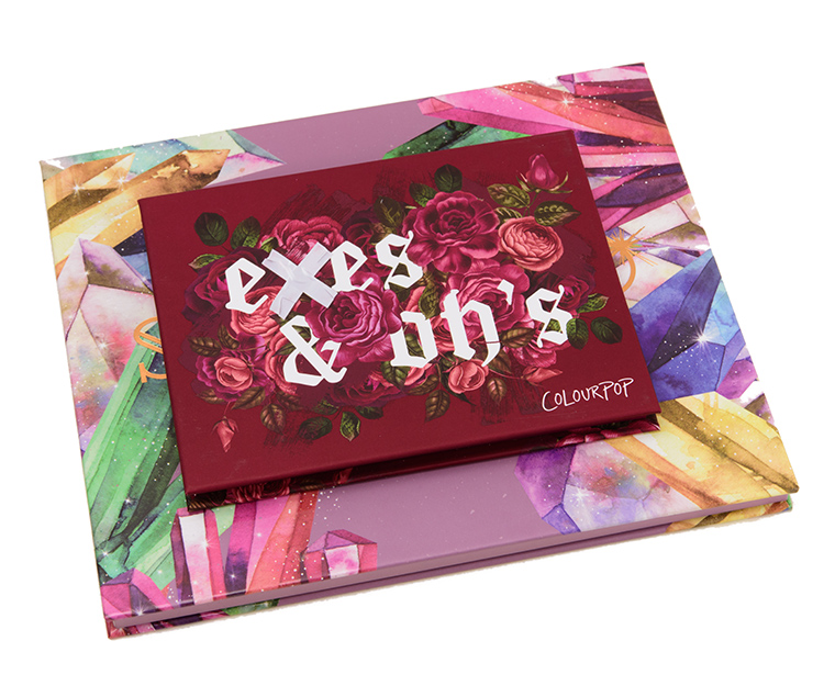
I like that you included a pic with one of their 12 pan palettes for a size comparison, it doesn’t seem overwhelmingly large to me now!
Got this to support Kathleen and normally I love CP. The shades looked to pretty; some of them still are which is why I’m giving it 2 stars. But I have more dislikes than likes about this which is why I’m so disappointed. 🙁
-some pigments are chalky
-excess glitter fallout
-some of the shades that look matte have glitter in them which to me, cheapens them
-the 2 glitters that aren’t “eye-safe”…in an eyeshadow palette. I don’t need to put glitter in my hair. It’s a waste of 2 spots in the palette.
-some of the shades skip when applied to the eyes, not as pigmented
-not much color range. I thought when I bought this it would be the only palette I need. But there are several “browns” that are actually red toned. The deepest everyday shade is more of a gray and it almost makes things look more sloppy
The biggest disappointment is that CP doesn’t have a return policy…..what? I get it, things are cheap, but I’m not happy with this product and now it’s just going to sit around while CP keeps my money. Doesn’t seem like good consumer relations.
This doesn’t RUIN the brand for me. I will just be way more cautious buying from CP. Will most likely only buy when I can test it first at Ulta.