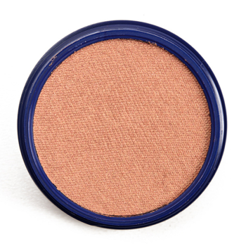
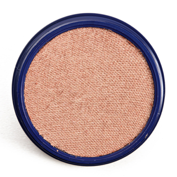
ColourPop The Zodiac Collection | Swatches of All Shades

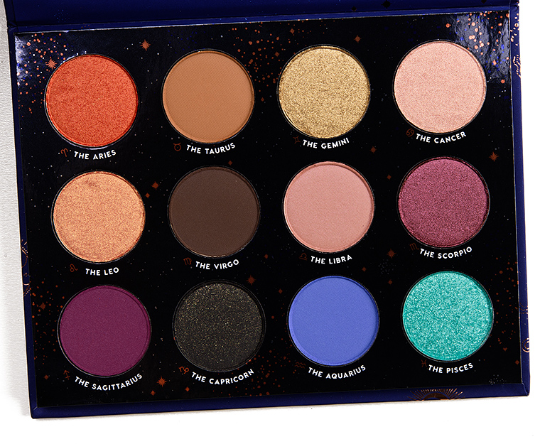
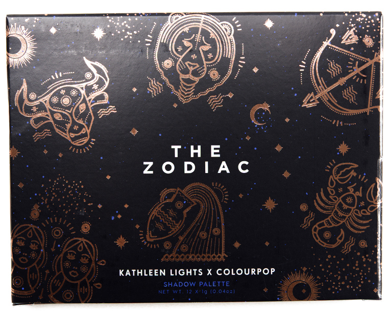
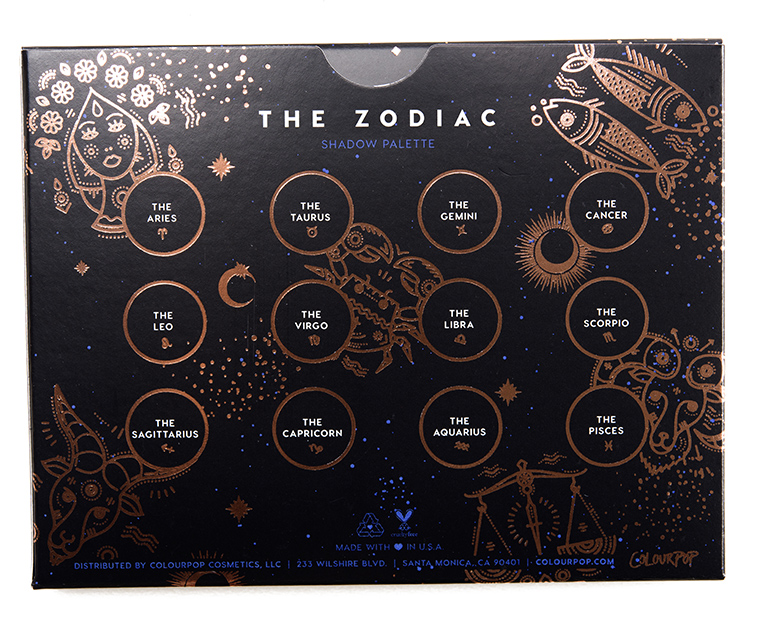


ColourPop The Zodiac Collection launches July 26th and includes an eyeshadow palette, two lipsticks, two liquid eyeshadows, and two cream highlighters. Here are swatches…


Yikes! I feel bad for my Aquarius friends! I think between my Fortune and Perception palettes, this will be a easy pass for me.
This all feels really uninspired and forced.
The last 2 shades in that palette just kill it stone dead for me. Scorpio Moon looks nice but I’m sure I have a million shades similar, so we’ll see.
Thanks for the early swatches, Christine! 🙂
This is really the year of the zodiac collections I guess
Swatches look promising except for that periwinkle
Oh, that Aquarius swatch looks rough! Not feeling this release at all.
In trying to appeal to everyone, I think they’re appealing to no one. More warm neutrals, the ten millionth black shadow in a palette, and a couple of meh-to-horrible cool tones. Easiest pass ever.
For Virgo, could they have picked a more boring brown? Considering all the colors found in nature, why does “earthy” automatically have to be interpreted as the color of actual dirt? Why not green, or gold or amber, or one of the million other beautiful things in and from the ground even?
As a Virgo, this comment resonates with me on a spiritual level.
My thoughts exactly. Total hard pass
I totally agree with you, so disappointed.
100% agree with you!!!! Just because we are an earth sign doesn’t mean we want something the actual color of dirt. This collection is not as ntereatng and as beautiful as it could’ve been.
Exactly!
YES, THANK YOU.
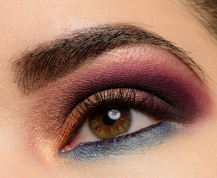
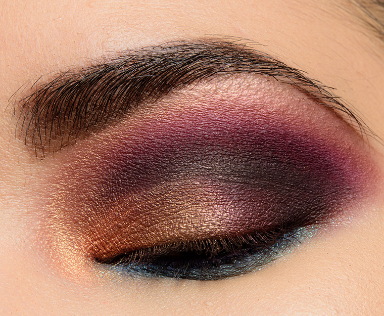
As a Virgo, I completely agree with you! I was disappointed we didn’t get a beautiful olive green shade… On the other hand, this kind of cool toned brown usually looks gorgeous smudged all over the lid, like a grunge smokey eye.
Here’s what I would do:
Aquarius – fuschia or bright orange maybe (thinking more hippy-ish like Age of Aquarius)
Virgo – Cool-toned metallic-ish olive green.
Scorpio – Fire red. For obvious reasons
Gemeni – Gets a duo-chrome. Also for obvious reasons.
Those are all my initial ideas. Would love to hear what you pretties think for colors for an astrology palette.
I agree for Virgo and Gemini (for the latter I was thinking about something like MUG Voltage). But no, neither Aquarius nor Scorpio suit the colours you’ve just described. Aquarius’ colour is blue (or aqua if you go by the ruling planet’s actual colour) and Scorpio’s colour is black or a really dark red.
The colours I would change are:
Aries – She should have gone with her initial idea of using red.
Taurus – This should have been green 100%. Maybe a forest green.
Cancer – Something less pink and more grey or silvery (I think Dream St’s Kaleidoscope would have been a better match).
Capricorn – Either the light brown or the dark brown should have gone here.
Scorpio – The black should have gone here.
Other than that, astrology-wise, this palette is by far the best I’ve seen. It’s obvious that Kathleen loves this topic.
My color (Aquarius) looks like a disaster.
Darn. I thought that Aquarius may be a dupe for the Norvina Soul but I am not hopeful for high quality given how Aquarius swatched . I’m trying to find a dupe for Soul as I don’t need the whole Norvina . This palette is an easy pass for me.
Try the single from Buxom called Luxe Life. Christine has an old swatch & review here.
Thanks so much for the tip! I appreciate it,
I just picked up Nars Kamchatka to fill that urge myself 🙂 it was on sale on Jet.
I’m a huge fan of hers and while the colors didn’t jump out at me, her video and swatches on her Instagram made me understand the palette a bit more. She considers this one a sister palette to her Dream St. one and seeing her post on Instagram definitely made it clear her thought process. I’m probably going to get the eyeshadow palette because the color story in combination with her other one is gorgeous! But as a stand alone palette, I feel like this one is lacking.
sooo…star signs are the new unicorns?
I don’t really like anything from this collection,beside the Aries shade…sad
I like it OK, but it’s not a terribly original or exciting collection. The Aquarius looks pretty awful, which is weird, because CP can do fantastic blues.
I am with you and I don’t get it. It is kind of funny because that is Kathleen’s birth sign, Aquarius, LOL. You would think she would have a stellar blue but it looks like the poorest shade in the palette. I am a Capricorn and while I don’t put a lot of store in horoscopes I am kind of surprised by the black leaning green shade. Oh well. I may pick up the Scorpio Moon lippie as it is suppose to be an updated version of her shade Lumiere from the lippie stix line and the liquid lip. I prefer a bullet lipstick and although I can tell the colour isn’t the same it is a nice shade.
As an Aquarius, I find the quality of the color not representative. We are more interested and complex people than this faint nothing.
I’m a Taurus, and feel personally offended LOL, for that boring dirt brown they attributed to my sign. How about a
deep emerald green metallic? Or a greenish gold duochrome? That would be nice. And other earth signs are all assigned some ugly colors, especially Capricorn. I don’t know what happened there…. I have no words. Then poor Aquaruis, would’ve been such a beautiful periwinkle, but it swatched terribly, looking like it’s clogging Christine’s pores. I suggest Colourpop slow down on these subpar collabs and instead focus on improving the formula of the product and get a new creative team.
I agree with everything you have said!
Hmmm – the shade selection seems fairly random and certainly the Aquarius shade looks quite bad. With a bit more thought this could have been a great palette. I don’t know why the brand felt the need to include that black shade either.
Even the “me” from decades ago who was heavy in to astrology would have been underwhelmed. The quality looks good, but there is something very lacking when it comes to the actual shade selection here. I’m not feeling it.
My birthday is is September 26th so I have always considered myself to have a unique mix of Libra & Virgo traits considering I’m right on the border and procession( which is when the sun is actually in the astronomical constellations of the Zodiac) (Biology major science nerd ? ??♀️,lol) So according to those dates I am a Virgo. Check out your “real” zodiac sign, based on the sun’s current path, and compare it to the date still used by astrologers (in parentheses):
Capricorn — Jan. 20 to Feb. 16 (Dec. 23 to Jan. 21)
Aquarius — Feb. 16 to March 11 (Jan. 22 to Feb. 20)
Pisces — March 11 to April 18 (Feb. 21 to March 19)
Aries — April 18 to May 13 (March 20 to April 20)
Taurus — May 13 to June 21 (April 21 to May 21)
Gemini — June 21 to July 20 (May 22 to June 22)
Cancer — July 20 to Aug. 10 (June 23 to July 22)
Leo — August 10 to Sept. 16 (July 23 to Aug. 22)
Virgo — Sept. 16 to Oct. 30 (Aug. 23 to Sept. 22)
Libra — Oct. 30 to Nov. 23 (Sept. 23 to Oct. 22)
Scorpio — Nov. 23 to Nov. 29 (Oct. 23 to Nov. 22)
Ophiuchus — Nov. 29 to Dec. 17 (not included in the Zodiac)
Sagittarius — Dec. 17 to Jan. 20 (Nov. 23 to Dec. 22) I thought you all might find this interesting because I totally notice how I have strengths and weaknesses of both signs. Virgo’s shade is kinda boring and so is Libra’s I like it better than Virgo’s shade but it could have been way more fun. Aquarius is so sad?
According to the new one i would be a cancer but my moon sign is already cancer and I am a total leo so I choose to believe the old one but I think it’s cool that you are a mix of both. The aquarius shade swatches badly but Kathleen said it has to be built up and when it is it’s gorgeous
Interesting…I’m a Virgo (moon in Taurus), but your chart makes me a Leo, which doesn’t really describe me at all. I’m pretty much a Virgo through-and-through!
As far as these Colourpop swatches are concerned, the Virgo shadow is way too dark for me. I can see using the Leo shade, though. And I know I’d get use out of the shades Libra, Cancer, and maybe Taurus.
I’m sorry, but this would make me a Gemini and I have absolutely NO gemini characteristics. None whatsoever. I am a Cancer through and through.
100% getting the PR box. palette is a little non-cohesive though- and the gold super nova? boring
This Scorp may have to pick up Scorpio Moon lipstick.
Aquarians took the zodiacal hit for the rest of us. Too bad, very interesting colour.
I like the lipsticks, too bad about the eyeshadow palette.
I watched Kathleens video about the collection and she admitted that Aqaurius doesn’t swatch well due to the fact that a matte blue like that is difficult to formulate. It’s a color that isn’t going to create a lot of of pigment and it will have to be built up in order to get true opaqueness. Whether that’s true or not ,I have no idea. I’m just passing the information on ?
I don’t know if aim buying inter story about Matte blues. CP usually does nice blues and if you look at ‘Christine’s next post with Coloured Raine swatches, those blue/periwinkle shades look great.
BH Cosmetics makes a great Zodiac palette. It’s now at Ulta. 25 shades for 24.00.
I don’t feel the need to pick this up, but I LOVE the look you created with this! I think I can create something similar with what I already have though.
I think I am reaching saturation point with ColourPop. I have so many palettes and their is nothing here that screams that it is unique. I am sorry about the Aquarius shade which is rather funny since Kathleen is an Aquarius. You would have thought she would have made sure to do an amazing blue and ColourPop is capable of that. I am probably only going to pick up the Scorpio Moon Lipstick. She mentioned in her video that is suppose to be a slightly updated shade of her Lumiere Lippie Stix and the Lumiere 2 liquid lipstick. I do like the shade and it is one that works for me but we will see. I am definitely waiting on reviews and doubt I will get the palette at all. I am waiting for a brand to bring out something truly unique and innovative in unusual shades. Maybe there isn’t anything unique left to do in beauty?
Cosign. I agree with the saturation point. The last three years have been incredible with booming makeup releases. I think those companies that are still willing to sprint in this race are going to soon run out of steam…and customers willing to spend their cash. Or perhaps that’s why they keep trying to appeal to younger and younger demographics with these themes at the expense of quality.
Time for the old fogies/long time makeup lovers who have seen it all (and just might own it all), to probably sit down.
Didn’t they just release this palette with Shayla??
Everything is beginning to look the same…. and please tell me that this zodiac theme is ending soon. Why is everyone doing it? Do companies have meetings about these things?
#unimpressed.
I can’t put my finger on it exactly but this palette doesn’t feel as cohesive as other CP palettes have in the past.
The palette is okay to me, but that Aquarius swatch hurts! I love Colourpop, but not sure what they were thinking.
As always, I just don’t get the Pisces shade. I’m a pretty typical example of my sign and could never see myself using a bright aqua on my eyes. I feel like something a bit more mysterious and/or duo chrome would be more fitting for us, but maybe that’s because I’m partial to duo chrome and deeper shades… I think a deep purple or green with some shift would have been awesome and a bit more unique.
The lipsticks looks nice, but the rest Im not impressed nor does anything say, “You need me in your collection.”
Does this look a little like Shayla X Colourpop Perception palette?? That’s the instant feel I get from it. Cute but so similar