Sneak Peek: LORAC Mega Pro 4 Palette Photos & Swatches


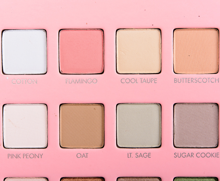
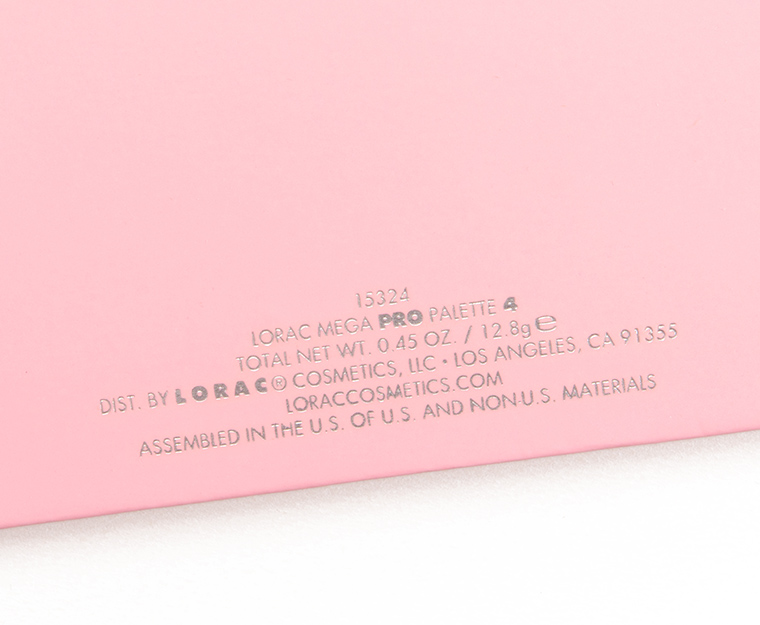
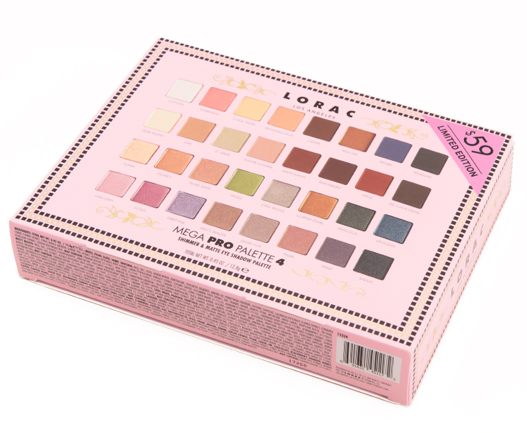


LORAC Mega Pro 4 Palette ($59.00 for 0.45 oz.) is a new, limited edition palette for the holiay season, though the color scheme is certainly not typical for the holidays! To my eye, it gave a more springtime vibe to me due to the more muted quality of a lot of the colors.
First Impressions
While I have always appreciated the blendability of LORAC’s Pro formula, I have often struggled to wear it well on bare skin due to how powdery/soft they are, as the colors often sheer out or go on unevenly (as they seem more prone to absorbing the natural oils on my skin). This palette had some shades that were dusty and thin, and those sheered out very easily and were hard to keep intense/opaque. There were others that were quite pigmented and seemed to go on well (or that they would). The more powdery formula often wears shorter on me than the average powder eyeshadow, and the eyeshadows in the palette felt similar to past releases so nothing says that the wear would be improved but we’ll see.
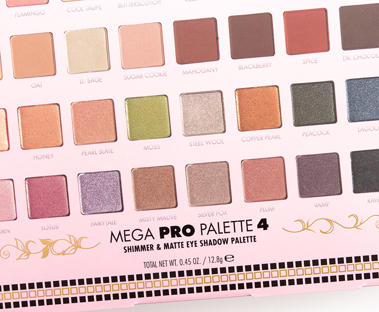
LORAC seems to like to reuse names, as there were several shades in the palette with the same names as past releases but the colors were completely different (not just in a way that might occur from a different batch). I have no idea why a warm beige is called “Cool Taupe” at all given the shade existed previously (and was more taupe-like!).


A giant shrug fest for me colour wise.
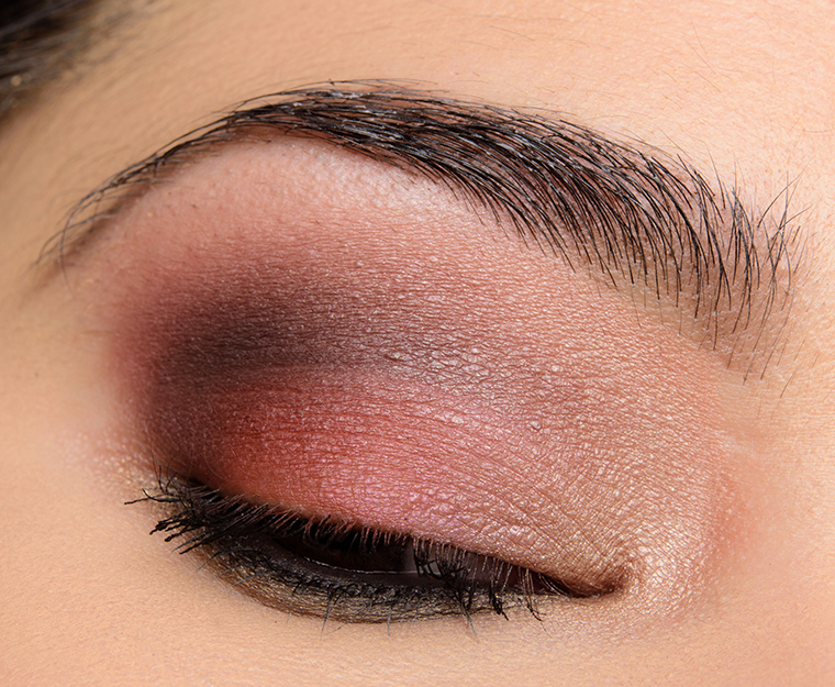
It def has a spring feel, though the upper right, flowing down seems to have the deepening shades. Nothing earth shattering or avant garde here. But it is cooler, lighter, and more muted. Deep set eyes, aging, cool toned…what’s not to like about this one for s.o. like me?. And I think it arrives tomorrow. Could become a workhorse. Big run on Lorac for me this year. Psych!
I’ve seen several people suggest that the shades sugar cookie and cool taupe got switched.
That sounds about right!
I was just going to say … I don’t think I would eat a sugar cookie that color.
Pretty sure that’s exactly what happened. So much for quality control and proof reading before producing the product.
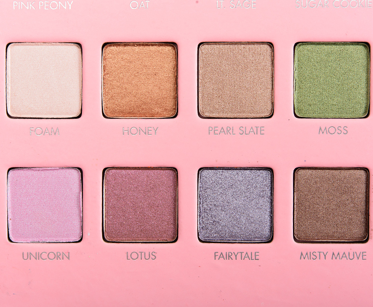
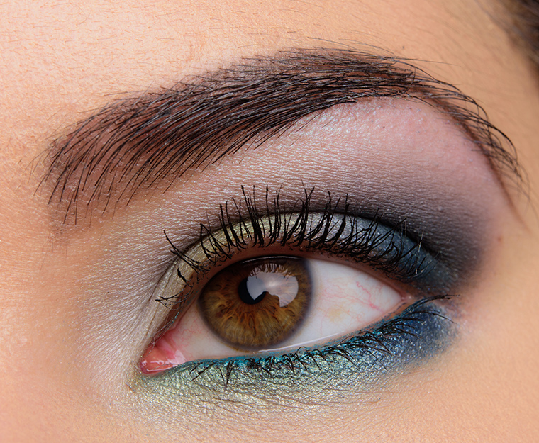
First impression based on swatches and your comments is that this is pretty much what I expected and really only love 2 of the shades, Moss and Lagoon, but that is because I am dying for a really cool palette and this is as close as anyone ever gets!! I am so in love with the “cooler” toned look that you did and might be willing to buy this palette just to reproduce that look alone. No maybe not, just wait for dupes, me thinks, LOL.
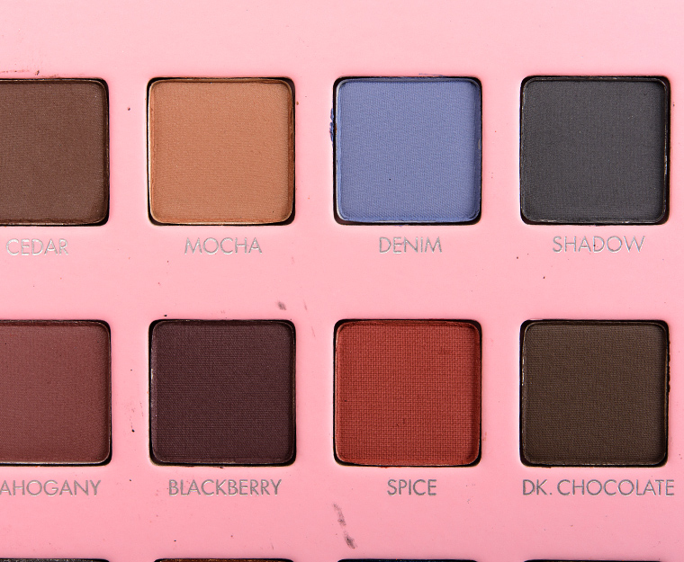
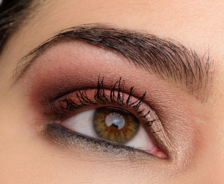
Admittedly these swatches don’t look promising, but I was playing with my MegaPro 4 yesterday when it arrived and I’m very happy with it! There’s definitely a few shades that I expected to be smoother or more pigmented, though. For my look today I used Misty Mauve, Mocha, and Butterscotch.
“Cool Taupe” is driving me crazy, too! Especially since the brand straight-up describes it as “ivory matte.” FWIW, the Ulta site mentions a shade called “Cherry Blossom,” which appears to be a reference to the shade in the palette labeled as “Pink Peony”… so naming shenanigans abound with this one.
Thanks for the swatches! Still debating if I want to pick this one up… the deciding factors might be your final review and my ability to justify virtually any purchase made with Ulta points. 🙂
Yeah, I saw “Cherry Blossom” on Ulta as well, but since the palette says Pink Peony, I went with that!
Oh yeah, definitely seems like Cherry Blossom was a random goof-up in Lorac’s promo materials (possibly due to them releasing what seems like about 36 different palettes in the last few months). But at least now we know they’ve got more names in the holster for their future off-white shades!
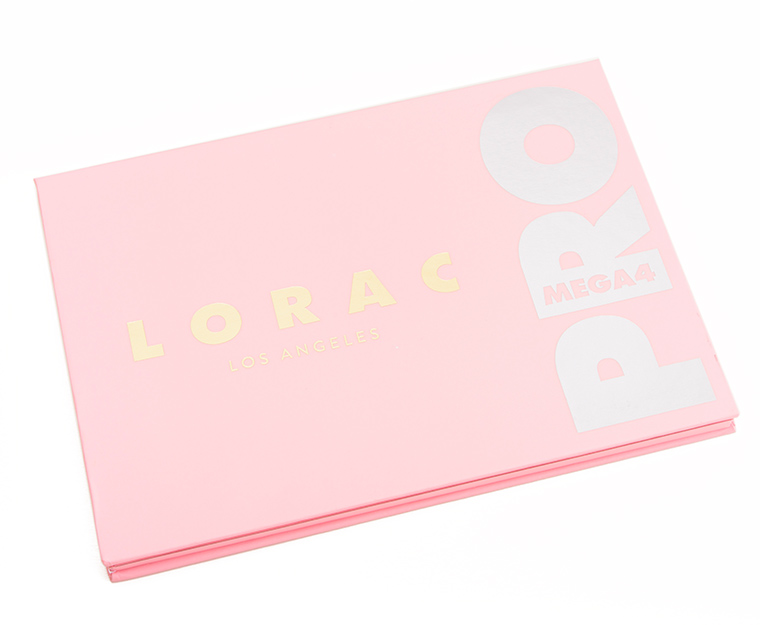
Yes, it does look very springtime-ish to me. And a boring springtime palette, at that. This holds no interest for me, other than a couple of individual shadows that are nice, but I probably have close dupes for them. First off, it’s too big. I’d rather have fewer colors that were better coordinated. This palette has an oddly random assortment of not very exciting shades. Even the packaging is bland. Pass.
I really don’t like the pink packaging for this palette, it totally throws off the eyeshadow colors. I’m still debating whether to buy this palette. Looking forward to your full review!
I fought the urge to buy this when it was released. Now that I’ve seen your swatches I’m not really all that impressed (for the price). I have 4 palettes (Besame Snow White, KVD Saint + Sinner, and 2 of the new Lime Crime Pocket Palettes) already on their way to me and I think they will perform better than the LORAC. I’ll wait for your final review though before I make a firm decision. Thanks as always!
The KVD palette is soooo beautiful. It was at my Sephora in JCPenny and my husband picked it up for me. Love it sooo much.
Oooh that was so sweet of him!
Binx! I literally just adopted a black cat on Sunday and named him Binx!
That’s awesome! (Both the name and adopting!)
Snow White is out? Better check my email. More psyched for that than this, not to mention loving Besame and very curious about their first foray into e/s.
People that signed up before Sept. 18th received emails for early access to the Storybook palette. The entire collection will be available in October.
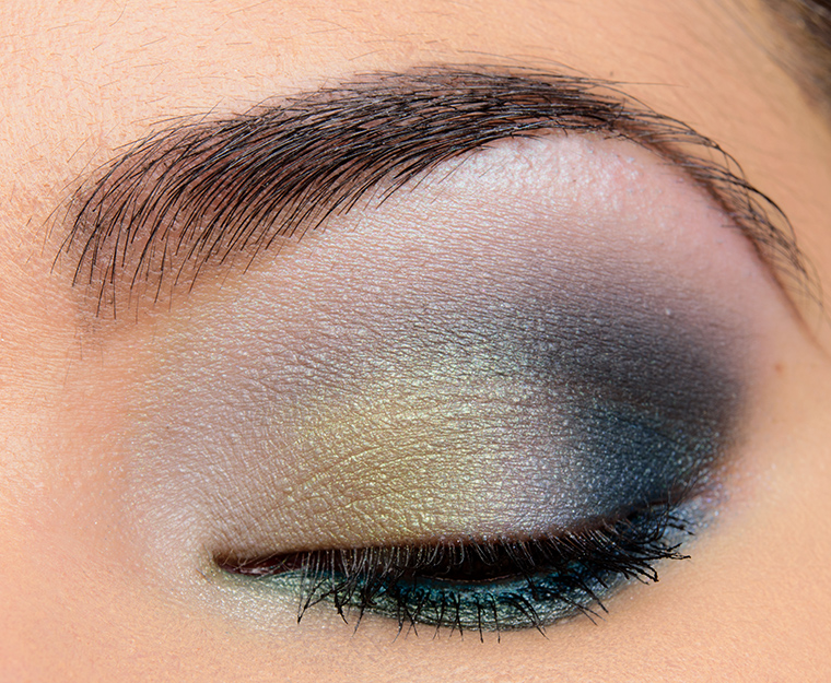
Meh. I’d rather that I would have bought the POTC Pallette when it was available, tbh. Now wishing I had. I do love that blue, green and gray look you did using this palette, though!
If you mean the Pirates of the Caribbean palette, it’s still on Ulta’s web site. I LOVE mine and am so glad I bought it. I know various bloggers had different results from it, but mine is so pigmented and buttery.
Mine is coming tomorrow night. Yikes, looks like a mixed bag here! Hoping some of these apply better on the eye with primer. I bought this because I like the mix of colors, and there’s 2 rows of mattes and 2 rows of shimmers. IDK, might still be ok for me. I have the Lorac Brunch palette, and the pigment sucks, almost returned it, but I’ve been using it like 3x per week, as there’s a number of unique colors, and the soft colors go so well with bold lip looks for fall/winter.
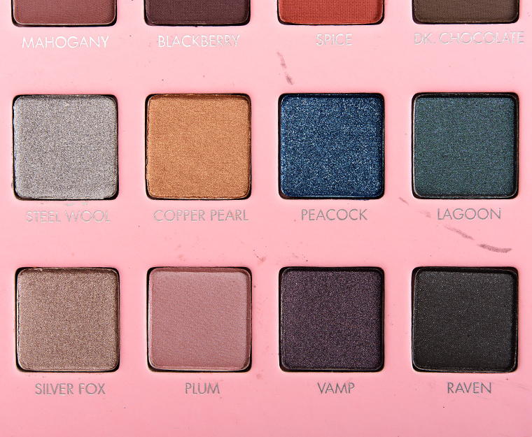
There are a few stunners in here – Vamp looks like a really nice purple but I’ve got MAC’s Fathoms Deep which looks very similar. The same with Peacock, Fairytale and Lagoon – beautiful shades for which I already have numerous dupes. Since I can’t easily get LORAC anyway and since more than a few of these shades are blechy, it’s just as well.
I was considering getting this, but now I don’t think I will. The colors aren’t catching me, but I do think it’s nice that they have a bunch of cool tones in here.
Not impressed and too easter bunny for me…
Somehow this misses the mark for me – too many samey shades, patchy mattes, pinks, purples etc. Sorry Lorac, but your Pro Metal one was stellar and this is not.
The shade range is too random for me.
Now as I stated on another blog, this is another palette that does not inspire me at all. That said, Christine, your blue-green eye is beautiful and THAT inspired me; however I’m certain I could achieve similar with shadows I own (of course I’ll have to work the technique some, but that’s another issue.) 😉
I’m banking on this one going on sale at Ulta. I got one of their Disney palettes that way. I like a couple of the darker shades but this one just doesn’t talk to me. Meh…
This looks like an easy pass for me.
Yeah, I’m with you on the Spring vibe. I actually thought this was a super-early Spring release before I read the text. Not for me, though.