Swatch Saturday: Make Up For Ever Artist Shadows - Satin Finish (Part 3)
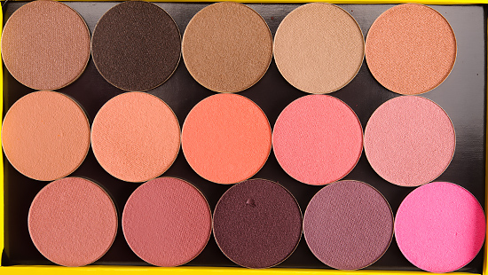
Make Up For Ever Artist Shadows
Here is second half of the remaining Satin finish shades of Make Up For Ever Artist Shadows. That’s all I have for the range! Hope you enjoyed.
See all of these shades in the Swatch Gallery!

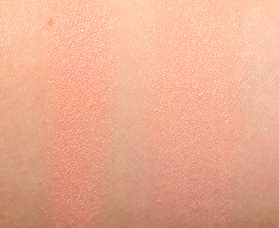
Make Up For Ever S706 Milk Toffee Artist Shadow
Make Up For Ever S706 Milk Toffee Artist Shadow
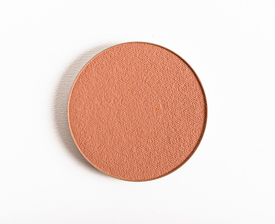
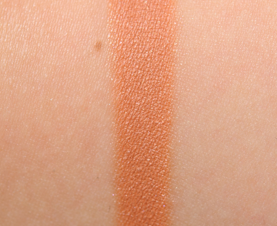
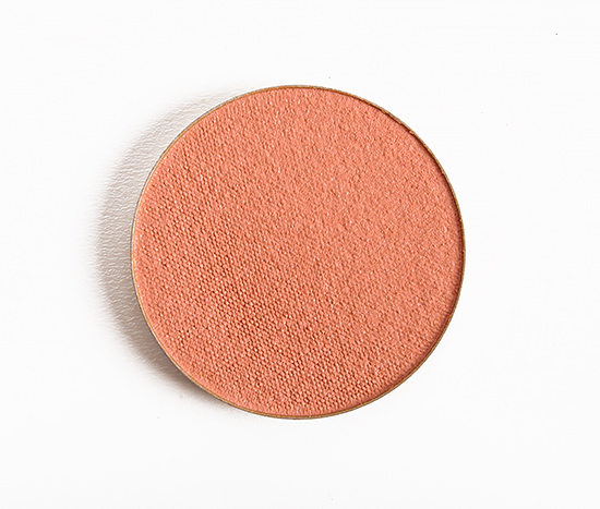
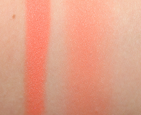
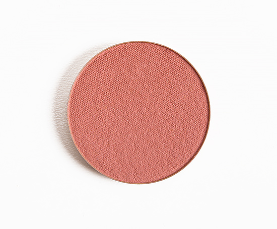
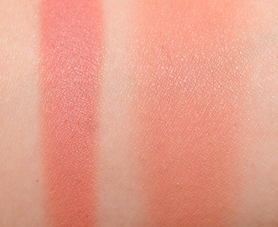
Make Up For Ever S710 Peach Artist Shadow
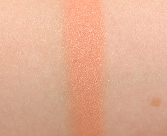
Make Up For Ever S710 Peach Artist Shadow

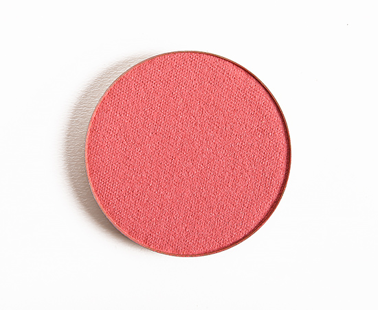
Make Up For Ever S714 Bisque Artist Shadow
Make Up For Ever S714 Bisque Artist Shadow
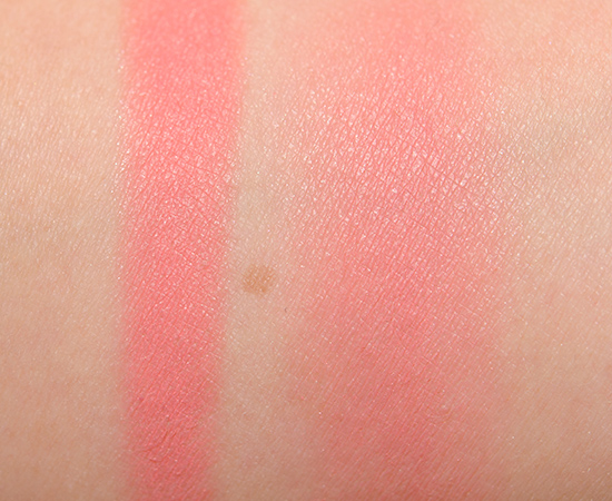
Make Up For Ever S718 Salmon Artist Shadow

Make Up For Ever S718 Salmon Artist Shadow

Make Up For Ever S748 Coral Artist Shadow
Make Up For Ever S748 Coral Artist Shadow
Make Up For Ever S800 Grenadine Artist Shadow
Make Up For Ever S800 Grenadine Artist Shadow

Make Up For Ever S812 Tea Pink Artist Shadow
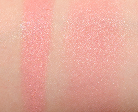
Make Up For Ever S812 Tea Pink Artist Shadow
Make Up For Ever S814 Light Rosewood Artist Shadow

Make Up For Ever S814 Light Rosewood Artist Shadow
Make Up For Ever S818 Pinky Tile Artist Shadow
Make Up For Ever S818 Pinky Tile Artist Shadow
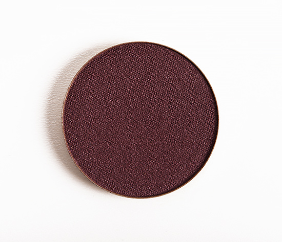
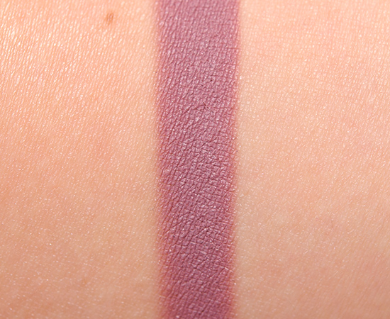
Make Up For Ever S832 Ash Plum Artist Shadow
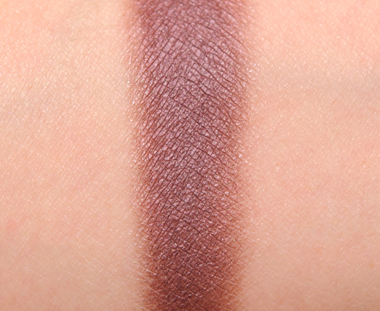
Make Up For Ever S832 Ash Plum Artist Shadow
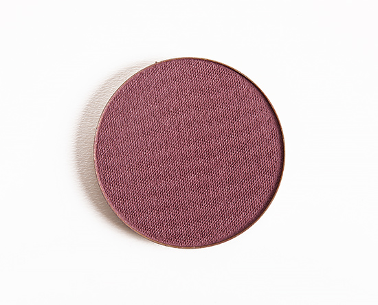
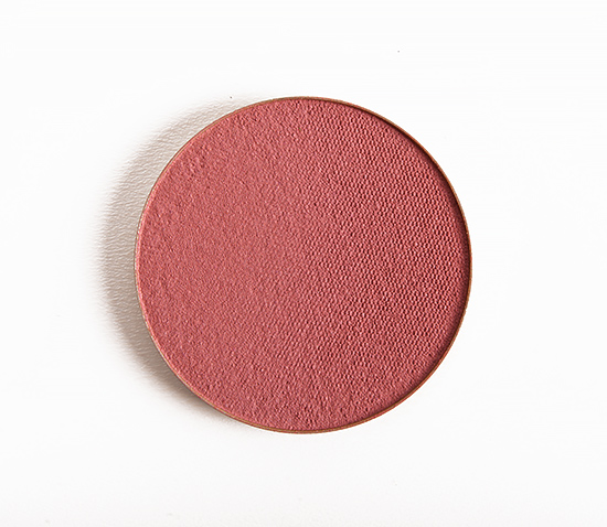
Make Up For Ever S836 Pink Ash Artist Shadow
Make Up For Ever S836 Pink Ash Artist Shadow
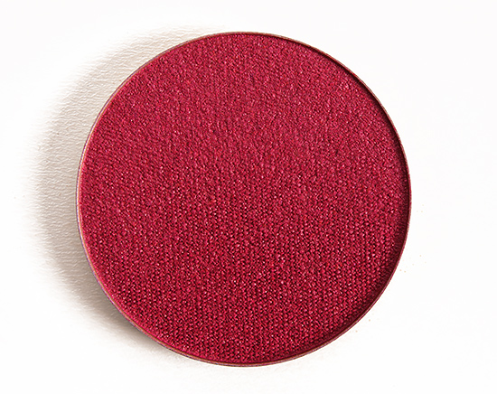
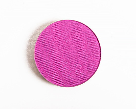
Make Up For Ever S848 Raspberry Artist Shadow
Make Up For Ever S848 Raspberry Artist Shadow
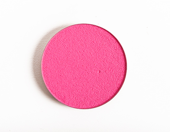
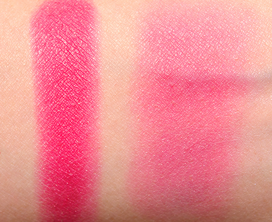
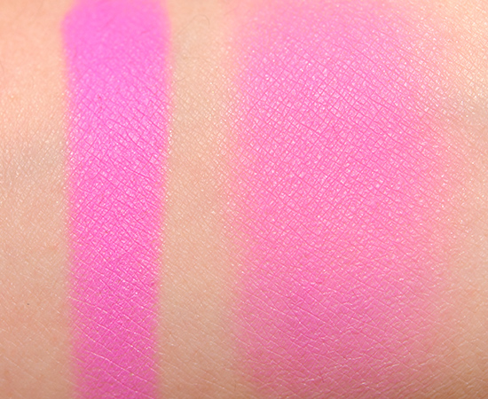
Make Up For Ever S854 Candy Pink Artist Shadow
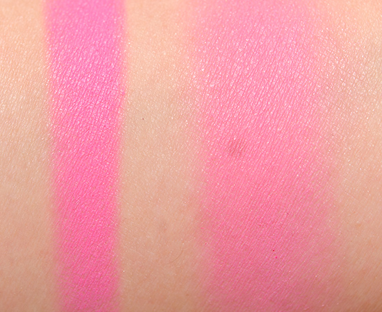
Make Up For Ever S854 Candy Pink Artist Shadow
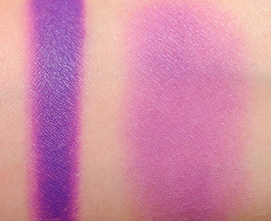
Make Up For Ever S908 Mauve Artist Shadow
Make Up For Ever S908 Mauve Artist Shadow
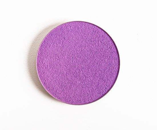
Make Up For Ever S920 Violet Artist Shadow
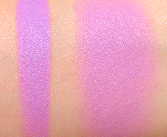
Make Up For Ever S920 Violet Artist Shadow

Make Up For Ever S924 Purple Artist Shadow
Make Up For Ever S924 Purple Artist Shadow
I wasn’t really paying the satins any mind, but now I think I’ll be picking up a handful.
I like the finish of them – most are more matte than you’d expect, but they have something “extra” that is nice without being too shimmery.
Coral and Raspberry are so true to their name, love it.
Right on!
These colors are some of my favorite. Absolutely gorgeous! I’d like to see them on you, I bet they are stunning on you! 🙂
xx
Jenny
Glad you’re digging them!
Again I am drawn to Rosewood, hehe. Pink Ash is a stunner as well. Thank for for all of these wonderful swatches Christine and all of your hard work!
My pleasure, Kimmy!
Delightful.. !!!!!! Your swatch gallery would be an epic framed work of art.. Oh, Christine! You DID find an A- palette! (Parisienne) CONGRATULATIONS! <3 haha! 😉
Make Up For Ever’s Studio Case was an A 🙂
These colours would really suit some warm toned complexions, and given the quality of Makeup Forever products, they would be very useful.
Agreed!
Is Candy Pink a blush? Sephora did not list it as a blush so I’ve been using it as a shadow, oops!
They started getting REALLY confusing to keep track of, so I did start taking photos of the back of them – luckily this was one of those – but S854 is listed as “Blush” on the packaging.
Here in Brazil it’s still Sunday, and just ten minutes before 11 at night.
I spent the whole day visiting a historical city, I have just returned and came across four Posts about MUFE Artist Shadows once again!
Thank you so much for your hard and absolutely unparalleled job !!!!!!
In relation to theses shadows, I love ‘S718 SALMON’ and ‘S814 LIGHT ROSEWOOD’.
But I intensely in love with with TEA PINK. I think it willl be my new GO-TO everyday blush!
Happy to help 😀
Thanks so much for being a swatch hero. Happy you did so many before the VIB sale :*
Glad I could help!
I love love how versatile some of these shades are!! I’m already eyeing some of the “blush” like shades to get for the upcoming VIB sale!
Which shades have caught your eye, Stephanie?
How do they perform as blush? Amazing swatches, thank you!
Hi Maria!
Please check out my reviews for past shades- the ones in here, the majority I haven’t had a chance to try – only photograph and swatch. 🙂
Everything from Ash Plum down has me drooling! The light pink and peaches/corals would be beautiful as blushes. I really like Tea Rose a lot.
It is amazing at how many of these are listed as blushes!
S836 Pink Ash and S924 Purple shadows are screaming “Pick Me”…
Pink Ash is nice!
OMG Ash Plum! Love!
I like how muted it appears!
Tea Pink and Ash Plum are my favorites from this list I think.
Nice!
So, so awesome! Thanks for the swatch, Christine. I think I love all of them no matter what!!! If I’m being practical and taking my skin color into consideration (and also my budget), I can see Salmon, Candy Pink, Pinky Tie being so easy to use and look good on me. (Adding them into my Sephora Love list.)
Happy to help, Fuji! 🙂
Christine, thank you so much for posting all of these swatches! I was going to get the Studio Case and the Artist Palette, but now I think I may choose some favorite shades from the swatches and make up a couple of 3-pan palettes instead. So hard to choose!
Of course! It was my pleasure 🙂
I love Pink Ash!!
Grenadine and Pink Ash are such interesting colours! I feel like you don’t see them much, especially Pink Ash! Of course, Raspberry, Purple and Violet are all pretty OK in my book 😉 I have only one complaint: Mauve is about as far from Mauve as you can get without entering another colour, LOL! 😉
Oh, Salmon and Tea Pink are too pretty! Thank you so much for swatching all of these shadows, Christine 🙂 Your swatch gallery is always my first stop when I’m looking for a certain colour (or comparing different variations on a colour)!
Ooooh, I might have to add Pinky Tile or Salmon blushes to my wishlist, the finish is really beautiful! Healthy, fleshy (in a good way!), muted, natural – me likes!
Christine, do you think Pinky Tile looks so warm because of your undertones or would it add some warmth no matter what?
I think it has a warmer tone to it (regardless)!
So … the MUFE website says these are 2 grams, which makes them just slightly larger than a standard MAC eyeshadow (.07 oz. vs .05 oz. — right?). I love Pink Ash, and have never seen anything like it. I guess I’m resigned to getting it since I just did a swatch search of all pink/purple/berry/plum eyeshadows in non-sparkly finishes and I got nothing even remotely like it. That cool “potter’s pink” color is amazing.
BTW, Christine, I just figured out how you got those orange-red lipstick swatches you linked to: the compare feature! Yeah, I’m slow. I assumed the red I was looking for would be categorized as “red,” because orange, to me, means a particular color range; but you chose orange and narrowed the results down to just the red shades of orange with “compare,” right? I’m not typing this “out loud” to embarrass myself, just to maybe help anyone else out there who may be as slow as I am. :-/
Hey Alecto!
I usually pull comparisons using a “spectrum,” so when you said you wanted a warmer red (and not neutral it sounded like), I refined my results by red, orange, and coral, and then selected “warm” for undertone. I narrowed finish down to matte, semi-matte, and satin. I also filtered by permanent so I would only look at shades actually available! Finally, I clicked “compare” on each the shades I thought might fit your criteria, and clicked the green-teal “Compare” button (at the top and bottom) to just see the ones I selected.
If you have any suggestions for making the process clearer, do let me know 🙂 We are always open to suggestions.
The idea is that there may be a pool of 100 shades, and maybe you like ten of them, so you can compare just those ten together.
For Pink Ash, the only dupe I saw when I tried to look just now was http://www.temptalia.com/swatch-gallery?sg=171253,161374
which isn’t that close, and is a cream formula, so it is pretty different.
I’m not sure there’s anything you can do to make it easier; I’d argue that I just wasn’t paying attention until I tried to find a match for the Pink Ash, spanned several color ranges to get there, then had my a-ha! moment on the red/orange lipsticks.
The two things that tripped me up initially are the color categorizations (one person’s berry is another person’s burgundy), and the fact that I work with color scales on a daily basis, most of which have pigment names, and are not in any way fashion related, so I go sideways when reading fashion-inspired descriptions (Pink Ash looks like pink ash to me, and it’s a dead ringer for an historical pigment called Potter’s Pink, or pinkcolor, which is classified as Pigment Red 233 — see? confusing!).
Anyway, these are my own limitations, and there’s nothing you can do to help someone like me, other than maybe put a disclaimer on the top of the swatches page reminding them that they may have to select a lot more color categories than they initially thought to get at the color they’re looking for. I expected my perfect red lipstick to be similar to cadmium red, which is a RED, not orange, pigment. But I’ll say it again: These are my limitations, and they come from my experiences; I expect most of the people who visit this site are much better at thinking outside the box than I am.
I saw that Prune Taffetas in my initial search, but it seemed too plummy, and missing the essential grayed undertone of Pink Ash (someone nailed that name). Thank you so much for humoring me, and I promise to never write another essay in your comments section. 🙂
Not to worry, Alecto! I appreciate you explaining it to me, because it is always in our interest to make things as easy as possible (and the least confusing!) so that more people can use things like the Swatch Gallery and get more use out of it 🙂
I totally agree – sometimes a berry or a burgundy can easily be categorized as one or the other!
Thank you!
ThNk you for all these swatches Christine! Everything is gorgeous! Some of those pinks and lilacs look like they would be beautiful blushes too!!!